Software
Houzz Logo Print
nosoccermom

Help me pick paint color

15 years ago

Help me pick paint color for a family room with adjoining breakfast area and kitchen. Hallway is BM Morning Sunshine. The rooms are bright but face north, except the for breakfast area and kitchen, which also get Western light.

The chair and sofa are PB leather in camel; I think they have slightly greenish/yellowish undertones. Plan is to put up a photo/picture gallery wall and light sconce above sofa (there's an outlet behind the bike picture :) Still will replace coffee table, new window treatments, etc.

I've narrowed it down to either a grayish blue (Healing Aloe) or a creamy yellow.

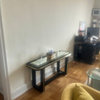
Family room from hallway

{{!gwi}}

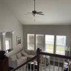
Family Room from breakfast area

{{!gwi}}

Breakfast area from family room

{{!gwi}}

Kitchen (breakfast area is to the right)

{{!gwi}}

Several scenarios:

1. Go with Healing Aloe (blue) throughout --- looks great with the painting, but I think it'll look strange in the kitchen area with the blue tiles (I got rid of the cherries, etc.).

2. Go with the creamy yellow; either a lighter version of the hallway color, i.e. BM Lighthouse or with Wyndham Cream, You are my Sunshine, or maybe Soleil. The paint sample to the left of the sofa and in the breakfast area is Wyndham Cream, the sheet in the breakfast area is Lighthouse. I think it would flow with the hallway, look better in the kitchen, but I'm not so sure overall.

3. Go with Healing Aloe everywhere, except the facing wall in the breakfast, which would be yellow as well as the rest of the kitchen.

4. Any other scenario (e.g. gray/blue, but fireplace wall yellow which continuesg to breakfast area+kitchen).

Please help!

Comments (10)

  • 15 years ago

    I like the yellow idea. I like blue in small isolated areas that don't have to get along with other open spaces. Good luck!!!

  • 15 years ago

    I too would carry the yellow into the room. Yellow with the white and touches of blue you already have will be a very pretty and classic look.

  • 15 years ago

    I like the idea of yellow; it would look good with the flooring. But that's a whole lot of yellow. I love Wyndham Cream, but even that could be too much when it starts bouncing off itself.

    I would go more towards a white or cream that leans yellow. Don't have a color to suggest, but there are lots of discussions here on whites and creams and what their undertones are. Do a search within this forum on the word "mayonnaise" and you are likely to pull up those threads.

  • 15 years ago

    Ditto Graywings' suggestion. Yellows, even in north light, are tricky and can be over powering when reflecting off the adjacent walls. Cream with yellow undertones may give you just what you're looking for. Hope all those threads are still available here. If not, you can try googling THS warm whites or GardenWeb creams (or mayonaise). HTH.

    You can even paint the kitchen a slightly different color than the family room since it doesn't get as much light. E.g., in a previous house our kitchen was BM Linen White and the north facing family room was Bone White. Subtle, but looked great.

  • 15 years ago

    I was actually thinking about the Lighthouse, but, yes, a lot of yellow. I could go with Milky Way; that's on the same strip as Morning Sunshine and Lighthouse. I've had white walls for so long that I feel I need some color.

  • 15 years ago

    Totally understand, but suggest you get a sample and actually paint a large section of both walls at a corner to see if you like it once up. The usual advice is to go lighter with yellows as they tend to intensify more than some other hues.

    The other thing is to be careful with undertones. Have you considered using the hallway color @ 40% or 50% since you like that? I think it looks great in your pix, but the wainscoting keeps it from overwhelming.

    Though you didn't ask for suggestions, I think before I'd spend $ to replace your coffee table (which looks nice in the pix), I'd opt to get larger art for the wall behind the sofa and maybe a small floor lamp for reading in that comfy- looking burgundy chair. Good luck!

  • 15 years ago

    We have a lot of golds and yellow in our downstairs and I ended up using Raffia cream on a couple of walls to help tone it down. It's still a lot of yellow but when you add drapes, pictures and so on it's ok. It's pretty in the morning when the light comes in. I have to admit though, after 5 years, I'm looking forward to a change from the yellow in our kitchen. If you're interested in a nice creme color, Raffia Creme by Behr is lovely.

  • 15 years ago

    I will try the toned-down version of the BM Lighthouse or Windham Cream. Both have no peachy undertones (the Lighthouse actually even less so). Yes, abundantblessing, I am planning to put up a wall with pictures and photos behind the sofa. The current picture is way too high and was just temporarily put there to see how the wall color would work :)
    The floor lamp is a great idea.

  • 15 years ago

    The living room has to be in tan to brown to red wine, with very traditional heavy drapes and the trim and ceiling in off white, based on the furniture.

    The kitchen and breakfast area can be a brighter white based color scheme, with the blue matching the existing kitchen, but not as cheerful as the yellow, and will need more decor to pull it off, like fun drapes and art, or an accent wall with a pattern.

    Here is a link that might be useful: brown and red rooms

  • 15 years ago

    It's the Pottery Barn Manhattan set in camel; I was thinking bamboo/matchstick blinds, no heavy drapes.

    For more info about the layout: The fireplace wall continues into the breakfast area, so basically the right wall on the pic with the breakfast area is the same wall as the one with the fireplace. Standing in family room facing the fireplace, from right to left: window, corner, window, fireplace, French doors, window, corner, window. Now you're in the breakfast area with kitchen to the left.