Software
Houzz Logo Print
maypcs19

Neutral paint colors

13 years ago

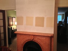
I'm desparate for help in picking a dining room paint color.
I've spent over $60.00 on paint samples. Here's the dilemma. My dining room has a salmon/coral marble fireplace. I'd like to find a warm neutral with no obvious peach undertones. I don't want to use gray because it won't flow well into the living room (Georgian Green by BM) and Phil. Cream in foyer. I've tried Putnam Ivory, Monroe Bisque, Powell Buff etc. They all seem too dark. The room gets very little light. Then I tried Barely beige, everlasting, lady finger, barbados sand, adobe beige, etc. I'm leaning towards barbados sand since it's a little deeper than barely beige. I thought I'd love Putnam ivory, but when I painted a patch it looked too dark. Maybe I should just go for it and pick a color. I could have bought a gal. of paint already. None of the Affinity colors work. Sorry this is so long, but I'm thinking of just turning off the lights and forget about it-at least for a little while. Thanks in advance.

Comments (22)

  • 13 years ago

    I feel for you may because I am experiencing paint paralysis myself. I bought 4 quarts of SW paint and they all seem muddy to me. Today was also the last day of their 30 percent off sale so I missed out on that. I just bought 5 samples of Ellen Kennon full spectrum paints and I am so hopeful that one will be just the right one. This is so exhausting and getting darn expensive as well.

  • 13 years ago

    Take a look at the color below, it looks a tad bit lighter when painted and would compliment all your colors.

    Here is a link that might be useful: Elmira white

  • 13 years ago

    Elmira white seems a little gray, but I'm going to the BM store today and I'll ask for a larger sample sheet before I buy another sample. Thanks. I'm waiting for the Farrow and Ball color card. There is a FB store in Canada, just across the river from me. If anything looks good, I'll make the trip. I couldn't find any SW colors. Color look so different in the paint deck than on the wall. Thanks

  • 13 years ago

    When I plugged in a coral color into BM, the neutral the computer suggested is cotton tail 2155-70.

    I think going more cream or ivory would look better.

    How about going in a completely different direction? Navy?
    Navy looks great with salmon, green and ivory.

    Hale Navy is one of my favorites.

  • 13 years ago

    The BM web site says to coordinate Georgian Green with BM Cotton Tail or White Vanilla. So that would also agree with pps7's find that Cotton Tail goes with coral.

  • 13 years ago

    Can you post a photo? I have been very pleased with bm mascarpone on our living areas - it is a warm white that goes well with everything in the house and ties it together... From deep reds to cool blue grays.

  • 13 years ago

    You have tried so many different colors, but have you tried having paint colors mixed in an attempt to get one that pleases you? Good luck.

  • 13 years ago

    I'm leaning towards Barbados Sand or Cayman Islands. I'd like to bring out the brownish veins in the marble. I'll try to post a photo. My3dogs-you're right. I'm testing on a white primed wall, so the darker colors look too dark. I just have to find the right tone and go for it. It seem like all of BM beige/tan colors have a pink undertone. At least to me. I'll try to upload a photo tonite. Thanks everyone.

  • 13 years ago

    Here's a good neutral creamish tan. I used it in my master br and we love it. Check out Steamed milk.

    Here is a link that might be useful: steamed milk

  • 13 years ago

    For what it's worth, I have BM Georgian Green in a guest bedroom and BM Ashley Gray In the (dark) hallway leading into the bedroom. Both have BM Linen White trim. I think they look great together. The BM Ashley Gray is a much darker color than what you are looking at and I know you thought gray probably wouldn't work well, but I wanted to throw it out there b/c I get SO many compliments on the Ashley Gray. I think dark colors in a dark room can be successful in making the room feel warmer and larger. Good luck with your choice!

  • 13 years ago

    Well, here is the photo. The livingroom can be seen with Georgian Green. The house is 120yr. old so there is no open area, but I still want the colors to flow. Over to the right of the livingroom there is no wall-just 2 archways. That is where the entrance is with stairs going up to the 2nd floor. That is painted Phil. Cream which I love. The entrance and stairs can be seen from the dining room. The dining room is 14 x 14 with 1 long window and a niche with 4 sm windows that the china cabinet sort of blocks. The painted squares are: Cayman Islands, Barbados Sand, Putnam Ivory and Barely Beige. I'm leaning towards Barely Beige because I thought I could use a darker color for just the fireplace wall. In person, Cayman Islands looks a little muddy, Barbados Sand is too light, and Putnam Ivory is too dark. Any suggestions will be appreciated.

  • 13 years ago

    Forgot to mention, I'm trying not have a similar color to Phil. Cream. Thanks again

  • 13 years ago

    Yayagal, I love the Elmira White, I could go for that! I really like thePutnam Ivory.

  • 13 years ago

    I like the Cayman Islands and the Putnam Ivory, they both look great there I think!

  • 13 years ago

    I'm leaning toward Cayman Islands as long as it's not too peachy. Does the room get a lot of natural light?

    I'm asking because I painted a dark foyer SW Sand Dollar and it looked neutral, but when I used the same color in my bright powder room, it looked peachy which I didn't want.

  • 13 years ago

    The room gets very little natural light, just 1 long window (house is 120yr old). The room is shaped like a box 14 x 14. There are some small windows but they're partially hid by the china cabinet. That's why I skeptical about Put. Ivory. I may just buy a gal at 25% less as someone suggested and give it a try. I can always up it 100%. We'll see.

  • 13 years ago

    Rather than trying to go for the opposite of the coral, go for drama~cream walls, black accents~are those black-framed pictures I see in the room behind the fireplace? This would put the focal point on your beautiful fireplace.

  • 13 years ago

    I've finally come to a decision. As patty cakes suggested, I'm going to paint 3 walls a cream such as pale almond or a little deeper. The fireplace wall will be an accent color such as scarecrow by BM. I always use a mirror on the fireplace so it will reflect the artwork on the opposite wall. Thanks for all your input. As soon as it's done I post another photo.

  • 13 years ago

    If Pale Almond doesn't work, try Benjamin Moore's Winter Wheat 232 (also known as Albescent OC-40) or Cream Fleece 233 (next shade darker). Looking at my large BM Color Chips, the undertones in these two neutrals seem to coordinate well with Philadelphia Cream and Georgian Green. I believe they are mixed using much the same pigments as Pale Almond (yellow oxide, black or gray, and red or magenta).

  • 9 years ago

    Antique beige I have in a small bathroom and it is nice looking. Goes with everything.

  • 9 years ago

    Doing sand dollar with favorite jeans. To give my house a beach feel

Sponsored
J.Holderby - Renovations
Average rating: 5 out of 5 stars4 Reviews
Franklin County's Leading General Contractors - 2X Best of Houzz!