Software
Houzz Logo Print
jeannine

Knowing when to say 'when' (pics inside)

18 years ago

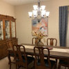
My condo has a dining "nook" instead of a dining room. After two years with an itty bitty table, I decided to commit to some more substantial pieces. I love what I've bought over the last few months: an oval table, a contemporary curio, and custom upholstered chairs (had to wait three months for them, but it was worth it).

Ignoring the contents of the curio, which is a bit of a mess at the moment, is what's on the walls "enough"? I'm a big fan of restraint, but am nervous that I've stopped too soon.

Specifically, should I look for some sort of art for the wall to the left of the table, where the light switch is?

Any ideas?

{{!gwi}}

{{!gwi}}

I know the curio is a mess right now...I've never had one and it's going to take me a while to figure things out. Obviously, the books have to go elsewhere. :)

{{!gwi}}

Comments (30)

  • 18 years ago

    Ooh, it's lovely!

    Maybe use the prints on top of the curio and move them to that wall. One above the other, or side by side?

  • 18 years ago

    Wow, you've done a lovely job, it looks great. Your new furniture is beautiful. I think the walls could use a little art, but I'll leave what kind up to those who know about such things.

  • 18 years ago

    I also think its LOVELY!!! I really love that style-what ever it is! I think of Candace Olsen when I see it! :)

    I actually like the prints where they are. How about something organic on top of the table, like some flowers or whatever?

  • 18 years ago

    Your home is gorgeous. I can't think of one suggestion to give. :)

    On another note: What is that blue color on the walls? And in which pic is the color truest? I love it!

  • 18 years ago

    I originally bought the prints for that wall, but the space is so small that hanging them vertically would put one of them low enough to be in range of one of the chairs (I could just see someone backing up from the table quickly and smacking the glass).

    I went out to find some flowers for the table today, but all the stores are sold down a bit. I bought a square, squat vase for some flowers already, just need to hit a flower shop during the week to find some flowers to add to it.

  • 18 years ago

    Gorgeous! I would leave that wall blank so that the person in that chair does have enough "comfort space" when standing or sitting at the table!

    As for the centerpiece -- simply fill the bowl with green apples and green grapes. Or silver "christmas--style" balls for a bit more sparkle.

  • 18 years ago

    I believe there is a rule of thumb that if a wall is less than 36 inches wide, it is too small for artwork.

  • 18 years ago

    I vote for some lemons in the bowl on the table. I vote for bowls of lemons on every table. LOL

    I like that silver ball recommendation also.

  • 18 years ago

    OH, organic_smallhome, the color is BM Smoke (I used Aura).

    The top photo is what the dining area truly looks like. The light bulbs are 2 CFLs and 1 traditional bulb (3 CFLs won't fit in the light fixture!). In the living room, the same color comes off as in the other pictures because I use traditional light bulbs in there (my lamps are 3-way and the 3-way CFLs I've tried haven't lasted more than a few months).

    Re: the bowl, you all are dead on! In the winter, I fill all my bowls and vases with blue/silver ornaments.

    I'm going to veto the green apples because I did that at work...and because I don't want to be accused of being Vern Yip ;). Maybe lemons...or those little green moss stones I've started seeing here and there. Hm.

    Interesting rule about the 36" wall. Of course I had to run over and measure it: 53 inches. I guess that's permission to go either way. :)

    Thanks so much! You all have given me lots to think about.

  • 18 years ago

    Lovely space!

    For the size of the area, I think you have enough going on. The mirrors on the longer wall make a real statement, and reflect the curio to add another layer of visual.

    I would love to see the square vase with some grasses and pods in it - no need to find flowers.

    If you can, I would see about getting a round rug for your entry. It will pick up on the curves of the table and lighting, and make the entry feel more expansive.

  • 18 years ago

    I wouldn't add more, but I'm a believer in calm spaces where the eye can "rest."

    BTW -- those chairs are devine. I could never get away with those off white chairs, unless they were vinyl, LOL. And no, I'm not just blaming that on kids. We're a salsa and red sauce loving group. :)

  • 18 years ago

    Oh, don't think I haven't scared my boyfriend already about those chairs. He thinks I'm getting a splat mat made for him.

    He doesn't know that the fabric was treated before used, so things should bead off. The treatment supposedly has a guarantee, but I'll have to email the woman who helped me with them to get the details.

    There were a few chairs that were similar (Ballard Designs, Z. Gallerie, Restoration Hardware), but none of them seemed just right. I figured that if I didn't absolutely love them, I might not take such great care of them. I also thought about the fact that my mother bought her dining chairs when she was younger than I am and hers are still in her dining room now and in all those years, were only reupholstered once. Maybe mine can last as well.

  • 18 years ago

    Very pretty furniture and space. I also agree that your room does not require anything more.

    I attached a link to a rug I think would work for your entry way. It looks like you are going on the transitional/contemporary end of style. These are fun. I have Island/Moonstone with the brown background in my PR which is painted a Gray-blue. It's great to accessorize with. There are others you may be interested in. I love the word "sale". The quality of these rugs are great and they are a little different.

    Here is a link that might be useful: Angela Adams

  • 18 years ago

    Your dining room is lovely as it is. I'm a huge "less is more" person and your DR fits that perfectly. Great job!

  • 18 years ago

    I absolutely love it!
    Alicia

  • 18 years ago

    I'm definitely in the more is more cottage camp, but I will chime in. I am not bothered by the empty space. If you can find a companion print to the ones on the curio that may look nice too. I must say that your space is inviting, elegant and calm - all at the same time. I love the chairs.
    Sarchlos- maybe its time to try salsa verde LOL!
    I would keep the top of the curio as is and the only thing I would do would be move the books as you said.
    Someone else asked my question regarding the blue paint.
    Great job!

  • 18 years ago

    The room is beautiful and those prints look better 'leaning' than they would, hung. It's a casual application for a more serious art form.

    Very nice work.

  • 18 years ago

    In case the paint stuff got lost in my rambling, it's BM Smoke and I used Aura paint. I have an open floor plan and it looks bright in the dining room, but more muted and grayed out in the living room.

    I'm so surprised no one has asked about the bells by the door yet. They're my dog's potty bells and people always look at them funny when they come in.

    Thanks for all the comments...you've convinced me that I can focus on the curio and leave the walls as they are. Hooray!

  • 18 years ago

    I knew what they are and you have 2 different sized dogs!! LOL. I had not taught my guys that but we thought about it.

  • 18 years ago

    Just one dog...a golden. The bells are commercially made and I'm not sure why they designed them with two sets of bells...maybe to keep them from swinging too much when the little guy noses them?

  • 18 years ago

    I love it pretty much just the way it is . . . you've done a wonderful job! I, too, think you should keep the wall empty. I think adding artwork there would crowd the space and distract from your wonderful mirror grouping on the other wall, IMHO.
    The only other thing I'd suggest is to move the books from the bottom of the hutch someplace else. They don't do it justice. But, all in all, I think your dining nook is lovely!
    Lynn

  • 18 years ago

    The only other thing I'd suggest is to move the books from the bottom of the hutch someplace else.

    I mentioned in my original post that they aren't staying there...I just needed a spot to keep the dust free until I found another place for them.

  • 18 years ago

    Truth be told, I saw the bells and didn't want to appear too ignorant, lol.

    Didn't have a clue.

  • 18 years ago

    Can't really see the whole wall in question, but if it was my house, I couldn't have a 53" wide wall with nothing on it! But I'm no minimalist, that's for sure. I have never heard the rule about not hanging art on a wall less than 36" wide, but if I had, my house would be almost devoid of art! We have so many doors and windows that we hardly have any wall space. I have artwork crammed into spaces about 10" between doorways and windows... can't help myself. I'm with cooperbailey in the "more is more" camp, I think. Anyway, what I wanted to say was leave the wall empty for now, and if you happen to find something that will look right, you'll know it when you see it. I love everything else you have in the room!

  • 18 years ago

    I think it is perfect as is. Love your new chairs, very sharp looking.

  • 18 years ago

    Orrrr.... You could simply stencil a large pattern on that wall in a tone-on-tone techinique by using either a different sheen of paint or poly. This would result in a subtle pattern for interest, without taking up too much attention. I hope you can envision what I'm describing. Just a thought...

  • 18 years ago

    Oh! I forgot! I had considered painting 12" horizontal stripes in the same color, but with a slightly higher level of gloss (just in the dining area, so it would be defined in this open floor plan). The graphic idea is interesting, though.

    I'm putting up crown molding, so I'll wait until that's up to revisit those ideas.

  • 18 years ago

    Your space is lovely as is. Just add something interesting in the bowl and you are set!

  • 18 years ago

    I think the space is really nice it just needs a little color for some punch. I would definately add something of interest to that blank slate (I mean wall) behind the table, something that has color in it for interest. I've never heard of the 36 inch rule of thumb, know for a fact that a design rule of thumb is use of 3 colors (or shades when using monotones). Personally, I'm really into words and so I would pick 3 inspiring words that I'd love to convey to my guests, and either hand script them directly on to the wall in a nice warm color, or purchase prefabricated cutouts, paint them the colors of choice and hang them there. Have done that in one of my rooms and it looks fabulous!

  • 18 years ago

    I think it is beautiful and would only add that I think Les' comments are right about adding something personal like a vase with some organicity (or pretend organicity) for softening the room.