Software
Houzz Logo Print
lorishopaholic

dining room help

13 years ago
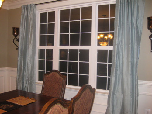
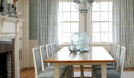
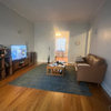
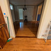
I posted here for the first time last week and can not believe how much help everyone was! Thank you, thank you! I have moved on to the dining room and need more advice. I am trying to decide which curtains to go with. The fabric on my dining room chairs is throwing me off, I think. The solid blue curtains are the same color as the lamp shades but the curtains almost seem to bright or they really stand out. Could just be me over analyzing? The print curtain in the next picture almost seems to blend more but I am afraid the print fights with the chair fabric. Should I go another direction with the curtains? Any suggestions would be great!

Comments (18)

  • 13 years ago

    Another pic. BTW is there a way to post more than one pic at a time? Thanks

  • 13 years ago

    print curtain

  • 13 years ago

    other side of room

  • 13 years ago

    Maybe more touches of blue would help? I am planning on changing the table runner as soon as I figure out the dang curtains. LOL! Also, the curtains are brighter then they are showing up in the pictures.

  • 13 years ago

    Oh my, how I love your peacock lamps and art work! It is simply beautiful. Where in the world did you happen upon them?

    I like both drapes but agree that the second blends better. You have a lovely room! I'm anxious to see more of it.

  • 13 years ago

    Just my opinion, but the curtains come out of nowhere with the chairs. I "can see" the blue of the lampshades if I really try, but given the wall color and especially the chair upholstery, I think that you need to be in "earth tone" colors on the drapes. I don't think a table runner will help. BTW, you have beautiful moldings!

  • 13 years ago

    I like the idea of the blue curtains and prefer the print but agree that there needs to be something else in the room to tie it together. Have you ever tried one of the paint company decorating tools that lets you "paint' the wall on a picture? I think a deep rich blue on the wall would make the gorgeous wood furniture stand out and would tie in the drapery panels.

    I think that would be beautiful in your room.

  • 13 years ago

    I think the print blue curtains looks great! I agree you just need some blue elsewhere in the room to tie it together. A few decorative pieces would work in a blue color to go with the drapes. Maybe a large dough trough with some blue green glass balls in the center of the table.

    Lovely dining room!

  • 13 years ago

    Funny you should post this as I'm helping GF with her DR and LR now. She has colors in her DR chairs that are very similar to yours, and (she's working with decorator at Ethan Allen) suggested wall color and chair rail and picture molding just like yours. And then she was trying to tie the two rooms together, but the DR rug has more red and no blue and the LR rug has no red but blue colors. She bought fabric to cover a chair that brings the DR fabric into the LR and it didn't look good at all. So we are changing it up and using the blue in the LR and isolating the red tones to the DR.

    So I guess what I'm saying is the warmer reds in the chairs doesn't go with the brightness of the blue. The print looks better because the colors tie in better, but the blue is still too much. If you really want a blue in the room, it needs to have more green and be softer...or at least it does in GF's case...like BM stratton blue. I do see some color in the chair, but can't tell from the picture exactly what shade it is, but it looks more green and much softer than your drapes. Maybe a close up of the chair fabric would help...

    Love the peacock picture!

  • 13 years ago

    Here is a up close picture of the dining chair fabric. I hung a earth tone curtain up to see how that would work but will have to post a picture later. There is too much of a glare from the window right now. Thanks for the great help so far! For those wanting to know I purchased the peacock picture at Pier 1 and the lamps at Kirklands. The dining room was Tuscan theme and I wanted to update it but I am starting to regret that. I am happy with how the peacock picture looks with the furniture and the lampshades pull out the little blue in the chair fabric but these curtains are driving me crazy.

  • 13 years ago

    Here are the pictures of the earth tone curtain. I can't decide but this particular curtain is too short so if I used it I would have to figure out how to add length or passible just go with a plain earth tone curtain.

  • 13 years ago

    another pic

  • 13 years ago

    I'm such a chicken when it comes to mixing fabrics, so my opinion isn't worth much.

    Looking at all of them, I think the print is the most interesting and prettiest. You're right about the blue being too blue and the earth tone is not FUN. Too close to the chairs and looks matchy.

    I wish I could offer a fabric that would scream "I'M IT!", but I don't have the talent.

    The one thing that strikes me is that the rod needs to extend further on either side and more curtain fabric stacked, so that it looks like it would cover the windows without looking flat.

  • 13 years ago

    Your room is beautiful. I don't care for the earth tone drape. It is blah. Maybe an olive green drape would work?

  • 13 years ago

    what color is the paint on the walls? on my monitor it looks green. I think the blue drapes make it look even more green.

  • 13 years ago

    On my monitor, the color in your chairs looks more teal than blue. What color is it? Love your dining room. So elegant!

    aktillery, is that your dining room? I love the wall color and would like to know what it is if you know.

  • 13 years ago

    The fabric does have a teal color which the lampshades and drapes lean more towards the teal side. The wall color is a greige but I looked back at the pic I posted and it does look green. In real life it doesn't look green at all. Thanks for the compliments the advice.

  • 13 years ago

    Marti8a, the dining room can be found at For The Love Of a House. They bought a NH farm home and rehabbed the heck out of it.
    I recognized the painting!

    Here is a link that might be useful: Joan's blog