Software
Houzz Logo Print
catalynn

Paint to go with this patchwork quilt?

11 years ago
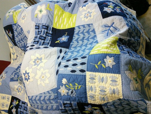
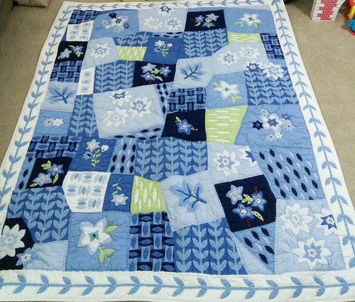
I'm doing some redecorating and not sure what wall color or colors would look best with this Pottery Barn patchwork quilt set I'm using on the bed... any suggestions greatly appreciated.
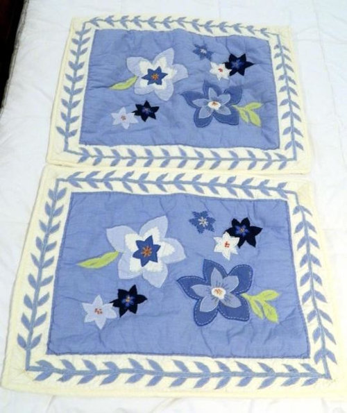
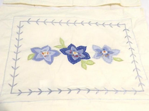
I've added pictures of the quilt, the shams and the little boudoir pillow shams as well.
As you can see it's several shades of blue & warm white with a few little patches of a bright lime green as well.
I'm really not sure what color to use on the walls or if it might be a good idea to paint one wall an accent color and then the other walls another color... help!!
Thanks in advance for any replies. :)

Comments (28)

  • PRO
    11 years ago
    last modified: 11 years ago
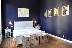
    If your furniture is white (you don't say what it is), I would do a dark navy on the walls. Fold the quilt at the bottom of the bed.

    Ambiance · More Info
    catalynn thanked JudyG Designs
  • 11 years ago
    oh sorry you're right I should have added that information.
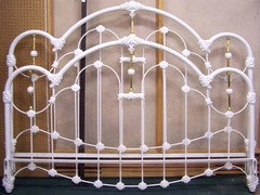
    The bed is a warm white (almost cream) iron bed like the pic I've added and the the other furniture is mainly white (a couple pieces have a little medium color warm wood areas)
  • PRO
    11 years ago
    Judy's image would work wonderfully and be dramatic. If the room you're working in does not have a lot of natural light, you could also consider any of the lighter blues in the quilt. Another thing to consider is whether you could put a chair rail in and paint the lower half of the room darker than the upper half. You also get two colors in one and a great "architectural" element.
    catalynn thanked Village West Design
  • 11 years ago
    The dark blue walls might be a bit too much blue. Consider the lime green family
    catalynn thanked Barbara Almandarz
  • 11 years ago
    Those greens will make the blue in the quilt pop. Your focus in the room is your quilt. So let that shine and let the wall color complement it.
    catalynn thanked Barbara Almandarz
  • 11 years ago
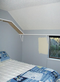
    light is a problem, we live on a heritage street with HUGE trees that the city protects so our home is shrouded in a lot of shade, the bedroom in question is located on the back of our house and in one of the shadiest areas, it has what I think is referred to as a "shed" style ceiling running the entire wall the window is located on so that wall isn't a full 8 feet which also seems to restrict the amount of light.
    It's wonderfully old fashioned looking and looks great with patchwork and iron bed.. but not the best source of natural light so I'm a bit hesitant to use navy blue on all the walls for fear of it looking like a cave. :)
  • 11 years ago
    While I love the pops of bright lime green on the quilt I'm not sure I could handle it on the walls and I'm also not sure about it with the old fashioned look I'm going for?
  • 11 years ago
    I have a bright green in my guest room that would be perfect with your quilt. If you search the Houzz advice section with my username and "trying to use existing curtains in guest room" it will come right up. My room is black and cream. I have an antique quilt on the bed ( circa1840's) and the green is gorgeous. Whether it is a lot of light or less, it is a very interesting color.
    I will try to find the name if you want. It is SW, but I had it done with BM Aura paint, I had to cover the old navy blue walls from before!
    I hope this helps. I say go for it!
    catalynn thanked sunnydrew
  • 11 years ago
    How about a pale orchid/violet?
    catalynn thanked Jamie
  • 11 years ago
    Green family
    catalynn thanked Libbmom
  • 11 years ago
    wow...honeydew your room is lovely!
    The green looks great but I'm wondering if you have a lot more natural light than my room... how large is the window in your room? or do you have more than one window?... your room looks like there's quite a bit of natural light?
  • 11 years ago
    okay please ignore the "catwalk" shelving attached to walls lol.
    That's been removed and drywall was repaired since this pic was taken.
    This is just to give you an idea of the ceiling and window in the room.
  • 11 years ago
    just to add... the old cottage cheese texture on ceiling was removed since this picture was taken as well.
  • 11 years ago
    last modified: 11 years ago
    I think BM guilford green would look nice.
    catalynn thanked kadodi
  • PRO
    11 years ago
    You don't say WHO will be using this bedroom. If it's someone who lives in the house, then I wouldn't use the navy blue because you said it doesn't get much light. But if it's a guest room, go for the dramatic and paint it navy. With a white/ cream soft fold Roman shade for the window...Smashing!
    catalynn thanked User
  • 11 years ago
    Catalynn, the color I used in the guest room is SW 6710, Melange Green. I do have 2 widows together and get afternoon sun, but I will tell you that this green is very bright in the room even on a cloudy day. Of course you will have a couple lamps in there anyway. With sunshine it is almost psychedelic green. I call it a green apple color.
    It may be too much for you, but you can at least get the sample card and see for yourself.
    Hope this helps.
    catalynn thanked sunnydrew
  • 11 years ago
    last modified: 11 years ago
    Yes to the green you already have a lot of blue .
    Michigan Lake House · More Info

    Van Alen Green HC-120 by Benjamin Moore · More Info
    catalynn thanked Geneviève
  • 11 years ago
    Be careful that the color you choose is the right tone. Also, if you are daring enough to go bold with the green, maybe just one wall is that color. It can take over!
    catalynn thanked Barbara Almandarz
  • PRO
    11 years ago
    I would paint the walls and ceiling all one color and do a pale silvery gray/blue, the bed and quilt will pop!
    catalynn thanked Colorsmith
  • PRO
    11 years ago
    Im surprised no one said a butter cream color... That was my first thought. There's already a lot of blue and lime green just isn't for me so I thought of a butter cream. Good luck!
    catalynn thanked DaVill Blinds
  • 11 years ago
    Chartreuse
    catalynn thanked retroearth
  • PRO
    11 years ago
    I would love to see some pictures of the room that you are using the quilt in, the architecture and details, (ie. furniture, artwork) in room will be helpful to look at when making a color selection.
    catalynn thanked Eye 4 Color Designs/Paint Smart Studio
  • 11 years ago
    yeah, another vote for green -- pick a sunny shade that matches the leaves in your quilt. green can be tricky, so I'd get at least three samples and paint them in patchs on the walls (one sunlit and one shaded) to be sure you're getting the lightness and mood/shade that you want to live with.
    catalynn thanked acm
  • 11 years ago
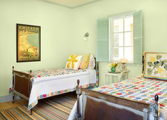
    I did a room in Valspar's Prairie Willow, which everybody seemed to love (with white ceiling and trim) -- here's a snip.
    catalynn thanked acm
  • 5 years ago

    Hi I used to have this same quilt and sold it. Am trying to find another. Any chance you know the name of it? I’ve tried searching online with no success

  • 5 years ago

    Benjamin Moore's Castleton Mist.

  • 5 years ago

    haha, no, I meant the name of the quilt :)

Sponsored
Hope Restoration & General Contracting
Average rating: 4.7 out of 5 stars35 Reviews
Columbus Design-Build, Kitchen & Bath Remodeling, Historic Renovations