Software
Houzz Logo Print
idabean2

BM constellation blue-FAIL!

Using BM "Constellation" I couldn't figure out why the paint in the kitchen looked nothing like the sample; the lights weren't installed yet, and in natural daylight it is washed out, bleh gray-blue. The direct natural light is from the north. Midday sunlight comes through a large doorway from an adjacent room. The paint doesn't look any different then, either
The cabinents are a 'soft white', floors stained pine,trim BM white ice, counters azul platino.

Eventually, The lights were installed:cree soft white 4" in 'boxes' b/c not enough room above ceiling for cans/

In a tiny section of hallway, the electrician put in, temporarily, bright white cree bulbs without the cover.s

Suddenly, I saw the beautiful blue I planned for the kitchen. The different light made all the difference.

In sum,
In the kitchen's natural light, the blue doesn't read as blue.
With lights full on or dimmed, it still doesn't read blue
Where the light is 'bright white' the paint is perfect

Problems:
We own all those soft white bulbs. The boxes are gone
I think the bright whites would be too much in the kitchen. There are too many fixtures and even with the lights dimmed I think the bright white would be harsh.
There is one coat of paint. We are waiting for the second one. I don't want to go ahead and live with an insipid color

Starting with the general: what color paint will work ? Can another color or tint be added to Constellation be so that it will read a truer blue?

Or could an another coat of a different color be applied over constellation to get what I want?

Any and all suggestions most welcome.

Ironically, we painted a bedroom upstairs with Lafayette Blue that is so intense I keep the door closed. I'm only half kidding when I say maybe I should switch ;paints for the rooms.

Comments (10)

  • 12 years ago

    I love Quietude in my family room. In different lighting I rarely see much change in the color.
    In my kitchen which has cream cabs with saddle glaze and saddle island, granite is blacks, browns, salmon and a tinge of blue I went with a brown wall color. I do not have much wall space in my kitchen, but I'm happy with the brown walls and seeing the Quietude in my FR.

  • 12 years ago

    Starting with the general: what color paint will work ? Can another color or tint be added to Constellation be so that it will read a truer blue?

    This is why you need samples and to look at the samples with the ligh sources you plan to use. All surfaces change color depending on the light source: that's what happens with reflected light. It's only blue because the light hitting it has some blue wavelengths.

    Start by bringing in all the pale blue chips you can find and tape them to the wall ... observe them over a period of several days, removing any chip that loses color with changes in light.

    You may need to bring in some of the "sunlight" or "bright white" or "cool white" bulbs into the kitchen to make the color what you want. If the rest of the colors go too garish, you will need to change the color scheme.

  • 12 years ago

    Thanks, lazygardens,
    I had the same thought.I could leave the cool white in small hallway adjacent to kitchen. "Nice blue" would register when coming in.
    Under the cabs, I'm thinking of going bs-less....The house is 150 year old not-elegant farmhouse. If I painted I could cool white leds on dimmers.
    I think it might look odd to have the ceiling lights vary. This is not a huge kitchen and all the ceiliing lights are visible from any doorway. There's a small "expanse "of wall (8 x9 maybe) on the only non-cabinent side. I put put could up a cool white down light to "wash the wall" ; there will be some attractive pictures there; they'd also benefit from cool lighting.

    There aren't any "other" colors. gray,white counter, white cabs, wood floor. There's also very little wall: the backspash area is only about 10 inches, the door frames, moulding, all of which are simple and modest proportions to go with age and style of home.

    OTOH, as I said, the blue doesn't read well in daytime either. So perhaps I just need to do it right and change the paint. In the scheme of delays and mistakes it is one of cheapest and easiest to fix.

    Of course I'll take you advice (and my own counsel which I did not listen to) and be more thorough in vetting.the color.

    This post was edited by idabean on Sun, Oct 27, 13 at 18:56

  • 11 years ago

    Had I read your post... oh had I read your post. We recently had a two story entry way and upper hallway and also the ceiling of our open kitchen/livingroom painted with BM Constellation. I HATE IT! I mean hate it... well only like it in perfect lighting which only exists in one spot for one part of the day. One wall looks grey, one baby blue, one periwinkle... What to do b/c I hate it. The entry way is huge and open and well.. mult walls are painted this color. Also in the kitchen/lr... it doesn't even look blue... it looks dirty white. BLAH>>>>>>>

  • PRO
    11 years ago
    last modified: 11 years ago

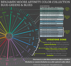
    I'm going to post a mini-graphic of the Benjamin Moore Affinity blue-greens and blues. The colors are in order of overtones around the color wheel. Chroma is the last number in the notation. For example here is Constellation's color notation, 1.84 B / 8.63 / 0.86.

    Constellation doesn't have enough chroma to work with a north quality of light. Not enough chroma means not saturated enough, not colorful or strong enough. It's too weak. If you want a blue for a north facing room it has to be a clean-ish blue (not too muddied) and have some oomph and strength to bust thru the dim quality of light.

    Considering the overall quality of light you have to work with in the space, I would not be looking at anything pale.

    Instead try colors with similar characteristics, lightness/darkness and colorfulness as something like AF-500 Atmospheric.

    Many think with a dim quality of light you're limited to warm colors or need to stay away from anything that qualifies as "white".

    That's not correct.

    You can use any hue including white in a dim room as long as the color has an edge of crispness, not too muddied, and has a generous degree of colorfulness. If you do samples in the space, you'll see it and understand immediately what colors will pale off into the light and the ones that will stand up to it.

    Link to color notations for all the Benjamin Moore Affinity Colors

  • 11 years ago
    last modified: 11 years ago

    Since your room has only a north-facing window and artificial light, if you want to see and felt he blue, you need to go much deeper than BM's Constellation Blue. It's the low light that is making it look blah.

    Get a sample of maybe BM Gossamer Blue and paint at least one full wall with the sample and see if that works better.

  • 11 years ago
    last modified: 11 years ago

    Even better for a north-facing room, low light:

    BM Lake Victoria, a warmer, less gray blue. Kind of a saturated SW Sea Salt, which is a really nice color.

  • 10 years ago

    Bm glass slipper. A shimmery blue silver

  • 5 years ago
    last modified: 5 years ago

    I love BM Constellation! Ceilings in Master bedroom and Laundryroom with much different lighting conditions, it all looks subtle and like a soft sky blue. Using it next in vacation home ceilings in the bedrooms in the mountains.