Software
Houzz Logo Print
budge1_gw

is this any better? making (slow) progress

18 years ago
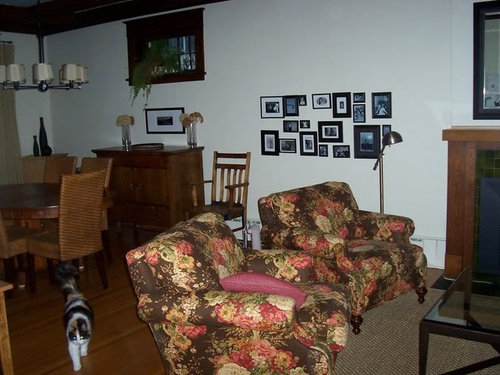
Okay, first thanks to everyone for comments last time around (hah, and you thought you were done with me - not even close!)

We hung the mirror and switched the chairs with the couch. The chairs definitely look better, but not so sure about the couch.

The cluster of small photos is going. I've been looking for something to put in their place. I found some antique prints of mushrooms that I love, but would this be way too weird to put in a living room. We have lovely traditional botanical prints already, but they just scream old lady to me. I'm picturing the shrooms with a big cream mat and simple modern black or dark wood frame. Please check out the link below.

I'm waiting for paint samples of some neutrals from farrow and ball either a tan or grey (I still like the white, but something is not working here and everyone else seems to feel it's the paint).

Thank you for putting up with this for so long. I'm still enjoying the process and really couldn't do without the feedback from everyone here.


Here is a link that might be useful: Mushroom prints

Comments (31)

  • 18 years ago

    I think the 'shroom prints are fab! You have your poisonous, and you have your edible! It would be an unexpected punch that would still be appropriate to your space. Go for 'em!

  • 18 years ago

    What is it that you are unsure of w/ the couch? I wish I'd seen pics of it before you flip flopped the couch & chairs. Right now to me it seems sort of 'chair heavy' on one side. Do you have enough room to straighten the chairs instead of having them on an angle? I remember seeing your chairs before and just have to add that I think the are so nice and unique in pattern and color. Really nice.

    As for the prints I think they would look great in there. The coloring seems right on the money. Speaking of which - what colors have you ordered from Farrow and Ball?

  • 18 years ago

    The fireplace, the window, the mirror, it's all so craftsman. I like it. What about craftsman lighting pieces (instead of the two floor lamps)? What would you think about moving the mirror over the buffet down and put the print somewhere else (mantle)? And the plant from the buffet mirror to the mantle (green on green)? Ooo, how about a craftsman stained glass piece instead of the little prints?

    Here is a link that might be useful: craftsman both sides of the mantle?

  • 18 years ago

    rob333 - I was also going to suggest moving the mirror over the buffet. But now that I look closer, I believe it might be a window. Probably a little too much work to move that!

    Great space!

  • 18 years ago

    Oh, I should have remembered to mention acouple of things from last time. The "mirror" over the buffet is a piano window and can't be moved. Also, we love antiques, but are trying to mix them with a modern aesthetic (cleaner lines, less clutter, a few modern pieces, maybe some modern art). Things are already moving a bit too much towards traditional for me.

    rob333, I can see going whole hog craftsman would create a great look, it's just not us. We are looking at getting a craftsman side table, but are trying to maintain a more modern feel.

    ttodd, we'll try straightening the chairs and see what that does. Might try some other configurations too. The sofa just seems kind of heavy and big at the end of the room (I think I just need a new sofa - all picked out in my head just no budget for it - camel velvet with lovely low english arms...sigh).

    Have ordered f&b cord and bluegrey and french grey.

    Thanks aunt jen. I think I may just go for the prints. They aren't that expensive a mistake if they don't work.

    I've got to head to work, but look forward to more comments.

  • 18 years ago

    Hi budge1....First, I want to say that I absolutely LOVE your chairs. Do you mind if I ask where you got them?
    Secondly, I agree that straightening the chairs instead of having them on an angle would make the room look more modern.
    The mushroom prints are gorgeous and I think they would look FABulous in place of the small grouping of pics.
    I would also add a chocolate brown throw on the couch to warm it up a bit.
    Maybe you could also move the small print under the piano window (which is gorgeous) and instead of having something on the wall, add a tall arrangement or some books with a beautiful piece of pottery on top to "close" the gap between the buffet and window.
    Can't wait to see more!!!!!

  • 18 years ago

    I like the chair fabric with all the rich woods on the dr side, but now there are so many chairs in that area, and a lot of smaller scale pieces. I like the sofa in front of the window, but not the dr and sitting chairs back to back in this arrangement.

  • 18 years ago

    If you're going for cleaner lines and less clutter, I don't think you should put anything on the wall where the group of pics are now. If you decide to get the prints, frame them with large matting and frames, but I would suggest you not spend money on any more prints until you get the walls painted.

    Is there a doorway opposite the fireplace?

  • 18 years ago

    You could also move that entire grouping of black picture frames over the buffet..

  • 18 years ago

    Just running out the door, but wanted to reply quickly.

    Annz, yes there is a door there. You also bring up something dh and I have been discussing - too many focal points on that wall. What about a large print on either side of the fireplace so that it is all one focal point?

    aquirrel, I can see what you mean about the chairs. This is not looking like the ideal arrangement.

    Thanks for the suggestions and compliments declansmom. The chairs are from Wesley Hall. The fabric is a Waverly linen. I love them too but they definately dictate a whole new style I'm not sure I was prepared for.

  • 18 years ago

    Oh, budge1, what I wouldn't do for your lovely craftman home and old dark trim! TDF! I know you do not want anything overly traditional, yet I can't really see a totally modern asethetic in this room either. Keeping things uncluttered, simple and with a few signiture touches will go a long way however. I think you are creating a nice balance. I love your picture wall, but feel it should go elsewhere. Perhaps the hallway, office or a short entry wall? So many smaller black frames don't go with the scale of your heavy trim. I think you need to echo the scale of the trim in your decor--with fewer, larger scale items. Repainting the walls sounds like a great idea. You need something with more umph to balance out all that dark trim. I must've missed the post where you discussed swapping the sofa and chairs. Personally, I liked it before before with the chairs in front of the window. Did you ever consider a narrow console/sofa table behind the sofa--or is there not room? What is in the tall dark cabinet and do you need it in the room? I like the mirror over the fireplace and would like to see some chunky pillar candles on the mantle, but agree to keep it simple. I'd also like to see the buffet more visually connected to the piano window above. Perhaps with 1-2 tall vases with some dried flowers and put the fern lower on a plant stand.

  • 18 years ago

    I don't know if this was discussed on your other thread, but is there room to have your sofa facing the fireplace with a chair on either side of the fireplace facing the sofa?

  • 18 years ago

    budge,wonderful space! I checked your original layout and think your beautiful chairs looked great by the window. The sofa worked well IMO on the DR side but I'd suggest larger and lighter toned accent pillows to bring across some color from the chairs. Consider solids (not necessarily squares) in rose and gold with multi-colored fringe (chocolate, gold, green & rose) along with a deeper berry throw. Since you did such a terrific job making the slipcover, I know you can sew fabulous accent pillows.

    While I love F & B texture, the paint requires the right natural light to look its best. Although our home has tons of light, F & B colors looked horrible. I had better luck with DK82 in a BM Aura matte. Not the velvety hand of F&B but the color looks rich in our home and the finish holds up to pets and kids. What I love about DK82 is that it's not too warm but definitely not cool as, like you, I love off-white and airy. I do think your rooms will be more lovely with a touch of color.

    I'd like the visual impact of larger art so I'd be inclined to use the mushroom prints elsewhere. I don't think you have to go for symmetry with equal sized art on both sides of the fp, but rather balance. Try replacing the grouping of pix with one large piece and see what you think. I've seen examples of wonderful textiles, even framed wallpaper work well until the right art speaks to you.

  • 18 years ago

    I just came upon this. I'd also like to see the chairs and sofa swapped. The back line of the sofa would help define the living area and the chairs would expose more of the beautiful windows.

  • 18 years ago

    I like the mushrooms, but if you're trying to move away from the whole Craftsman period feel, maybe a more abstract, larger image would work.

    Maybe a Jere type metal sculpture (but not one of the very representational ones) or a large Mark Rothko poster?

    Here is a link that might be useful: Rothko poster

  • 18 years ago

    Could you put the couch opposite the fireplace, and have the chairs flank the fireplace on either side?

  • 18 years ago

    Hi Budge, no time to write much but just wanted to say it looks awesome...love love love the woodwork trim. Be proud, you did good!

    Susan

  • 18 years ago

    Budge,
    Your chairs are so pretty & I still can't believe you made the slipcover for your sofa - you did good! Could you make another one out of a warmer colored linen for winter? Think that would look good.

    I like the chairs in front of the window better - & would love to see if you could flank the FP with the chairs - sofa facing FP. Or does that not work for TV viewing?

    I am wondering what your photo collage would look like over the buffet - pictures hung very very close together?

    It is a very pretty room - love that window & woodwork. I agree the white does not make it sing, thou. Maybe the way the photo takes but I could def. see a warmer color on the walls - not dark just with some warmth.

    Smiles:)

  • 18 years ago

    I like what you have now. Is it possible to find a throw and some throw cushions with the bright colours of the fabric on the chairs for the sofa. Just to balance it a little. If you move the sofa you will block the traffic pattern won't you? Right now you can see through the chairs. To bring the two areas together grab a bowl with some oranges or something to pull out the colours of the chairs as well to set on the table.

  • 18 years ago

    Hope you don't mind if I show this.

    Here is just a thought I had. Just a little colour on the wall and leave everything else as it is right now.

    {{!gwi}}

  • 18 years ago

    Okay, going to try different configs with sofa and chairs this weekend when dh is around to help. I like the idea of chairs flanking fireplace, but won't be able to tell if it works until we actually move it. I would like to be able to see the chairs when you first walk into the room. When they are against the window, you have to be right in the room to see them.

    Am going to put some colour on the wall but a little more subtle. Not sure if anyone remembers, but we just painted out the strong colour on the walls. We had it there for about 10yrs. When everyone else had white walls we went for deep colour and now that everyone we know has put colour on their walls, the contrarian in me wants something different (also, I was just sick of it). Looking at Farrow and Ball's cord or blue gray.

    I am thinking about a doing another slipcover for winter in brown linen, but I've just finished doing 3 other slipcovers for friends and am kind of sick of it at the moment. The contrast isn't as bad as in the pictures either - the white is unbleached cotton. The pillows in the sofa are really working for me. They are in the shadows in the pic but IRL they have the exact colours of the chairs and are quite bright (teal, gold and red).

    I have a golden brown throw on the sofa, it's just missing in the photo.

    I've found some really large antique architectural prints on ebay I'm in love with and think I will buy today. They are black and white and I think 3 of them framed properly will look great where the group of tiny frames are now.

    We've been looking at the work of a local artist whose work is very similar to the Rothko poster linked above. We brought some home and dh and I both agreed we love the way the works looked in the room, but if we are going to invest in art, we want to love the art for itself, not for how it looks in the room and we were not quite there with guys stuff. We'll keep looking.

    Thanks mpwdmom! I appreciate the time for the compliment. I really could just stop now and be thrilled with it. I walk in and it makes me happy, happy, happy. Having said that, if I could have the red and gold striped rug in the picture linked below, I would be beyond happy ;-)

    Apologies to those who go the link and are sucked in for ages, as I was.

    Here is a link that might be useful: striped rug

  • 18 years ago

    I would think about a soft green for the walls. I think it would bring out the green tile on the FP and also compliment all the green in the chairs. A good balance for all the wood in the room, too.

    Don't hang any art until you decide on the furniture placement.

    One other thought. Since you made the slipcover, I assume you did it in a cotton, washable fabric? Would you consider tea-dying it, just to warm up the color a bit? I think you would be amazed at how it would work with the chairs even better then. Add some pillows on the couch in a more contemporary stripe that contain the colors in the chair. Pier 1 has a huge pillow sale right now, if you have one close by.

  • 18 years ago

    Hi les, thank you (again) for the comments. Hope you are still out there. I'm looking at either a greeny tan for the walls or a greeny blue (I know you can't tell in the pics but there is a nice bit of greeny blue in the chairs. the tile on the fireplace is going to be changed soon so I don't want to decorate around it. Funny how somethings that look good IRL look hideous in the pics and some things that look hideous IRL look good in the pics (take my word for it, the tiles are hideous).

    We tried doing the sofa facing the fireplace last night and found that it is just too long to do this. Also the coffee table is so long that the chairs had to be way out on the sides of the fireplace rather than pulled up close. A small round coffee table would fix this but I love our coffee table (and it was one of the few fairly expensive things we've bought for the space).

    I totally agree that dying the slipcover would make all the difference. I actually tried to dye it a couple of weeks ago and it was a bit of a disaster. I tried using rit dye in Tan and it came out really pinky tan instead of golden tan. The dye remover wouldn't work and I had to bleach it and I think it came out whiter than before. I then tried dying one cushion with tea, but it didn't seem to change the colour at all (probably not strong enough sol'n) and at that point I was so sick of it, I gave up. Next time it gets dirty, I'll try the teastain again.

    Awhile ago you suggest doing darker pillows on the sofa to connect the chairs to the sofa. I found pillows in the same brown as in the chairs and made some out of a contemporary stripe in the green, red and tan (but don't show up well in the pic). You were absolutely right, they look great.

    Like most everyone else, we've been hit by the economic crisis and there is a possiblity the school my dh works for will have to close. So we won't be spending anymore money on the room (or anything else for that matter) until we find out if they can weather this storm.

    I'm going to try ttodd's trick and scour the basement. I've got at least 10 cans of paint in the basement and I'm thinking I'm just going to mix away until I get a colour I like (don't laugh now, this is how I got the perfect colour for the kichen walls and living room ceiling).

    I bought the prints already, but may look for cheap frames at the craft store or do what I used to do in my college days and just hang them from a wire with clothes pegs :-)

    Truth be told, I love decorating on the cheap. In the photo below you can kind of see the trio of modern black vases. I saw the trio for $130, but didn't want to pay that. I found a collection of different coloured vases in shapes I liked and spray painted them all black (total cost $30).

  • 18 years ago

    I love your home and furnishings. I don't have a clue about my own decorating, and have no design experience, so I won't venture to make a suggestion but I do want to say...

    I absolutly adore your beautiful little kittie. She was the first "thiing" that stood out in the photo for me. She's so precious. You could use the golden-tawny color of her patches on the walls!

  • 18 years ago

    Hi Budge -- I've been catching up on your earlier threads and am drooling over all your woodwork and windows! I've saved your FP as an inspiration shot (sorry you hate the green tiles, ha).

    I'm also an old-house lover who nevertheless likes to mix it up with furnishings and colors that may or may not relate to the house's era.

    Since you're wanting to skew a bit more modern --

    * I think your desire to experiment with a pale blue/grey or blue-green is a good one; the right shade (easier said than done!) will set off your wood and furniture.

    * I also think you should clear everything *small* out of your DR/LR and assess. That means all the small tables, the small frames, the plant in the window (which I'd find a new home for, maybe in the LR, so that window's architectural beauty could shine), etc.

    In terms of the big items, I'm a bit sorry to say I'm with the others who preferred your chairs by the window.

    Budge's former layout

    I agree about the chair-heavy nature of the two rooms when the chairs are on their current side. For me, the old layout does two more things:

    * unites the fabric with the lighter browns of the woodwork and the panoramic green outside

    * ties the lighter sofa in with the DR chandelier shades(in fact, I'd like to see more white/ivory in the LR...maybe you could start by putting your white vases on top of the dark cabinet by the window? And didn't you say you had some charcoal drawings on ivory your 4 y.o. did?)

    My .02, but overall I'd love to hang out in your room as-is!

    ps [from other thread] I'm not sure why you want to plaster over the lincrusta/anaglypta before painting -- I don't think it will interfere with the overall feel you want. [But the stuff's a paint-sucker, true.] Of course I'm biased as I like the texture anaglypta adds in my LR/DR. It hides a multitude of sins, too -- in fact, I wish I had it elsewhere and may eventually have to add repro stuff!

  • 18 years ago

    Caroline, thank you. The kitty picked us at the local shelter - I said it was fate 'cause she matched our decor so perfectly.

    vixen, I love your buffet 'scape. Those lamps are to die for. And we agree about the chairs going back. They are half way there now - we are slow movers.

    Unfortunately, I took the vases back to the store, but will keep in mind about drawing neutral into that side. The ivory drawings are on the wall next to the fireplace.

    Still not sure about plastering out the paper. Your right, it does hide those wonky walls.

  • 18 years ago

    Hey Budge, I hear you on the "slow movers" part. I am currently ignoring several things that NEED to be done -- house projects do require a certain emotional and physical energy in addition to just-plain-time (and too often, MONEY!).

    I think with your love of found objects it'll be easy for you to add in more of the ivory shades if you want to go that direction. I'm a little sad the vases went back because I wanted to encourage you to create a spot for them with MORE ivory shapes (maybe on top of the dark armoire?) but again, fun to look for that sort of stuff at yard sales, Goodwill, etc. if you so desire!

    I see your daughter's drawings now -- for some reason I was thinking they were bigger. This echos what others have said upthread but I think you could handle poster-sized art on either side of the fireplace -- I know you and your husband are looking and that you're holding tight on the budget for now.

    Me, I think it could rock to hand your daughter black or brown paint and let her do poster-sized art on ready-set-go stretched canvas, but that's me. Of course I think nothing of pairing aqua lamps with vintage MoP buttons in a DR, putting photos of blown-up sewer covers in my LR, or using vintage mug shots in my hallway! Then there's Mr Vix, who has to have an enormous tree table in the LR....

    [I know my way is not for everyone, though, as posting that buffet shot yesterday brough my decorating e-stalker back for yet another round of making er, "interesting" comments on the site where I host my photos, ha.]

    And hey, if you plaster out the paper I'd love to see the results -- but if you get your camera out anytime soon I'd love to see a close-up of them now! From painting my walls -- and from just repainting my actual textured-plaster ceilings -- I don't envy you the amount of material it will take to level that out! Darn crevices, snort.

    ps Thanks for the lamp compliments, BTW -- I love 'em too, especially as they were $30/each at Lowe's several years ago.

  • 18 years ago

    Vixen, you have your own e-stalker!!! How cool is that?! I would love to read the comments just for a laugh. I know negative comments about our decor can go straight to the heart, but I also find it a bit hilarious that some people have such a rigid view of decorating that they can't appreciate a setting unless it fits a specific formula.

    I love your style and nosey parkered my way in and snooped thru through your photos. Will use for inspiration for sure.

    Don't feel too bad over the vases. They weren't ivory, but bright white and I would have had to paint them. Think I'll just look for ones that fit better. I've seen cheap vases everywhere lately.

  • 18 years ago

    Well, when you put it THAT way...what's taken so LONG?

    I mean, I've been posting pics on GW (with a link in my profile) since, hmmmm, 2003 and I'm only NOW getting an e-stalker? Hrrrumph.

    The comments are pretty boring right now, alas. After I deleted my buddy's latest batch last night, he/she/it came back to comment on the SAME pics but was obviously worn out and things devolved to 1- or 2-word remarks!

    In general, I leave up ones from regular folks saying "I would have lined up the pics another way" since to me that's constructive criticism but try to catch-and-delete random ones that comment on, say, the outfit I'm wearing to scrape down my porch.

    LMAO.

    Thanks for the reframe. And I still want your FP, tiles and all!

  • 18 years ago

    budge: would you care to try F&B Fawn? I have a sample pot and will be glad to send it to you. I also have Biscuit which is a darker tan. I have the feeling that you would like Fawn.

    My recommendation...

    1. Keep the sofa in the middle & the chairs under the window

    2. Put some white/off white throw pillows on the arm chairs to relate it to the sofa. Maybe something white w/ stitching or embroideries that pick up the color of the sofa. Could be simple white w/ monogram. I am not crazy about that red pillow -- I think it throws the color scheme off.

    3. Put some pillows on the sofa that pick up the armchairs: I see chocolate brown, caramel, and perhaps some blue or green. The sofa is like a white elephant in sea of dark -- adding white accents like creamy throws & pillows on armchairs will make it blend it a bit more.

    4. The photo collage looks a bit lost in the space. I think it needs something to ground it a bit. Something on top of it -- maybe a clock?

    Let me know if you want sample pot of Fawn.

    If you want a neutral w/ more green (yellow greenish neutral) then F&B Light stone could be a good choice.

    Good luck!!

  • 18 years ago

    Thanks bellaflora. I've been working more than usual so just saw this now. I do have pillows in the same fabric as the sofa I can use.

    The pillows on the sofa are in the colours you mention - just hard to see in the pics. I've got our brown knit throw draped over the back of the sofa and it definately helps connect the sofa to the chairs. I'm looking for another throw to tuck over the front but haven't found the right colour/texture yet.

    I agree about the photo collage - it's going. I've ordered some large architectural prints to take their place.

    I really appreciate the offer of the fawn. That is what makes GW so wonderful. I do like the colour, but I've decided the F&B is just too costly for us right now. I'd be willing to invest in the paint if I knew I had the perfect colour, but I just know I'll go thru at least 5 sample pots and having them shipped is ridiculously expensive (even if one of them comes free from a friend :-) I've found a colour I like from CIL (roman holiday) and think I will try a sample pot this week.