Software
Houzz Logo Print
66and76

Life after neutrals

14 years ago

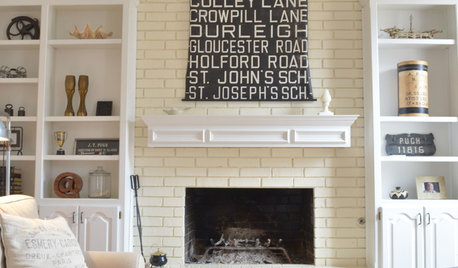
So, what comes after gray, cream, sisal, chalk paint, and burlap?

What do you think will come next?

Comments (34)

  • 14 years ago

    Well since we've already been thru orange, turquoise, and yellow, maybe pastels, but not for me. I'm neutral and will stay neutral, since it goes with any color.

    Sisal? Never bought into that.

    Chalk paint I haven't tried, but have heard it 's great for furniture, so can see it remaining in the retail marketplace.

    As for the burlap, you can throw that out the window with the beat up furniture with rusted nailheads, 'shabby' upholstery, and stuffing coming out. That just ain't right. ;o)

  • 14 years ago

    From what I have seen in some of the mags

    Pink, by itself
    Teal
    Cobalt Blue by itself
    Mauve, going by less mauve-y names. e.g. "amethyst"

  • 14 years ago

    What Pal said, plus the deep black-purples that haven't run their course yet, and orange in every shade.

  • 14 years ago

    I agree that we will still see teal and add pink and vibrant colors to the list. Honestly it will be a welcome change for me. I love color and am tired of the bland decor of the last decade.

  • 14 years ago

    And, apparently, emerald green.

  • 14 years ago

    pal is right, emerald green mixed with sharp contrasting greens. Several of them all together. If done correctly it's really beautiful. If it's not done right it looks like a clown threw up avo dip.

  • 14 years ago

    Oh after that I think it will be any powder color. Light, light pink, blue, mint green and gray will be a main stay. Lots of silver, crystal and a soft gold metals. Getting away from the darker heavy look to light and fresh.

  • 14 years ago

    I have seen a lot of Moroccan spice colors, rich, saturated jewel tones paired with dark wood or limed or cerused wood. Moorish influences abound, as do tribal motifs. I think ticking stripe, burlap and linens with French lettering are officially out, I was at TJX earlier today and saw many dish towels and even bath towels (!) in a dingy greige with the fleur de lis and/or French phrases. Once the stuff is at TJ's, the super set is so over it and on to the next must have.

    Interesting question, and great responses.

    Sandyponder

  • 14 years ago

    Dang it, Sandyponder. I'm always a day late and a dollar short. I like the French linen thing and ticking, and I have 3 sisal rugs.

    I read pastels were coming back. I did that 7 years ago and now want to paint everything shades like Wythe Blue and Revere Pewter. The BM 2013 paint color is yellow chiffon, I think they call it.

  • 14 years ago

    I still think grey is a good palette in the right circumstances, just like the all white palette. This can be the big things,or the envelope of the room and its character can be altered with colored accessories very easily. I think the grey accessories thing may not have been too popular (grey on grey on grey) but a neutral background palette is never really "wrong".

  • 14 years ago

    "... a neutral background palette is never really 'wrong'"

    But a teal one is.

    I stand by my neutrals. Though the other day I wondered if maybe, instead of trying to be timeless, we should give in and be shameless trendies. Of course, if I knowingly bought into every trend, I would want to do it on the cheap, since by definition it all has a short shelf life.

    But then you run into the TJMax problem. The truly trendy is not usually cheap -- it often doesn't get cheap until it is just about over.

    BTW, the NY Times had a piece on Derian. He is a little over the top with distress and patina, but I like it anyway. Love the kitchen.

    Here is a link that might be useful: Derian's distress

  • 14 years ago

    I am seriously considering buying a pair of indigo sofas. I don't see too many of them but I think I can get away with it in my cottagey island home.

    Emerald green sounds promising. The owners of our last house painted the entire downstairs in teal and pumpkin so I have a pretty intense aversion to teal.

    My teen daughters are usually much farther down the trend curve than me. For our new house, one picked mint walls and decorated with navy and white fabric. The other picked coral walls and decorated with turquoise and white fabrics.

  • 14 years ago

    I think of indigo -- the color of jeans? --- is a neutral, no?

  • 14 years ago

    Meh, I think any color used correctly can make a good room. Miles Redd probably doesn't pay much attention to color forecasting; this room is several years old:

    The teal becomes the relative neutral because you could pull the other colors out and plug something else in.

    I don't buy into individual colors being "dated" at all. That's like saying the color of grass is dated.

    Even the "never correct" Bandaid color looks good sometimes.

  • 14 years ago

    a neutral background palette is never really "wrong".

    Neutral is never really wrong.

    But teal CAN be wrong, is what I was trying to say, Of course, it can be "right". Any color can be right, I agree.

  • 14 years ago

    I can't live with all neutrals! I sold my 17-year-old teal sofa/chair to the cleaning lady. Painted the walls silvery gray and purchased a big Hancock and Moore strong medium red sofa with Italian leather, almost pale orange chairs. Love it! Saturated colors in the accents and the pale gray just shows them to their max!

  • 14 years ago

    Oh, I love that Miles Redd room - one of my favorites.

    In terms of I have always loved a relatively neutral background with some strong color accents. However, I have a pretty broad definition of neutral!

  • PRO
    14 years ago

    I think grey is quickly evolving. True grey wears out its welcome quickly. Many colors considered as grey are really colors knocked back so far that they're only a tick or two away from a totally neutral grey. But they're still colors, not grey. For example, it's not grey with a purple undertone or grey with a blue undertone, etc. In reality, technically it's purple and blue toned way down.

    Toned colors behave differently than a true grey. And people can live with them easier than true grey.

    So if grey manages to stick around, it's going to be very complex in nature existing in the almost neutral margins of true hues.

    Colors are literally all over the place. Teal, pink, yellow. Interest in yellow means violet and indigo can't be far behind. I believe navy was a bigger story than grey and it continues to be relevant with no let-up in sight.

  • 14 years ago

    Fascinating....!
    I guess the bottom line is, use what you love. For me, I'm sticking with neutral gold with hints of burlap and sisal thrown in. :)

  • 14 years ago

    A well done neutral room is never wrong....but builder neutral is never good either.

  • 14 years ago

    I agree w/ Loribee & so many of the other comments. I def. see a push towards pastels as well as the bolder teals, greens and oranges still going strong as they currently are. It seems to me that they've been pushing the pastels for the past year or so & the more 'jeweled' tones are current.

    Me? Still living w/ my original RH Silver Sage purchases from years gone by - but that's what makes a good purchase as far as I'm concerned. I can add bolder colors or 'pastelier' tones to it and have something totally current. That is of course w/ my neutral back drop of white, grey, black and range of wood.

  • 14 years ago

    I love neutrals - pale neutrals. I love color too but we recently switched out our larger pieces (upholstered pieces, curtains and walls) for neutrals. I use colors in my accessories, art, etc. and use dark stained and painted wood pieces. Then again, I'm not into what is necessarily "in". For example, for us, (me in particular!) earth tones would never work in our home. I'd be a depressed mess. So, I don't care how "in" they are, they will not be in our house!

    tina

  • 14 years ago

    I don't think decorating is ever "wrong" or "correct", it's just what works for each of us, and thankfully everyone doesn't march in lockstep or there would be no burlap or White Dove left on the Earth.

    sandyponder

  • 14 years ago

    Over the years, I've come to think that there are two essential reasons for "new" colors and color palettes from season to season.

    One is marketing. If you are done, we in the trades are done for.

    The other is that we really do tire of things, and want refreshment in our lives and our surroundings. As funcolors has pointed out many times, we have different color appetites and tolerances. By the same token, we have different appetites and tolerances for change.

  • 14 years ago

    In looking for something else, I just ran across Benjamin Moore's Color of the Year, Lemon Sorbet:

    {{!gwi}}

    They also feature "Color Trends 2013" in 4 different groupings, Artisan, Urbanite, New Traditional, and Coastal. All have a version of yellow, a neutral play on white, plus a grayed green, a dark/deep blue, or brown.

    Here is a link that might be useful: BM Color Trends 2013

  • 14 years ago

    If you don't prescribe to a specific palette, or a particular trend related color combination though, you aren't locked into an all-or-nothing situation when it comes time to change or refresh. An all silver sage and chocolate brown palette of a few years ago isn't going to accept the new color on the block very readily.

    But if you have a fairly limited palette in the background with a looser palette comprising the contents, things can come and go and shift on whatever basis you want them to.

  • 14 years ago

    I recently read that some design guru or other said that all white decor is a new trend! I LOL as I never saw it leave. All white has been around forever it seems. Perhaps it's now more trendy in upscale styles other than country and shabby. IDK

    Trying to keep up with trends is an invitation to frustration IMO. Poll 10 different well-known designers and you'll find 10 differing opinions on everything. If you doubt, just google "decor trends for 2013" and see how many choices you'll have to be trendy!

  • 14 years ago

    I'm not a huge fan of Ethan Allen, but I do like their happy colors featured now. I don't think painted furniture is going away anytime soon, and I'm pleased to see more colorful renditions.

    I can't believe I'm also a bit excited at the thought that pink might be making a comeback. Pink? I never thought I'd be saying that ...

    Here is a link that might be useful: Ethan Allen colors

  • 14 years ago

    Oh, I like those EA colors too SunnyCottage, I just saw them featured in Coastal Living, IIRC in their "Hot Sheet" (or whatever it's called) in the October issue. I think EA saw an opening with the demise of Maine Cottage Furniture in 2011 and that, together with the neutral craze reaching its zenith, convinced them to put down the knotty pine and take up the painted furniture. EA is based in the Northeast, and Maine Cottage was highly influential in the high end in this geographical area.

    sandyponder, whose kitchen hutch is being painted pink, *hot*, sizzling pink (and, depressingly, is not-even-close-to-done)

  • 14 years ago

    Neutral is usually very, very wrong. Sure, there are exceptions, but neutrals tend to attract people who are very bad with color, and think nothing of pairing green beiges with pink beiges and yellow beiges. Their rooms aren't so much decorated as soiled. And personally, I can not wait for the end of wry decay.

  • 14 years ago

    I was going through my tablecloths the other day to set the Thanksgiving table and came across a runner that I bought in the late 80's. The colours were the burgundy, teals, green jewel tones which is a colour palette that I still love. I'm going to bring it out and use it and not care what the colour police say.

    We reno'ed our house a couple of years ago and bought into the "neutral - oh add interest through texture" colour palette and have struggled and fought to bring back colour into my home ever since.

  • 14 years ago

    I live in the upper Midwest where we have definite seasons and I change my decorating to follow suit. Therefore, my background palette is neutral and I change accessories with the seasons, which usually coincide with changes in what's "in". I'll follow the jewel tone trend to a degree (aubergine and indigo) this fall and winter and I'll do the bright colors in the spring and summer. It would feel schizophrenic to have teal or citron in January but right at home in June. :)

  • 14 years ago

    Changing color with the seasons seems to have gone out long ago in most of the country, and it's too bad. My mother used to do it, and I enjoyed it even as a kid. Now that is a very good use for a color like a gray. In fact, I originally wanted a gray dining room for that very reason, but gray just didn't work in the darkest room in my whole house, unfortunately.

  • 14 years ago

    Ah, I remember that too - we always got fresh linens for spring/summer and then switched them out in the fall/winter. I always looked forward to it as a kid. But again, maybe because our walls were white we could do this? I'm currently painting all my walls here white and so far, I like it. Going from a LRV of 11 to one of 73 has energized this space.