Software
Houzz Logo Print
freckles_n_frills

Master Bedroom (Pics) Help Needed!

18 years ago

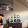
I just purchased bedding and drapes for my bedroom, I still feel something is missing. *I have not pressed the drapes yet. Does the pillow placement look OK? I need suggestions for wall art and accessories. Nothing too modern or country. I like elegant, something that ties in with the iron scroll above my bed possibly.

{{!gwi}}

{{!gwi}}

{{!gwi}}


Thanks, Freckles

Comments (36)

  • 18 years ago

    I don't have a suggestion at the moment, but just wondered if you'd share what that gorgeous cocoa color is that you've used on your walls?

  • 18 years ago

    Thanks for the compliment, auntjen. The color is SW Down Home.
    Freckles

  • 18 years ago

    Thanks so much! I'm jotting it down for future reference. I'd love to do that color in my home office. The top (above chair rail) is already a sort of light mocha shade, but I'd like to go a tad darker, and your shade would be just perfect.

  • 18 years ago

    Put the cocoa pillows against the bed, take the 3 pillows in the back and just use two of them at the front, omit the other pillows and let's see what it looks like. I think you have too much of the lighter color. See what happens when you omit a lot of the lighter color and then dink around with it.

  • 18 years ago

    Her are a few configurations. I feel the chocotale shams blend into the headboard too much what do you think?

    #1
    {{!gwi}}
    #2
    {{!gwi}}
    #3
    {{!gwi}}
    #4
    {{!gwi}}
    #5
    {{!gwi}}
    Thanks

  • 18 years ago

    I think the problem is with the pillows. You have dark solid colors (pillows and headboard), set against light solid colors (pillows, wall). When you place a dark next to a light, you will get a sharp contrast.

    This contrast won't work for you when you're trying to create something soft, like a bed.

    Move the light colored pillows away from the dark headboard.

    And/or ... find a softly patterned sham that has both light and dark browns in it, to cover the big white pillows.

    This is a stripe, but you could use any kind of print -- floral, paisley...

    You need a third and nothing to tie them together.

  • 18 years ago

    One More!
    {{!gwi}}
    Thanks

  • 18 years ago

    Wait, this one is better, it's got scrolls --

    {{!gwi}}

  • 18 years ago

    Mclarke,
    Do you mean I need some type of print on the 3 euro pillows? Will Any of the other pillows work with that Or do I need to start from square one?
    Thanks

  • 18 years ago

    By Euro pillows, do you mean the small ones?

    They are cute, but the white is really a stark contrast to the dark brown. The large white pillows are a very strong contrast, so I think I would start there.

    Any way you do it, I think adding a print will tie all those solid colors together. I think it would be softer...?

  • 18 years ago

    I like #1 except add one brown pillow in front of the two white ones and I think that is by golly, a working solution. It is the white starkness, and by adding the 2 browns on the back, 2 whites in the middle and a small brown in the front, you are diuting that starkness.

  • 18 years ago

    I agree I need some type of print. The euro pillows are the 3 largest ones that I originally had against the headboard. None of the pillows are white, The flash on my camera must have lightened them up. The euro pillows are a soft ice blue/gray. The same color as the drapes and other throw. Anyone have suggestion for some art on the walls? Thanks

    Here is a link that might be useful: Color of pillows

  • 18 years ago

    Like this?
    {{!gwi}}

  • 18 years ago

    I think it would look better with just the 3 brown pillows in the back.

  • 18 years ago

    Try it with the 3 brown in the back and the 2 brown/white pillows in front of it. Also maybe something on the wall next to where the TV is?

  • 18 years ago

    A good piece of large art above your bed w/ an additional color other than blue or brown (or at least not those exact same shades of blue or brown). That way you can add depth to your color palette. The color palette that you have is limited to only 2 exact colors & you need more depth. I fall prey to that all of the time. Even the addition of blues & browns that are lighter or darker will help.

    Not knowing your taste for art or photography here are a few things I pulled off line quick:

    {{!gwi}}
    {{!gwi}}
    {{!gwi}}
    {{!gwi}}

    Or a Sepia toned photo above the bed:

    {{!gwi}}

    Beef up your beautiful curtain's (may I ask where you got them? They're gorgeous!) by doubling up on the panels.

    In a perfect world where money wouldn't be an issue I'd suggest 'heavier' bedside tables & lamps.

    You're off to a super start already!

  • 18 years ago

    The scrollwork is nice, but way too small for the wall. It needs more visual heft to counteract the bed, with its weighty headboard (lovely wood, BTW) and dark colors. The paintings ttodd posted would be good.

    I actually own that poster on the bottom of the tree framed by the fence. It's tall and not wide enough to be above your bed. You need one of the horizontal paintings, I think.

  • 18 years ago

    I'll let others fix the bed while I recommend a change in lamps if you don't mind. If you can change those out for those new glass and silver ones that are so popular right now. They come with black shades and I think that would give some color contrast that would look nice. What does someone out there with decorating ability think about the lamps?

  • 18 years ago

    I like the sepia tone print where can I find that? The cutains are from Target.
    Thanks, Freckles

    Here is a link that might be useful: Target drapes

  • 18 years ago

    Well I'll be a little contrarion. :-)) I'd take your 3 white Euros and put them on one of their pointy ends. That changes the 'all squares' thing and allows a better peak at your lovely headboard. (Choco's against headboard disappear IMHO) Then put the choco shams and then play with the balance of cushions. I'd probably be inclined to eliminate the neckroll entirely, just using two/three of the others.

    Realizing I don't know what's out the window or how much privacy you need -- I'd be inclined to pull the drapes to one side of each window -- full across the top but held back, swag like halfway down, maybe with a tassel/rope deal? As you can see I'm not a WT lexicon expert but hope you get my drift. LOL.

    Just my thots

  • 18 years ago

    The photo of the tree and the fence is called "Solitude" and it's by David Lorenz Winston. You can get it in different sizes.

    If you do a Google Product search for Solitude "David Lorenz Winston" you will get about 75 hits.

    Here is the search:

    Here is a link that might be useful: Google Product Search

  • 18 years ago

    brutuses,
    Where can I look for that type of lamp and what color shade would you go with? I will look for a print similar to the sepia print, but horizontal. If anyone has suggestions on similar print please let me know.
    Freckles

  • 18 years ago

    The colors are beautiful. Right now everything is too symmetrical and squared or rectangular shaped. Maybe find lighter colored shams and use with different sized and shaped smaller pillows. The artwork posted by ttod is great.

  • 18 years ago

    Here's a website with a pillow arrangement that might look good.

    http://casuallyelegantbedlinen.com/silence.html

  • 18 years ago

    The pics that I posted were to give suggestions of a direction to do. Please don't take them literally as the one's to get! There are tons of sepia prints - I just happened to log onto www.art.com.

    I agree that heavier lamps are needed but the bedside tables seem very 'open' & I think that heft would be ideal there too.

    What about blue gourd lamps? They are popular now so are easy to find at cheap prices.

  • 18 years ago

    Sorry, I haven't read through the whole thread yet, but I think you need another 'color' for some depth. Maybe a cream or light beige on the bed in one of the pillows. It looks like brown, gray/silver and/or white, but may be actually a light blue, ie, blue and brown?

    I think I might do another smaller stencil (sorry if it's metal :) on each side of the large one over the bed.

    Very pretty and on its way! Just looks a little unfinished at this point :)

  • 18 years ago

    I agree with what other posters have said about different lamps, if feasible.

    For the pillows, I think whichever ones you put in the back should be propped more upright so they appear taller. Then put the next shorter layer in front of them, still propped upright. I also agree about using a print to tie it all together. I do like the white and brown pillows you already have.

  • 18 years ago

    Just trying a few things. I'd lift the large brown pillows up so you've got more spread showing and not so much of the bright white. I'd try simplifying the pillows (less) and complicating the colors (more). A creamy/beige one in there ties nicely to your scrollwork. I also think keeping the brightness on the bed (toning down the runner on the chest) would focal the bed more. I think the light throws on the end chop up the bed too much. I think you have enough light color going there, and a deep chocolate just on the corner would be subtle and rich.


  • 18 years ago

    Here's something heavier over the bed, as suggested. You may not want to bring blue in, but just squint for the overall effect :)

    {{!gwi}}

  • 18 years ago

    The lamps I'm referring to are "everywhere" literally because hey are the rage right now. You'll see them at J.C. Penney, RH, and all the lighting stores. The base is usually glass type balls stacked one on top of another, up the shaft of the lamp. I know some others on this forum have these lamps so if you see this please post some photos for freckles. I do thnk the black shades would be a nice elegant touch. As they say, every room should have a touch of black and I think the lamp shades would do it in your room. By the way your choice of linens is beautiful.

  • 18 years ago

    Here's a few. I had to look them up to see what a gourd lamp was, I have seen them, just didnt' know they were called gourd lamps.

    I think a touch more silvery blue or even a little green would give a little spark to an already beautiful bedroom. I like what squirrel did with adding two little scrolls on the side or moving the scroll to the other wall. I would hang the scroll lengthwise if its placed on other wall though.

    Here is a link that might be useful: Goard Lamps

  • 18 years ago

    oops - misspelled gourd

  • 18 years ago

    Why do you have 3 brown shams? I would use two that are large enough to cover the width of the bed. Then.....make sure you stuff each sham with a really large, fully pillow. I would do as squirrel suggested and place the three grey euros upright against the headboard with the 2 shams in front. Then place the two diamond patterned pillows next with a neckroll (brown or some type of pattern)in front.

    If you have a lot of light in the room, try turning the flash off on your camera and see if the colors look better in the pics.

  • 18 years ago

    It's very pretty! To make it even better I second what squirrel says about the pillow arrangement. Right now there are too many pillows and it makes your bed look to cluttered. But equally important is the fact that the lamps are much too small as is the scroll piece above the bed. And like others suggested I'd like to see a third color introduced, perhaps a light olive, a soft teal.

  • 18 years ago

    A set of three pillows across the back makes it look like three people sleep there. I would change them out for two larger ones, as annz wrote.

    Just my opinion, but the drapes are not full enough, and I am not crazy about the contrast between the brown walls and the white drapes.

  • 18 years ago

    I love the color of the walls, and your headboard is lovely.

    Buy some wide brown print ribbon or some brown and blue print fabric and wrap each of the 3 large euroshams with a strip running vertically around the middle of the pillow. You can sew the strips into a circle and just slip them on the pillows, but be sure they aren't too small and scrunch up the pillow. Or you can pin them closed in the back, or even tie them (no bow, just tails) in the front if you want. This will break up the solid of the light pillow, but still make it stand out in front of the headboard. I also thing your stuffers in those pillows are too small. Go up one size or add more stuffing - they should be almost overstuffed to stand correctly on the bed.

    In front of those, use the two brown shams. In front of those, the smaller silver blue decorative pillows with the lattice embroidery. That should be enough.

    The lattice piece above the bed is too light for the walls. I would paint it black to match your curtain rods. Or, as suggested, add a piece of artwork there instead.

    Your drapery needs to come out further over the edges of the window on both sides, and should sit behind the headboard a little bit. If you need to extend your rods out a bit to get that to happen, it would be worth doing.

    Think about adding some touches of coral in the room - it would be very pretty.