Software
Houzz Logo Print
piper101_gw

Using PAINT to manipulate fixed objects,,cabinets etc.

19 years ago

Hi, I won't bore you with a picture for this.

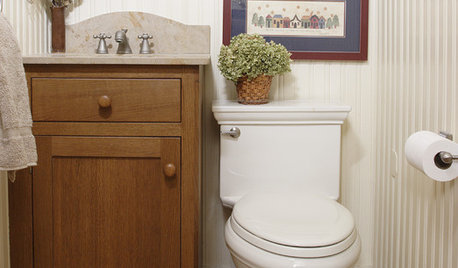
I have a guest bath with that faux marble counter that I hate, but IT and the cabinet stays for the time being/while. The color is creamish with a lighter streak thru it (so essentially neutral). Wallpaper is picked out,,cream bkground with red accents like toile (approved by my friends here). Now I'm choosing paint color for the wooden cabinets, since they are dated, white washed in stain and previous owner let the finish get water damaged a little.

QUESTION: If one is trying to make this counter top look a certain color,,say more cream than tan or warm vs. cool in tones, how can I manipulate this thru the use of the color paint I pick for the cabinets? I've collected lots of paint chips so it's just the final pick.

Will cream with warm undertones or cream with cool undertones make the counter look more on the warm end? I can't match the counter color since it's not a close match to the cream in the wallpaper and it has an almost greenish, slightly, cast to it if I had to name an undertone. I guess this is a theory question,,,or maybe not.

Thanks for your help.

Comments (10)

  • 19 years ago

    Okay, I can't answer your question - but I'll throw out a new idea. Why not paint it a darker version of the red in the wallpaper? It would be very striking and custom looking and may divert your eyes from the counter top. Add sparkle with beautiful handles.

    Skylar

  • PRO
    19 years ago

    You create color illusions with the color of your light bulbs first, then manipulate the context of surrounding color.

    To pull the marble more creamy and warm you'd want to choose a white with those same attributes. Problem is the orientation of the item that you want to manipulate to the single item that you can paint.

    Ten steps away and it all might work - the partnership of cabinet color to atmosphere creating a warm and creamy appearance of the marble. But, up close using the space as normal the context is edited and all you see is the top of the marble, not the whole picture. Leaving only the light to effect an altered perception. Light alone may or may not be enough.

  • 19 years ago

    Funcolors says that since you only see countertop and red wall when you are in the room, the color of the cabinet won't "color" the marble because it will not be visible.

    I wonder if accessories or decorations on the counterop or hung low on the wall would help? Funcolors says it should be creamy and warm to pull out those attributes. I don't have an eye for these things, but if I were you I would try a towel or piece of pottery or wall hanging and see. What color is the mirror frame?

  • 19 years ago

    If my memory of the color manipulation assignments we did in color theory class serves, a warm color will only make the cool colors of the counter more noticeable. I'd try a cooler color to create the illusion that the counter top is actually *warmer* than it is.

  • 19 years ago

    And what about reflectivity? I would think that whatever is around will be bouncing off that counter and changing your perception of the color.

    That's why my pale blue walls, which were opposite the deep green tiles went minty on me. Had to go with a deeper blue to counteract the green.

    So, paint your ceiling red. (That's really kind of a joke...but I have seen it done.)

    I also think in terms of what's filtering the natural light as it enter the room. Warm toned WTs will throw around more warm light, making the marble skew creamy, perhaps.

    So, I am no expert. Just working from corrections I've had to make in my own spaces. (Lori, your critique is welcome!)

  • 19 years ago

    I'll replace the faucet and mirror with something brushed, like nickel or maybe in this case oil rubbed bronze??? My only factor is the brushed nickel door handle in place already, so I'm open to suggestions on mirror, faucet, pulls etc.

    Here is the wallpaper

    I'll see if I can take a decent shot of the counters but know that everyone's monitors may not show it accurately.
    I'm very seriously considering painting the ceiling red since seeing those beautiful pictures from the toile bathroom post of several months ago.

  • 19 years ago

    piper101: "...I'm very seriously considering painting the ceiling red since seeing those beautiful pictures from the toile bathroom post of several months ago..."

    Ooh! With that paper that could be really fantastic!

  • 19 years ago

    I would paint the ceiling red. I think the "customer" would view the ceiling and properly ignore the countertop, customer as in someone using the bathroom.

    I once had a decorator tell me "some things we can do nothing about, they are there, they are as permanent as our limited budget, and we live with them, like the cream countertops, when we want taupe. We paint the wall taupe and we live with the cream countertops. We can find plenty of pretty items to put upon the counter to distract the viewer."

    Actually I did find a bathtub refinisher to change the countertops but the point is, sometimes you just gotta do what you gotta do.

    Do you think that fits your situation? Reverse the taupe and make the statement above red.

  • 19 years ago

    Patricia,,,Done, ceiling will be red,,,I think you have a great point about that helping to ignore the counters. I'll post pictures when I'm done.

    I probably should try to have the cream and red in the same family (formula wise),,,do you think? Meaning hold both paint sqaures together or should the red strictly be matched to the red in the wallpaper?

  • 19 years ago

    I think I would match the red to wallpaper's greatest intensity. I know it is going to be beautiful. I can hardly wait to see your pictures. You and Allison are certainly toile/red inspirations.

Sponsored
The Creative Kitchen Company
Average rating: 5 out of 5 stars51 Reviews
Columbus Area Kitchen Remodeling and Refacing Professional