Software
Houzz Logo Print
gavavemom_gw

Kitchen paint color help

12 years ago
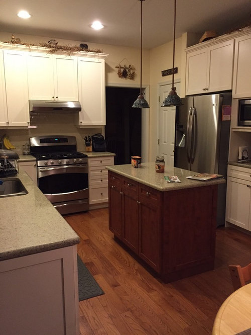
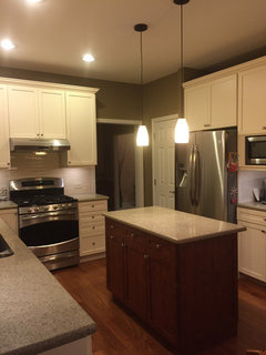
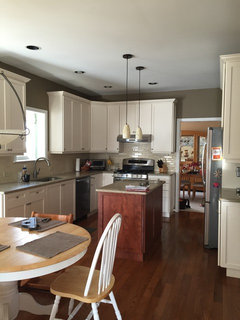
Hi there, I am really struggling trying to find the right paint color for our recently redone kitchen. The island is reddish cherry in color and the rest of the cabinet are creamy off white. The floors are a standard oak color. We most likely will redo the floors within the next year. The quartz is called "silky caramel" and takes on a taupy, grey tone. The backsplash is made by Sonoma called toast. Any thoughts?

Comments (102)

  • 11 years ago

    Thanks Junco for clarifying. If you are suggesting the yellow stay, I've already decided it has to go. My family loves the Coastal fog. It is lovely but looking gray to me and having it on the wall next to the Elk Horn do think they are not too complementary although the man at the BM store thought they could definitely work together. I just don't think it will be as warm as the Elk Horn but the family thinks EH looks dark at 50%.

  • 11 years ago

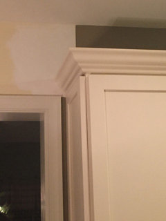
    I can't visualize the crown. You'll have to determine where to end it, as you are installing it!

  • 11 years ago

    Thought: you have a piece hanging over the doorway. Not sure what it is or whether it is something you would want to emphasize (if not, you might look for new wall art). What if you created a frame with trim -- box it in over the doorway, and create a separation/transition between the two rooms? The background there could be a lighter or darker version or a different color altogether. Then you could go with the Elk Horn in the kitchen and lighter in the family room. Coastal Fog is not something I would chose for your kitchen. Everything is already so light and neutral.

  • 11 years ago

    Here is what the Elk Horn is looking like so far. Nighttime pic so coming off almost olive green. I do love it and it's creating that contrast that I desperately need in the kitchen. I'm liking the idea of creating an artificial separation by boxing out the entryway wall with a larger piece of art, making the entire kitchen ELk Horn. What should I do with the bumpout? Color of FR? Not keen on 50% cut of EH as the FR definitely has more open wall space and I just don't know.

  • 11 years ago

    Oh and one more question. Color of trim in kitchen? The cabinets are creamy white. Should I try and match that or go stark white? We wound up doing BM White Dove for the ceiling.

  • 11 years ago

    Oh! That looks fantastic! New pendants, too, huh? They look marvelous as well. I would be inclined to do the whole space including the family room in the Elk Horn!

  • 11 years ago

    Fantastic! Does it look that olive green in real life, or just in the photo? I hope it's just the photo!

    And see what I mean by the color gives the room character and definition but it doesn't make it look dark?

    If your ceiling is White Dove, I'd do the trim in semi-gloss White Dove.

    If you're too nervous to do the Elk Horn in the FR, how about BM Coastal Path, which looks very nice next to the Elk Horn

    BM Coastal Path

  • 11 years ago

    BM Elk Horn

  • 11 years ago

    Coastal Fog

  • 11 years ago

    The photo makes it look olive green. IRL it looks brown up close. Tibbrix, are you suggesting Coastal Fog as well?

  • 11 years ago

    The Elk Horn looks great! I wouldn't add the Coastal Fog. I like the EH, an even lighter EH, or the Coastal Fog if it looks good IRL.
    I would take the EH around the bump out and end it at the interior corner by your bookcase with doors. Then decide which color and where you will put it on the left hand wall that continues into the family room and on around to meet the EH at the bump out. I still think you could start the lighter color in the left hand corner of the kitchen and bring it down that wall. It would blend just fine with the EH on the other walls. That way you wouldn't have to worry about the transition over the door.
    I also like the White Dove for the trim.
    It's looking good! don't lose heart.

  • 11 years ago

    Want to add, gava, that I do think the Elk Horn, as you have it, would be very nice in your FR. Look at it, for instance, with that green country shelf you've got on the wall. It looks GREAT with it. Your style seems to be country, and the Elk Horn is a very rustic, country color and goes great with all the usual country colors, browns, green, reds, cranberriesâ¦I'd probably try it, but I know it's scary because it's such a deep color.

    At the same time, though, I do my own painting, so if I get it done and I don't like it, I haven't' lost a whole lot. But if you've hired someone to do the painting for you, that's a huge expense and you really can't do a do-over.

    However, what you CAN do yourself is get a sample pint of the Elk Horn at 50% and paint the family room yourself. It's really awful paint, but it goes a long way. You'd probably be able to do the entire family room with it. $6. Then you really would be able to get an idea of how it would look. Then, if you like the Elk Horn, hire the painter to just do the second coat with the good paint.

  • 11 years ago

    Huh, I would have thought stopping at the face of the bumpout would be where I would stop Elk Horn and not wrap it around the corner. The 50% did not look all that different from what is up there now. If it was drastically lighter, I wouldn't hesitate. The family is opposed to the darker color in the FR but love it in the kitchen. I am doing my own painting and am spending my vacation time doing this project so the thought of repeating it is nauseating so want to get it right the first time around.

  • 11 years ago

    I'd fill in the area over the door with moulding or a picture frame with a painting in itâ¦or whatever, and do the FR in the Coastal Path, then. I think the Coastal Path segues very nicely from the Elk Horn.

  • 11 years ago

    I really like your pendants, btw.

  • 11 years ago

    It's going to look like Hodge Podge Lodge if you change paint colors or try to rig up an artificial boundary line. Your room is too small to handle that. You have a light rug and light green furniture, so just keep on going with the Elk Horn. Change out some of your dark accessories--use a lighter curtain, large rectangular art work on the wall where the star is now, lighter colored doodads on top of and inside the bookcase. Avoid large areas of blank wall space.

    We have medium green paint in our LR and have white plantation shutters, which break up the green. Shutters would be really cute in your country style home and repeat the white wood of your kitchen cabinets, making the area feel more cohesive. Another benefit is molding is added around the window to support the shutters.

  • 11 years ago

    We also have a bump-out exactly like yours and I stopped the green paint in the corner where your bookcase is. I have a creamy paint similar to what you have now and it wraps around the bump-out and goes down the hallway.

  • 11 years ago

    So sounds like the most ideal is to stick with Elk Horn, 2nd choice being a cut version and 3rd would be to go with Coastal Path for the FR. Thanks for the ideas may flowers. I do already have white wood blinds in the FR. That ok? If I go the Coastal Path route, I was thinking of stopping the Elk Horn as in the pic attached (most left hand corner of kitchen) and putting something like a fake plant to hide the line. Is that hideous sounding? Ugh too many things to think about.

  • 11 years ago

    The plant to hide a line of demarcation is a great idea.

    You can also always do the entire area in EH or Coastal Path.

  • 11 years ago

    My LR/DR is a small rectangle with similar dimensions as your LR/kitchen. Two colors would be busy in my small space.

    I suggested white shutters because the frame and molding adds a good dose of white and would be cute with your furnishings. Your DR set is cottagey and your sofa is gardeny, so I'd replace the black accessories with white and embrace the cottage look.

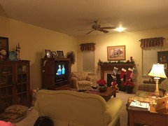
    Can I see a photo of the rest of the LR?

  • 11 years ago

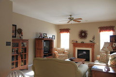
    Sure here is a pic looking out from the kitchen table.

  • 11 years ago

    I think the Elk Horn is much too dark for that room. I'd do it in the Coastal Path.

    I'd also get some trim around the windows and crown moulding. With those, the Elk Horn might actually be nice, esp. if you can get some recessed lighting in the ceiling. But if you keep your blinds closed and don't have any trim, the Elk Horn I think would look terrible.

    This post was edited by Tibbrix on Mon, Dec 29, 14 at 20:03

  • 11 years ago

    I'm not a fan of those putty colors like Coastal Path. I don't think they'll do much for your beige furniture and carpet. I have found that a darker wall color works better with beige carpet. I'd stick to one color, but whether that's Elk Horn, I don't know. Reading back, you said you wanted both rooms the same color, but then you forged ahead with EH. Is there another color that would work? Otherwise you're going to a bit of expense with moldings to compensate for a too dark color. Which is fine if you're ready for a room refresh.

  • 11 years ago

    I think the Elk Horn would be dark without some lighting changes. One thing not mentioned would be taking the Elk Horn down that same wall towards the fireplace so that it serves as an accent wall for the family room and then use either the cut version (no rule you have to go 50%, you could try 30-35%) or the Coastal Path. It looks like that would transition more smoothly than the Coastal Fog -- at least as I am seeing it on my monitor.

  • 11 years ago

    Not too worried about the carpet as that is soon going to go. I think my initial thought was to do one color but then realized given the neutrality of the kitchen, it really needed something bold. The family room just needs a refresh and not a statement color. I don't necessarily want to go through the expense of trim but absolutely agree it would add character.

  • 11 years ago

    may_flowers, I think you're thinking of Coastal Fog as being a putty color. Coastal Path is more a light version of Elk Horn.

  • 11 years ago

    Gava, I just think that, the only way you can get away with Elk Horn in there is to install trim around windows and ceiling. Those deeper colors need contrasting trim to make them work.

  • 11 years ago

    Lascatz-Interesting idea. Anyone else feel like I should do this? My initial thought is that the bumpout is kind of like an accent wall between the two rooms.

  • 11 years ago

    I like Lascatx's idea. Or stop the EH at the interior corner of the bump out and run the lighter color the rest of the way around. Is that a ceiling fixture over the fireplace? in addition to the ceiling fan? Those don't provide the best light . Try adding a floor lamp in the corner by the TV--one that projects the light up as well as down. That will help illuminate the darker wall color.

  • 11 years ago

    That doesn't seem like a natural accent wall to me.

    If the color's not working, don't force it. There's thousands of paint colors to chose from.

  • 11 years ago

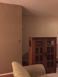
    Just to update you on my progress, today the Coastal Path went up but not without difficulty. The color went up looking green. We got through about 60% before it dawned on us. Took it back to the BM store and they agreed it was wrong. Took 3 additional tries before they wound up getting it right. Turns out the formulation in the computer was incorrect so they had to file a report with BM. They upgraded me to the Aura paint and I was shocked that it looks like it will only need one coat but we will check tomorrow. To make a long story short, first time with Aura paint and just love it. The color is great! I am though second guessing the bump out in Elk Horn. It just looks dark on that one big wall. Would it be an issue to re-paint it in Coastal Path? My husband is looking at me like I'm crazy. I just can't get used to it on the large wall.

  • 11 years ago

    Take the Coastal Path on around the bump, it will be fine. I'm so glad you like the colors and your BM store took care of you.

  • 11 years ago

    Happy New Year, Gava! Can you take a couple more pics from different angles? It's really hard to get a good idea of the colors and the segue of the colors. Can you take a long shot, for example, looking both into the kitchen and into the FR, with the big wall in them?

    I was SO nervous when I started reading your post because I thought it was Coastal Path that was green and that you hated the color, and of course I'm the one who suggested it! And I hated the thought that you would have spent the time and energy on painting with a color you hated that I'd suggested! So, what a total bummer about the BM mixup in the formula. I'm relieved, though, that it actually wasn't Coastal Path, and I'm thrilled that you love the color It appears to segue very well from the Elk Horn, but it's very hard to really tell in that photo. Long shots are a bit easier. In THAT pic, I really like the way the Elk Horn looks on the accent wall. And once you get decor and the light plate and stuff back up, it'll look very, very different and much better. But again, very hard to tell with that photograph. You are great at painting!

  • 11 years ago

    I wouldn't paint the bump-out EH. Keep the kitchen color in the kitchen.

    I think your next challenge with EH/CP is going to be finding some relief from all the beige and brown, so hopefully you'll find a carpet that doesn't add more. I think you've got that same 90s taupe we had. We replaced it last year with a darker multi-tone flecked color. It really grounded the room and provided contrast with our light camel-colored sofa. And spots don't show!

  • 11 years ago

    Happy New Year to you too. I will take a few more photos during the day as the photo I agree that I posted was not great. I put the shelf up against the Elk Horn and instantly felt like I would either have to restain the shelf or repaint the wall. Today I made the decision to repaint the wall to Coastal Path and so glad I did. It looks much better and I am happy now.

  • 11 years ago

    Then there you go! can't wait to see the pics!

  • 11 years ago

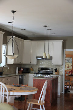
    And here is a view of the kitchen.

  • 11 years ago

    So glad you came back with them finished. Looks great, although I don't think the colors are well represented in your photos.

    Do you and your family like them?

  • 11 years ago

    Yes, we love it! All agree it was a much needed change. I've attached another pic (one taken without iPhone).

  • 11 years ago

    Glad to hear you all love it. It looks very fresh and clean. I think maybe your camera doesn't capture the colors well? That looks peachy as opposed to the tan/gold of Coastal Path; and the more green look of the Elk Horn. Love the depth of the EH in the kitchen!

    Great job painting, btw!

  • 11 years ago

    And another of the Elkhorn

  • 11 years ago

    You know I noticed in the paint can a peachy tone but it doesn't look that way on the wall, at least I don't see it. I do maintain that the Elk Horn has some green undertones to it. I did compare it to Coriander Seed in the store and that definitely is more of a brown but darker than EH. I'm fine with it. The countertop reads green sometimes so it's cool. After this job taking a week, don't want to paint ANYTIME soon!

  • 11 years ago

    I see a lot less green in the EH in the last pic. FR looks so airy and nice. Color goes great with your upholstery. I am so happy your family likes it! The softness of the EH is perfect with the creaminess of your cabinet color.

  • 10 years ago

    Getting back to this conversation as I'm finally in the process of redoing my hardwood floors (kitchen) and getting new floors put in the FR. The stain color will be consistent to match. We will be putting down new red oak floors. Want to go from Gunstock (too orange) to something darker but that will complement the new paint colors, cabinets etc. Want to go with a warm brown but yet not too dark. I like Minwax English Chestnut but in some pictures it seems orange. Want to avoid yellow and red undertones. Any advice what would complement these two rooms? Also, after the stain color is decided, want to focus on things in the FR, slip covering the couches and getting a new rug. I think white (even though it's a little scary) would be great with slipcovers and then I could pull in some color with pillows. Trying to avoid too much brown, so a little pop of color is essential. I've also gotten rid of the red valances in the FR and replaces with a natural color valence (geometric patterns that highlight it).

  • 10 years ago

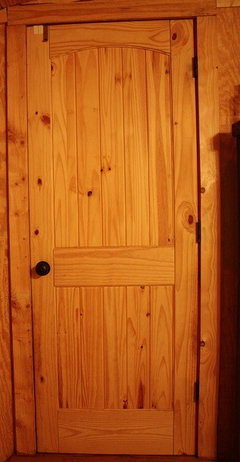
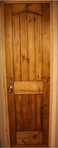
    Wondering if you've decided on a stain color for the floors yet? Minwax's Provincial is their best seller (according to the internet). I have light pine paneling on my walls, and knotty pine interior doors. I chose the Provincial for the interior door stain and door trim. (Just started this weekend so not all finished).

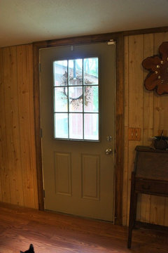
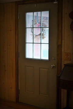
    I painted my front door BM Elk Horn and the Provincial stain really makes it pop. My trim was not stain grade but since we like the rustic look (and can't afford to change it out) it works for me. We live in a sw mobile home w/ an addition so we have to be super careful w/ costs since our home won't go up in value.

  • 10 years ago

    Here's one more view of the front door...

  • 10 years ago

    And then here is a before pic of the knotty pine interior door...

  • 10 years ago

    This is what one of those doors looks like w/ the Minwax Provincial stain on it. Since they were pine I did use a wood conditioner on it before staining.

  • 10 years ago

    No have yet to decide what stain to use. Thank you for posting your pictures of your door. I think it looks great up against the Elk Horn.

Sponsored
Trish Takacs Design
Average rating: 4.9 out of 5 stars36 Reviews
Award Winning & Highly Skilled Kitchen & Bath Designer in Columbus