

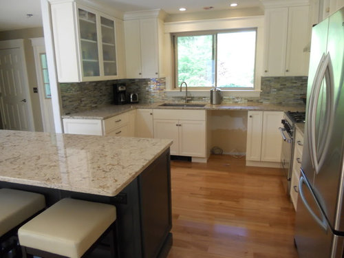
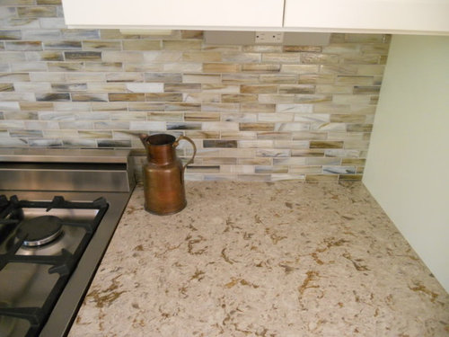
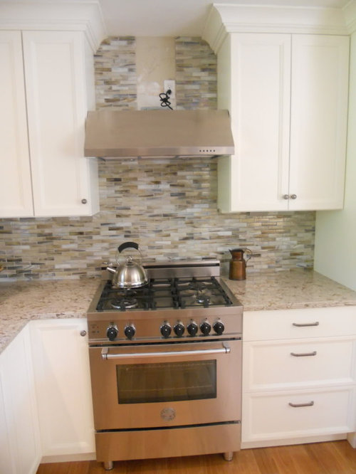
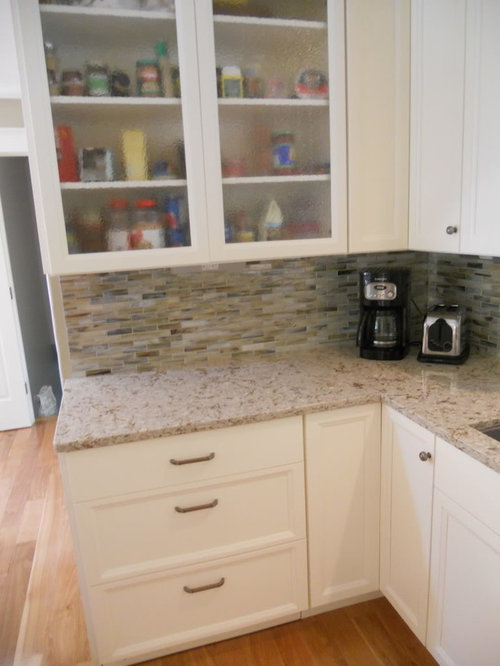
Vihara backsplash with grout - pics
15 years ago
Sort by:Oldest
Comments (10)
Related Stories
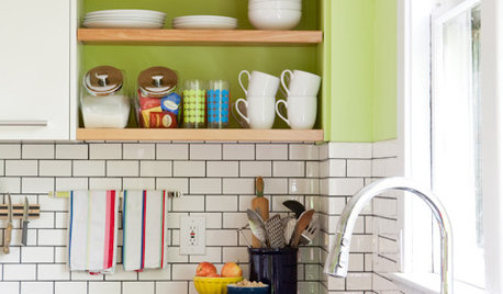
KITCHEN DESIGNSubway Tile Picks Up Gray Grout
Heading into darker territory, subway tile offers a graphic new look for kitchens, bathrooms and more
Full Story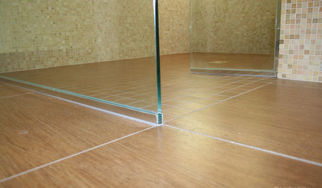
TILEEpoxy vs. Cement Grout — What's the Difference?
Grout is grout, right? Nope. Cement and epoxy versions have different appearances, durability and rules of installation
Full Story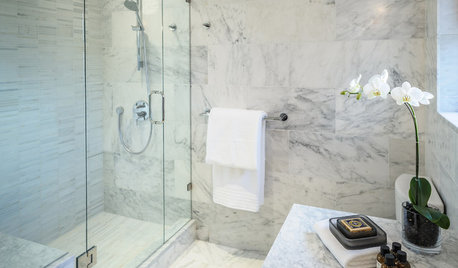
BATHROOM DESIGNConvert Your Tub Space Into a Shower — the Tiling and Grouting Phase
Step 3 in swapping your tub for a sleek new shower: Pick the right tile and test it out, then choose your grout color and type
Full Story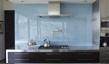
KITCHEN DESIGNThe Future of Backsplashes
Grout is out. Continuous sheets of glass, stone, metal and porcelain are saving cleaning time and offering more looks than ever
Full Story
KITCHEN DESIGNHouzz Quiz: Which Kitchen Backsplash Material Is Right for You?
With so many options available, see if we can help you narrow down the selection
Full Story
KITCHEN BACKSPLASHESHow to Install a Tile Backsplash
If you've got a steady hand, a few easy-to-find supplies and patience, you can install a tile backsplash in a kitchen or bathroom
Full Story
KITCHEN DESIGNCountertop and Backsplash: Making the Perfect Match
Zero in on a kitchen combo you'll love with these strategies and great countertop-backsplash mixes for inspiration
Full Story
MATERIALSKitchen Ideas: How to Choose the Perfect Backsplash
Backsplashes not only protect your walls, they also add color, pattern and texture. Find out which material is right for you
Full Story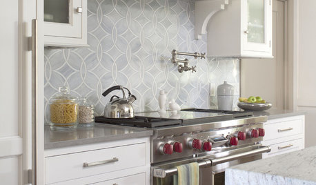
KITCHEN DESIGN8 Top Tile Types for Your Kitchen Backsplash
Backsplash designs don't have to be set in stone; glass, mirror and mosaic tiles can create kitchen beauty in a range of styles
Full Story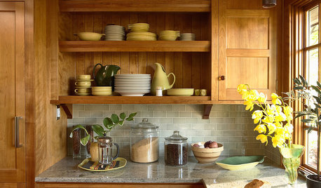
KITCHEN BACKSPLASHESHow to Choose a Backsplash for Your Granite Counters
If you’ve fallen for a gorgeous slab, pair it with a backsplash material that will show it at its best
Full Story
stannley
3mutts
Related Professionals
San Antonio Kitchen & Bathroom Designers · South Bend Kitchen & Bathroom Designers · Amherst Kitchen & Bathroom Designers · Scranton Kitchen & Bathroom Designers · Buffalo Kitchen Remodelers · Cape Coral Custom Countertops · West Palm Beach Custom Countertops · Dalton Custom Countertops · Houma Custom Countertops · Shreveport Custom Countertops · Gary Custom Countertops · North Adams Custom Countertops · Madison Custom Countertops · Oshkosh Custom Countertops · Montrose Custom Countertopscat_mom
brianadarnell
never_ending
sayde
L HOriginal Author
palimpsest
lawjedi
mythreesonsnc