Software
Houzz Logo Print
suzyg215

so does this wall look any better?

14 years ago
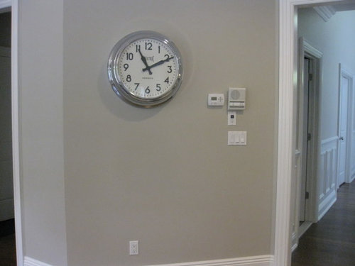
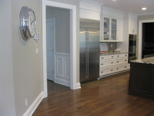
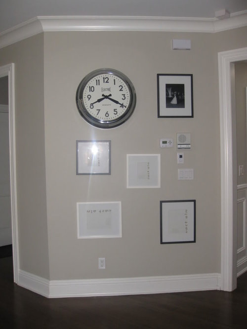
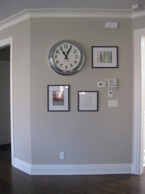
i posted this pic of a gallery wall i did and got overwhelmingly negative responses. does the second one look any better? i don't want to make a true gallery wall with many pictures close together because this is a clean, contemporary kitchen.

before:


1st attempt:

2nd attempt:

Comments (29)

  • 14 years ago

    Newbie jumping in. Hi everyone.

    First of all, I LOVE the clock. I feel like the pictures are too small next to the clock. With all the switches/controls on that same wall, it just seems really busy. I didn't see the original post.

    If it was me, I'd bag the gallery wall idea and put a good sized blackboard or something simple below the clock and be done with it. I think that would pull the focus away from all the switches.

  • 14 years ago

    i personally prefer your 1st attempt over the 2nd one....

    i understand your desire to take the focus off the array of thermostat, intercom/speaker, etc.... (too bad some builders don't plan those placements better!!) and i think your 1st attempt does that better---the 2nd attempt lets those boxes stand out too much imo!

  • 14 years ago

    I like both attempts, which probably doesn't help you. :)

    I think you are right in avoiding a typically crowded gallery wall because of the clean/contemporary look you want. I think the first wall with the extra spacing fits that theme best. It looks contemporary/modern to me. What would you put in the frames, though?

  • 14 years ago

    Now that I see more of your (gorgeous) room, I really like your 1st attempt very much. I like the clean, streamlined effect and think it provides just the right amount of interest on the wall. That clock is just fab too!

  • 14 years ago

    Just keep the clock and do a gallery wall someplace else. All the switches thermostats etc. make this an awkward wall to try and showcase.
    By putting pictures, you make those things more noticable.

  • 14 years ago

    How about a weather station, erasable calendar? Making this an area of function.

  • 14 years ago

    Love the clock! I also love the idea of a blackboard underneath the clock, making the whole wall utilitarian.
    My eyes seem to gravitate right to the cluster of switches with the photo setup.
    Dee

  • 14 years ago

    I prefer the first attempt, but either looks good. I do like the all black frames. Not much you can do about the electrical stuff, but I think the gallery idea is great. Yes, you do see the switches etc. but they stand out even more without the gallery. I think you are on the right track.

  • 14 years ago

    Have you thought to hide the thermostat ?

    Here is a link that might be useful: http://www.apartmenttherapy.com/boston/organizing/another-way-to-hide-a-thermostat-119648

  • 14 years ago

    Hmm. I think I like the wall best with just the clock. Your kitchen is gorgeous and I think the busy wall will fight with it. I'd move the clock a bit lower.

  • 14 years ago

    I also like it better with just the clock. The artwork draws my eye to the switches, thermostat, etc. and the art gets lost.

  • 14 years ago

    I think you can get it work, if you put black and white photos of different clock components in those frames. With that thought, I like the second wall with more added. I would like to see the frames come all the way down but spaced closer together.

  • 14 years ago

    OK, here's a crazy idea: can you frame all the switches, etc. with one black empty frame? To make it look like art.

  • 14 years ago

    That's a cute (not crazy!) idea, Gracie! I love it!

  • 14 years ago

    We have a room that's a converted garage, and there's a great big ugly breaker box in the middle of the wall, right smack when you walk in the room. Quite the focal point.

    I struggled with ideas to cover it or camouflage it for months, then finally surrendered to it. It's getting a bright red tassel for the pull ring, and I'm framing it with a big black frame. I'm even getting really froggy and adding great big stick-on letters that say "BREAKER."

    I don't think the OP's wall is so bad in any version, but that cluster of switches and such is a little distracting. I think if you go with the gallery look, I'd frame the whole thing and see what happens.

  • 14 years ago

    That is a great idea about using the frame to make the switches look like art.

  • 14 years ago

    I'd stay with the before....and see what it looks like centered on the wall.
    IMO, the size of the clock is overpowering the frames, but if I HAD to choose, I'd go with the second attempt.

  • 14 years ago

    I like your 2nd attempt much better, it incorporates the thermostats , and liberates the bottom of the wall. Great kitchen you have.

  • 14 years ago

    I also like the 2nd attempt better, although I didn't dislike the 1st. I'd just have placed the frames a bit closer together. I also really like the idea above to make the area functional, and add a calendar, weather station, dry erase board, etc. to the area instead of artwork. You have a gorgeous home!

  • 14 years ago

    Now that I've seen the wall in context - I think it's fine with just the clock. What I like about the clock is that its color provides flow to the kitchen, with the stainless steel fridge and the kitchen hardware. The thermostat et al. actually doesn't bother me at all either.

    However, it is your house, and you apparently are bothered. So...I like version 2 better than version 1. I think I'd like version 2 even better if you were to use silver metal frames. Do you have any that you could try out on your wall?

  • 14 years ago

    thanks everyone for your opinions. i wound up taking down all the frames and going back to just the clock. unfortunately, i had to spackle & repaint the wall due to all the drill holes. from now on, i will use command strips!

  • 14 years ago

    What about the same size frame hung in a row like this:

    Simple, streamlined, uniform.

    I also really like the idea of a simple blackboard as mentioned above!

    PS - those cammand strips are the best!

  • 14 years ago

    If you are going to have anything at all, the clock alone looks best. However, I would not even use the clock there. Those service walls always look cluttered when people try to decorate them. They think they're taking focus away from the switches and thermostats when all they're really doing is calling attention to them. Not every wall needs something, and your calm, serene home demonstrates that beautifully!

  • 14 years ago

    You have a beautiful home and I think kswl is right- sometimes the more we try to hide/disguise something, the more we see it.

    It looks like you've got a variety of boxes, switches, etc. on that wall. In my home, I tried these Taymac covers but they didn't work for me. I ended up painting all my covers the same color as the wall. The actual switch/outlet is white.

    Here is a link that might be useful: Taymac wallplates

  • 14 years ago

    I thought grouping #1 looked nice..You have too many things to try to conceal, it is what it is. With your wall color they don't stand out that much.

    I also like the picture above with the larger pictures stacked. That might be a possibility on that wall too. But it looks like you aready have frames to go there...I hang em' and be done with it. Look great IMO.

  • 14 years ago

    Personally I think the scale of the clock is too big for that wall, with or without the pictures. I also agree with kswl somewhat that decorating that wall is only calling attention to all the hardware there. I would start by painting the switch plates and the thing just above them to match the wall. That will go a long way toward quieting them down. You can probably paint the doorbell(?) at the top too. Then there's the question of do you really need/use the intercom?

    But, in picture #2 it looks like you have enough space there to place a small table. Something like these (but in whatever style suits you):
    {{!gwi}}

    Then top with something decorative and/or stick with your layout #2. That plus painting the switches and eliminating the intercom (if viable) might work.

  • 14 years ago

    The clock is over-powering for the size of the pictures. Ttodd's gallery wall is quite striking with all the black frames, and your wall would be perfect for the same type of vignette. The clock, because of it's size, 'speaks' for itself and doesn't 'need help'~~just my 2 cents. ;o)

  • 14 years ago

    Frankly I don't understand not painting things like switch plates, thermostats, outlet covers and cold or warm air vents the same as the wall. they are not design elements.....so why should your lovely painted wall have all these white plastic things on it?
    It I had that wall I would build or buy a small framed "box" to put around the electrical stuff....paint the light switch, the wall plug to match the wall and paint the door bell thing....then make an arrangement of smaller things....including a smaller clock.
    And remember....all the things on a wall don't have to be pictures....

  • 14 years ago

    I love clocks, especially analog clocks. I love that Newgate clock, but it's too big for that wall. It's too big for that whole room. It's not just the face diameter. It must be 5-6" thick. A clock like that belongs on the wall of a gymnasium.

    It's also a nostalgic, retro clock. Besides it's size, it doesn't really add to a sleek, clean, contemporary kitchen.

    And it's such a nice, clean looking kitchen, too. It's a shame to clutter that particular wall with a triple gang light switch, an intercom, a thermostat, a doorbell, and something else I can't identify. How much effort would it take to move the thermostat and the doorbell (and maybe the unidentified object) around the corner to the hall? Also move the intercom closer to the edge, near the door frame.

    Then finish the wall with a contemporary painting or photo that's large enough to occupy 2/3 of the upper portion of the wall. Make it have a stainless steel frame to match the contemporary kitchen.

    Or find a wall sculpture that vertically occupies a good portion of the wall. Keep it contemporary by using stainless with pieces of color you like for the rest of your kitchen.

    Just a few alternate ideas.