Software
Houzz Logo Print
divamum_gw

Kitchen Paint-challenged (pix)

18 years ago

Howdy all -

The folks on the kitchen forum suggested I come and post my woes over here...

We're knocking a small kitchen and tiny dining area together as part of a larger rehab - on a crazy-tight budget, not at all by the way - and while I managed layout, structure and amazing bargain shopping without flinching, paint, knobs, and backsplash have made me CRAZY.

I finally picked the backsplash which is helping narrow things down, but now that I'm to "paint" I'm strugggling.

House is a small, 1928 bungalow - more cottage than Craftsman, but definitely not modern at all. The kitchen style is what I"ve dubbed "garage sale chic" - ecclectic, with a nod towards period elements and trying to respect the house's era and inherent styling, but not a vintage/period kitchen.

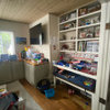
Here is the counter, floor tile and backsplash sitting on top of the natural maple cabinet wood:

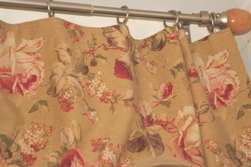
Here are some (existing) valances I quite like, although I'm not married to using them. However, I feel that somewhere in all this there MUST be a palette ... I just can't find it :)

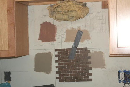
And here's the backsplash/wood with some paint samples I"ve been playing with. Some better than others, but none of them are completely wowing me yet:

Any ideas would be warmly appreciated! Thanks in advance :)

Comments (23)

  • 18 years ago

    These look great together. I like the floral also.

    My first thought is that you have plenty of light/mid-range values in the floor, counter, and cabinets, and that going with one of your deeper color choices would be good on the walls, to marry with the darker backsplash.

    I also see opportunities for deep rich terracotta, some ORB metal finishes.

    I don't know where you are, but those stone/tile colors (not the fabric) are very Oklahoma-like, and would look great with more saturated accents like colorful Southwest kinds art/fabric. It just really reminds me of the decor at the Quartz Mountain lodge - set in the midst of red granite boulders. The photos on their website give a hint, but just sort of.

    Here is a link that might be useful: Quartz Mountain

  • 18 years ago

    First thought was terra cotta/pumkin type color. Old Canal from Ben Moore is one thought. Can also check out the following: http://www.valsparatlowes.com/painter.html
    click on "see collections" then choose eddie bauer collection. They have lots of earthy colors that compliment the bungalow/craftsman style. Butternut or Molases would look nice with the counter/splash and compliment the cabinets well.

  • 18 years ago

    A soft green was my first thought. I see it in your fabric, which is beautiful btw! I think it would go nicely with the backsplash and flooring. I see a sort of green in the flooring? Try BM Dry Sage, Baby Turtle, EK Edgewood Green. Something along those lines. A warm green. Would you mind telling me where the valance is from? Thanks so much!

  • 18 years ago

    I hope someone pops in with some paint color ideas. I just want to say that I really like your valance and wonder how the rings are attached???

  • 18 years ago

    I too was thinking the green from the fabric...very earthy and appropriate for a bungalow. How much wall space do you have to paint?

  • 18 years ago

    I agree with the suggestion of a green as well!! I think if you go taupe it will all be too much one color. Terracotta would be another option, but it would need to be a deeper one.

    Good luck! It all looks great so far! Paint is so hard, but I think you've got a great palette there.

  • 18 years ago

    Thanks for all the great suggestions!

    Believe it or not, that taupe-ish, sage-ish green (lower left) was chosen to pick up the green in the curtains - it just doesn't look like that once it's on the wall! It turns into mushroom instead of green.

    Lots to think about here, and I'll be heading back to the store for some more samples, I suspect. That said, there's one which ISN'T in my picture above which I managed to forget about, and I must admit I kinda like it - it's close to the top right-hand one, but a little pinker and thus it picks up the terracotta warmth a bit better - we'll see.

    Bottom line is that most of the exposed wall will be in the dining area, so I need to think about something for there that coordinates with the kitchen stuff rather than the other way around I guess!

    Thanks for all the nice comments on my valances too - in fact, I made them. I'd been looking for something cottage-y and cabbage-rose which wasn't too girly and frou-frou, and I stumbled over this at a mill end store - I don't even know who makes it! The rings are simply sewn into the seam where the curtain tape is stitched on (I used heavy thread and just pushed them in and stitched them into place) - in the end, I didn't gather them because they looked so nice just softly pleated as in the photo.

    Keep the suggestions coming - it's really helping me think about it with a clearer head!

  • 18 years ago

    divamum, can you show us a pic of the wall into the dining area? I ask because a) it might help others to suggest colors, and b) because I want to see the rest of your house!! :)

    Colonial bungalow, garage sale chic, prints that are not too girly and frou-frou --- you and I will get along just fine!

  • 18 years ago

    Can you tell me a little bit about the countertop and backsplash choices? I have natural maple cabinets (similar style from the looks of it) and I've been trying to figure out what to do for my countertop and backsplash. I really like what you've chosen.

    Currently I have an odd green laminate countertop and my walls are painted SW Latte. I like the Latte but it really doesn't make the cabinets pop like I was hoping it would. I think I'd agree with the others that either a darker terra cotta or a nice sagey green would look nice.

    I'd LOVE to see more photos of your kitchen and especially of your final product!

    Astrid

  • 18 years ago

    Wow - thanks for all the nice comments! I'm afraid it's probably not nearly as interesting a house as it sounds, although we're working on making it the best it can be :)

    It's very VERY small, even by 1920s bungalow standards! The original footprint was 525sf - many years ago (we don't know exactly when) somebody added an 11x20 extension to the back (full width of the house) bringing it up to 735 when we bought it, and the attic work we're doing done means we have about 1100 useable sf now which, with a family of 3, makes a HUGE difference.

    The "new" kitchen area will be 9'7"x9'4" or so, and the dining area is a tiny 6'7" at its narrowest point, and probably will be about 9'6" long by the time all is said and done.

    So, everything is part of the remodel to open up our attic as extra living space - that required the stairs to be redesigned to a normal rise and run, which brought them down into the prior (even TINIER!) kitchen, which meant relocating the kitchen and taking down a wall.

    Of course, this threatened to push the project WAY outside our extremely limited budget, but my (unbelievably wonderful) contractor suggested all sorts of possible ways of saving costs on materials, one of which included checking Craigslist. I got unbelievably lucky and got ALL my appliances (which will be white) brand new w/warrantee cards, the Cambria quartz countertop in as-new condition (including an already-installed Blanco undermount sink) and the Kraftmaid natural maple Mission style cabinets in good condition for absurdly little money. We bought a couple of extra cabinets to round out the set for some specific sizes, and somebody at my husband's job heard him discussing the remodel and GAVE us the floor tile, which was overage from a project of their own, so that was free. Hence why I call it "Garage Sale Chic" :) We've just been very lucky that I found things which go together so wonderfully well!

    The backsplash tile I only just picked out, and I got that at Lowes - I gather it's a new line they've just got in. It's $5.27 a sheet but we don't need all that much because the space is so small, so it didn't break the bank. The name of it is "Cicerone" I believe.

    At the moment, it's in "halfway-through-remodeling" chaos, so nothing really to show - but when it's done, sure I"ll post pix. :)

    Thanks again! Now, off to Lowes to look at more paint... :) :) :)

  • 18 years ago

    Still working on this... s.l.o.w.l.y. getting towards some things that may work, but boy - this one is TOUGH.

    Things I've learned in the course of doing this:

    - this particular room is more light-affecting to colour than ANY I have ever dealt with. Not sure if it's the south-facing window, the east-facing window or the light reflection between the two windows, the small space or what, but colours look NOTHING AT ALL like they do on the swatches. Green-y cream turns butter yellow on the wall, sage looks grey and creamy tan looks muddy brown.

    - One of the problems is that I yearn for deep-toned, bling-y colours like sage, deep terracotta, red, or pumpkin, but if I do that it will be like sitting in a cave (or a 19th century brothel ;) - the space is just too small to carry that much depth of colour without closing in, and the shape doesn't lend itself to going "dark and cozy". So, lighter is probably more appropriate, but it still feels like a bit of an over-neutral compromise :)

    - we need lighter to help keep the space open and maximise light. But TOO light and it's too sterile looking.

    - I saw a GORGEOUS display kitchen at HD the other day that had the wall colour almost matching the cabinets (rich, orange-y maple with a pumpkin coloured wall and a dark granite, or maybe it was Silestone, with a pumpkin-y pattern in among the black) - I loved it. Given my cabinets are probably the part of my kitchen I want to showcase least (they're fine, but not as glam as my tile or counter, imo) and toning in with them may be a way of making them less prominent. Then again, it might make the dining area feel like it was also surrounded by cabinets, but even so....

    Anyway, I've moved on to Martha Stewart at Lowes "Wooden Spoon", and Eddie Bauer "Pecan", with a sidebet on Valspar "Holmes Cream". Haven't seen them in natural light yet (it was already getting dark when I slapped on some more samples), but they're not bad.

    That said, my favorite after today's shopping is the large paint-chip from BM in ALmond Bisque - I'm just hoping that it looks as good by daylight as it does right now! And at least THAT sample was free - I swear I've spent more on samples than I will on the actual paint!

    Lastly, a question about paint: why is BM 1. so much more expensive and 2. considered "THE" paint to choose? Colours? Textures? I'm just wondering what's supposed to be so special about it... my GC actually prefers Valspar or SW, so I'm wondering why BM is always the paint in magazines etc etc.

    Thanks!

    Thanks in advance for further comments (and more pictures coming on the current batch of samples once there's some daylight to photograph in)

  • 18 years ago

    On the paint, I prefer Behr by far to Valspar. Behr spreads beautifully and covers very well.

    Good luck on your choices!

  • 18 years ago

    I think everything you have chosen for your kitchen is great. We recently just finished painting our kitchen, dining and den and had a hard time with the colors. I can't even say how many boards I painted.

    The colors that we liked were all from the BM line. We also have maple cabinets. You might try these colors: firenze, masada, golden gate and camouflage (light sage green).

    We only painted one wall with the firenze (it totally make out caninets pop) and the others with camouflage.

    Good luck and let us know how it turned out.

  • 18 years ago

    Have you taken your samples with you to the paint store (not HD and Lowes) and asked for their opinion? Some stores have an employee that can help in choosing color and avoid undertones you don't want. Take a cabinet door or drawer, the fabric and backsplash with you to make selection easier. If you have a small piece of the countertop take it also. Lighting is still going to be a factor, but maybe someone else's input will narrow down the choices!

    I think you'll have to be careful with paint that has a pinkish tone and as you've mentioned I think you should find something that contrasts with your cabinets. The display you saw probably 'popped' because of the black granite..........the main contrast in the room.
    If you choose a green, remember that it doesn't have to be the same color as what's in the fabric......just stay within the same tones. For instance, you wouldn't want mint green! ;)

    If your BM store has Devine Paints, check those out. I've often found the perfect color there when I couldn't find it anywhere else.
    For a true color sample, try painting poster board instead of your wall and apply 2 coats. A paint's true color often doesn't show until the 2nd coat!

    BTW, nothing wrong with SW or some of the other brands. I not particular about brands when I'm looking for a specific color. Just stay with their 'top of the line' for best results.

  • 18 years ago

    Have you seen Gwendolynne's dining room? I'm wondering if the color she has would work for you, although it may be darker than what you have in mind.

    Laurie

    Here is a link that might be useful: Gwendolynne's dining room

  • 18 years ago

    msrose, you've nailed it: that is EXACTLY the sort of colour I would love. Unfortunately, I just don't think our space could handle it, as it isn't as open as that. Here's the floor plan (more or less - it's been modified slightly as we've created it IRL!), and also a 3d screen shot that approximates the space:

    The 3d doesn't quite capture the narrown feeling there's likely to be, because it doesn't really capture the narrow doorway BEHIND (ie the one to the LR).

    Anyway, I'm still working on it! I truly appreciate all these suggestions - thank you so much!

  • 18 years ago

    This thread has some great kitchen colors featured.

    Here is a link that might be useful: kitchens

  • 18 years ago

    A soft green was my first thought. I see it in your fabric, which is beautiful btw! I think it would go nicely with the backsplash and flooring. I see a sort of green in the flooring?

    Believe it or not, that taupe-ish, sage-ish green (lower left) was chosen to pick up the green in the curtains - it just doesn't look like that once it's on the wall! It turns into mushroom instead of green.

    Where did you shop for paint? Try going to the Depot. There's a few sage colors I have in mind.. of course all of my Behr samples are in the attic.

    Thanks for all the nice comments on my valances too - in fact, I made them. I'd been looking for something cottage-y and cabbage-rose which wasn't too girly and frou-frou, and I stumbled over this at a mill end store - I don't even know who makes it! The rings are simply sewn into the seam where the curtain tape is stitched on (I used heavy thread and just pushed them in and stitched them into place) - in the end, I didn't gather them because they looked so nice just softly pleated as in the photo.

    You did a great job.. love the fabric. With a name like Roselvr, how could I not? lol

    I can't wait to get to our new home.. I haven't sewn in years. We'll have space that I can get a sewing table & leave my machine set up.

    I got unbelievably lucky and got ALL my appliances (which will be white) brand new w/warrantee cards

    That said, my favorite after today's shopping is the large paint-chip from BM in ALmond Bisque - I'm just hoping that it looks as good by daylight as it does right now! And at least THAT sample was free - I swear I've spent more on samples than I will on the actual paint!

    You might have something there with the color if it looks the way it sounds.

    Check out this post. I posted a link to a program called Color Grabber. Try using it on the different pictures you have. I used it on your counter, came up with a mocha color similar to my bedroom which is a BM color. Excuse the room, it wasn't finished when the pic was taken.

    Have you taken your samples with you to the paint store (not HD and Lowes) and asked for their opinion?

    I think she should also take her stuff to Depot.. I have a few colors in mind.. I've found Behr colors to be easy to match my stuff, I'm pretty heavy on accenting in sage green right now. Glidden also makes a few lighter tones.

    Have you seen Gwendolynne's dining room? I'm wondering if the color she has would work for you, although it may be darker than what you have in mind.

    Like the color but wonder if it's on the dark side?
    The last picture she posted is similar to our dining room, custom color we made called Old World with French Bread for the ceiling. You can see it here

  • 18 years ago

    I think she should also take her stuff to Depot.. I have a few colors in mind.. I've found Behr colors to be easy to match my stuff, I'm pretty heavy on accenting in sage green right now. Glidden also makes a few lighter tones

    Yes, she can take the sample to Lowes or HD, but I don't think she'll find staff help like she will elsewhere. I've yet to find anyone knowledgeable working at the paint counter at either store.

  • 18 years ago

    Yes, she can take the sample to Lowes or HD, but I don't think she'll find staff help like she will elsewhere. I've yet to find anyone knowledgeable working at the paint counter at either store.

    She may do just as well on her own. For our bedroom I picked Depot colors but hubby wanted to see what a designer said.. When we 1st went we didn't have our carpet, he picked colors that I knew wouldn't match. We brought carpet back after taking it in at home.. sure enough.. the colors he picked next were close to what I picked, just a tad darker.

  • 18 years ago

    You guys are AMAZING- thank you so much for the suggestions.

    To answer a few questions...

    Our local HD is terrible - has a really small paint department and not a lot of choices displayed, plus the chips are always disorganised and frequently missing. Also, last time I asked, they said they don't do samples. So... especially since my builder likes Valspar or SW, I've stuck with those Lowes and the SW stores. Not that I can't look at colours elsewhere, of course - ah, technology! - but it's just been where I started and thus... Well, you get the idea :)

    I did go to a BM store and they were, as everybody suggested, WAY more knowledgeable and helpful, but we still didn't come up with anything - the taste of the "paint guru" was a little too trendy for me, so her suggestions, while valid colourwise, weren't anything I would like. Also, once again the extreme affect of light on my space (and the AWFUL light at the BM store - how can a paint store live with standard fluorescents?!) meant that what worked in the store wasn't as good at home.

    I'm pretty much giving up on green, particularly the sages - I love it, but there doesn't seem to be any shade of green which even comes close to working and anything sage turns a very depressing mud-gray on the walls, so I'm just going to abandon that altogether. Martha Stewart Wooden Spoon is the only exception and it's not "green" per se, although it does have a green undertone to it.

    In any case, yesterday I started working my way through the terracottas and bricks - to hell with it! I was gone most of the day yesterday, but that didn't stop me spending the hour between when I dropped the kid at school and when I had to hit the road myself looking at paint chips...

    The new contenders include Gingerbread Man and Tropical Nut (who NAMES these things?! It's worse than nail polish colours!), the former a deep burnt orange and the latter a dark brick red. I love them both. Ideally I probably need one right BETWEEN them and a shade or two lighter, but I think I may finally be getting somewhere; SW's Oak Creek may be a possibility - it's a medium depth colour with an orange undertone, but there's also a greenish something lurking in there somewhere too. It picks up the darker streaks in the wood, which might be just the ticket.

    I really DO prefer the deeper colours, no doubt about it. Stuff the beam line and the room divisions - if necessary, I'll just paint the kitchen a different colour than the DR and have done with it! I'm now thinking of maybe making the trim in the kitchen a creamy something to set off a deeper colour, and then use a satin version of that in the dining area (with dark trim?).

    Too many choices! However, I seem to be working my way - however slowly - towards something. And, as people keep telling me, if I don't like it... I can just change it!

  • 18 years ago

    If you are still interested in a green, check out Sprout 7728 from Shermin Williams. SW has to colors named Sprout; make sure you look at 7728. If you go to the SW website and open the Color Visualizer, you can type the name in the box to find it. I don't know if it would go w/ you other stuff or not. I just know that I was leaning towards a sagey green, but I think I am going to use the Sprout instead. I got the chip at SW and had a sample color matched at Lowes. It's more yellow-green that gray-green, so I know it wouldn't do the mushroom thing you mentioned.

  • 18 years ago

    Can you post the brand / color names of the samples you have on your wall?

    Our local HD is terrible - has a really small paint department and not a lot of choices displayed, plus the chips are always disorganised and frequently missing. Also, last time I asked, they said they don't do samples. So... especially since my builder likes Valspar or SW, I've stuck with those Lowes and the SW stores. Not that I can't look at colours elsewhere, of course - ah, technology! - but it's just been where I started and thus... Well, you get the idea :)

    Do you have another Depot you can go to?

    Below is the link to the Behr site, if you click on color smart, you can see the colors. Going in the attic tomorrow to get the Christmas decorations down, will try to grab my samples so compare it to what I see on my monitor. I have a few colors in mind but need my chips.

    Here is a link that might be useful: Behr