Software
Houzz Logo Print
susied

Please HELP the Range wall!!

16 years ago
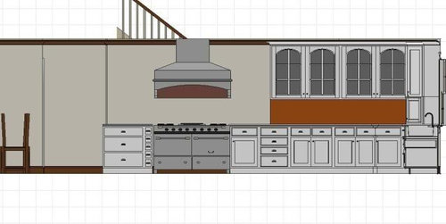
Here is where we are. I think if I can get satisfied with this wall, things will start to fall in place. Everyone has seen my ridiculous layout, but this seems to be the wall I hit everytime.

I know you all can *fix* this. Please help me, it looks like a mismatch of style. I would like to add, if the glass fronts are a bit too much, I believe I can get new doors or something to make it look better.

I need your ideas before moving on!

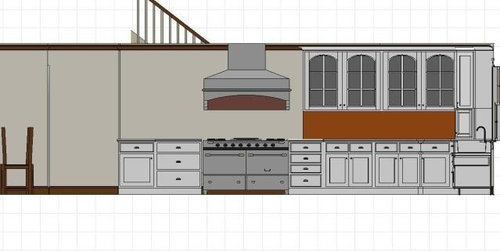
This is the elevation as the cabinets are NOW, with the tray cabinet on the right side of the range.

I can move out the tray cabinet and move the range down as far as that. Another 21". Here it is in a mock up BUT no details, just to give you an idea.

I thought maybe it would be easier to see in this view rather than the floorplan. I hope this helps. Then, we can move on to the rest of the room.

Thanks so much, you all are my KD Angels!

Comments (33)

  • 16 years ago

    Three things....

    The first thing that "jumped out at me" was the glass doors...and two things about them:

    (1) The curved top seems out of place to me
    (2) They look like peas in a pod all in a row

    (3) The third item is the backsplash...are these colors the colors you're using?

    I wonder if you made two of the glass doors solid if that would help. Not sure what to tell you what to do about the curve in the upper doors. Maybe if you fix other things the curves will no longer be an issue.

    The way the backsplash ends seems "jarring" and seems to create a disconnect b/w the range area and the rest of the kitchen.

    What if you switched the 3-drawer base & the 4-drawer base in the second pic? I like a little more room b/w the cabinets and the hood, I think...but maybe not as much as in the first pic?

    Hmmmmm....what about moving two of the glass door'd cabs to the other side of the range and moving the range to the right even more? Then, continue the backsplash the entire length of the counter run.


    You have a lot of space b/w the range & sink...too much, IMO to make the sink useful for the Cooking Zone. Is there another sink somewhere? If not, the location of the sink on the far end will force the Prep Zone to be close to the sink and far from the range...

  • 16 years ago

    I think the stove could move even closer to the sink and I'd rather see the lower cabs line up with the glass uppers. I am not a big fan of the arch in the glass either.

    Can you do a narrower tray storage and keep it as filler between the lowers under the glass uppers and the stove?
    Then you could move the drawer stacks to the other side of the stove.

    Can the 4 drawer stack be a 3 drawer instead? I think it would look nicer visually.

    How about some shelves to the left of the hood?
    Or, would you split up your glass uppers to either flank the hood or give it some room and be a little further from it on each side? Then you could put open shelves between the glass cab on right and the corner cab.

    The backsplash looks very jarring as drawn.

    Ok.. it is late, off to bed...

  • 16 years ago

    {{!gwi}}
    Blue and yellow is a suggestion for a tile pattern - not intended for actual colors!

  • 16 years ago

    Like dianalo said, I think it would really help if your vertical lines, well, lined up....Meaning, the upper and lower cabinet lines should match. What do you think?

  • 16 years ago

    Nice job bmore... a picture is worth a 1,000 words... the only thing I might tweak is try to center the lowers under the right glass cab. You might take the narrow "stack" of tiny drawers and cab next to it to the left and make another drawer stack to the right of it... This way you'd have your doors run to the left of the stove and drawers run on the right.

  • 16 years ago

    Just chiming in to agree with the other comments.

    1. Make the vertical lines of the cabinets line up: the lower cabinets and upper cabinets should match in size.
    2. Move the range far enough down the wall to include some (ideally symmetrical number) of cabinets matching to the left and right of the range.
    3. Also, consider having the drawer sizes match on either side of the range. Perhaps it would not be much of an issue once really in place, but it looks a little strange in the mockups.

    Great mockup, bmorepanic! I really like the symmetry of the upper cabinets and the backsplash going from countertop to ceiling.

  • 16 years ago

    Thanks for the thanks!

    I think part of what suzie left off her description is she wants to re-use as many of the cabinets she already has as possible. I know she's somewhat concerned about that run of uppers and I never could tell from the photos if its one cabinet or two or five.

  • 16 years ago

    Susie also left out that she can't move the range that far to the right because of structural issues interfering with venting the range. I agree that it'd be nice for a base cabinet edge to line up with the glass uppers, BUT there will be a substantial island in front of all the bases, so that won't really be seen. Still if you could fix that, while leaving the range centered in the section without the glass uppers, it'd be nice.

    Susie, I actually like the first view with the range centered on the left half. I think it will work. (the second view is way out of balance for me) The drawing is not what real life will look like...It makes little things look like a big deal, when I'm not sure anyone will think anything of it when finished. Things like the wall color beneath the glass cabs are making a difference and you don't want to judge by that. Can you pull back and do a 3D rendering with the island in the scene? (Be sure to color the walls and give yourself a backsplash close to what you plan.) Something more realistic?

  • 16 years ago

    I like the last mock up - it looks so much better to break up the block of 4 glass cabinets. If that's not possible... What about putting a cabinet on either side of the range hood? Maybe splitting the glass up so there's one on either side and then a block of glass, plain, plain, glass? What looks out of balance to me is a big block of cabinets on one side and only a range on the other.

  • 16 years ago

    I think I hope that whatever you plan for the wall under the glass cabs, you do for the entire wall behind the range and around the hood. That will help visually balance the wall. I happen to love asymmetry and the challenge of visual balance. Much more interesting and artistic in a lot of ways than simple symmetry. jmho

  • 16 years ago

    Thanks so much for the feedback. Rhome is right, I failed to mention that the range can only go down as far as in the second picture. Also failed to mention there will be an island with sink on range end.

    I didn't notice the backsplash color, I didn't put it there, don't know where that came from, I was just working on the cabinets/range.

    I'm using terracotta dark flooring, white cabinets, soapstone counter. And, was planning the backsplash to go around all the way. The hood I'm going to get is not like the one pictured, they don't have one in my program, but it's going to be a mantel hood. So, there won't be that much to go around unless I opt to not use cabinets next to the range.
    Would yall suggest a lighter or darker backsplash? I have a sample of a small 3x6 lighter terracotta, was thinking of doing that behind the range, but maybe not a good idea?

    I like bmore's drawing, but would it work with the range down farther to the end?

    OK, I'm going to go do as yall suggested and try to get a better picture.
    Thanks!

  • 16 years ago

    I think I"d prefer it without the arch... and switch out some of the door base units for drawer. Also.. and I'm just throwing this out there. What if you took out two of the glass uppers and did shelving between the two remaining uppers.

  • 16 years ago

    Oh! Important information!

    OK...first, a mantle hood will probably be more substantial.

    Second, the presence of an island changes things...the island will "fill in" the area.

    As to lining up upper & base...don't do it (even if there is no island). In real life, you don't see the "line up" or lack thereof....the counter & backsplash interrupt the flow and your eyes do not look for it. With an island, there's even less of a reason to line them up...you won't see the base cabinets!

    Since the backsplash is one of the big things causing the problem (IMHO), that also makes a difference.


    How about posting a picture w/cabinets in place of the hood to represent a mantle and, if there are going to be corbels, put in corbels (or little rectangles where the corbels would be). Remove the backsplash, or better yet, put one in exactly where you plan to have it.

    Since you're asking about the total "look", try to put close to actual colors as well as that will also make a difference. If you can't use the right colors, at least try to get the same color families.

  • 16 years ago

    BTW...what are the structural issues preventing the move of the range?

  • 16 years ago

    Buehl, there is a chimney stack that's bricked all the way up through the wall on the other side of the kitchen wall. That part of the house is 2 story, and the brick even goes through one of the upstairs bedrooms, so it wouldn't be possible. Thanks for the advice that I don't really need to line up the uppers and lowers! They are that way, and always have been, and I've never even noticed!

    I'm working on a 3D picture as Rhome suggested, having a real hard time figuring out how to get that backsplash color changed. I don't know how in the world Bmore Did that so quickly! I'll try to post those in a while, I do have 3d pics, but they came out with the backsplash the red/orange and half done. So, I'm working on it.

    Thanks again!

  • 16 years ago

    Do you have a backsplash specified when you click on your base cabs? Or you should also be able to have it hang from your uppers? Click on an upper and look for that option in the box...Then click on the materials tab and specify from the choices.

  • 16 years ago

    Don't usually comment on layouts but one thing jumped out at me immediately and that is the asymmetry. The visual weight on the right side with nothing on the left doesn't work for me.

    Bmorepanic addressed it but I'd like to push it a bit more.

    I'd look to "finish" the run on the left end with a pair of upper and lower cabinets -- even measure up and down. Then the range could float between with open space around it where it fits (best if centered but sounds like it cannot be) and you have another pair of upper and lowers with same dimensions at the opposite end. That works as a "frame" for the beautiful range.

    Also, watch how the island lines up with the whole thing -- that can be very important. A floor plan is always the best thing to include with elevations so relationships can be seen.

  • 16 years ago

    Rhome, I'm going to go as you suggest and try that.

    Thanks rococogurl, I see what you mean, I will go back and try that too. I'm posting 3d's so you can see what you think of the island and whole layout asymmetry.

    I'm posting a few of the 3d's I have, BUT before you scroll down, just know that a LOT of what is shown is NOT what I plan, the images are just there for reference. Like the columns, they will be different, and the cabinets over on the oven/frig area are totally not right, and I know that! It's BABY steps. And, the sink won't be hanging off the island like it shows, I'm just having heck with my program, so pay no attention to that!

    Thanks!
    From back door:

    From family room window seat:

    From sink, looking toward back door:

    From range looking at fridge area:

  • 16 years ago

    I think you could do a version of what rococo suggested - move some of the glass fronts down to the left edge of the run and move the range much more to the right (enough beyond the brick obstruction for the range vent).

    I was thinking it would be very handy to have your dish storage there - yeah, it would be a carry from the dishwasher, but better than having everyone running around through the work area when its time to set the table or while replenishing drinks. If you did a full-on hutch treatment of an area and then centered the range in the remaining open area before the corner, it would look great.

    Or rather it would look great EXCEPT
    --oversized corner upper cab right beside the sink down to the counter. It looks bad and will function worse robs counterspace for dishes waiting to be washed or the occasional hand washed thing drying.
    --The to the counter cabinet in the baking area that can only be opened by removing everything from the counter in front of the door. Either go for open shelves or use a set of those tiny drawers on the bottom or use a normal wall cabinet 18" above the counter. Be a very cute place for open shelves.
    --The open shelves over the ref/frzer - now there I'd have doors because they are too high and deep to have to dust out regularly.
    -- Depending on where the range ends up, consider locating the prep sink so its not back to back with the range.

  • 16 years ago

    Bmore, when you say do a full blown hutch area, do you mean at the very end of the range wall on the left side?
    Then have the shorter uppers next to it? I will ask DH to take another look to see if there is any way to vent the range, but I think it would require a lot of extra money. He's home this morning, so I'll go talk to him.
    Do yall think the extra money/effort would be worth it? One thing I noticed it would center the range between the columns of the island. Honestly, I've always liked the idea of it down farther because I feel cramped up closer to the sink window. Maybe the second sink will alleviate that problem.
    I know Rhome would be happy to see it go down to the middle, as well as bmore, they've been with me since day one, over a year ago! And, it seems to be a unanimous vote on the range in the middle.
    And, I think the open shelves over in the baking area would be great, Rhome suggested that, and I forgot to put it in the plan!
    OK, off to talk to DH, wish me luck!!

    Thanks all!

  • 16 years ago

    susie I think the columns on the island are killing your sightlines. You have a beautiful kitchen plan but they have no function there. If you want to repeat the motif from the bookcases in the other room then I'd think about putting them on the bottom of the island somehow but my preference would be to lose them.

    Then work on the range wall. bmorepanic and I are on the same wavelength -- I also thought about a hutch at the end there to anchor the end. It could go either way. When you see the sightlines in the elevations from the other room it's immediately clear. Is the style of the range hood on the drawing correct or is it just a placeholder? It's not compatible with the cabinet door shapes.

    Also, on the other side, the cabinet to the left of the refrigerator bank will be unreachable and unusable. I'd think about open shelving there.

  • 16 years ago

    sorry i can't comment on the layout, but: have you given any thought to what needs to be stored near the range and how much space you'll need for those items? i designed all drawers to contain pots/pans/dishes/glassware with inserts vs the doors. i took out everything i have and measured and made a map of where exactly everything needs to go. just seems like you have a lot of doors where you'd get superior functionality w/drawers. jmo. good luck!

  • 16 years ago

    Rococogurl, the columns are of necessity because that is a load bearing wall. I don't know if a beam would work or not. I see what you mean about them killing the sight, and I would love to lose them, but right now, where the island is on the outer edge, there is an 11' peninsula which has a column on the end. If possible, do you think a beam would work better than the columns? I'll work on the hutch idea, and yes, the hood is just a placeholder, what I really had planned was a mantel hood, but I'm even rethinking that, someone has a black hood they had painted to match the range with a brass bar across it, I'm looking for that.
    And, definitely open shelving on the oven/fridge area.

    Kateskouros, I'm reusing most of my cabinets, and they all have the pullouts. I plan on all drawers in the island, would that work?

  • 16 years ago

    susie, I wouldn't want support columns propped on top of a wood island to support a load-bearing wall.

    Even if the support beam created a bump down on the ceiling (no problem it's handled with paint) a steel or double-ply header beam is what I'd look to be going with for a load-bearing wall. No idea where you live but I'd be sure to check building codes on that. Perhaps it's not the case but I'd expect you need a beam there especially over a large span. I'd want one in my house. We installed one when we opened up our two parlours.

  • 16 years ago

    Nice collection of photos in this lady's blog below. Some are standalone and some are in-line with kitchen cabinets. Rococo's get nice pictures over at atticmag but I'm not remembering being able to search for specific features. It'll be a nice time drooling at them anyway.

    Also google for Kitchen hutch or built-in hutch, then switch over to images.

    Here is a link that might be useful: many hutches here

  • 16 years ago

    I was thinking of a hutch too when I saw bmore's sketch. You could take two of the glass fronted cabinets on the right side of the range, from your second picture, susie, and place them centered over the two bottom cabinets. You could paint the uppers and lowers in a different color than the rest of the cabinetry in the room, maybe something darker, and add corbels underneath the top cabs, painted to match. And maybe cup hooks underneath the top cabs, and beadboard or something else as a "backsplash" to make it look more furniture-y. Or even a small bank of small drawers between the tops and bottoms.

  • 16 years ago

    Rococogurl, I talked to DH and he told me to call the GC who did the initial work and ask him to come out and look at the possibility of a beam and venting the range. So, I'm calling him as soon as I finish this post. Don't want to get too excited if it can't be done.

    I've been working on new 3d renderings, and will post them now, I wish I had seen bmore's post before doing them, but I need y'alls opinion on what you think about it now, anyway. I'm not sure I have the *hutch* in the right position as y'all described, so let me know if not. Also, please take a look at the frig/oven corner and see what you think needs to be done there.
    I was a little concerned about losing so much cabinet space, but since Rhome came up with the idea to move the pantry wall in two feet, it gives a HUGE pantry, and 70% of what I don't use daily can be stored there if I get it configured correctly.

    beckysharp, I like the idea of different colors. The all white is beginning to wear on me, and I wondered just what you suggested, if I could incorporate something different without it looking odd. I like the unfitted look.

    Well, here they are, take a look and let me know if it's anything close to what you all were suggesting!
    Thanks again, more than you know!

    View from family room:

    From main sink and window:

    From Pantry Door:

    From range, looking at baking center:

  • 16 years ago

    I'd take the cabinet on the end of the sink run and do exactly the same thing with it that you did with the one on the stove end. Then I'd lose the bottom piece on the counter in the corner and have two cabinets adjacent cabinets in that corner with nothing below to lighten it up. Is there an actual corner upper? All the uppers IMO should be glass door.

    The range and hood doesn't appear centered but that whole wall, with those adjustments, will calm down and look great I think. You've got the two hutches closing up the whole perimeter and the range as a focal point in the sightline.

    For me, it's endlessly better without the pillars. If you must do them then I'd look to build supports as vertical parts of some structure over the island such as a pot rack.

    Do your drawers clash over in that baking center? I'm wondering if an open vertical slot thing should be where those small drawers are -- one tall enough to stow oven racks, baking stone, baking sheets etc. Then I'd think about a single cupboard with pull outs for the baking stuff with a bank of drawers in gradulated sizes on the left.

    Above, I'd make a top for the open shelving "hutch it in" so to speak, and sides so you can put display or use it functionally. Also I'd light below the lowest shelf and the whole area if any part would be display. You could think about how to store spices or small stuff like extracts etc on the right hand side on that short right hand leg. That's what I see though you may need/want other things entirely.

    No idea what your fridge/freezer are but they need some structure over depending on height. I'd want a continuous line at ceiling height over there to unify the area.

  • 16 years ago

    Rococogurl, I did as you suggested and put the hutch on the end of the sink run, and took out the appliance garage. Does it still look bad with the diagonal cabinet? It has a large double shelf Lazy Suzan, and I use it for a lot of daily use. I don't understand what you're saying about a structure to hold pots and pans. Can you elaborate please?

    Problem with the hutch is it sticks out two feet, and I do have an empty area in the family room behind that. I suppose I could think of something to do in that area, or should the hutch be shortened to 24"?

    Bmore, LOVED all those hutch ideas! Do you think a different color would look odd, should it stay all white?

    I'll post another picture showing how that one sticks out. Don't want to post Too many!

    What could I do around the range? I've always wanted a brick or something like that in a surround, but not a closed off alcove. That is one reason I was going with the mantel hood. I'll see if I can find a picture of what it was. I don't want white subway tiles, my kitchen is ALL white now, and it's just too sterile for my taste. I've always loved Igloochick's rooster mural behind her range, and thought about that too. Need to ask her if she ever got tired of it.

  • 16 years ago

    susie, I'm not at all one of the layout gurus here, but I'd shorten the hutch next to the sink. And I hate to make more work for you, but is it possible to get a picture of your sink wall?

    How tall are you? Would you really get that much use out of the corner/diagonal cabinet? I would suggest insteadanother upper, glass front as Rococogurl said, but on the sink wall and not on the diagonal.

    Do you want the upper "hutch" cabinets to come all the way down to the counter, or do you want them shorter, so you could use the area for a coffee "bar", other bar, or baking storage area? Whatever you decide, definitely keep both hutches similar. And I think a different color would look great, and especially if you like the unfitted look. It's also a very warm look. There's a thread now on accent pieces in different colors, link below. Take a look at the photos there for some inspiration : ).

    Here is a link that might be useful: Thread: Your accent (color) furniture piece/island...pictures?

  • 16 years ago

    The one near the sink, make it a single hutch instead of a double. If the range one is about 48-60 inches, then the sink one should be 24-30 inches. If it sticks into the family room a little, its possible to have a desk, bookshelf or cozy window seat on that section of wall.

    You could try the other side of the sink without any corner upper - run the cabinets flat on the wall and end them at the corner. I can't do a 3d drawing so I don't know exactly how that would look, but I think it would be better than the corner cabinets.

  • 16 years ago

    bmore said it for me. The width of the cabinet that was there looked good -- was just suggesting to match the style at each end.

    I don't mind the top corner cabinet though I'd likely go with something decorative on there. Glass would be ideal but something else could work.

    The area I was suggesting to open in the baking area is essentially like the vertical sections you see in some cabinets over the oven. Here's mine -- it would just be much narrower and in the base cabinet and open. Looks as if the space you have there could work well for this. In Europe they put that sort of thing next to the stove and it jumps out but your space is perfect.

    Re color. What about painting bottoms one color and tops another. That gives a great sweep. I worry that the vertical hutches in a different color will make it look narrower though it likely depends on the color.

    Also, what about doing the backsplash on the entire wall behind the range? I'm thinking of the way this damask tile is used on that area, not about color or style. Just use. These glass tile backsplashes are used in a similar way though more modern in style. But again, not for style.

  • 16 years ago

    Not sure if I've followed all the conversational movement here and I may be way behind the wave, but back to the range wall...If the lowers had wide drawers instead of the four matching doors and one oddball door, they could span an area that would be more functional for pan and pot storage. Perhaps turn these into 2 wide drawers plus a cupboard?

    I don't like the narrow vertical open? drawer? set to the left of the range--what would you put into it? Incorporate that space into the big drawers. Or make a spice&oil pullout that runs from countertop to floor.

    This is a big kitchen. Be sure to have sufficient plunk space on both sides of both sinks. I have 14 inches from the end of the unit to the left edge of my peninsula prep sink and about a yard and a half on the side nearer the range and am glad that I have both. [Oh, I see that the second set of drawings has more plunk space adjacent to island sink. Good!]

    You have so much room, consider making deeper cupboards.

Sponsored
Miller Woodworks
Average rating: 5 out of 5 stars23 Reviews
Franklin County's Trusted Custom Cabinetry Solutions