Software
Houzz Logo Print
positano_gw

Need help choosing countertop(pics)

18 years ago

Hello,

It's me once again! What would I do without all of you.

So, I'm not sure what to do about the countertop. It is a small kitchen, we are knocking out the dining room wall. I think I have choosen Cambrian black antique. The price is right and it has passed all my tests with flying colors. It is a long and narrow kitchen. One half kind of a dining/bar area. I ended up going with cream colored shaker doors for everything. Should I put the Camb Antiq throughout, or I was thinking of using a Quartzite for the bar area. They have a beautiful color called Madre Perola(cream, grey , greens) or Luce di Luna.

My question is.....would it look funny to have two different countertops in the same run? The fridge really breaks up the two areas. I just don't know. If I do all black, it is 63 sq ft of black! My dining table will probably be a dark wood.

The cabinet shown is the right color, but not the style I chose. And the tile is WZ, I liked the color tones, but not sure it will work.

General color scheme is cream cabs, black, olives, browns.

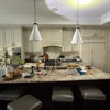
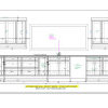
Here are some pictures. I hope I made this clear enough.

Thanks so much!


Comments (14)

  • 18 years ago

    I absolutely positively love the glass tile with that quartzite. The black is lovely too but OHHHHH that quartzite. (can you tell I love it?!). I think it would look fine with two different countertop materials as it is separated by the frig. You could consider a different backsplash for the black side even but the glass goes beautifully with both.

  • 18 years ago

    I think the bar area is distinct enough that it would look great with that quartzite to really set it off. Beautiful stone!

  • 18 years ago

    Go for it. Your choices look great. The counter behind the table doesn't cry out for a different counter (as in it's not necessary), but it would look great and offer a different feel to that portion of the room. I think using the same backsplash in both places creates a nice continuity.

    If you hadn't found the quartzite, the black would've been fine everywhere, but now that you've seen it, how can you pass it up? ;-)

  • 18 years ago

    Great choices and the glass tile is spectacular with both countertop materials. Will the island be Cambrian Black or Quartzite?

  • 18 years ago

    Wow, I'm not normally a fan of quartzite, but I LOVE what you have chosen. And I like that black granite too. I'm going to be picking my granite in the next few weeks (to go w/ off-white shaker cabs) and am looking for something just like that! I originally wanted absolute black, but after hearing the horror stories am too scared. Keep us posted on how it goes. I can't wait to see the end result!

  • 18 years ago

    I'm so glad you like the choices. I absolutely love the Quartzite too, it is pricey though. That's why I can't use it everywhere.Surprisingly it did very well with all the stain tests. Lemon juice, food coloring, ketchup all faired very well. I guess I should try red wine too.

    Here's another question. The island is the cream shaker. How would it look with the quartzite on just the island and the black on the perimeter? There is a remnant of the madre perla that I could use, just the right size for the island.
    I originally thought it wouldn't work, too much light in the middle of the room. But now I'm not sure. I have to use it somewhere..it's my wow factor!!

    Keep the ideas coming. I really like the glass backsplash too. Are you sure you don't think it's too busy? This is a picture the tortoishell using a lot more. I'm kind of worried it's too much.

    The next photo is a little softer color. Think it's better?

    Bigger area of the tortoiseshell

    A softer color in the glass tile

  • 18 years ago

    Do like the softer glass tile compared to the tortoiseshell. It would be beautiful with the quartzite but I do like the continuity of the perimeter being the same granite as you have suggested.

    Checked out the Madre Perla online and I don't think it is anywhere as gorgeous as the quartzite. Go with what you like best.

  • 18 years ago

    I'm confused. Is the green tile you show with the other samples above either of the ones you show in the latest post?

    I liked the idea of the quartzite by the table, rather than on the island. It was different than the norm. Having a different counter on the island seems more typical and expected, more safe, which is something I'd steer away from. I prefer unique without being outlandish, and I think that's what it would be to have the quartzite only on the one section and black in the main working areas, including island.

  • 18 years ago

    JB1176-The Madre Perola and the Luce de Luna are both Quartzite. The small square in my mockup is the Madre Perola(more cream and green/olive than the luce). The photo of the slab is Luce di Luna(still has greens and greys). Is your vote for quartzite on the island?

    Rhome-All of the glass tile is from WZ. All of it is the tortosieshell, except for the last softer picture in my last post. It's the same mantra tile, just muted greens. It is funny how it looks so different installed. I love my sample, but don't love that big picture.

    The woman with the quartzite left a message that she doesn't have a slab long enough for the bar area. I need 108 inches and she has 105. Where would I put a seam? right after the hutch? The answer to my problem would be to just use the remnant on the island, but would it look ok and balanced.

    Rhome- I do like your thoughts on having it in the bar area. I also feel like it will seperate the kitchen from the table area....even though it is just one space.

  • 18 years ago

    bump

  • 18 years ago

    The first pictures you posted of the the backsplash have a green tone to it, whereas the picture of the bigger area doesn't. Does it have the green tone in person? If so, I think it will be perfect. If not, then I like the soft green.

    Laurie

  • 18 years ago

    positano,

    I apologize for my confusion about the Madre Perola. The picture I found online was of a stone that was dark green and black. I didn't realize that in your first picture above the middle stone was your sample of Madre Perola - which I think is beautiful.

    I understand rhome410's point about being different from the norm. I guess you have to decide whether you like being outside the box or being a traditionalist. In either case, the elements you have chosen are all wonderful together and I bet however you put them together the overall look will be stunning. I have a hard time being brave enough to be beyond the norm so in answer to your question I guess I'd choose a traditional approach and keep the perimeter surfaces consistent and do something different with the island.

    Your original idea appealed to you and you should go with your first instincts. It will be fine.

    JB

  • 18 years ago

    I should mention this is not my forever home, so resale down the line will be an issue.Maybe not for another 5-7 yrs though. So, I don't want to go too far outside of the box. Still confused, not I feel like I am leaning towards black perimeter and quartzite island.

    Thanks JB and msrose for your input.

  • 17 years ago

    Positano,

    I'm just starting the backsplash research, having finally settled on Raven C-stone to go with my Natural Bamboo (very light colored) cabs....

    Funnily enough, we went to tile store yesterday to look and came home with a WZ Mantra sample in the same color you show here. I am curious if you ended up going with it, and if you have finished photos...I am loving it, but DH thinks it's a bit too soft and quiet - wants more pop. Eventually I'm going to post pix of different possibilities and ask for opinions - but just came across this and thought I'd ask.

Sponsored
Mary Shipley Interiors
Average rating: 4.8 out of 5 stars34 Reviews
Columbus OH Premier Interior Designer 10x Best of Houzz