Software
Houzz Logo Print
gailrolfe

Help on colors for kitchen

18 years ago

Most of the "functional" decisions have been or are close to being made for my kitchen--that was the easy part for me. Now it comes to my real weakness--the "vision thing" as one of our recent Prez's called it. I have a 1930's "mediterranean/traditional" style home in SoCal and I started out thinking that I'd probably just want white shaker cabs, soapstone/unhoned granite perimeter cabs and a wood countertop on my peninsula. (It's basically a U-shaped kitchen opening to the family room.) But that began to feel too plain/current or something to me and I started looking around and found a marble mosaic that I love to go behind my rangetop. Here's the link to a picture of it:

http://www.mosaicmarble.com/product_info.php?cPath=6&products_id=3582

(I don't think the picture will come up embedded because I can't copy it as it is copyrighted.)

Now I think that I need to adjust the color of the cabinets as the soft off-white I'd started out with seems stark to me...but my very poorly developed "mind's eye" doesn't seem able to come up with anything else. For awhile I played around with a darkly stained cherry idea but the one fixture in the house that we really want to keep are the original dark mahogany doors, a couple of which will be visible in the area and I don't think the cherry will mix well and any darker wood will not pass muster with DH. After losing several nights sleep tossing and turning and trying to envision a solution, I'm throwing up my hands in despair--it's like that envisioning part of my brain just doesn't work! So, please, if anyone has some suggestions as to colors I might consider or ways I might pull this together, I would really appreciate it. I don't know if I've even given those of you with this gift the right kind or amount of information to work with but I'm happy to answer questions. Thank you!

Comments (18)

  • 18 years ago

    A creamy white sounds good to me...Unless, like me, you're not a white/cream painted kitchen person and would feel like your kitchen was more 'you' if it was wood. You could do mahogany cabs? Or maybe another wood or stain could coordinate well with the tones in the mahogany?

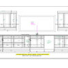
    This is where 3D's are nice. Did your KD do the elevations for you? Does she have any suggestions for color? If you have the elevations, you could make copies and use colored pencils to try some different things.

  • 18 years ago

    Did you look at the recent finished kitchen from yesdear? It sounds like you are trying to create a look somewhat like theirs. They have creamy white cabinets and a mosaic. They bring color into the room via the wall color. If you search 1930 Spanish kitchen you will find it.

  • 18 years ago

    How about if you still went with painted, but went with a deeper off white color (towards a gold or medium brown tone) or better yet add a dark glaze over the off white so they don't seem so white/stark to you.

    By the way, I can see why you love the mosaic - it's very classic and beautiful.

  • 18 years ago

    rhome, my KD is working on the elevations right now...I like your suggestion to "color" them, maybe that will help me see. I haven't preferred the "wood" stain, primarily because the lighter colors won't work and to get a color that will look good with the doors would mean, I think, something too dark for our kitchen. So we've been leaning towards the painted look. If I stay in the white-ish line, do you think I would want something close to the white-ish color in the mosaic or will that be too bland?

    Like you suggested dlspellman, I wondered about glazing the cabs with a walnut/mocha sort of color, but wasn't sure if that would help tie it all together with the mosaic or not since there really aren't brown tones in the mosaic. Glad you like my tulip mosaic...there are many others I could go with too if this doesn't come together for me but it's my fave so I'm going to try to get the vision thing going....and now I'm wondering also if my shaker doors are too plain to blend well with the mosaic?

    Annes arbor, yes, I do know yesdear's kitchen very well and it has been in my "inspiration" folder for some time...but the type of mosaic I chose is so different from what they have that that was when I began to think I needed to think a little more flexibly about what it would take to make my mosaic work. I do love their's though and for awhile considered being a complete copycat! :-)

  • 18 years ago

    Hi. A lovely medallion came up. Is that the one you've chosen, or is it one of the backsplash designs?

    I was in a historic home from the 1930s last week and was surprised to really like the original old kitchen painted top to bottom in one of its early colors--a kind of dull deep green. It looked dignified, calm, and distinctive, as well as warm and cozy (it wasn't very big at all), and the dark tone beautifully highlighted the views out the original 1930s windows on 2 walls and the door to the garden.

    Wish I had taken pictures. In any case, how about a historic old color, picking up one from your mosaic, for all cabinets or perhaps just the lower ones with a creamy white up top? Most people weren't as crazy about wood as the finish for kitchen cabinets back in the 30s as we are now, anyway. Paint was big.

  • 18 years ago

    If I stay in the white-ish line, do you think I would want something close to the white-ish color in the mosaic or will that be too bland?

    Not bland...elegant. I don't think the Shaker would be too plain either. Classic.

  • 18 years ago

    You guys are great! Yes, rosie, that is my favorite medallion right now...I've always had a love affair with yellow tulips and in my current kitchen have some nice wooden ones as decoration but they are getting worn and this medallion will allow me to leave them behind...I'm intrigued by your suggestion of the green/cream combo and will play with it when I "color" my pictures per rhome's suggestion. Was it a dark green...sort of what I might call "forest green"?

    On the other hand, it is reassuring to hear from rhome that sticking with the basic idea of white-ish might work nicely, too. I guess I'd have to wait to get the medallion to try to match the white nicely...it looks to me like it might have sort of a gray-ish tinge too it which I was afraid might be sort of "dirty" looking. And I was afraid that Shaker and marble mosaics might not work together...sort of New England vs the Mediteranean but I can see that I just really have no clue on this stuff. I will be working with my KD-consultant but I like to kind of meet with her already having some ideas and I find the forum just offers such a wide variety of good ideas and opinions that it always makes me feel like I have a better comfort level when she and I decide something if I know I've already seen "what's out there". No fears of "leaving something on the table" so to speak.

    thanks again!

  • 18 years ago

    Gail, I have been having similar thoughts. Lately I've been thinking may-be a light gray taupe for the painted cabs (combined with some stained wood in the island). Some of the images that seem to be sticking with me: the grey kitchens in attic.mag, the images in VictoriaJane's recent thread-- there were a couple of links there -- I like the slightly darker cabs combined with the lighter window millwork and the wood island. Like you I am drawn to the white kitchens but wondering if white or ivory would be too stark. I think a lot depends on how much natural light you have, the quality of the light, and the night time lighting plan.

  • 18 years ago

    I was afraid that Shaker and marble mosaics might not work together...sort of New England vs the Mediteranean but I can see that I just really have no clue on this stuff.

    You are assuming I know what I'm talking about? ;-) I just happen to think Shaker is a style with simple lines that can go with anything. Please listen to your own instincts along with what anyone says here, because you are the one who will be in the kitchen every day...and you should love it, not have regrets because of what someone else said.

    Mediterranean says 'warm' to me, so if you went at all grayish, I'd keep it creamy, dove(?) gray, so it didn't feel cold. A grayish cream or a grayish glaze on cream might work.

  • 18 years ago

    Gail,

    This has nothing to do with the cabs but I loved, loved, loved the colour pallette of this companies Painted Collection. The Oyster might be perfect but check them all out. Colour selection is the flowers on page 4 (I don't love the brochure). I would say this company is in direct competition with Cabico. It is usually the top line in any Canadian showroom that carries it. Again it isn't about cabs just the beautiful soft colours (the green is gorgeous). If the link is a bust just google Luxor cabinets

    Here is a link that might be useful: link to PDF for Luxor painted collection

  • 18 years ago

    caryscott, I couldn't really see the colors very well in the brochure but I like the sound of oyster....thanks for the references.

    rhome, of course I assume you know what you're talking about! Anyone who has a 3D program has to be better at this than I am :-) I went to the tile shop today with a picture of my mosaic and the gal there has encouraged the idea of working with some gold and white marble for the backsplash around the mosaic and we both thought it might work to explore more about the dark green and cream thread...so another diversion! Eventually, I suspect I'll end up with some kind of glazed white but it'll be fun trip getting back there, anyway. DH says, "I encourage anything that involves a little more color." So I guess that means he thinks I was being a little too conservative in my choice of white, soapstone and wood....but as you say, I'm the one that has to love it. So this evening I started coloring....it'll be fun to see where this leads.

    Thanks again, all!

  • 18 years ago

    It's so nice to hear when someone has a "love affair" with some element to go with. Yes, that particular green was sort of foresty but probably a bit less yellow-brownish. I was really just thinking you might shake loose from the whites and consider other colors, a green of course being a possibility as it's in your medallion. I do agree, though, that a white, hued to harmonize with the stone, could look wonderful too. If that off-white color you're thinking of in the stone were picked up in the white, it'd probably end up looking excellent--not dull but rather just softening the contrast between the white, black-gray, and yellow. Regarding the two-tone cabinet possibility, the off-white could even be taken a bit deeper for base cabinets.

    Regarding Shaker, that's just a marketing name applied to this ubquitous old style. As an appraiser I saw them all over Southern California in old homes, including those of your style.

    Enjoy your coloring!

  • 18 years ago

    Gail,

    Let's be candid the brochure sucks but those colours are "gorgeous" (think "Little Britain"). One of the many advantages of working with art is it sort of demands access to a high quality colour printer\copier and those colours are great on the page - I kept that brochure in my kitchen binder for a long time just in case our budget suddenly tripled (didn't happen). I don't know where you live but this is their sales area:

    In Canada, LUXOR sells cabinetry in Quebec and Ontario. In the United States, LUXOR sells down the east coast all the way to Florida as well as the midwest down to Tennessee.

    If your going to explore green (my favourite is the Oyster, though all the off-whites are nice) maybe there is a dealer in your area or they can send you something with a decent set of colour samples. Check out the Pottery Barn Collection from Benjamin Moore - I gave my sample book away but I was impressed with colours in this Collection, you might find some good inspiration colours and it isn't as overwhelming as going to the paint store and facing down the wall of chips (though if your thinking colour it is a lot more helpful than you might imagine to be looking at specific colours - it's less abstract especially when picking something like an off white or soft colour for cabinetry). Good luck.

  • 18 years ago

    I love the mosaic you've chosen! It is beautiful. When I looked at it, I immediately thought of a creamy grey color for the cabinets or a pale gold to pull out some of the colors from the mosaic. Or what about a mix of the two? I think you could still go with the soapstone because of the dark colors in the mosaic. I wouldn't do plain white in a mediterranean style house as it would be too stark. I also love the idea of using some gray and gold marble tiles for the rest of the backsplash. Sounds fabulous!

  • 18 years ago

    Rosie, last night DH and I played (colored) with the dark green/cream and were very excited by the possibility--at least as much by the idea that it's just something new and different as anything! But we did like it and now I wake up to some new color suggestions that sound really nice too. Auchmedden, I can't really picture in my black-and-white brain what a "creamy grey" would look like but I love the sound of it and will check it out today when I go to the paint stores. Same for the pale gold. The gold marble tiles that I saw at the tile store to use as a field tile for the backsplash looked really nice iwth the mosaic. And based on what she was saying I guess the white-gray in the mosaic is probably white carrara. However, putting the mosaic up against it didn't do much for the mosaic itself.

    Thanks, caryscott, for the suggestions on paint collections to look at. I'm going to go pick up some of the brochures from paint companies today. In the past I've had some unpleasant surprises by what paint actually looked like rather than what it looks like in the brochures so this time I'm planning to do some "test" painting.

    I love everyone's suggestions....thanks so much! This is kind of fun "with a little help from your friends"! Much less stressful than trying to imagine it by myself....

  • 18 years ago

    gail, If you want a dark cherry, I have seen cherry with a walnut stain and it was very pretty. I was considering cherry but wanted to get away from the red tones because my woodwork is mahogany also. Could your KD play around with the cherry stained in those tones?

  • 18 years ago

    marybeth, the cherry with walnut stain I've seen is beautiful and I really thought about it for awhile. But like you said, I ultimately couldn't get past the red tones clashing with my mahogany doors. And, as much as I love my doors, they are really too dark for me to want to do the kitchen in the same tones. I can see how the mosaic would look lovely with cherry cabs but I think it will have to be in someone else's kitchen!

  • 18 years ago

    gail, I understand being afraid to go that dark, I was looking at that color for my island to contrast my light cabinets DH has a phobia of painted cabinets and I am trying to reach a compromise.