

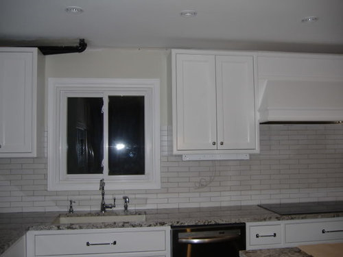
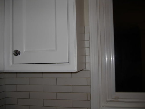
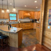
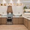
Backsplash in - Weird part around window
17 years ago


Sort by:Oldest
Comments (13)
Related Stories
TRANSITIONAL HOMESHouzz Tour: Part Traditional, Part Modern and All Family Friendly
With clean lines, vintage touches and durable surfaces everywhere, this Los Angeles home balances tastes and needs beautifully
Full Story
EVENTSOn Show: Weird, Wondrous Science Meets Design
Houses grown, not built. Power-generating soil. And snail poop that ... well, see for yourself in our coverage of a new Rotterdam exhibit
Full Story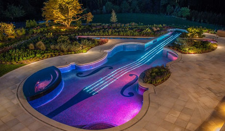
FUN HOUZZWeird but Wonderful Backyard Features
These outdoor areas will have you looking at your own backyard through fresh eyes. Do you dare to be different?
Full Story
DOORSKnow Your House: Interior Door Parts and Styles
Learn all the possibilities for your doors, and you may never default to the standard six-panel again
Full Story
LIFETime Travel to Houzzers' Childhood Homes, Part 1
Peek into home design's past and share the memories of Houzz community members with these personal photos and stories
Full Story
HOW TO PHOTOGRAPH YOUR HOUSETake Better Photos of Your House in a Snap: Part 2
Think like a professional photographer and learn to capture stunning images of your home
Full Story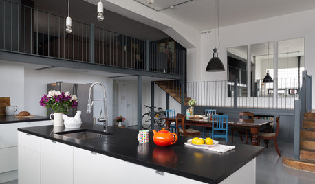
KITCHEN DESIGNKitchen Takes Off in a Former Aircraft Parts Factory
Generous storage and clever carpentry transform a cluttered kitchen into a sleek, minimalist living space with an eclectic heart
Full Story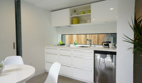
KITCHEN DESIGNPut Your Kitchen in a Good Light With a Window Backsplash
Get a view or just more sunshine while you're prepping and cooking, with a glass backsplash front and center
Full Story
DECORATING GUIDES6 Focal Points to Build a Beautiful Interior Around
Not sure what element to make the attention getter in your room? Find some great choices here
Full Story
MOTHER’S DAYWhat to Do for Mom Around the House on Mother’s Day
Show appreciation for your mother and make her day extra special with these ideas
Full Story
lightlystarched
jessie21
Related Professionals
Daytona Beach Kitchen & Bathroom Designers · Louisville Kitchen & Bathroom Designers · Killeen Kitchen & Bathroom Designers · Barnstable Kitchen & Bathroom Designers · Cape Coral Kitchen Remodelers · Alexandria Kitchen Remodelers · Pullman Kitchen Remodelers · Jacksonville Custom Countertops · Charleston Custom Countertops · Johnson City Custom Countertops · Victoria Custom Countertops · Ithaca Custom Countertops · Janesville Custom Countertops · Wheeling Custom Countertops · Helena Custom Countertopsremodelfla
clax66
redrozeOriginal Author
nomorebluekitchen
footballmom
natesgramma
favabeans5
cat_mom
redrozeOriginal Author
mpwdmom
redrozeOriginal Author