Software
Houzz Logo Print
saypoint

trouble choosing a wall color

15 years ago

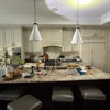
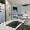
I'm having a terrible time finding a wall color that works with my existing cabinets. They are kraftmaid, finished in "antique biscotti with taupe glaze". Counters are brown/gold/black granite, appliances stainless except for the black fridge, which I will likely replace before long. Floors are dark gray slate, also may replace with lighter stone or tile, or wood, at some point. Range backsplash is tumbled marble with a slight pink undertone. Cabinets have a yellowish or slightly orange or pink undertone depending on the light. Also, the faux beadboard areas on the peninsula and above the fridge are a pinker beige than the rest of the cabinets, which tend to yellow or orange. The areas where there are no cabinets have the original 1800s paneled wainscoting painted white. In these pictures, I've just removed the wallpaper and primed the walls and woodwork.

It looked good with the brown faux-painted-finish wallpaper that was there when we bought the house, but it made it room very dark. I'm also not a huge fan of brown. After removing the wallpaper, nothing I've tried seems to work. I tried light blue gray (BM Quiet Moments), several beiges, and a gold (BM Straw Hat). I'm so frustrated that I'm ready to have the {{gwi:1980322}}

{{gwi:1980323}}

{{gwi:1980324}}

I've seen some beautiful work done by contributors to this forum, and would appreciate any suggestions or ideas. My ideal kitchen would have a slighty creamy white but not yellow cabinet finish with warm neutral or soft green walls, but that may have to wait for the next house.

Comments (16)

  • 15 years ago
    last modified: 11 years ago

    If you like greens, I think you should use greens. I think the cabinets and your colors would look great with a green. Try the following greens:
    BM Georgian Green, Wheeling Neutral, Richmond Gray, Spring Thaw, Natural Elements, Moon Shadow, Harbour Town, or Fernwood Green. I think most will go well with the tones you have in your kitchen and work as a good accent color.

  • 15 years ago
    last modified: 11 years ago

    Colors.....

    I think you can make your dream. Keep the cabinets
    the way they are and instead search for the right
    green to go with those tile floors, the granite, cabs...

    Don't give up yet. Paint can be so frustrating. What
    looks amazing in one person's home can look horrific in
    another.

    When I look at your images my instinct says a darker
    green. Something to pop that space. A dash of drama
    that works with the lighting and elements. Of course
    keep in mind I am looking at the image on my monitor
    and this is never perfect.

    Here are some ideas... If you get a chance look them
    over in person and try a sample. Then take an image with
    the sample so we can all see and vote. It will help
    with confidence and choosing.

    ~boxer

    Garden Cucumber BM (Benjamin Moore)

    Clover by Pratt Lambert

    Inland Sherwin Williams


    This is from Green Design Crisis Blog
    Look at how a good green paint can make beiges and creams
    look more cream. This is a BM paint, I am not sure
    which green it is. I think of Bunker Hill green but
    it is probably one of the other million greens that BM
    makes. Check out the blog.

    Farrow and Ball paints have this amazing ability to
    soak up light and reflect it back to look beautiful.
    The problem is FB paints are super expensive and hard
    to come by. This image is difficult to achieve in
    your space. I love the lightness but this could be
    the problem you have already had. Going for a darker
    green will be easier on the space.

    French Gray Farrow and Ball

    Olive by Sherwin Williams

    Grass Cloth by Behr This is a great color that goes
    wonderfully with gray and light cream.

    Everyone loves Ellen Kennon paints. EK is super.
    Edgewood Green by EK

    Creek Side Green BM (this can look more gray in person)

    Great Barrington Green by Benjamin Moore is a gray
    green that makes cream stand out in a lovely way. Try it.

    Green Velvet by Benjamin Moore.

    I know you are thinking this is too bright. But trust me
    this could work in your space and rock the room.

    Bunker Hill Green BM

    Green ideas from GW

    http://ths.gardenweb.com/forums/load/kitchbath/msg1122034529666.html

  • 15 years ago
    last modified: 11 years ago

    I vote for the "grass cloth" and the second to last photo. Each has some punch and would liven up the cream.
    Try photoshopping them and see what it looks like virtually before you decide.

  • 15 years ago
    last modified: 11 years ago

    Wow, lots of great suggestions. I don't have photoshop, or rather I did but it's an old version and doesn't work anymore on the new computers. Came with my camera. Is there other software that will allow this kind of photo editing? cheap or free?

    I think green is the way to go, but I was hesitating because if I didn't control myself, the whole inside of the house would be green. Laundry, foyer, and one guest br are bm tree moss, my office is RL mountain sage, looks alot like the Pratt and Lambert Clover. Is my desk cool, or what, I picked it up for $150 at a local junk shop and stripped off the white paint. I thought it would have to be repainted, but it was mahogany! Had to fix some loose veneer and it was a pain to strip, but I love it. I holds almost everything I need, and I run a biz from here.
    {{gwi:1980331}}

    Powder room is bm dune grass, but I might want to redo with slightly darker, less "sweet" color. Den in bm nantucket gray, was thinking of changing it to bm palladian blue to work with the new blue sofa.

    Here's the url to a walkthrough I did of the house for an out of town decorator to see. Not great photos, I was trying to get good shots of the colors without using flash, and more of a general idea of the place. I've since swapped the blue sofa in the den for the gold sofa in the living room to see how it works.

    http://smg.photobucket.com/albums/1003/JoanneH/interior%20walk%20thru/

  • 15 years ago
    last modified: 11 years ago

    I was thinking Baby Turtle by Benjamin Moore. It's a very neutral green, and might read too brown in your kitchen/for your taste, but I think it would look great with the taupe.

  • 15 years ago
    last modified: 11 years ago

    Restoration Hardware "Silver Sage" best color ever! It is the color painted in all the stores. It looks great with everything.

  • 15 years ago
    last modified: 11 years ago

    Thanks for the ideas. I've picked up swatches so I can see them without the whole fandeck in the way, and will try to narrow it down to a couple to try. I don't have easy access to the EK paints, but there is a store not too far away that I believe carries F&B and P&L, will have to take a drive. So many gorgeous greens! I was planning on repainting the laundry room anyway, maybe I can go with something else in there to avoid having too much of a good thing. Cabinets in the laundry are white, and though adjacent to the kit., I have more options in there.

  • 15 years ago
    last modified: 11 years ago

    I might try a mango color just for the heck of it since you have so much green already. I'd also love to see an eggplant next to your cabs, but you said you don't want to go darker.

    Try MS paint. It is in the accessories folder and is free. The little eye dropper tool is great for clicking on a color and then matching it.

  • 15 years ago
    last modified: 11 years ago

    I think your cabinets are very nice. I think it is the fact that your cabinets are beige/taupe and your floor is gray, that you are having trouble. I think I would stay away from bright greens. Taupe and gray are soothing colors and throwing in a bright wall color would look out of place. I would use a medium tone gray green. Dry Sage is nice, so is Horizon Gray which is lighter. Another choice I would look into is Grayed Taupe. I think you need to keep that dark floor in mind and have a gray tone to whatever paint color you decide on. Keep us posted!

  • 15 years ago
    last modified: 11 years ago

    Taking an opposite tack, I'm thinking about doing the room moldings in a color near to the cabinet color. I kinda like the chalk white, would check out a light pearl gray and Great Barrington Green suggested above for the walls.

  • 15 years ago
    last modified: 11 years ago

    OK, here's the first test, with actual paint. I used ms paint to extend the color to a larger portion of the wall than I actually painted, so IRL the color will vary more depending on how much light it's getting.
    BM Harbour Town, a bit bluer than and "sweeter" than the pic I made with mspaint and a color sample from an online swatch. At bit cottagey?

    {{gwi:1980332}}

    Same paint color photoshopped from online swatch. Quite different.

    {{gwi:1980333}}

  • 15 years ago
    last modified: 11 years ago

    OK, I'll be odd man...errr...woman out here.

    Since you already have so many variations of green, how about a soft terracotta?
    OK, I confess, all variations of TerraCotta and Rust are my favorites, ever and for as long as I can remember.

    But I'm seeing a very neutral background behind the stove and very neutral shades throughout the area so why not a TerraCotta?
    Just make sure it doesn't go into the "Pink" catagory.

    Using the TerraCotta....it goes so well with the greens and with the counters.
    Might look dark and shocking when you roll out that first swatch but to me, terracotta is like a neutral in my house.

    OK, so I don't know much about color coordinating so that's just my two cents worth of knowledge. :)

    And I love everything about that room!

  • 15 years ago
    last modified: 11 years ago

    I was just going to suggest a "rust" color, too. In my dreams for our new house, my kitchen was going to have cream cabinets and "rust" walls. However, in the cabinet line we were using, the painted cab's finish looked kind of "plastic-y"--for lack of a better word (according to hubby, and I sort of agreed), so we went with cherry. But, I still used cream cabs in my laundry room / pocket office and used my rust color there (and on the GR ceiling and the powder room). It's an old Duron color (but Sherwin-Williams can still mix it up) called "Basque Brown". It flows well with earthy greens, too, if you have green elsewhere in the house. I'll try and post some pics later after I figure out my new camera.

  • 15 years ago
    last modified: 11 years ago

    I'd like to see a much darker colour greyish-green. The one you photoshopped feels way too light for my taste. You have a kitchen with good natural light, so it will be able to take a darker wall colour.

  • 15 years ago
    last modified: 11 years ago

    Another test, this time with Great Barrington Green. Very dark, like pool table felt, darker than a green chalkboard and similar in hue. I don't think I'm comfortable with a color this dark.
    {{gwi:1980334}}

    before editing it's a tad bit lighter in value.

    {{gwi:1980335}}

    Back to the drawing board. I did think about a rusty terra cotta color but haven't tried one yet. To avoid it being orange, I think it would need to be a fairly dark shade, and I'm not sure if I'd like it. Haven't given up yet.

  • 15 years ago
    last modified: 11 years ago

    I agree with amity and tracie b ~ would love to see a nice warm terra cotta/rust/orange in there.

    I just painted my kitchen Ellen Kennon Pumpkin Spice and absolutely LOVE it!!! And have gotten so many compliments on it. First time using her paint color and would do so again in a heartbeat.

    Google Ellen Kennon and take a look at her website ~ very impressive!!

    jody