

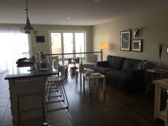
Too much colour?
11 years ago
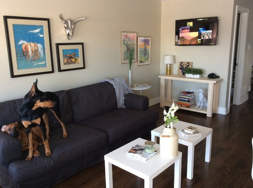
Featured Answer
Sort by:Oldest
Comments (19)
 PRO11 years agolast modified: 11 years ago
 11 years ago
Related Professionals
Kenosha Interior Designers & Decorators · San Bernardino Interior Designers & Decorators · San Diego Interior Designers & Decorators · Montréal Interior Designers & Decorators · West Palm Beach Architects & Building Designers · New Orleans Architects & Building Designers · Oklahoma City Architects & Building Designers · Charlottesville Architects & Building Designers · Newburyport Architects & Building Designers · Altoona Architects & Building Designers · Helena Architects & Building Designers · Medford Architects & Building Designers · Riverton Architects & Building Designers · Athens Kitchen & Bathroom Designers · McComb Kitchen & Bathroom Designers- 11 years ago
- 11 years agolast modified: 11 years ago
 11 years ago
- 11 years ago
 11 years ago
- 11 years ago
 11 years ago
 11 years ago
- 11 years ago
- 11 years ago
 11 years ago
 11 years agolast modified: 11 years ago
 11 years ago
- 11 years ago
 11 years ago
 11 years ago







Related Stories
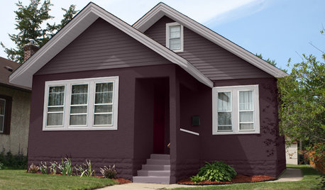
EXTERIOR COLORChoosing Color: 1 Home Has Fun With 5 Different Color Schemes
See a home’s potential for transformation with several new hues. Do you have a favorite?
Full Story
COLORColors of the Year: Look Back and Ahead for New Color Inspiration
See which color trends from 2014 are sticking, which ones struck out and which colors we’ll be watching for next year
Full Story
COLORHow to Add Color if You’re Color Shy
Here’s how to break into the world of color without breaking a sweat
Full Story
COLORColor Feast: 6 Deliciously Uncommon Dining Room Color Combos
Give your mealtime space a generous helping of hues paired in a most refreshing way
Full Story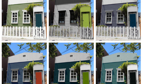
EXTERIOR COLORChoosing Color: 1 Cottage, 6 Striking New Color Schemes
See 6 color palettes for this sweet San Francisco home, vote for your favorite and then find out which one was chosen
Full Story
BOLD COLORColor Guide: How to Work With Primary Colors
Go beyond the ABCs with Mondrian-style renderings and eclectic takes using these notice-me color foundations
Full Story
DECORATING GUIDESGreat Color Palettes: 8 Hot Bedroom Color Schemes
Go spicy, mild or a mix of both with warm and cozy hues in your bedroom
Full Story
COLORColor Fix: Energize Your Room With a Colorful Club Chair
Less commitment than a sofa but making a major impact, club chairs in vivid hues can work wonders
Full Story
COLORNature’s Color Wisdom: Lessons on Color From the Great Outdoors
Nature offers much inspiration for using color at home. Get some starting points and links to deeper guides for each hue
Full Story
INSIDE HOUZZSearching for the Perfect Paint Color? Try Our Color Finder Tool
Houzz’s Color Finder tool will help you find a shade that’s just right. Here’s how it works
Full Story


groveraxle