Software
Houzz Logo Print
rockybird

Shelving unit...does it work here?

11 years ago

I am not sure this works here? It is a long room and I was hoping to divide it up for a separate sitting area. For some reason I am currently obsessed with shelving units. It was a floor sample from dwr.

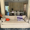
Before shelves:{{gwi:2139726}}

After shelves:
{{gwi:2139727}}{{gwi:2139728}}

{{gwi:2139729}}

{{gwi:2139730}}

Comments (23)

  • 11 years ago

    It definitely works for me. Sometimes when you make a big change from something you are used to, it seems weird. But, as a stranger, I can tell you that the space looks 100% better.

  • 11 years ago

    I like the wide open space in a house of this sort. I think it looks a little "retail" in that location.

  • 11 years ago

    Too many shelving units in one space.

  • 11 years ago

    I like the more open look. Would it fit in the alcove on the right?

  • 11 years ago

    I prefer your room without it.

  • 11 years ago

    Holy cow. Definitely too much for me, but I like things rather plain.

    Maybe if the shelving unit had a back on it, it would be better.

  • 11 years ago

    I like it. The only thing I'd want to do is center on the back of the sofa if possible.
    I love your home! It was nice "seeing" it again.

  • 11 years ago

    My problem with it is that I like what the sofa looks like from the back, and with the shelving unit there, you can't see it.

  • 11 years ago

    I think there's a proportion problem. The sofa is too long and the shelf is too tall. Love the unit, but not there.

    Do those two teak pieces match? I could kinda see them side by side behind the couch...maybe.

  • 11 years ago

    I think there's a proportion problem. The sofa is too long and the shelf is too tall. Love the unit, but not there.

    Do those two teak pieces match? I could kinda see them side by side behind the couch...maybe.

  • 11 years ago

    Super cool house. I like the room better without the shelves in that spot. They are a bit distracting and you lose the open modern feel. I think the sofa does a good job of dividing the room, and looks good from the back.

    Maybe the new shelving unit could go the the right of the doorway, where you have paintings leaning. They would look good framed in the opening to the hall.

  • 11 years ago

    Without.

  • 11 years ago

    Without. . The whole thing screams clutter that can't be seen. You already have lots of small things on the walls with a couple of larger things so view it as a pattern. There is small pattern on the walls and now small patterns on the shelves. You need to bring large scale into the area. However, if you wanted it I would try a metal or dark wood shelf and as mentioned you have too many itty bitty things on it. It might work with one or two larger things per shelf.

    But as you now have it arranged - no.

  • 11 years ago

    I agree--it is great to see your place again. It seems you are still arranging clocks--I see a couple on the coffee table. When I look at the unit from behind the couch I prefer the shelves where the couch backs them. I think an opaque backing on one side might help? Maybe larger pieces on the shelves? All the lines and shapes are just too much. My eye has no where to land. I do like the division idea----

  • 11 years ago

    OH NO! It definitely does NOT work! I would put it where you have those paintings laying against the wall. Another thing is the wood color doesn't work with the rest of the decor, I would paint it maybe even a fun color to go with the decor.

  • 11 years ago

    Kinda looks like a storage room with this new unit. Too much.

  • PRO
    11 years ago

    I'm voting no as well.

    The room already kind of seems unbalanced, and the shelving unit makes it more so. Most of the furniture is on one side of it, kind of feels crammed... then that poor lonely blue chair on the other side of it. I don't like the proportions between shelf and couch either.

    Personally, I would put that shelf on the outer wall where you currently have one of the cabinet shelves. Then put that cabinet shelf somewhere else. Give that blue chair some company with either a table, another chair, or both.

  • 11 years ago

    I'm in the no camp. You already have a lot of little things around, and the shelf not only blocks the view in what is otherwise a very clean, sharp space, it adds more little things and starts to look like, as CL called it, room dandruff. The room, the styling and the colors speak minimalism...the shelves do not.

  • 11 years ago

    It's real busy and cluttered looking with the shelf. Another thing that I notice is those little small collection pieces displayed on that big shelf are just too tiny and don't really look right on that big ol' shelving unit.

  • 11 years ago

    Thanks guys! And thanks for the comments on the house! That's a big help. I was worried that it looked too cluttered. I dont think I can put it against the wall with the leaning tile pieces as there are three bedroom doors there and I'm afraid it will interfere with entry.

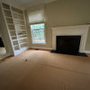
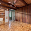
    Below is the other wall. I could combine the danish pieces (they are the same manufacturer) and put the shelving here, as suggested by robotropolis (I think?). Or put it in the recessed wall or move it to the master closet to put clothes on.
    {{gwi:2139731}}

  • 11 years ago

    I prefer the taller shelving on the perimeter of the room.

    Of course, the room is very much a work in progress, but I think you need some sort of unifying influence -- more than just the artwork and the Danish furniture.

    Perhaps a very large rug ... or one large rug for each conversation area, with the same main color. I prefer a rug (or rugs) over wall-to-wall carpet in this case. [If you can't find what you need, an option is to buy carpet and have the edges bound to make rugs the exact size(s) you need for each conversation area.]

    I think the sofa does a good job of dividing the room, and looks good from the back.

    If the finished room will have two conversation areas ... and there will be artwork all around the perimeter (both hanging and in cabinets/shelving) ... and you will want to be able to walk in front of the cabinets, shelving, and walls in order to appreciate the artwork (especially the smaller pieces), are you going to be able to walk around that sofa on both sides without having to sidle between the sides of the sofa and the seating perpendicular to the sofa on each side? [You do need to access the far seating area from around both sides of the sofa.]

    Think of the overall seating plan as a figure 8 -- though obviously the 8 can't be entirely closed, or you wouldn't be able to access either one of the seating areas.

    Which raises the question of whether the seating area at the far end of the room is accessed through the seating area in the front, or from one or both sides? You already have various entrances into the room, as well as possible aisles around the perimeter so that the artwork can be admired....

    In your place, I would be measuring everything, plotting the dimensions of the room on a double sheet of graph paper, and cutting out pieces of construction paper (in the appropriate colors, of course) for all your furniture, as well as various sizes of chairs and tables which you don't have yet (make those all the same color, maybe gray). [I grew up moving all over the country and regularly saw my mother fine-tuning furniture arrangements in the next house by this means, so it's always been natural for me to do it for homes and workplaces. My brother refers to this as 'playing with your paper dolls.']

  • 11 years ago

    missingtheobvious -thank you for your comments! They are very helpful. I know the room looks disorganized. I have a nesta rug that I need to install in the seating area where the blue chair is.

    I agree with everyone here - the sofa looks great from the back. It is a florence knoll sofa from 1958.

    I think the sofa is accessible from either side. Unfotunately, it is so wide, I cant move it over much more.

    I am thinking of just moving the shelving unit to the master closet area. If I put it against the wall, I will have even less space for the clocks, which are collector's items. The ones on the bench are ones that I dont have room to hang.

  • 11 years ago

    I guess I am the odd man out. I love the shelves as a room divider!!

Sponsored
J.Holderby - Renovations
Average rating: 5 out of 5 stars4 Reviews
Franklin County's Leading General Contractors - 2X Best of Houzz!