Software
Houzz Logo Print
jhgifford

Need help with a backsplash, please.

11 years ago
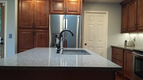
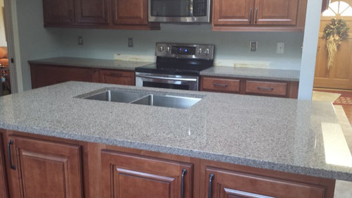
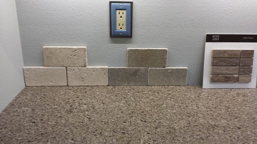
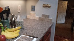
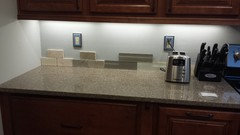
We picked cabinets and countertops so easily, but can't seem to pick a backsplash. Please help. Cabinets are maple with an artisan glaze. Countertops are pental quartz pebble beach. Paint is Devine Horizon (light blue). Not really looking to change the paint. There is also a small cabinet in the corner that needs a backsplash as well. Current backsplash options include a cream travertine, and a tumbled seagrass in 3x6 tiles. Also looking at Walter Zanger Moda in machiato.
Thank you! Jill

Comments (32)

  • 11 years ago
    Forgot to say that my husband doesn't want glass!
  • 11 years ago
    I like the lightest color one. It seems to brighten up the countertop and cabinets. Other ones seem too dark
    jhgifford thanked Jennifer Hill Neu
  • 11 years ago
    last modified: 11 years ago
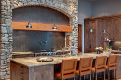
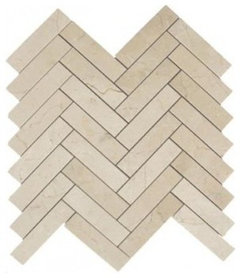
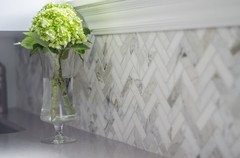
    Your kitchen feels very earthy and natural so I think the stone is a good choice, but maybe consider a tile that is a bit narrower and longer and lay them in a herringbone pattern using lighter grout. A modern look, but still warm and also different. houzz=
    Apple Farm · More Info
    ]
    jhgifford thanked Maureen
  • 11 years ago
    What about a vertical pattern with the tile? Or is too contemporary? I'm leaning to the lighter one. I really like your choice on cabinets and counters! Pretty!
  • 11 years ago
    Yes, we installed under cabinet lighting. And I know what you mean. I think that is my problem. I don't love any of them! But we ruled out a lot of others over these. I don't want a lot of competition with the countertop.
  • 11 years ago
    last modified: 11 years ago
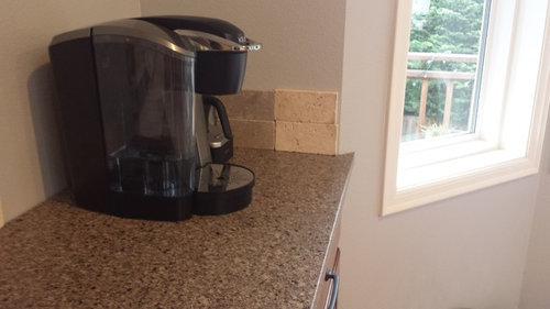
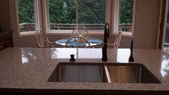
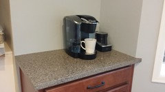
    I definitely lean more traditional. Here are a couple more photos. One to show where coffee cabinet is...to left of window. Faucet looks funny b/c it is not installed yet. Happening today!
  • 11 years ago
    The lighter one is the best out of what you have so far. I do think that adding a brighter color, or something with more contrast will make the countertops stand out.
    jhgifford thanked User
  • 11 years ago
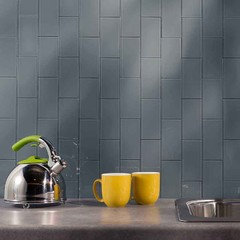
    YourCeiling, I do like the color of the subway tile. Do you know what it is? Also, what is the material in left picture. It is pretty cool. My husband joked that it looks like a breastplate of a Klingon....I think that means he likes it. LOL!
  • 11 years ago
    Maureen, do you know what tile that is in the picture you posted? thanks!
  • 11 years ago
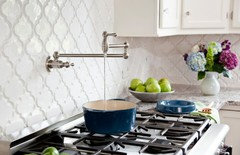
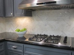
    Keep it simple--you'll thank me later : ) This is called long crema marfil laid in a herringbone pattern. Or how do you like this arabesque--it comes in cream, too? Keep your backsplash lighter than the counters.
    jhgifford thanked leelee
  • 11 years ago
    last modified: 11 years ago
    If you click in the link under the picture, there are comments and they mention grey mosiac that are 2X6 - I think it's their proportion that make them so nice. Good luck.
    jhgifford thanked Maureen
  • PRO
    11 years ago
    I think you need something that flows almost seamlessly color-wise with your counter top. Maybe glass so there is some reflection. I feel like introducing another color is throwing things off a bit. I almost don't want to notice the backsplash, just a little shimmer. Good luck :)
    jhgifford thanked Color Zen
  • 11 years ago
    leelee, I am trying to keep it simple, but I think that is why I ended up with fairly dull choices? I do like the herringbone pattern, and you are the second person to mention it. Don't think I like the arabesque. Maybe a bit too frilly? It also appears as though I like the tumbled, earthy look over the honed.
  • 11 years ago
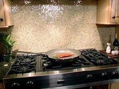
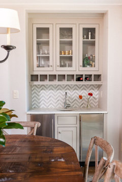
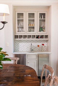
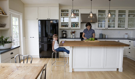
    You might need a little shine to reflect light--that's why I gave you the picture with the tiny squares. I love the herringbone. It's simple and very subtle and won't overpower the counter. Here are some more examples ( not choosing these to match your counters) just to give you some ideas.
    jhgifford thanked leelee
  • 11 years ago
    leelee, what were the tiny squares? Glass tiles? And I see the crema marfil on houzz as 1x3s..don't see anything longer.
  • 11 years ago
    I like the darker colored backsplash sample that you have there.
    jhgifford thanked horselover222
  • 11 years ago
  • 11 years ago
    I'm guessing they're marble that's been polished. You know, the kind that comes on a 12 x 12 sheet. Don't think they're glass.

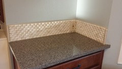
    One other idea is to cover only your back walls with tile. In other words, don't try to wrap around at the corners. Because then, where do you stop? Notice how they kept it just on the back wall?
  • PRO
    11 years ago
    I like the light tumble marble you picked. It's very neutral, not something you will get sick of right away.
    jhgifford thanked Canterbury Custom Homes LLC
  • 11 years ago
    leelee, agreed! Except something needs to fill the small gap between counter and wall. Was worried a caulking of some sort would look ugly and get dirty. Similar problem with coffee cabinet in corner. Small edge of tile or up higher?
  • PRO
    11 years ago
    I think the lighter color stone goes best with your colors. It keeps it light and picks up the lighter flecks in your countertop. I would suggest looking at a slightly larger subway stone tile size, like a 4x8 or 3x12. The larger sizes are very popular with my clients and added a bonus of fewer grout lines.

    I do like the grey marble options others have mentioned but I would recommend a honed finish, not a polished finish for a kitchen. Marble etches very easily, so to avoid those dull spots in a polished finish I'd do the honed so you'll never notice the etched spots
    jhgifford thanked Shellee Anderson Design Studio
  • 11 years ago
    I think a bluish gray subway tile would look good. Husbands!
    jhgifford thanked Natosha Schafer
  • 11 years ago
    Thanks so much, evreryone. I'm headed to the tile store today for more samples. Any last minute thoughts or pictures, please fire away!
  • 11 years ago
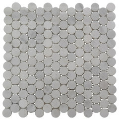
    I'd look for something even lighter. White would be ideal, IMO.
    Statuary Carrara Penny Round Mosaic Tile · More Info

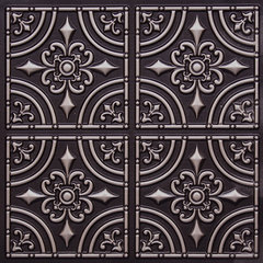
    I also like the look of tin tiles for your kitchen!
    Wrought Iron Faux Tin Ceiling Tile · More Info
    jhgifford thanked Emmy
  • 11 years ago
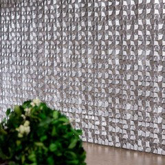
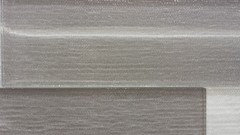
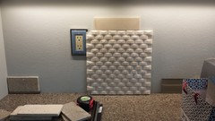
    Color Zen and all, I went back for more samples. I think I need to have my husband reconsider glass. I picked this up and love it...."just a little shimmer". The photo makes it look a lot darker than it is in person. It is a grey seattle day and not a lot of light coming in at the moment. So I took a close up with second picture to show the color better. Tell me what you think!
  • 11 years ago

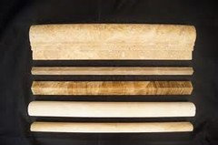
    You could use a very small pencil tile to fill the gap between counter and wall.


    jhgifford thanked leelee
  • 11 years ago

    Actually, the wall is already butted up to the counter so there doesn't have to be a problem that needs solving.

  • 11 years ago

    Keep the backsplash lighter than the counters and the walls.

  • 11 years ago
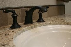
    Thanks, Leelee. Was looking at trim pieces today. I like how the photo of the sink you posted shows me that my trim doesn't have to match. Very helpful! And I do need something. There are small gaps, and if liquid spilled, it would go down between my wall and cabinets, where I can't get to it. Would be disastrous.
  • 9 years ago
    2 year old post

  • 9 years ago
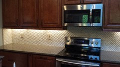
    Well seeing the new comment made me realize I never posted the end result. Here is what we went with! All the suggestions were a big help in our decision!