Software
Houzz Logo Print
jill4feet

Where should I place couch and loveseat?

11 years ago
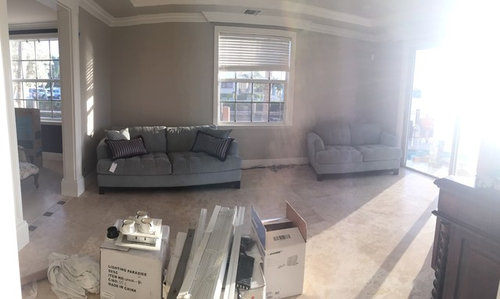
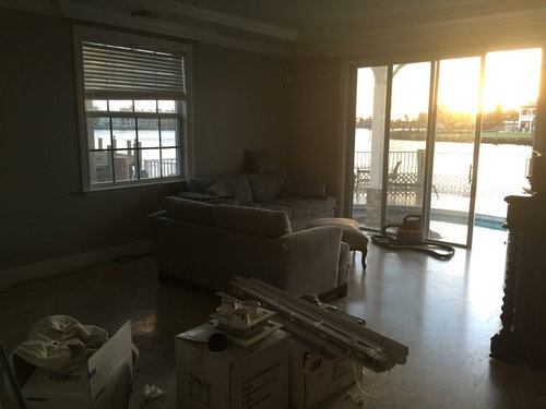
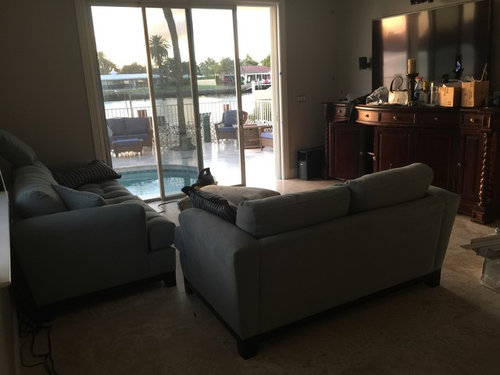
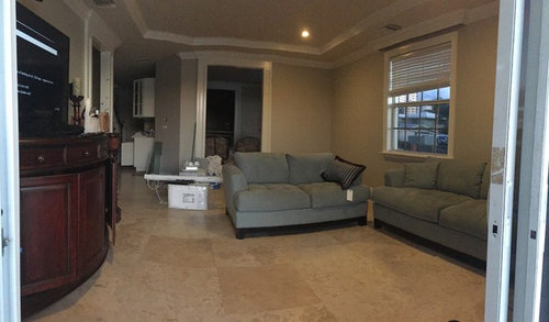
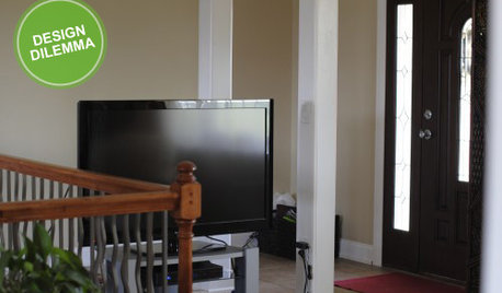
Please, Help with furniture placement for this room.
1. Couches and loveseat on either side of window?
Or...
2. Couch and loveseat in L shape

If L shaped, what do I do behind loveseat? A bistro table perhaps to sit coffee, wine?

I also need to find a rug, drapes and rest of the room furnishings. Help please with suggestions.

Comments (4)

  • 11 years ago
    Definitely put them in an L shape and not on the wall on each side of window.

    When you put them in an L shape do not push the sofa to the end of the wall, but put it under the window.
  • 11 years ago

    Center the sofa on the window, then place loveseat on the right, facing the patio doors. You might also want to get a chair for the side near the slider.

  • 11 years ago

    Consider a writing desk behind the loveseat - tall lamps - with an upholstered straight chair, and use the back corner for something tall and dark - a bookcase? to help balance the tv / credenza. Add a small chair at the left side of the sliding door angled back into the room. Looks like you have dining area adjacent anyway. . . You can use symmetry with large portrait scale "twin" art canvases on each side of the window over the sofa . .

  • 11 years ago

    Jill - I see the adjacent chairs and the lovely stone floor with the blue . . I'm a blue fan and see you've water outside to carry off a real blue and sand sort of palette. May I suggest:

    1. If you want to use this entertainment credenza here, consider using a polyshades matte in a darker wood tone to help the carvings go sort of island colonial antique for you. It would make the room feel ever so much bigger if you hang the television on the wall and use a picture frame molding in the same dark wood tone around it on the wall - that buys about 8" of space above the piece and lets this gorgeous casework feel like a bar with its height - even use a bar tray on it with a carafe of water and some short highball glasses, some gorgeous coasters. The dark will balance the sand -sky palette better than the red undertone in the wood now. It is a big nice piece but you want to marry it to the blue sofas and this is the way to do it.

    2. Stick with the dark wood and a bit more ornate style for the tall bookcase and let it be on the wall opposite the door . . maybe the x sides that also sort of reference that bahamas vibe but skew modern. Ballard has these I think . .. use really contemporary abstract art - real if you can afford it, and echo the sand tones with something pretty monochromatic.

    3. Then, go eclectic with the coffee table - not mid-century and not colonial - maybe a cerused oak or birch to echo the blond, sand tones and echo the floor. A pedestal cerused oak round but in the coffee table height would be perfect . . you could also use a driftwood finish that echoed the walls . . but not gray gray / must be warm gray and light - edgecomb ish.

    4. Add drapery in the floor tone, if only for the softness and sound absorption they add and to repeat the sand color against the wall which is a little deeper.

    5. Your blue is a sky blue, not a blue-green. In your choices of textiles, for the first 7 of 10, make sure they are true blue undertones and not blue green undertones. You can mix in a few blue greens at the end (Sarah richardson was all about 10 textiles in one space - now that's expert layering!) but they need to be in combination with true blue to have the balance come out right. You can skew into predominantly blue green in a bedroom or distant kitchen adjacent no problem but in these public rooms, denim is about as blue-green as you can go in the main things. Stay away from teal with this blue. Due to the size of your space, carry the sand and sky colors through all your public spaces. Your outdoor textile is perfect for this approach as is. I'd love to see a wide sort of awning stripe on your dining chairs - maybe run horizontally to add that little bit of contemporary feeling -Color wise, also, with the sand tones, be careful with yellow - add only those paired with beige / warm grays / dijons . . here's a great pillow fabric for you as inspiration - suzani http://beautifulfabric.com/asccustompages/products.asp?fav=0amp;fpage=1&page=1&categoryID=18&productID=9645&pStart=800&recNum=855

    6. Blue does seasons well when properly paired - you can add lots of seasonal linens / dishes/ items in forest green at Christmas, red for fourth of July, pumpkin for fall, and lots of white and mixed pastels for spring / summer / easter. Seeing the pool, considering the seasons, I would upholster the corner single chair with a print for 6 months of the year and when it is warm enough May to October, have your local upholstery guy make you a natural canvas slipcover that you can zip on top of it during that season - you'll have more activity, won't have to worry and it will take the room in a summer direction that feels fresh every year. You can extend that with blue and off-white slipcovers for your dining chairs with tabs around the base of the back with velcro . . again, with a photo, your local upholstery guy can do wonders . . but shop the fabric first yourself / take in a sample and get close or buy your own / ship him the fabric roll after he prices it for you labor wise.