Software
Houzz Logo Print
walka01

Living room

11 years ago
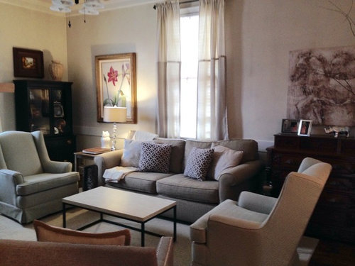
Any suggestions on final touches?

Comments (52)

  • 11 years ago

    Great advice from decoenthusiaste. It is a really beautiful space so far. I feel like there may be too much furniture though. Are the chairs by the fireplace used? I don't think you need them. Then the fireplace would be more of a focal point too.

  • 11 years ago
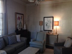
    I do like these two prints switched. I was thinking about a darker gray curtain.
  • 11 years ago
    last modified: 11 years ago

    Much Better. Have you tried the mirror and FP piece switched? If you replace the curtain, try extending the rod so that the drapery just covers the inner edge of the window frame and mostly hangs over the wall on each side.

  • 11 years ago
    last modified: 11 years ago

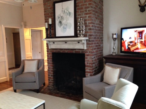
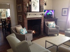
    Small suggestion. Could u remove that silver candlestick? near the tv? It takes away the focus on the fp. Also, could you try those blue print pillows from the sofa to the two chairs by the fp? Those chairs are very bland. Good luck.

  • 11 years ago

    Also, is the artwork on the fp upside down?


  • 11 years ago
    I don't think it's upside down.
  • 11 years ago
    Thanks for all the suggestions!!
  • 11 years ago
    Not really feeling this print here. I feel like it looks so small now.
  • 11 years ago
    The chairs are new CasdidyZ. I would like to possibly add some color with pillows.
  • 11 years ago
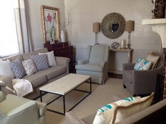
    The print is more balanced with the lamps weight wise. What happened to the medallion (or whatever you call it)? Would it work over the fireplace? Darker drapes and a chandelier would look great as previously suggested. Nice room. You are almost there!
  • 11 years ago

    I agree, the print doesn't have the right visual weight next to the other picture. I do expect the round mirror may be too busy against the brick too. Always worth a try though.


  • 11 years ago
    What do you think of the new pillows with color?
  • 11 years ago

    Gorgeous!

  • 11 years ago
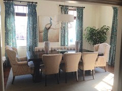
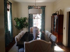
    My dining room has the blue color in it also. Which you can see from the living room.
  • 11 years ago
    Ah ha! Really like that slightly turquoise color in the new pillows and it seems that is the same basic color as in dining room curtains? But it clashes with the old blue pillows on sofa .... Repurpose those and add just one turquoise there...keep the rest in the cream-tan tones. Once you do that, I think you're done! Very very nice!!!
  • 11 years ago
    I know it's hard to tell in the pic but the ones on the couch are actually gray. Do you think gray is ok?
  • 11 years ago
    By gosh I think u r there!
  • 11 years ago
    Think grey pillows should go.
  • 11 years ago

    That's a nice cabinet in the back on the sofa wall but it just seems to be stuck back there. Could it go in the dining room? It's like you didn't know where to put it and it crowds the otherwise great look of your room.

  • 11 years ago
    No I have a china cabinet in there.
  • 11 years ago
    Dining room.
  • 11 years ago

    I was starting to get into the neutral palette when you popped in those turquoise pillows. I agree you can bring the same blue into the living room, but keep it in the same hue. Those seem a bit intense compared with the color next door.


  • 11 years ago

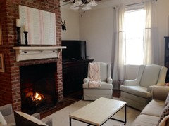
    I feel the room is too crowded with the sofa and four chairs.

  • 11 years ago

    I tend to agree with Heidi Ma, and I think the two short ones at the FP should stay. Maybe the other two would work well in the master bedroom.


    Traditional Bedroom · More Info


  • 11 years ago
    Oh no don't say that!! I really want all of the chairs to stay.
  • PRO
    11 years ago

    its a lot whats going on in here. I have not seen so many beige/gray colors together that actually make it look busy.

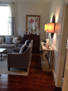
    put the console table behind the couch and let the lamps flank the window.

    move the table in the corner behind where the console was. and move the horse painting there as well.

    eliminate the glass ball lamp.

    remove the bookcase.

    move the chairs near the couch to angle more at the fireplace. put the end table between the chairs closer to the tv.

    put the flower painting where the book case was.

    put the shorter gray chairs to the sofa side, and the taller to the FP side.

    i may even say loose the other espresso console all together.

    try hanging the leaf picture over the FP vertical. and remove the silver vase.

    put something with some color on the coffee table.

    you have lovely things, and great taste, but its just a lot and makes the room crowded rather than cozy. people might feel like they will bump into or move around something every where they go.


  • PRO
    11 years ago

    What about the ceiling fan? is it new? do you use the fan?


  • 11 years ago
    I live in South Carolina so yes it has to stay. Lol. There is one in almost every room.
  • PRO
    11 years ago

    Coming into your discussion a little late - sorry! Just found your post regarding this lovely room.

    I see a couple of things that you could think about that might make you more comfortable in this space. Sometimes we "feel" something is a little off without knowing it.

    So, let's see what you think about these ideas.

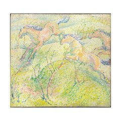
    The horse print and the branch print should be hung on each side of the window. They are the most alike of your art pieces and will calm the window wall down. The lily art piece could be hung over the fireplace, blending in with and enhancing the reds in the brick. Hang the round mirror over your console table where you had it, but lower it.

    Think about placing the taller chairs beside the fireplace and the lower backed chairs at each end of the sofa. This will open up the center of the room more - make it feel more spacious. Remove the vase on the mantle - - it is too big for that placement. Try it on the cocktail table.

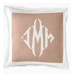
    Use the Cocktail table for a simple table scape - the vase, large scale books, small sculpture [great against the light color sofa], etc. Make sure to include some shades of your lily painting and bricks here. Add one or two pillows with reds, blues [from the DR], naturals, that have nice texture [you could use more]. Monograms would work nicely in here - tone-on-tone, for example. Wheat velveteen pillow cover w/ brick monogram maybe in the low-backed chairs. Do not go pillow-crazy. You do not need a lot of them so keep them to a minimum.

    The drapery panels are good. Adding darker ones will chop up the walls and cut some natural light.


  • PRO
    11 years ago
    last modified: 11 years ago

    Things got a little screwed up above and I don't know what I did - 2 pillow ideas . . .

    Monograms can be done several ways. If you or someone you know is a sewer, that helps with the cost. Independent monogramming companies are all over the place and the cost is reasonable. These pillows bring personality to the space while adding subtle pattern and color.

  • PRO
    11 years ago
    last modified: 11 years ago

    can we pick a new one?


  • 11 years ago
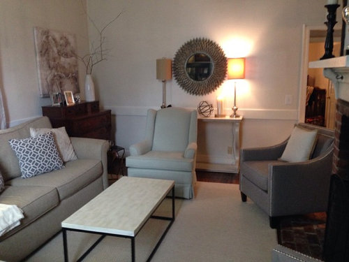
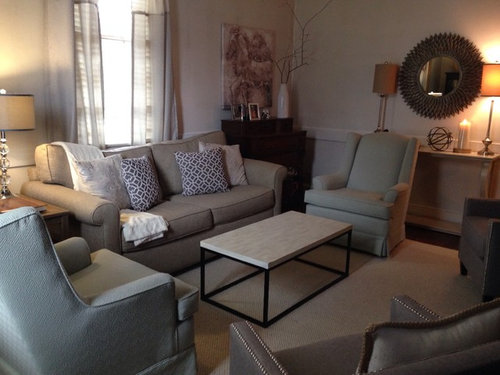
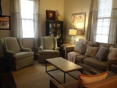
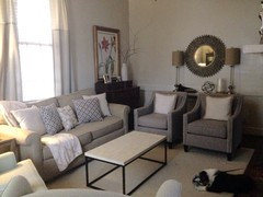
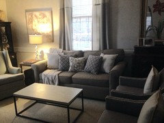
    How about this arrangement?
  • 11 years ago
    How about the print this way?
  • 11 years ago
    last modified: 11 years ago

    Both of your changes are big improvements! I love how cozy it feels. Can you post a photo of the view from the couch of the fireplace/tv now?

  • PRO
    11 years ago

    The placement of the chairs is better. However, the pair in front of the console table is hiding this table, so you could find another wall in your home for the table and let it shine there. Then, pull the chairs back some.

    The taller back chairs look nice where you put them now. Place a larger/taller table between these chairs + a lamp.

    The horse piece of art needs to be moved to the other side of the window. As it is now, the horse looks like he is running out of the room! Instead, you want the image to lead you into the space. This may seem trivial, but these small details help make the room flawless.

    On the other side of the window, hang the branch image. The tall cabinet is dominate in that corner so a lighter - looking piece would do better there. This would open up that side of the room.


  • 11 years ago
    Beautiful room. I would add a little more color in the way of pillows, lampshades, and accessories in red or some variation.
  • 11 years ago
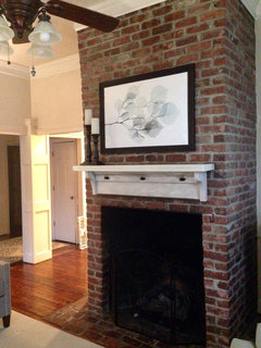
    I added a new print on the fireplace today to add a little color.
  • 11 years ago
    For what's it's worth I am not liking the new picture on fireplace. Take your time you will find something u love and won't need our advice because it will make u happy!
  • PRO
    11 years ago

    The new print above the fireplace is very fitting with its subtle hues. Gorgeous room! Everything looks amazing!

  • 11 years ago
    If u walk in the room and say to your self I love that picture, then it's the one for u.
  • PRO
    11 years ago
    last modified: 11 years ago

    I am a little confused because the mantle/shelf on the fireplace feels rustic while your new artwork looks contemporary. That is fine if you like a more eclectic look, but are somewhat incongruous if you would like one solid style.

    In either case, it would help if you painted the mantle/shelf something darker so it melts into the brick façade. Then, the artwork would be the focus of that fireplace wall - not in competition with the light colored mantle/shelf. Painting or glazing or staining the shelf a dark or matching the color of the grout would soften it and help to make it one with the fireplace - leaving the artwork the star of that brick wall. To try this idea, simply remove the shelf or drape a dark, neutral towel, for example, over the shelf.

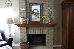
    In this example, the art piece is the star of this wall because it is the lightest value on the wall. The mantle groups more with the brick because it is darker than the artwork and closer in value to the bricks.

  • 11 years ago

    EDIT EDIT way too much furniture and accessories Sorry

  • 11 years ago
    I'm thinking the print is going to go back. I'm feeling like it doesn't fit the space even though I love the colors
  • 11 years ago
    I'm confused about removing furniture and accessories because a lot of the pictures I see on houzz have a lot of both.
  • PRO
    11 years ago
    last modified: 11 years ago

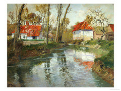
    Artwork. A good way to go about shopping for a new piece of art is to think about the style of the image you would like, contemporary, old master, rustic, etc. The colors you are working with and the size and shape.

    Here are some pics of artwork that might work in your particular space. I looked for a presence of a shade of green [because green is the compliment of red and so these 2 colors work to make more of a hit of wow]. I also looked for a touch of red, to pull in your lily piece. This spot needs more pizzazz than the white one you found. The images are organic so they do not bicker with the strong lines of the grout in brick wall.

  • PRO
    11 years ago
    last modified: 11 years ago

    i agree that you just have too many things in here, and some are becoming hidden by other things. The LOt of pictures you see on houzz... the room square footage is larger or laid out in a more square fashion. Your room is small. yes you can layer, but its a bit exteme.. the eye goes all over the place, and I feel like i would bump into something every where i turned. let alone if people where sitting on the couch and trying to get by the people in the chairs...there goes a knee cap on the coffee table. " or exuse me, sorry i need to get by.." People need to feel like they are not crowed into a fish bowl. this is why I say either eliminate, 2 of the chairs, or the hutch and the console table. breathing room is better than a room with too much stuff.
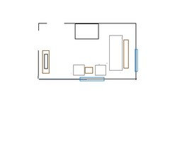
    what about moving the tv from the corner? putting the couch across the side wall, two chairs facing the fireplace? or have the couch on wall that you enter on and two chairs across from the fire place and the tv on the right wall?

  • 11 years ago
    I think we are off track again! The room is finished and beautiful and the guest ion now is the choose of art for fireplace.
  • 11 years ago

    Guess I am really confused!! In the beginning of the thread, once the 2 pictures were switched, you were quite pleased with the room. And you should be! I love the 'rustic' fireplace against the refined upholstered pieces. And I totally understand why you want all the pieces in that room. Why not go back to the original placement, sit back and enjoy it for a while? It was gorgeous!!

  • 11 years ago
    I totally agree! You have a beautiful room! Enjoy!
  • 11 years ago
    Thanks ladies for easing my mind.