Software
Houzz Logo Print
estonge80

Glass tile backsplash

11 years ago
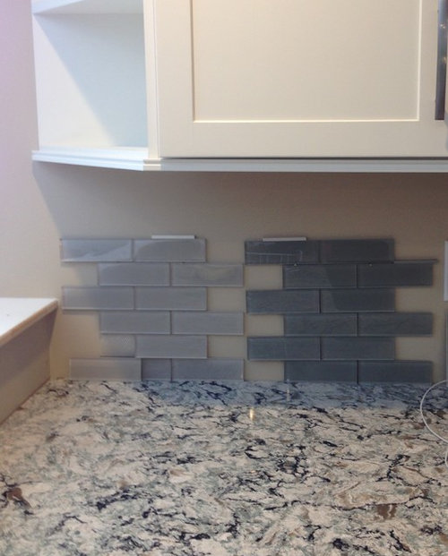
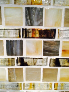
Having a hard time choosing between the light or dark glass tile back splash for our new kitchen. They are both Anatolia with the lighter one being most and the darker one being smoke. I tend to like light cool tones. The Quartz is Cambria Praa Sands and the cabinets are a soft white. Our island is Graphite and the fixtures and appliances are all stainless steel/brushed nickel.

Comments (37)

  • PRO
    11 years ago

    The darker really allows the cabinets to pop as well as bring out the color in the granite. Looks great!

  • 11 years ago

    I like the darker one...

  • PRO
    11 years ago
    I love the darker one. It separates the light cabinets and countertop and makes both pop!
  • 11 years ago
    Darker
  • 11 years ago
    Darker!
  • 11 years ago

    I do not like glass tiles. I would go with the tried & true off-white porcelain subway tile in a running bond, close together with a medium gray grout. Classic, timeless. cheaper too.

  • 11 years ago

    I would pick the darker one. The light gray seems to make your "white" cabinets pull a yellow undertone. Don't see it at all with the darker. Go for it!


  • 11 years ago
    I prefer darker also.
  • 11 years ago

    Never choose a darker backsplash. Always go lighter. Think of a backsplash as an extension of the paint on your walls. Would you paint your walls the darker color? Do you want to close in that space or open it up?

  • 11 years ago

    There was a an earlier dilemma posted on this same subject-trying to choose a backsplash tile. At first the person posted a picture of just the counter and backsplash, but once the person posted a picture of the entire kitchen, including the floors, cabinets, island, and the walls, everyone changed their minds as to which tile worked best.

    My point, is it's hard to tell which backsplash tile looks best in isolation. Can you post a picture of your kitchen from a distance, so we can see the floors and all the cabinets including your island? This will give us a better idea of which backsplash works best with all elements in your kitchen :-)

  • 11 years ago

    I think glass doesn't go with your traditional kitchen. I agree with Sandra. Go with a traditional porcelain tile.


  • 11 years ago

    Do we know that this is a traditional kitchen from the small picture that was posted?

  • 11 years ago

    I agree with Karen. A picture including the floor is needed to better see/understand the whole kitchen.

  • 11 years ago
    darker
  • PRO
    11 years ago
    Glossy glass will show every spot and cast a shadow to magnify it, so imagine cooking bacon next to a window. Make sure your tile installer reads the installation procedures, it requires special adhesive ($$$) and blades / techniques for cutting (back needs to be scored before top is cut). The white adhesive cannot ooze through the joints, it will visually jump out if you use a grout other than white (you can see through the sides of the glass to the bottom of the tile). Have your installer make you a grouted sample before they do the install and use tiles that have cuts (cuts can be jagged / rough). Matte finish glass is much easier to work with but also shows grease (imagine cooking bacon next to a chalk board). Ceramic is timeless safe and easy to work with. That said I have no maintenance glass installed in my kitchen by the beach but it would not look good in your kitchen.
  • PRO
    11 years ago

    You have the option to really make then stand out. There is nothing wrong with going darker. Color is very important. What you don't want is it to look like every other kitchen. That tends to happen when people get to comfortable with one look. Design and decorating is about doing something new and fresh. If everyone did the same thing there would be no need to Designers. Take the risk, it will be worth it.

    I work with a lot of high end builders and they still use what is considered by industry standards traditional cabinetry usually white. However, they are stepping it up with chrome handles and knobs as well as chrome lighting. there is nothing wrong with mixing traditional with a cleaner contemporary look. I would not get yo crazy with that, but it does make it interesting.


  • 11 years ago

    The darker one really makes the stone stand out.

  • PRO
    11 years ago

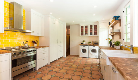
    This kitchen had yellow high gloss tiles as a back splash.

    The new home owner really wanted a little more of a twist so this is what we came up with. This is a very traditional kitchen.


  • 11 years ago

    Darker one for sure!


  • 11 years ago
    last modified: 11 years ago

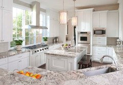
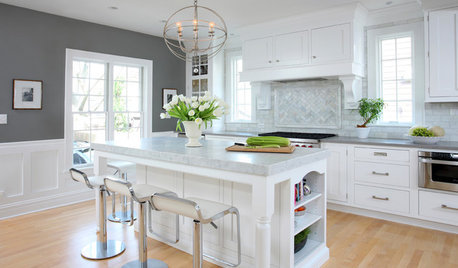
    Here is a kitchen that appears to have all the elements that you posted (close enough) :-)
    Note that the back splash is a light glass tile.

    Karen Dumont made a lot of sense when she posted her comment about seeing the whole picture i.e. your kitchen in this instance

  • 11 years ago
    Dark.
  • 11 years ago
    Lee lee, sorry disagree with comment.
  • 11 years ago
    Lee, I also disagree with your comment. The darker one looks far better with the countertop. Which is the design book that taught you that dark colors should be avoided!? Have you seen a show room or an ad of Italian furniture against a light background? Well I am a professional designer....and I haven't.
  • 11 years ago
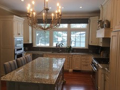
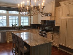
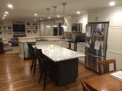
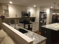
    These are other pictures of the majority of the kitchen to get a better idea of the design
  • 11 years ago
    The dark, definitely. It makes the entire room pop.
    The light is just blah.
  • 11 years ago

    Thank you. That's a big help. Lovely kitchen and I think either of your choices will be perfect. There is nothing that either one of them will be fighting with. Nice job on your kitchen!

  • 11 years ago

    I'd love to see finished pics when you're done!

  • 11 years ago

    Think the dark would add just the right zing

  • 11 years ago

    Like both. The light tile will add subtle beauty, while the dark will add drama and lots of contrast. Good luck and keep us posted. Can't wait to see :-)

  • PRO
    11 years ago

    Darker one.

  • 11 years ago
    Thank you everyone, your perspectives and insight have been very helpful
  • 11 years ago

    Really like the dark--think the light one looked blah!


  • 11 years ago

    That coordinates beautifully! Great, great job on your kitchen!

  • 10 years ago

    Hi. I know this is older post but I was wondering what paint color you used on your kitchen cabinets? Your kitchen pictures look great and the cabinets seem to be in the same kind of lighting as mine but I'm just having a difficult time finding a soft white paint without yellowish undertones! Thank you!

  • 9 years ago
    Hi- I know this is an old post but love your kitchen. We are redoing our kitchen and are going with White cabinets and the Praa Sands for center island. It is hard to tell from the picture – what color paint is your center island. Really looks beautiful!
  • 8 years ago

    Hi. Your kitchen is beautiful. We are doing Praa Sands counters and Smoke tile backsplash, thanks to you. Would you mind telling us your wall color? We are not sure if we should go more beige or gray. Thanks.