Software
Houzz Logo Print
designerdanny

decorating dining and living room

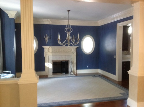
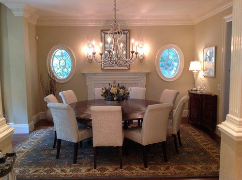
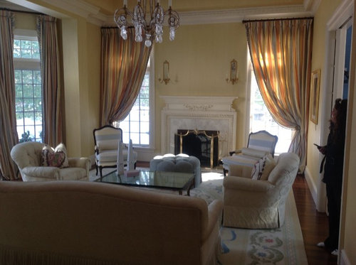
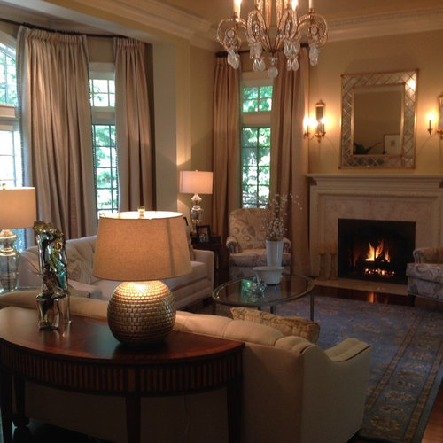
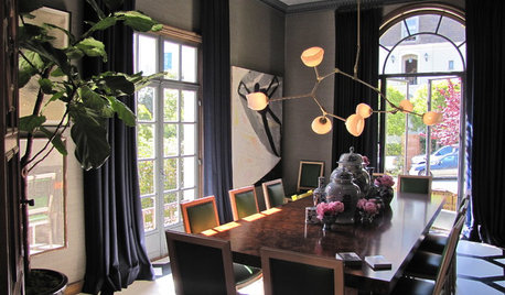
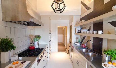
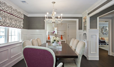
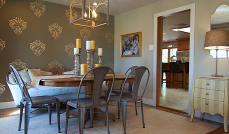
I have a client who purchased a beautiful high end home and even though the previous home owner had good taste she wanted to make it her own. Here are the before and afters.

Before

After

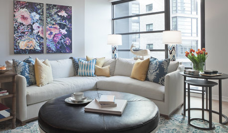
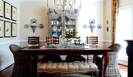
Living room before

After


Comments (52)

  • PRO
    11 years ago

    Thank you so much for your feedback. As designers we like to think everything we do is amazing but hearing it from others confirms what was done is appealing.

  • PRO
    11 years ago

    Great, warmer tones....very classy !

  • 11 years ago

    Beautiful!

  • 11 years ago

    Excellent!


  • 11 years ago

    The blue was so much better.


  • 11 years ago

    Lovely!

  • 11 years ago

    WOW amazing!!!


  • 11 years ago

    What colour did you paint the dining room walls? It looks great!

  • 11 years ago

    Looks great!

  • 11 years ago

    I love the round table

  • 11 years ago
    last modified: 11 years ago

    WOW...amazing! Before it was a decorated "space".. no personality. Now - the "after"- exudes warmth, personality and looks so much more like "home". ;) Great job!

  • 11 years ago
    The blue had much more personality
  • 11 years ago

    It sure did.


  • 11 years ago
    Everything about that DR - wall color, rug, round table - is simple stunning!!!! What color are the walls??
  • 11 years ago

    My laundry room is that color blue, so I do like it; but to me the AFTER wins hands-down.

  • 11 years ago

    Noticed that you changed out the rugs in both DR & LR for darker backgrounds, and you lightened the walls in the DR. Like the changes in color!

  • 11 years ago

    Both rooms were greatly improved and really lovely!

  • 11 years ago

    I'm crying for the parts of the fireplace mantels that were removed. Other than that crime - nice.


  • 11 years ago

    Too much blah beige!

  • 11 years ago

    Beautiful. The natural colored walls with accents is the best way to go, dark colored walls most times are to much. Love all the rooms

  • 11 years ago
    I'm so over the dark colors. Your palate looks calming and elegant. My living room is very similar, and as I redecorate I am keeping your design in mind.
  • 11 years ago
    Warmth, convert, serene, classy... Well done !
  • 11 years ago

    That looks beautiful! Great work.

  • PRO
    11 years ago

    Thank you everyone for your comments. As a Desiger you only have so much say with anything you do. The Blue is nice if you like Blue. This client did not. That was the first thing she wanted changed. The color of the room is Monroe Bisque by Benjamin Moore.

  • PRO
    11 years ago

    It is much easier to change the personality of a room with just changing out pillows or accents then having to paint room. The trend seems to be getting away from darker walls and lighter walls are in.

  • 11 years ago

    Mirrors over both fireplaces? Would prefer one to have artwork.

  • 11 years ago
    I think the fireplace, crown and oval windows pop more with the blue walls.. The redesign is not bad, just a different direction and feel.
  • 11 years ago

    Hey Daniel, quit beating your own drum. Basically, you picked out two new(safe) paint colors. If you can't do that without expecting a pat on the back, then you are definitely in need of a little self-confidence.

  • PRO
    11 years ago

    there is no need to be rude. This is about sharing ideas. There was a lot more involved with this project then choosing colors. That was just the first component to making this dining and living room come together. Apparently you really don't know much about decorating or you would have known that.

    The great thing is we all have opinions and that is what makes the world go around. Thank you for your comments however Houzz is a place to show ideas whether it is just color or placing a lamp on a desk. The concept is to allow people to get ideas from things you have done. These 2 rooms had a budget of 60,000. I think there are a few more things to it besides paint.

  • PRO
    11 years ago

    The problem we had with the Blue is that it was too Blue for the space and it really did not flow well into the Foyer. The client also was not a huge fan of the color either. The client wanted a calm feel to each space and wanted to lighten it up. Blues are not easy to work with. There are some Blues that are amazing and easily workable.


  • PRO
    11 years ago

    Thank you all for your comments. It does allow one to see ot many different ways. The beautiful thing about design is that there is no wrong. It is all about opinions. When you are being paid, then it is all about what the client likes and trying to use your expertise along with what they like to see and come up with a beautiful room. It is much easier to use color when accenting the room then to have a dark color on the wall.

  • PRO
    11 years ago

    Thank you all for your comments. It does allow one to see ot many different ways. The beautiful thing about design is that there is no wrong. It is all about opinions. When you are being paid, then it is all about what the client likes and trying to use your expertise along with what they like to see and come up with a beautiful room. It is much easier to use color when accenting the room then to have a dark color on the wall.

  • PRO
    11 years ago

    Thank you all for your comments. It does allow one to see ot many different ways. The beautiful thing about design is that there is no wrong. It is all about opinions. When you are being paid, then it is all about what the client likes and trying to use your expertise along with what they like to see and come up with a beautiful room. It is much easier to use color when accenting the room then to have a dark color on the wall.

  • 11 years ago

    Lovely


  • 11 years ago

    These new colors are sooo much better! Everything is so much better, though I concur the fireplaces look sadly chopped up and the dining room is on the verge of looking like a board room with so many chairs.

    I am curious what is the age of this house. On one hand it seems a bit like over the top new construction. On the other hand it has some nice features of age. Interesting to not be able to tell.


  • PRO
    11 years ago

    The house is young. I am not exactly the age but I would say between 10-15 years. The house was very over the top. The new home owner preferred it to be a little less ornate with taking everything down. The fireplaces were the first thing that went. They were beautiful for the right person. Without taking the entire thing down the best option was to try and take the ornate parts away.

    Whoever built the house did an amazing job with the floor plan. Every space was utilized. Did not spare any expense. It's tough for new home owners when the purchase a home like this and want to make it their own.

    The home owner wanted a large round table and wanted to have a good deal of seating. The pictures don't do it justice but it really looks amazing even with all the chairs. If you go into my projects and pull up a Brookline Residence, you will see the remaining pictures of the room with window treatments. You will see that we still kept blue in the room.

    Thank you for your comments.

  • 11 years ago

    This may have already been said...sorry if repeating. I am so glad you kept the chandler.

    The round table was the perfect decision for this room.

    Lovely design throughout...just what I like the traditional with a modern twist!

    Transitional is not always easy to have a client zero in on....congrats!

  • 11 years ago
    Very warm and homely....lovely
  • PRO
    11 years ago

    Just lovely!

  • 11 years ago

    absolutely lovely. I am also in the process of redecorating my dining room and its just an empty shell right now but this time around I'm taking my time-never really considered a round table but id does look nice

  • 11 years ago

    The rooms are greatly improved! Beautiful work!

  • 11 years ago
    Beautiful work well done lovely.
  • 11 years ago
    I think the blue was to dark.....love the way it looks now...
  • 11 years ago
    Love, Love it!
  • PRO
    11 years ago

    Elegant and sumptuous space! House looks like it has aged to perfection now. Thanks for pointing out that designers do WAY more than pick paint colours (if they only knew, eh?!). I get that a lot too and while colour can make or break a space, it's the least of what we do. Kudos from Montreal.

  • 11 years ago
    I can't say enough about the beautiful lighting choices. The entire project is stunning.
  • PRO
    11 years ago

    amazing job!

  • PRO
    10 years ago

    Great job! The blue paint was nice too.

  • PRO
    10 years ago

    Looks amazing and really inviting! Love the colors and the lighting!