Software
Houzz Logo Print
kitch4me1

Art height...opinions

11 years ago
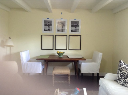
i'm hanging six botanicals above table. Do you think they should be lower?

Thanks!


Comments (24)

  • 11 years ago

    Where are they going? In the mocked-up frames or where the black and white photos are taped or in both places. Do you eat at that table or is it a drinking/games table?

    For me personally - I have quite a large personal space requirement (can't even stand having the arm of the chair in the car down) so if you're talking about the mock-up frames I just think they are too big, too low and crowding the table.. I'd be moving my chair over so as not to bump my elbow, shoulder, whatever against them. This is very obviously a personal opinion.


  • 11 years ago

    I would go a bit higher. If you ever put anything a bit taller on the table it will block the art.


  • 11 years ago

    I agree, slightly higher. They appear to crowd the table. The focus should be the pictures, hung up higher would draw the eye more toward the pictures I think.

  • 11 years ago

    I think they are fine at that height. Higher would have them crowding them ceiling.

  • 11 years ago

    I think the height looks good as is.

  • 11 years ago

    If it is the frames to which you are referring, I would go higher. They are very close to the table. I read somewhere about proper heights for art. This is a clip from what I read. I do not think all art should definitely follow this rule. But here is a starting point.


    57" On Center

    In addition to being a pleasing height, the 57" on center tends to be a lot lower than most people naturally hang their artwork. People hang things too high (I don't know why people do this!). It also means that your artwork is going to hang in closer proximity to the other elements of your home, such as furniture, rugs, lighting, etc and will therefore "talk" to everything better and have a closer relationship, which is GOOD.

    In addition, I have discovered is that if you stick to this standard, you create a harmony among ALL the pictures in your home, as they will all share a midline as you look around your home, no matter what outside dimensions may be. This creates harmony and is also VERY GOOD.

    So, here are directions.Step By Step:

    1. Measure and lightly mark 57" on the wall
    2. Measure artwork and divide by 2 (this gives you the center)
    3. Measure top of your picture to the tightened wire (a small amount)
    4. Subtract "tight wire" amount from 1/2 height amount for the "to the hook" amount. This will tell you how far above 57" your hook should go
    5. Lightly mark wall just above 57" with the "to the hook" amount

  • 11 years ago
    last modified: 11 years ago

    If you actually want to look @ the artwork, I say hang it @ a comfortable 'eye level'. What is the point of hanging a picture on the wall if you can't see it properly?

    Seems to me that in the photo, the frames could be raised a bit. & the taped up pictures confuse me (they are definitely not botanicals) - are they going to be there as well, or in the frames? Because that would make a difference.

    FWIW

  • 11 years ago
    last modified: 11 years ago

    I really like the placement of the 3 frames - with the table and chairs it looks like a cohesive arrangement. When you are seated, the art is the correct height for viewing, (altho, if you used just the 3, I might raise them just slightly, an inch or two). I think you are just showing us 6 pieces to represent all of the botanicals, which also look good as you have them. I do think you could just do the bottom row, tho, and skip the upper row, as I agree that they will be above comfortable viewing height. Such a pretty room!

  • 11 years ago

    And here I was thinking they needed to be lower lol!

    Blfenton, this is our dining table. I'm hanging 6 pictures, 3 over 3. Before I put nails in for the top row, (taped paper) I wanted to make sure the height looked good on the bottom frames. When I sit at the table, I don't feel I'm going to hit them. They are a bit big, but that's the look I'm going for. Thank you for your thoughts!

    Chispa and Zorro, I was thinking if I put something taller on the table, the pictures wouldn't feel to high. I guess it's the space between the bowl and the bottom of the pictures that bother me.

    Cyn427 and sheeshareell, I'm glad to hear you think they look good as is! DH says he doesn't want them any lower, so maybe he wins this one lol!

    Aktillery, thank you for that info. I couldn't find a lot of info about picture height above dining tables. I did read that if you hang pictures in a location where you will view them when you are sitting, they should be lower. Since I'm placing 6, I want them to feel a connection to the table.

    Thanks everyone!


  • 11 years ago

    Carolb and olychick, sorry for the confusion! The taped up paper is what came in the frames. I was just using for placement purposes. I'll be hanging 6 pictures. Waiting on the mats before inserting the botanicals.

    When I sit at the table it feels comfortable. They do have a bit of a looming effect, but I think it feels that way because it's new to me. I want to go big!

    Olychick, my room is still a work in progress, but I'm getting there! Thank you!

    Thanks for the replies!

  • 11 years ago

    according to aktillery's formula, the 57" mark would be in the midspace between the paper and the frames-- does that area measure about that ht?? just based on your pic, I think if you had more space between the table and the bottom of frames, that would look odd.... as you have it, it looks like the 6 are centered between table top and the ceiling... that looks about right to me.

  • PRO
    11 years ago

    I just tried the “57” formula for my artwork, and all the pictures were much too low. I’ve always used the formula of 66 inches from the floor for the center point of the artwork, and that looks right and keeps the artwork at a comfortable level for viewing. 57” for the center point is just too low for me, and would have the frames of several of my paintings lower than the backs of couch and chairs - not good!

  • 11 years ago

    busybee3, the space between bottom row and top row of pictures is at 59". So, based on aktillery's posted guidelines, they could be lowered a couple of inches. Kind of what I was feeling.

    Based on other guidelines, 58, 60, 63, they are at an acceptable range. I guess it's just a matter of preference. I'll live with it a few days before adding nail holes. Thanks!

    4heidesign, I'm 5'3 so I tend to like my art lower. I agree that hanging below the sofa would not be good!

    Thanks!

  • 11 years ago

    I don't post much here


    I like the grouping and I think the height is ok but I think they are too close together. I noticed you have beams...maybe centering your pictures between the middle three beams would open it up a bit. You have the center picture centered in the space created by beams; move the other ones over to the next space and center in the space created by beams.


    Based on how you have your seating, the frames would take up about the same space as the table and chairs. If your botanicals have a lot of color, the extra spacing will help each one stand alone but still display as a grouping. Plus it will take up a bit more of your wall space.

  • 11 years ago

    Dees_1, I did consider hanging 8 pictures, but I tend to like odd numbers. Our table is up against the wall (small space) so I would be worried about hitting them if they extended past the table. I think I will get a better idea of spacing when I get the botanical prints in the frames.

    Thank you for posting!

  • 11 years ago

    I agree with dees, they are too close together. The frames should be at least 4 inches apart.

  • 11 years ago

    I don't think they are hung too close; they look perfect to me. Since they are being hung as a "unit", more like a large singular piece of art, I think having them further apart would make it look disjointed. As is, they fit the space above the table wonderfully.

    Clear Creek · More Info


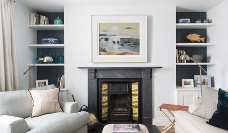
    Transitional Living Room · More Info


    Edina 5 · More Info
    Eclectic Living Room · More Info


  • 11 years ago

    The 57" guideline is for gallery viewing and doesn't work well for art as decor IMO, unless you have a lot of white white walls, halogens and no furniture.

  • 11 years ago

    I do have to agree (even though I posted the 57" rule). How many people are even that short to come eye level at 57"?

  • 11 years ago

    That looks good to my eye! I would center, vertically, between the top of the table and bottom of the beams, more or less. It looks like you did close to that. The distance between the pieces, also, looks good to me. You could probably space everything out an inch more in between if you want the entire size to increase slightly.


  • 11 years ago
    last modified: 11 years ago

    I do 60" wherever I can in a very un-art gallery like house (exceptions: above mantel, my gallery walls, above taller pieces of furniture) and it now looks totally "normal" to me. It does help to keep things consistent around the house.

  • 11 years ago

    Good morning,

    Popping in to say thank you! (I'm at work)

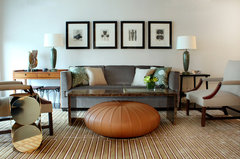
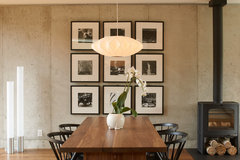
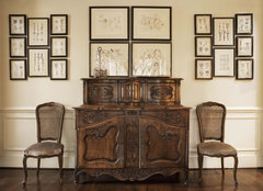
    Olychick, thanks for the pictures, that's the look I'm going for !

    I appreciate the opinions!

  • 11 years ago
    last modified: 11 years ago

    Olychick, thank you for providing wonderful examples of collections mounted closely together. I love the exchange of ideas here and have learned so much.