Software
Houzz Logo Print
nuhomdesign

Design Poll on Curb Appeal ! Give us your feedback!

11 years ago
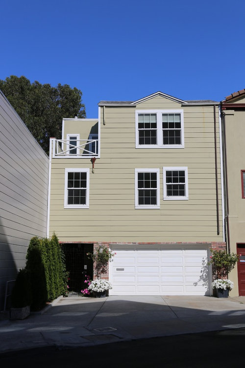
Design Poll:

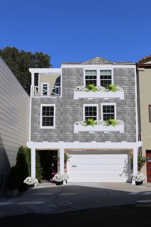
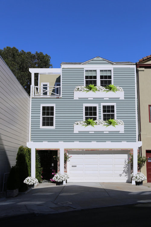
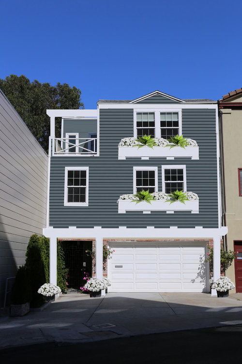
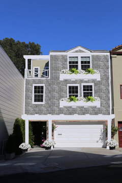
I am working on a clients home in the Castro / Twin Peaks Area. The tan photo is "before" . Do you like the Grey Shingles, light blue siding, or the dark blue siding??? See more examples at my website :http://www.nuhomdesign.com/projects/

They are looking for a Traditional and Classic San Francisco look. I added new trim, window boxes and Pergolas.


Thoughts?


Comments (72)

  • 11 years ago
    If you were working on my home and posted pictures like this I'd be looking for a new contractor. The only opinions on my home that are important is mine and my husband's.
  • 11 years ago

    What app did you use to get the different looks?

  • PRO
    11 years ago

    Hi, I created the design myself in photoshop. First I sketch, then do the rendering. It is a part of my design services : https://www.nuhomdesign.com/projects/

  • 11 years ago
    Dark blue siding! Rich color is nod to ocean in SF
    Nu Hom Design thanked shortlisa
  • 11 years ago
    last modified: 11 years ago

    gray shingles are most appropriate for the location and style of home - neighbors have stucco or horizontal siding - stand out and away from them with your shingle texture . . it is more nautical - navy works if you paint the brick white too but otherwise the pink variegated brick wants gray

    Nu Hom Design thanked libradesigneye
  • 11 years ago
    I'm sick of seeing gray everywhere and while the dark blue is a nice shade, I'd prefer the light blue. It has a cheery look to it. But if it were my place, I'd chose a light celery green or soft light yellow. I prefer the warm, lighter colours from the Spring or Autumn palates.
    Nu Hom Design thanked Michelle Wilson
  • 11 years ago

    The blue-grey lap siding is the most appropriate for that location. The grey shingles are too beachy and the dark blue is too dark for an environment that has lots of overcast days. But there are a number of simple things that would up the curb appeal: 1) paint the front door a contrasting color...say an orange tone, 2) reduce the scale of the window boxes - they are too massive, 3) replace the railing on the balcony, 4) paint the wall that looks on to the balcony the same color as the rest of the house..like you did on the dark blue solution, 5) the second floor window box is set too high.

    Nu Hom Design thanked johnwalker2
  • PRO
    Nu Hom Design thanked Debra White Real Estate Group, Inc.
  • PRO
    11 years ago

    I like the dark blue and the light blue. The dark blue really makes all the colors pop and the light blue is really fresh and clean. I love the addition of window boxes to hide the uneven windows. They also add some interest to that blank/flat wall. Great design!

    Nu Hom Design thanked Kemora Landscapes
  • PRO
    11 years ago

    I like the dark blue. The light blue will fade a bit with time and become non-descript and the shingles will turn a boring, blah color after the sun and salt.

    Nu Hom Design thanked Stephens Painting, Inc.
  • 11 years ago
    Dark blue hands down..
  • 11 years ago

    upon first look, I immediately loved the gray - but after looking them over a couple times, the dark won out. Nice job!

  • 11 years ago

    I like the dark blue too. I agree that the little peak looks too little and not separating it visually from the body of the house would help. If the windows are really mismatched, trim should be added to make the short one look taller. I suggest something interesting hanging in the little deck on the top floor - a mobile or light fixture.

  • 11 years ago

    I would paint the front door white and the garage door dark, to emphasize the right thing.

  • PRO
    11 years ago
    last modified: 11 years ago

    Bravo pmc's. The homeowner already knows where the garage doors are, but do the guests know where the pedestrian door is?

    Is this San Francisco? If so, my John Lescroart novels complain that it is always covered in clouds, so lets get some post lights, at least one at the end of the tall row of evergreens on the left. Perhaps a green post that doesn't attract attention by day.

    Could we have a row of rectangular planters, perhaps a low hedge to keep it looking like an architect designed it, between the pedestrian zone and the vehicular zone, maybe even a wooden fence with feet, so it will sit on the pavement.

    For this fence design, bring the handrail from the upper terrace down as a sample, and build a suitable railing above. Make the upper railing strong enough to withstand the wife's anger when the husband get thrown out onto the porch at night; - and with structural members spaced close enough to prevent a child's head from sticking through or getting caught.

    While you are building sections of fence with feet, consider a row of fence blocking the driveway just inside the sidewalk, connecting at right angles to the entry walk fencing, so that the guests could feel comfortable parking on the street, and, more important, the kids could use the paved play area during the day (and after supper). Keep the kids and the balls and tricycles inside the fence, and the vehicles and strangers outside the fence.

    Otherwise, I love all the architect-proclaimed options.

    cascio.offsite@gmail.com

    Nu Hom Design thanked Cascio Associates - Site Planning - Landscape Arch
  • 11 years ago
    Dark blue for sure!
  • 11 years ago
    .
  • 11 years ago
    I like the grey.
  • PRO
    11 years ago

    I prefer the light grey, the second photo.

  • PRO
    11 years ago

    Janet, this is alittle harsh! After 33 years of designing and building homes I still ask for opinions from peers, past clients, etc. I find it informative, productive and enlighting. For all we know Nu-Hom Design put this out there just to get feed back in a general manner. They did come up with the different "curb appeals" schemes and maybe the client asked for the poll.

    mwd.designprojects@gmail.com


  • 11 years ago

    Yes it is harsh! I think design projects are always collaborative. Each option presented was an improvement and there is usually never ONE way to do something. Who knows someone might be able to improve the appearance even more and that is always what is the goal.

  • 11 years ago

    I would split the wall! If you are going to go with grey shingles complement with corigated Iron siding or pale blue siding use a soft maple side panel to the left side! Hope that makes sense. It looks too traditional right now! Looked at your site love your work!

    Nu Hom Design thanked Christine Amey
  • 11 years ago
    I vote grey shingles, the shingles break up and add texture to a very large flat area.
  • 11 years ago
    I would put one window box under the higher window and not under the one to the left. Yes, put them under both above. 3 total. A little interest....imho.
  • 11 years ago

    Grey shingles, and have the funny little peak match the trim if the homeowners prefer one of the others. The pale blue is close enough in impression/mood to the existing beige that I wouldn't bother re-painting.

  • 11 years ago

    Or at least give the little peak a fascia board, maybe having it interrupt the horizontal fascia you've added (which is a nice addition).

  • 11 years ago


  • 11 years ago


  • 11 years ago
    last modified: 11 years ago

    Dark blue for sure! However, if I lived in SF I would do a wilder color just because it's SF. Amazing city!!

    No window boxes, try heavier white trim instead or Bahama shutters. The porch (top left) needs to be more private.......possibly a cool tree/plant or privacy railing. Also, the front door needs to pop more, it disappears in black.

  • 11 years ago

    I love to look at all of these different examples!!! Yes it is up to the homeowners but if it was me I would love having input from others!!

    Nu Hom Design thanked 2badkittens
  • 11 years ago

    Grey shingles!

  • 11 years ago

    The dark blue in last photo makes the house stand out. The railing looks frail and may need to be beefed up. Nice job.

  • 11 years ago

    Gray!


  • 11 years ago

    If you have not painted yet, I favor a bright navy color-like naval from Sherwin Williams. That way it gets an unusual color which fits right into San Francisco without being too far off the mark. In doing so perhaps a yellow door, a purple door, a bright yellowish green or a red orange door. I like the idea of no window boxes--pretty but a pain--and bolder white trim around the windows. Brass hardware and a beefier fence. Perhaps a rectangular lights on the front posts and a nice bright light under the porch. Something needs to be added to bring out the front door location--big pots of flowers address in brass, more moulding maybe --a feng shui must. All good choices though.

  • 11 years ago

    This is The City, so I say light blue - Twin Peaks can get foggy, so the light blue will be more cheerful and stand out a bit on those days. The dark blue is a bit too traditional and the shingles are wildly outdated, especially for the City.

  • PRO
    11 years ago

    It is wonderful that you put so much attention into your exterior.

  • 11 years ago
    I love the gray shingles! Window boxes were my first thought.
  • 11 years ago

    All of the colors will disappear in a short minute in the S.F. fog. The trees near the pedestrian door would be considered a safety hazard by police as they could easily hide someone waiting to enter/commit a robbbery when the owner comes home. More light is needed in the door area plus a brighter door that stands out. The gray and white shingles hold the most interest of those shown but the ideal color may still be in the paint box! I do like the trim and window boxes. How limiting to the palette is the customer's desire for a classic look?

  • 11 years ago
    i like the grey or dk blue
  • 11 years ago
    I liked the darkest option, paint the garage door the same color (it is too dominant in white). The front door must be in the shadow, I would paint a prominent color.
  • 11 years ago
    I love the dark blue one.
  • 11 years ago

    dark blue

  • 11 years ago

    i would go GREY = elegant & urban . light blue is nice but too holiday like in a carabean style, dark blue is very SF or Australian also quite nice

  • 11 years ago

    light blue for me..... would love to know what was finally decided!


  • 11 years ago
    Dark blue grounds the house as it is so high. Visually more pleasing. Fill in railing. Looks too flimsy and out of scale compared to window boxes. Bright front door color.
  • 11 years ago
    Grey shingles. No contest
  • PRO
    11 years ago

    Would love to see what you choose!

  • 10 years ago
    last modified: 10 years ago

    If you really want the look of a traditional SF house, creating a bay window or faux bay window for the four vertically aligned windows is something to consider.

    SF row houses:

    https://www.bing.com/images/search?q=San+Francisco+Row+Houses&FORM=IRIBIP

    The peak is fine because it is the same width as the two windows below it. You might even consider adding a cupola and/or weather vane or other decoration atop it, especially if you can find a topper that says SF to you.

    Aside from bay windows, you might consider using wider trim and/or double trim boards to enable you to connect the trim around the two mismatched windows on the middle floor as the windows on the upper floor meet and and to make the overall size of the two window pairs appear to be the same could help as much or perhaps even more than the window boxes. (If the plants in the window boxes don't thrive, they can actually detract from your home. Then there is the potential for holding dampness against the home that window boxes offer -- something that can be problematic for wood trim.) Once you create white frame spaces the same size, then on the white span below the shortest window, add a decoration that says SF to you such as pressed metal exterior wall art.

    https://img0.etsystatic.com/137/0/10782337/il_340x270.963038952_t9li.jpg

    Or that reflects your own personal hobby or interest.

    http://g01.a.alicdn.com/kf/HTB1HF6tLFXXXXXSXpXXq6xXFXXXn/-font-b-musical-b-font-font-b-symbols-b-font-wall-art-stickers-home-font.jpg

  • PRO
    10 years ago

    Love the dark blue with the white!

  • 10 years ago

    I like the dark blue. Just used Sherwin Williams Anchors Aweigh. Looks very rich and blue.