Software
Houzz Logo Print
berobert

Will the style of this Houzz photo house translate to my house?

11 years ago
Hi all,

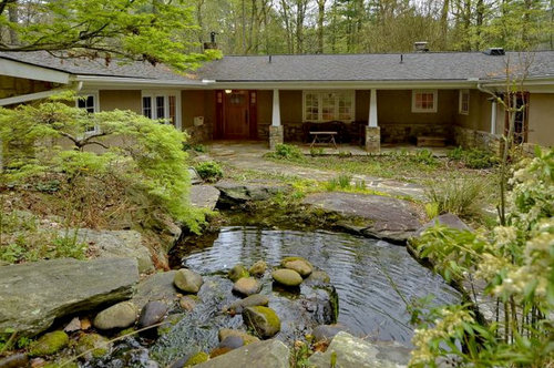
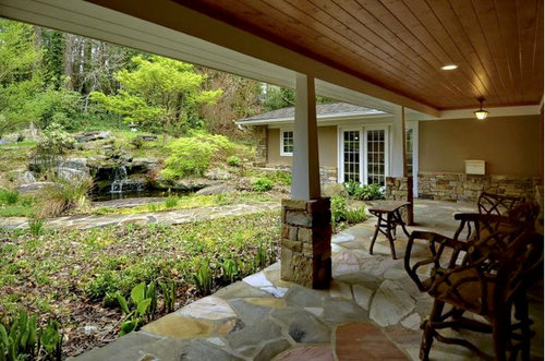
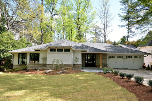
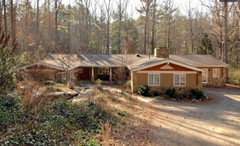
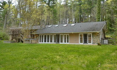
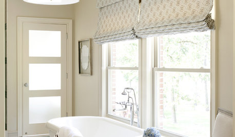
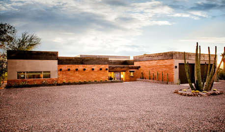
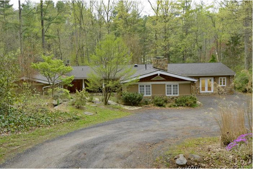
I'm considering purchasing the house in picture 1/2/3. The inside and back yard are amazing. The front needs work. I want a more modern and sophisticated feel for the exterior rather than arts and crafts they were going for and thought this Houzz photo at picture 4/5 would be something I'd heavily use as inspiration as they both are ranch style, similar color roofs along with some stone work. Most importantly, do you think the style from this Houzz photo will translate to my potential home? The obvious change is paint: Repose Gray for the main color and then I'd paint the windows and doors (other than the front door) black, and paint the gutter down spouts black. I was thinking instead of the tapered white support columns on the front porch, to swap out for stained wood supports identical to the Houzz photo as well (on top of the stone columns though rather than totally freestanding like in the Houzz photo). Where I'm getting stuck is what to do with the triangles over the garage (the front most structure) seen in picture 1? The top part is almost a cherry color architectural shingle which it'd be a shame to paint or remove if it could work, but what color should I paint the triangle in the middle and the thick bold white piece under the shingle? Maybe I should remove that thick white board altogether or just paint it repose gray to blend in with the rest of the exterior?


Comments (22)

  • 11 years ago
    last modified: 11 years ago

    Brilliant sir. I think you and I have a similar eye. Excellent points. I had thought about doing the window surrounds in white and the windows themselves along with grids white as the white frame / black door motif almost always looks good - great to hear someone mention that again (here it is on my studio garage conversion [https://www.houzz.com/photos/garage-studio-conversion-transitional-patio-los-angeles-phvw-vp~7085362[(https://www.houzz.com/photos/garage-studio-conversion-transitional-patio-los-angeles-phvw-vp~7085362)). You're so right, it might keep the outside from sliding into boring if it's too monochromatic. I'd love to hear what others think as well!

  • 11 years ago

    Lovely house. In all seriousness, I'd replace the shrubs at the very front, leave the house as is and go on a nice vacation instead.


  • 11 years ago
    It really is a lovely home. I echo the last poster above. I think changing those posts would be a regrettable decision.
  • 11 years ago

    I too love the current home's vibe in this setting. I too would perk up the front landscape and enjoy the beauty plus the extra cash in your account

  • 11 years ago
    last modified: 11 years ago

    Interesting reaction guys. Hmmm. We'd definitely be sprucing / cleaning up the landscape and also paving the front drive of the house to give it a more finished look and feel. Our tastes are modern leaning, so we were hoping to give this house a quick modern facelift. I think those white windows and doors are really bugging us.

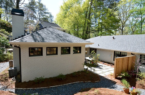
    Any other thoughts on how this house could be given a more modern facelift? Here's another shot from the front with more daylight and then a shot of the back just for fun:


  • 11 years ago

    This is an absolutely gorgeous house. I also think if you just modify that triangular piece on the front - it will look updated.

  • 11 years ago
    I honestly cannot see a thing I would touch other than overgrown landscaping, and that wooden deck which seems like an afterthought..
  • 11 years ago

    If the grills in the windows come out, remove a few and step back to see if you prefer them without the grills. Easy to try out, and no cost. Improves the view from the inside, and nothing is more modern than walls of glass. Amazing setting by the way.


  • 11 years ago

    Gorgeous house, and I love your ideas. Yes, get rid of the triangle, and replace the posts with something square vs triangular. While I love the gray and black in the last two photos, be careful with the stone color. The stone in your new house has more sandstone colors, versus the gray/bluestone tones in the other house. I'd still go with the stark contrast of the black trim and light siding, just be sure that you get a grey that matches your stone.

    Those gardens have fabulous bones! I envy you the next few years. If you live where you experience seasons, you should live there for a full year and make a map of everything that comes up. You don't want to rush in and pull something out only to find it was the perfect backdrop for something springing up later on. Keep track of the sun and shade on your map (once every other week mark an hourly progression - you'll be amazed how helpful it is when you want to put something in then find it's really sunnier or shadier than you thought and your plant isn't happy.)

  • 11 years ago

    For the triangle, what about keeping the red shingles and painting the triangle and the thick white trim board the same black you are using for the window trim. The triangle should fade away, and the trim board should act as a divider but still connect to the windows (as it does now, just in black). It would be consistent with your proposed color scheme but maintain the original design of the house.

  • 11 years ago
    I think the before pictures are great but the before house does get lost a bit within the shrubs/greenery. Grey with black trim is quite sharp and I'm not even a fan of black trim but consider the grey colour as it might not stand out a whole lot more than the current colour. I bet with a little cleanup of the landscaping... Shrubs with more defined edges and some red and plum coloured shrubs your grey w black would look stunning and I'm a young professional that doesn't usually lean toward modern/contemporary.
  • 11 years ago

    As someone who lives in a desert environment, I'm still gaga over the beautiful green landscape. Others have given you great advice. I'm just going to wish you joy in your new home.

  • 11 years ago
    I wouldn't do anything with those columns I love them I think it's beautiful. maybe a little bit of gray like the other gentlemen said the eve. and a bit of landscaping with color.
  • 11 years ago
    Wait, your house is the first three? Don't touch a thing!
  • 11 years ago

    First live with the house for a year or two while you shape up the landscaping, adding color to direct the eye. Then list all exterior details that bug you before making any changes. Painting the exterior a very pale gray would freshen up the house without touching white frames. The more color contrast between the body and trim, the more the trim will pop.

  • 11 years ago
    last modified: 11 years ago

    I agree with many other posters-- the house you are thinking
    about buying looks beautiful as it is. I too would focus mostly on the
    landscaping. However I would lighten the cherry color shingles. To me it makes
    the house look top heavy. And I would get rid of the triangle. Personally, to
    me, your house should be the inspiration, not the other way around. Your house
    seems to "fit" in the surroundings as is. I just don't see your house
    as a modern house beyond the modernness that comes with a ranch style home. It
    would be a pity to force the fit. Why not keep looking for a home that has
    a more modern aesthetic?

    Or maybe consider using the money you're thinking about
    using on the house to replace the drive. I think the drive and new landscaping
    would help the house really shine. Again, though, it's a beautiful home
    as is.

  • 11 years ago
    I realize I am echoing some sentiments already expressed here, but you are polling us, right? If it's purely aesthetic, I would indeed remove the triangle from the front of the house; if not, paint it the same color as the house to blend it in. Your color choices for the exterior should do most of the work "modernizing" the house, while revamping/tidying up the landscaping will do the rest. I do not find the current columns offensive to your declared style, so personally I would leave them for a while with the new paint & landscaping to see whether they start to blend in. If you still feel the same way about them, then I would certainly replace the tapered parts (not the stone bases!) with straight pieces. I agree that the wooden column looks unfinished and combined with the stone bases would look more rustic than modern. That is indeed a beautiful house.... best of luck!
    Bryan thanked Katie Williams
  • 11 years ago

    Katilly - yes, a poll, I guess sort of a litmus test. I'm honestly pretty surprised to hear so many loving the existing look! I've relooked at those pictures a million times and I think one of the posters just hit it on the head that the house is currently just blending too much into the landscape. If you were trying to modernize this house, what colors would you consider painting the house, trim, windows, shingles?

  • 11 years ago
    To optimize the look I would add iron windows and paint the house white. But don't paint the stone, leave it the way it is now. It looks good whatever is burgundy now I would also paint white Leave the columns too. So basically add iron windows and paint everything not stone, white.
  • 11 years ago

    I think you could get a lot of mileage out of a fresh coat of paint and perhaps replacing the triangular arts and crafts columns with square in raw wood. I'd leave all the stone work. You might add a splash of brighter color on the doors and/or the porch ceiling. And the "triangle" does detract, but it is almost certainly a functional vent. Make sure you have adequate ventilation in the roof if you remove it, or maybe just paint it to be less obvious.

  • 11 years ago

    What is the triangle inside the triangle? Is it a vent, small window or...?