Software
Houzz Logo Print
annabee4

Tile Color Clash?

11 years ago
Hello All,

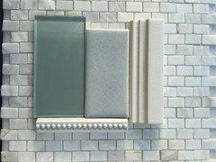
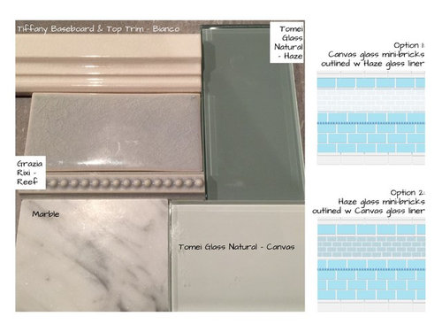
I think I made an error. Does the soft blue crackle tile clash with the smokey glass tile? The minibricks glass sample had a much more crystal appearance in the showroom, and their designer thought it was a good match with the baby-bluish subways. My error for not taking samples home first, allowing a deadline to rush my decision.

The bathroom will have lots of natural light, and while the attached photo is fairly accurate in showing the contrast that will appear at night, it looks a little better in daylight. Will a white grout help even out the smoke of the haze? Or should I just fix my error by finding a better glass tile match? The photo also includes a drawing of the possible arrangements. I was leaning towards the canvas (white) mini bricks with smoke liner (option 1) till I saw the possible clash of having the haze next to the crackle reef (blue).

Thanks everyone.


Comments (12)

  • 11 years ago

    I don't think I like either glass tile with the rest of your elements.


    annabee4 thanked enduring
  • 11 years ago

    I don't think they go well together at all. Both make the other look drab.

    annabee4 thanked Bunny
  • 11 years ago
    Aliceinwonderland, Linelle, and enduring, your eyes and comments are exactly what I'm looking for. The description "drab" hits it - not just clash.

    Back to the drawing board.
  • 11 years ago
    last modified: 11 years ago

    Something is not right. first, what color is behind both glass tiles? Are we seeing their true colors? Right now, the chair rail molding looks beige to me, and I see it says it is white, "bianca." The Grazia Rixi Reef tile and the dot liner look like they have beige undertones that will clash with the Carrara.

    You might put everything against a white or gray background and photograph again, the glass tiles may look very different then.

    Where does the Carrara come into the design?

  • 11 years ago

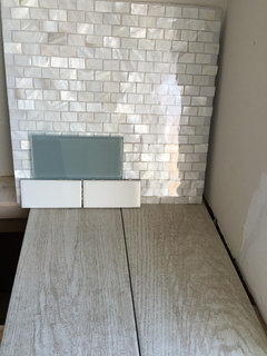
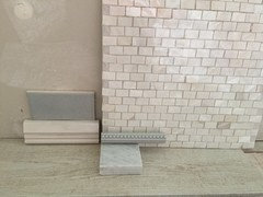
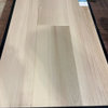
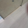
    Here's the GR Reef against another item we are using in an adjacent bathroom (sitting on a garden windowsill with lots of light). Second photo is with GR Reef against a close approximation of a slate-colored floor - the actual floor tile will be lighter in color, but close enough. If I can't post more than 1 photo, will post again. Either way, the arrangement appears to look best without the glass.

    The next photo is the floor and tile being used in a 2nd small bathroom. I'm liking the haze here. ??

    The carrara will be on top of an undermount tub, and on two small vanities, so, its presence will be felt. I was hoping to use the haze glass not just in a backsplash/trim, but against a small wall above a vanity, adding some crisp contrast. I'm sensing I need to rethink it...liking this shell mosaic picked out for the other br.


  • 11 years ago

    It is so hard to see it online. One thing to know is that glass tiles are applied on top of white mastic if your tile setter knows what he/she is doing, so putting something white behind the glass tiles when comparing them to other tiles will give you the best color comparison.


    One of the problems I see with your original design is that there are just too many different things going on with the design. It feels like you are using too many different styles and textures and color combinations. For instance, the baseboard and chair rail molding are one color and design family, then you add in a bar with dots from the design and color family of the field tile (I think, at least. In one photo it looks like the dots ARE white, so maybe they do match the other trim pieces.). The design would feel more cohesive if the bar with dots was from the same line as the chair rail and base board. I would change the baseboard and chair rail to match the dots and the field tiles, if it were my choice. If you want to have a different set of moldings to make your field tile stand out, I would go with Carrara, which would tie the baseboards, chair rail, and liner in with the counter tops!

    Another thing to watch out for is the depth of the tile. Front to back. If a tile is thicker than the rim of the bar liner or other decorative tile, and stands out further from the wall than the liner or chair rail or base board, it is not going to look right. It is asking a lot for the tiler to back-butter every one of the line of tiles and get them all at an even depth. It looks like some of your tiles are a lot thicker than the ones that will be next to them. I had exactly this problem myself and had to rethink my whole design, so I know of what I speak!

    One way to solve the problem of the difference with tile thickness is to use a liner tile between the two different field tiles. Since the glass tiles are so much thinner than the crackle tiles, putting a bar liner between the crackle and the glass tile will make the difference less noticeable. That is why so many decorative tile strips end up at the top of the tiled wall. You can use the chair rail molding to top the decorative tile strip and not spend several hundred dollars on another row of liner.

    annabee4 thanked Nancy in Mich
  • 11 years ago

    nancyinmich, thank you. Yes, I had considered some of these issues and is the main reason I was using liners in the original design. The shell mosaics are so thin - 2-3mm vs about 8mm for the blue crackle. I've read about a few ways tilers bulk it up to be even with the rest of the design - lots of work! The original space for the shells is small, so I am hesitating to ask them to do the same for another bathroom. Plus, I've taken to heart the idea of simplifying the design to allow the blue to take center stage.

    The white baseboard and cap are different lengths than the blue, but surprisingly are a good color fit. It was either white wood baseboard or white tile, and the GR did not carry anything similar. But now that I am taking out the glass inserts, I regret getting a blue crackle liner. The Tiffany bianca set had lots of liner options. Still lots to ponder.

    Hmm... I might be posting for advice on the best way to sell unused tile I can't return. (=


  • 11 years ago

    With your pictures, I still don't like the glass with your other elements. I like the opacity of the other tiles, and don't think adding the glass fits in.


  • 11 years ago

    I agree. The glass is nice, but doesn't go with the rest of it.

    annabee4 thanked writersblock (9b/10a)
  • 11 years ago

    I agree with enduring and writersblock. If you take away the glass tile, the others look very nice together.

    annabee4 thanked Bunny
  • 11 years ago

    I think I've just about sorted it all out, but now I'm wondering if I should rethink floor choice.


    Our original choice - the slate shown here - ended up being as dark as a similar product I was using in previous pictures. Is it too dark? In the 2nd option, does the rustic look of the whitewashed boards (that are being used in an adjoining bathroom) downplay some of the intended feel of the crackle?


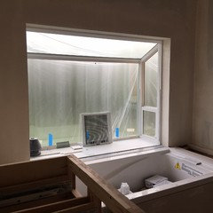
    Lots of light in this smallish bathroom. I will be using the shells on the tub wall and side of tub. The blue tiles will start 6"above floor, on a white ceramic baseboard - so there is a color break before the slate and the blue.


    Thanks everyone - this has been so very helpful!