Software
Houzz Logo Print
jen_haynes

Before and after bathroom

11 years ago
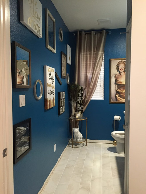
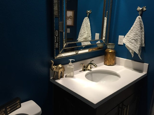
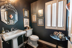
Redid the downstairs powder bath...would love some feedback. Good or bad. Thanks in advance!

Comments (37)

  • 11 years ago
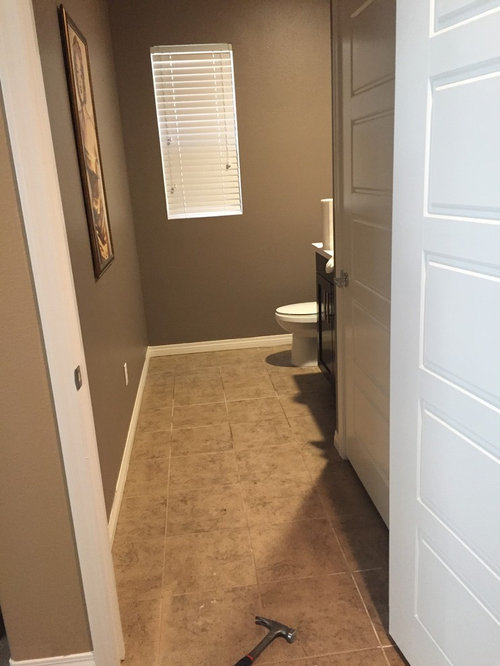
    Side note! I'm not quite done- still needs a few finishing touches, such as base boards.
  • 11 years ago
    Nice!
  • 11 years ago
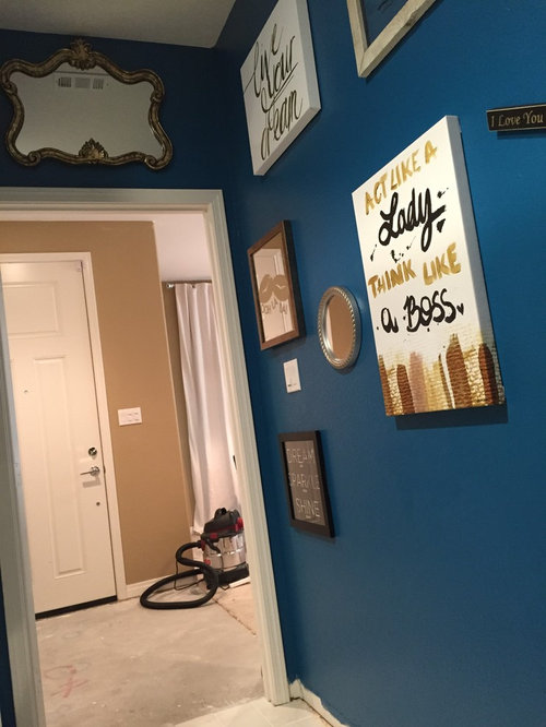
    Nice and I like the act like a lady pic.
  • 11 years ago
    Thank you all!! You never know how you're doing without feedback. This was the second time I laid down tile and re did a room. I appreciate you all!
  • 11 years ago
    This room is so fun!!
  • 11 years ago

    I almost like, the mirror is lovely, but not above the door. I see the vent. I would put it where round mirror is located. Then put round mirror above light switch. And don't forget to touch up the mop boards. You're almost there!

  • 11 years ago
    Lovely!
  • 11 years ago

    I like!! Very Fun!! You gave me great idea to be bold. I have a spa sea foam green & time for a change! I love blue do that may be my choice! Love it!

  • PRO
  • 11 years ago
    I love it. There was a Toronto den featured on houzz where they had used a similar blue in gloss and matte. It rocks. now I see what you've done.... Im dreaming in indigo.
  • 11 years ago
    this is model
  • 11 years ago

    I used the same blue in a guest bathroom and I do love the way you used it in this powder room. The blue mixed with splashes of white and waves of bronze produces such a soft blend of colors. The change in floor color was a good choice to lighten and widen the floor look and I think my favorite aspect is your whimsical choice of accessories. Truly this Marilyn Powder Room puts a smile on the face of visitors! Your creativity is impressive Jen! My only suggestion would to be to try a different color of curtain...experiment a bit...my first thought was white but then the infectious fun with which you crafted this invaded and my thought was gold with a tie back that looks like a gold bracelet with diamonds...shades of "Diamonds are a girl's best friends!" Wonderful rendering!


  • 11 years ago
    @rose246
    I love that idea!! Gotta have some bling in there and what better way than a diamond draw back. Will definitely be taking your advice. Thank you thank you!!
  • 11 years ago

    Will be fun!


  • PRO
    11 years ago

    Nice touch of character, looks beautiful!

  • 11 years ago
    Great update! The only thing I would do is group your art like a gallery wall. Looks too scattered and allover the place right now. But great job! I love the color choice.
  • 11 years ago
    I'm currently adding more word art. I spaced it out to allow for more. Because the bathroom is so spacious, I felt I either had to go big or go home. My plan is to cover more of the main wall. I will post pics when I am done. Thank you all for input!
  • 11 years ago
    That's a top shelf doggie, not a bottom shelf doggie.
  • 11 years ago
    In that case, I would fill the wall floor to ceiling. Leaving only 2 to 3 inches between most art pieces uniting the wall and making it look together.
  • 11 years ago

    What I love about houzz is it gives us so many ideas from others and a chance to discuss these ideas. Your art wall got my interest peaked in gallery walls and I found an article about creating them at:
    http://www.apartmenttherapy.com/why-they-work-11-truly-great-artwork-arrangements-217330

    I then looked back at your wall, and yes I know you are not done yet , but I like it, and realized the appeal is that the blue background has a unifying effect, the contents have similar themes and colors, the spacing makes it serene, and of course all is fun and inspirational. The article showed me there are many ways to group objects on a gallery wall and many ways to add appeal.

    Your powder room re-do is one of those appealing ones that draw a crowd. I am one of many I am sure who are enjoying the process, learning more about design by soaking it all in, and sticking around to see the end creative product!

  • 11 years ago
    I'm in the process of painting my entire house gray but got this idea this morning to use navy blue in the powder room instead of gray! Then I randomly came across your post! I really like it! Which color did you use on the walls? :)
  • 11 years ago
    I love it, fun and took away Builder grade look. It looks like you have lots of personality.
  • 11 years ago
    Thank you all for comments!
    The few touches I have left-
    Hang more word quite art ( I picked up quite a few more pieces the other day)
    Base boards- debating on doing white, same color as wall, or going gold! What do you all think??
    And I got a little bit of thin set on the cabinet doors...so debating on if I should re finish the cabinet or just try to get the thin set off as much as possible without destroying it
    This was my second time laying down tile- so live and learn right?

    As for the paint color- I used sherwin Williams- but don't have the paint number with me. I will post later tonight.
  • 11 years ago
    I think white baseboards would be best. You art should be the focal point. It will also give an illusion of walls being wider apart. Also, (along with your go big theme) paing the ceiling blue as well. It will make the ceiling disappear and seem taller. Hence, making the bathroom appear bigger again. The white ceiling is cramming down right now.
  • 11 years ago
    sorry for misspelling. typing from a phone this is what i meant
  • 11 years ago

    White baseboards for sure and a bit wider then what you have now if possible. I think that would look very fresh and accent the white you have now!


  • 11 years ago
    last modified: 11 years ago

    Yes, tall white baseboards for sure!

    I also searched some dark powder room photos and I think it would look great to leave the window bare. Simple white blinds would look better. You can also frame the window to make it appear larger. Just because the bathroom has dark color on the wall, it shouldn't be dark. I think the bathroom should filter as much natural light as possible. Having the window bare like in this photo will make it seem as though it is part of your artwork. You can even hang an additional small piece on top of Marilyn Monroe and below the window. Removing the curtains will also draw the eye to the various things you have displayed on the side table.

    Project Clarkson (Mississauga) - Major Interior Renovation · More Info

    I also would suggest not to hang that gorgeous mirror over the door. I would hang that mirror over the toilet. That would be an awesome statement piece (The Throne! haha). It will also bounce back the artwork from the main wall and add additional depth to the space. I think a good height would be if the mirror falls about 10 inches on top of the toilet top.

    Using all these tricks will make the room feel larger, taller, wider, etc. than it is.

  • 11 years ago

    You could still have your bling on a white or gold curtain pulled to the side... :)


  • 11 years ago

    When it comes to windows in a bathroom there is a lot to be considered. For sure what is outside the window is important and if you need added privacy or not would be one consideration. Another is upkeep. Curtains can be easy to wash and blinds need frequent dusting. Then there is the matter of surfaces. A curtain can soften hard surfaces in a room. Sheers can often add softness and admit light sometimes making a window look a lot bigger and brighter. I use long white sheers in many rooms for that purpose. I can see a long white sheer brought to the side with some bling. I can also see a true gold curtain there in the same way. I would use sheer on the rod for a soft hanging.

    Maybe try the beautiful mirror in other places and see if one stands out in your mind.
    This is as you have said a work in progress and sometimes it takes time to decide what looks right to you. I often leave some decisions until partway through the process and constantly rejudge the weight of objects as colors and positions change. I do like where this is going!

  • 11 years ago
    last modified: 11 years ago

    In terms of privacy, the existing blind already provides that. Having a curtain adds another layer through which natural light has to fight through to get into the bathroom. This powder room is glam. I wouldn't do any softening, but I would focus on bringing as much natural light as possible to show off the blue walls and gold accents. Let that light bounce off all the shiny fixtures as well.

  • PRO
    10 years ago

    Great work!

  • PRO
    10 years ago

    Very good work.

  • 10 years ago

    I love the color of those walls!

    Nicely done

  • PRO
    10 years ago
    last modified: 10 years ago

    Love that shade of blue for the walls! The room is both feminine and strong, very nice.

  • PRO
    10 years ago

    Love the outcome! The decor is a nice finishing touch! Really like the colors! Thanks for sharing

  • PRO
    10 years ago

    The color is very rich! Great job!