Software
Houzz Logo Print
mj242

Need Help Picking Out a Backsplash Tile

11 years ago
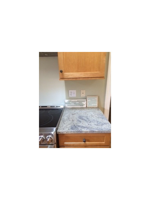
Please help - I can't make up my mind!


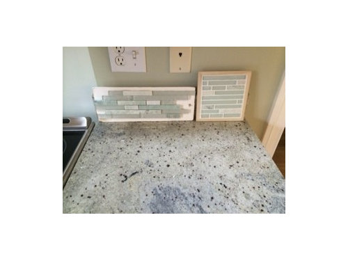
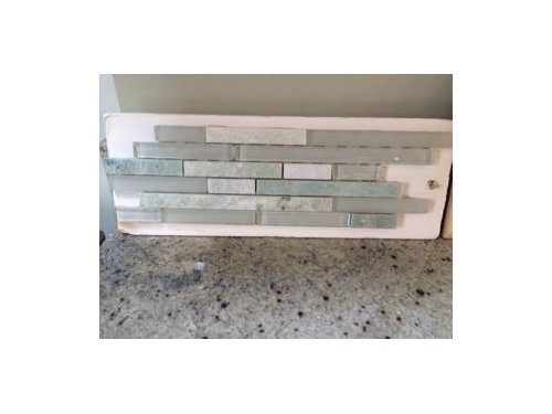
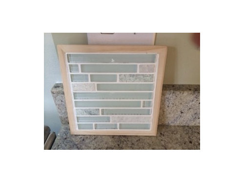
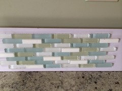
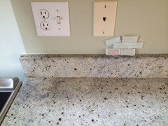
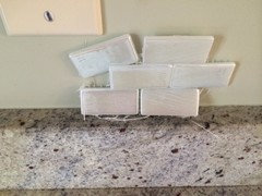
Which of these tiles do you like better? The rectangular sample on the left blends in a little more with the counter. The square sample on the right is a little bit lighter and I think will stand out more.


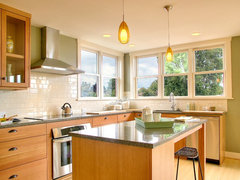
I'm trying to coordinate with the counter, cabinets and appliances. The paint color is changing, so that's not a concern. We tentatively were going to paint the lighter color that you see over the stove, but we'll decide that after picking out the backsplash.


Thank you!


Comments (21)

  • 11 years ago

    I I like the one on the left......the rectangle. The gray in it brings out the gray in the granite and the appliances and has more interest. The other one I think is too light and washed-out looking next to the granite IMHO.

  • 11 years ago

    I think they are both beautiful as is your granite. Choosing from just those two, I like the square one.

  • 11 years ago

    I love the granite. I think both tile samples are too busy and will detract from the gorgeous granite being the star. I know it is hard to decide because the tiles are so beautiful, but sometimes you have to edit.

  • PRO
    11 years ago

    I like the one on the left better but agree that it might be a bit busy. I would consider something in the color of the dark spots of the granite, for more contrast.

  • 11 years ago

    both the back splash samples are truly pretty, and if i needed to choose one I'd go with the one on the left, but I'm not sure that they are perfect partners for the granite. Is there a bit of sea green in the backsplash samples that I'm not noticing in the granite? the colors seem beachy and maybe a bit spa-bathroom feel? On my monitor it looks like there's some dark blue in the granite that calls my eye and I want to emphasize.

  • 11 years ago
    last modified: 11 years ago

    Interesting. Well I guess the problem is that I'm not much of a fan of the granite. I'm glad you all like it so much! :)

    This is not part of a kitchen remodel. The cabinets and counter were already here and all we've done is update the stove from white to stainless, and add the hood. The backsplash is just going to go behind the range, or possibly along that entire wall since it's just a few more feet on each side, but not around the entire kitchen.

    To give you an idea of my personal style, in my last kitchen we added an all white quartz countertop. Medium to dark green is not my favorite color and I prefer light to dark kitchens.

    There are some very pale aqua-ish spots in the counters, and that's what I was trying to draw out with the glass green tile look. We had considered just plain glass green tiles - maybe we'll reconsider that option.

  • 11 years ago

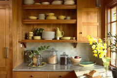
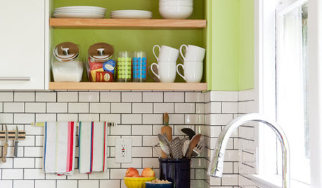
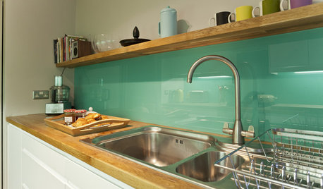
    Ok, that makes sense. If you want to lighten it up, maybe you could switch your cabinets knobs to chrome or glass, and as you said, go with a very light paint color. Here's some lighter backsplash ideas with granite:

    Saint Paul Craftsman · More Info


    Saddle River Estate · More Info


    Kitchen · More Info


    Crown Hill Remodel · More Info


  • 11 years ago

    I agree with some of the others that both backsplashes are pretty but perhaps a bit too busy with the pattern in the granite. I like the light gray granite in jlc's first picture above.

    Your granite looks similar to the River White granite in my bathroom - does it have small garnet colored spots? I really like my granite, it's very pretty, but I do need to regularly seal and be careful about water and soap stains.

  • 11 years ago

    I agree to go solid.Your kitchen could be a candidate for glass. (Check out sixtyohno"s kitchen!)

  • 11 years ago

    I hear you all, and both samples are out. I see that part of the problem is that there was too much stone in the backsplash, which fights with the granite. I have one other sample left that I didn't post yesterday. It still has the color variety but more glass, and the stone is plain white marble. Really liking how the white plays against the other colors. Do you still think this is too busy? I'll pick up some single-color glass samples today.


  • 11 years ago

    I agree with posters who think the multi-color tiles are too busy with your granite.

    The last one you posted looks off to me in tone - at least on my monitor. Looks more like cooler sea glass shades where your granite has muted colors & warmer tones.

  • 11 years ago

    I like the larger tiles - the granite has a lot of detail - and smaller tiles ends up jumbling my eyes. The colors are great.


  • 11 years ago

    Yes, the colors on it are brighter. That's why we ruled it out initially. It actually looked better at night though - not as washed out as the other samples.

  • 11 years ago

    Go solid, just sayin'…...

  • 11 years ago

    Solid, yes ---- as in top photo from jlc . . .


  • 11 years ago

    If you want this look I think the first rectangle you posted goes better. I also like jlc's first picture..it has some subtle shading to it which might be a good compromise.

  • 11 years ago

    Solid and larger format, pulling your favorite color from the granite. In my area, the times of the small glass mosaic are past.


  • 11 years ago

    Can you share a larger photo - showing the granite with it's detail?

  • 11 years ago

    Just my 2 cents, but i'm not a fan of the smallish glass tiles as I think they're a current trend, and not a long term item. Have you considered, or even looked at subway tile? 4" x 4" tile on the diagnonal with a possible border is another possibly. I'm more traditional so not into trends at all.

  • 11 years ago

    We finally have our selection and we love it - we're feeling much more confident about this choice. The glass tiles are iridescent so it's hard to get a good feel for them in the pictures. Thanks to all your guidance. Hope you approve!