

Need suggestions for our "new" home paint colors!
The living room is hard for us to figure out how to lay it out for TV and our sofa and couch. We may need to buy a sectional for this room and use what we have for the smaller family room (not pictured).
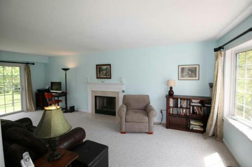
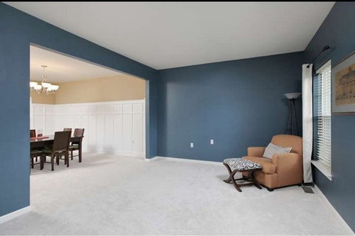
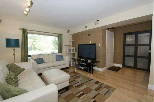
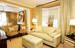
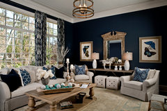
For the living room (currently baby blue) we were thinking about a navy blue with white trim, wrap it into the dining room (which opens to this room) and have white wainscoting. First pic is the current paint, second pic is a color we were thinking and last pic is our sofa (bone white).
suggestions?
Comments (60)
 11 years ago
The issue with brilliant white is twofold - it is not going to show off the wood to best effect .. the blue undertone will render it more orange where the softer tones will help it look rich. The other issue is the color of your leather . . it will look not white next to brilliant white in the room . . but it will look white like a magazine cover with a dark white trim . . If you go with a soft white it will look like it was planned. It doesn't have to be maritime. there are lots of soft whites . .
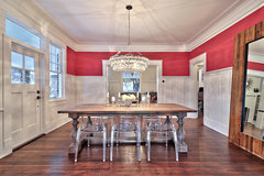
dark whites / warm whites look richer on trim too - so if you do the board and batten approach (I love these higher than the old colonial wainscot heights . . . more of an arts and crafts look at 66" high - see how this one lines up with the sash of the window? consider elements like that when you determine how high you want to go - this image is a great mix of modern decor in a traditional house - you may want to be brave with your lighting and go modern -- contemporary brass and gold tones are coming back - it is amazeballs with navy and doesn't clash with dark rods)
Finally . . also seeing that the stone around your fireplace is in the creamy tones - best to keep the same color family with built in elements like trim and stone and wood.
 Brady House · More Info
See this in honey gold
http://www.ylighting.com/george-kovacs-pontil-6-light-chandelier.html
Related Professionals
Macon Interior Designers & Decorators · Fort Worth Interior Designers & Decorators · Escanaba Interior Designers & Decorators · Kalamazoo Interior Designers & Decorators · Gillette Interior Designers & Decorators · Kahului Interior Designers & Decorators · Crestview Architects & Building Designers · Greensboro Architects & Building Designers · Houston Architects & Building Designers · Lincoln Architects & Building Designers · Edison Architects & Building Designers · Los Angeles Architects & Building Designers · Clarksburg Kitchen & Bathroom Designers · Watertown Kitchen & Bathroom Designers · Janesville Kitchen & Bathroom Designers- 11 years ago
pcmom1 . . do you think that is so with a dark wall? he's going navy on walls ...doesn't he need some light bouncing help? Maybe darker than ceiling white, sure . . champagne with metallics could be nice . . but I hear you about 8' ceilings. ..what about using something tall but plain like a cove moulding and painting it the ceiling color? so it feels like they raise the ceiling?
Joe
Original Author11 years agoI see your point about the warm whites Libra and I really like the taller batten look, definitely sparked plans for that!
Pcmom, I really like that color navy...good find!
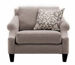
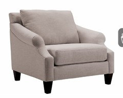
So here is my latest thoughts. Attached is a rough diagram for what I'm thinking for a setup for my living room. I found two chairs that I think will fit perfectly, their color is considered platinum/pewter/dark wenge chenille, I included a picture of those as well.
I will use my current end table between the two arm chairs and matching coffee table between them and my current ivory leather sofa. In back of the sofa, I will find a narrow sofa table. Then behind that just under the bay window I will put a cool bench that I just picked up. It's ivory cushioned top with matching dark wood to my other furniture. To the right of the fireplace I was thinking a low book case.
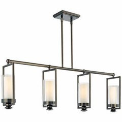
Also, I was thinking this could be a cool chandelier for my rectangle table. It fits great ceiling wise and it would leave about 1' of table space on either side of my table.
Please take a look and let me know what you think!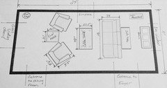
 11 years agolast modified: 11 years ago
I don't think that there is room to walk around if this is to scale. Getting from sofa into dining room etc.
If you have an eight foot sofa and room is only eleven wide and you leave a couple of feet on the fireplace side....that leaves only one foot near the entrance.
Sofa could go on wall between entrance and dining room and a chair on each side of fireplace.
 11 years agolast modified: 11 years ago
Congratulations on your new home! It looks lovely.
Just a few quick notes:
- I had a master bedroom painted darker navy and it was beautiful. Our ceiling and moldings were Benjamin Moore 'Decorator White' which complemented the white wood bedroom furniture.
- We had nickel medals which looked great.
- If you are unable to change the curtain hardware, would you consider spray painting it to match your trim colour?
- For the furniture placement in the L/R: On the floor, consider 'drawing' the furniture placement with blue painters or masking tape. If there isn't enough space, you might consider a smaller chair or a different furniture layout. I think 'pcmom1' has made a good suggestion.
- When purchasing furniture, I've found it very difficult to match whites and creams to new pieces. Be sure to either procure a generous sized fabric sample, bring a chair into your home on approval, or take a couch cushion with you to the store. If your sofa cushions cannot be removed, I suggest that you take the ottoman with you. When I want to test fabric colours, I ask the salesperson to allow me to take them outside. (The lighting in most stores is so unreliable.)
- When I didn't find chairs to compliment my sofa, I chose a geometric print with a spot of the off-white.
- I love the rectangular shaped lighting fixture that you posted seven hours ago. I wasn't able to find a description of your dining table. So I'll say that I think a round chandelier is best over a round table, and likewise rectangles are best suited to one another.
Best of luck. I hope you enjoy the decorating process and your outcome!
- 11 years agoI would not do white washed floors, esp if you are using hardwood. I would use a medium wood tone because it is more timeless. The whitewash or grey will be more likely to go out of style quickly.
- 11 years agolast modified: 11 years ago
Hi. Saw this pic on 'Houzz' and wondered if the floor plan might be an option if your original doesn't work.
Depending on the measurements, just 'pretending': (1.) there's ample enough room for a 'walkway' behind the sofa; and (2.) the photos 'picture wall' (on the right) is your front window wall.
If there's not enough depth in front of the fireplace to allow a 'walkway' behind the sofa, then I'd recommend putting one side chair, on each side, closer to the fireplace. Then the traffic flow would pass in front of the coffee table.
 Brookhaven Living Room Remodel - Atlanta · More Info
 Joe
Original Author11 years agoI'm afraid your right Pcmom, for some reason I wasn't even thinking about the need for traffic! I do know that the sofa won't work on that wall, as it's too small. I don't even know if my love seat would work there.
Kaywest, thanks, we're excited! Thanks for great tips. We currently have a antique bronze finish theme on the door handles and curtain rods and don't want to paint them. I think we're going to stick with that, at least for the downstairs. The master has nickel medals.
Do you ladies think the chairs I picked out would compliment the ivory sofa? I'm not necessarily trying to match them as they're different material and color but feel they would go but I could be wrong!
Kaywest, your picture gave me an idea that might just work. I'm not sure if this is what you meant but see my attached diagram. I am awaiting measurements from the sellers. That is what's making things hard, due to my schedule an the holiday weekend I haven't been able to go in and get accurate measurements. I think there could possibly be enough room in back of the sofa for traffic and yes, the "picture wall" in the picture would be my bay window.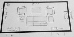
- 11 years ago
@Joe D, 'yes' your latest drawing does reflect what I was attempting to communicate. Although you will have to leave space for people to enter/exit the conversation area in front of the fireplace. Hope this floor plan works for you!
- 11 years agolast modified: 11 years ago
Appears that sofa could move back and fit on the wall. Will it? Then chairs move towards fireplace and angle. Coffee table moves with sofa. That would leave room to walk in front of coffee table and between the chairs. That could be the traffic lane.
Either that, or pull the sofa more towards the fireplace so that there is at least 3ft behind it for the traffic. But with only 11 feet....3 feet traffic lane, 3 feet sofa depth, that leaves only 5 feet in front of sofa for coffee table and chairs. Too tight.
Sofa may have to move in front of window.
- 11 years agolast modified: 11 years ago
Place the sofa first. You could try different angles. That saved me with my small living room.
Try angling sofa out from sliders some. Leave room to get in and out the door, of course! Then chairs opposite.
Diagonals are the longest line in a rectangle!
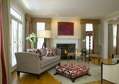 Portfolio Photographs - Room in Red · More Info
 Joe
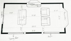
Original Author11 years agoI decided the sofa I have is probably just too big for this room so I'm now trying to switch it out with my loveseat, which is 6' long. I'm also starting to think the chairs that I picked out are too big for this room and may go look for something smaller. The chairs that I'm trying to use in the diagram are 3'6" wide X 3'5" deep.
In this picture, everything is to scale and this is all I can come up with.
- 11 years agolast modified: 11 years ago
Sorry, but 2 feet three inches isn't much for a traffic lane to squeeze by the chair into the room.
I need to ask what functions you want this room to serve: Are you just sort of stumped and trying to fill with some furniture? A lot of times the "formal living" is just a room to walk thru, look at.
This is a difficult room because it is so narrow and there is the need for a traffic lane from foyer into dining room.
You could stop trying to center the arrangement around the fireplace and create a couple of different "zones". Put the sofa or the loveseat into the bay window. That would be a great spot to lounge and read a book.
Put two chairs, one on each side of the fireplace with a table in between for games.
Add a narrow console as a writing/computer stop along that wall between the entrance to foyer and dining.
Corner by slider and fireplace can hold a large plant (good spot for the Christmas tree).
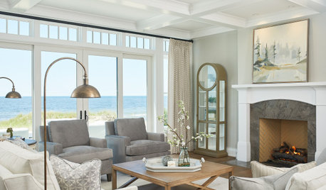
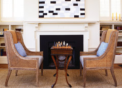 Beach Style Living Room · More Info
 Jennifer Brouwer Design Inc. · More Info
 Joe
Original Author11 years agoThe reason I was centering around the fireplace was in the event we put a TV above the fireplace it would be good seating for watching it. However, I think you may be right, I need to stop centering around the fireplace. If I went with what you suggested and put my sofa or loveseat at the bay window (Unfortunately, I bought a bench just for that area) and two chairs by the fireplace, do you think the room would look off balance? The large potted plant would help...
As far as my intended function, originally I was thinking more of a formal living room without a TV. However, the other room where we'd relax and enjoy TV would be the family room which is smaller and without a fireplace. For comparison, this room is 23X11 and the family room is 16X11. Part of me wants to set this room up for the family room because it has more "amenities" but it's obviously a hard room to furnish.
Any personal recommendations, would you use this for a formal living room or for a family room?
I haven't tried angling the sofa by the sliders due to the way they open and you walk in. I think it would be awkward to get inside or out. I could be wrong and won't really know until I am inside the house again.- 11 years ago
The only way to make this room feel functional is to float the sofa away from the bay . . your bench will still work there behind the sofa. You want two chairs at the sliding door - one of them at the fireplace end. You can't line the furniture up on the walls or you end up with no communication center -12- 14' is the radius for the front of all the seating area / chairs. . .
Joe
Original Author11 years agoHow about this Libra, I used the club chair and ottoman that I have for the left side nearest the sliders - floor lamp behind there - current coffee table in front of fireplace - large sofa then bench under bay window. Does this seem functional or would anyone suggest making changes?
Sorry to be such a pain!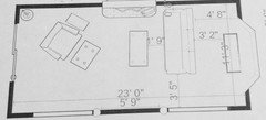
- 11 years ago
This is a good start. Try it out in the room and see how it feels .. If it were my room, I would put the bench on the wall opposite the fireplace, pull the sofa back towards the bay window and use a narrow writing desk as the sofa table behind it with lamps/ etc. The coffee table wants to grow up to be a round so that it visually fills the space but its "center" / alignment with the other furniture isn't such a big deal. That is something you can grow into as you watch craigslist for terrific mid century finds that would complement your contemporary leather upholstery - vision.
Joe
Original Author11 years agoBy moving the sofa closer towards the bay window, wouldn't that make it too far for conversation for the club chair? How about the coffee table, I like how you suggest making it a large round one in front of the fireplace but then I would lose it's functionality as you wouldn't be able to reach it to rest a drink etc.
I think the sofa table in back of the sofa would be nice, as long as it's not too cramped and there is a decent amount of room between the sofa and bay window. Maybe something about a foot wide.
- 11 years ago
Joe, you are right - the trick is to get the things in the room and work with them. In the photo, the distance from the fireplace to the sliding glass appears smaller than to the bay, but in the drawing the fireplace appears centered. .. I'm hoping your bay creates a nice area that is really not lost. With tablets, and mail sorting, I've found that a sofa table / narrow writing desk you can sit at is really useful - maybe 20" is enough .. sort of creates a desk area there that enjoys the bay window. You might rather have a narrow sofa table (a place to put drinks) instead of a larger surface after you figure out your favorite placement.
What I was sort of working towards is getting the sofa out of the line of entry into the room / stopping the narrowing of the path across the entry and exit side of the room . .
Overall, if the seat of the sofa to the seat of the armchair is about 12 -14', this is a comfortable yet generous conversation distance. Let's say you have only 9' left - if it is distributed equally then this area may feel too narrow for a desk and straight chair . . you can also use your bench and pull it over when that mood strikes . .
Joe thanked libradesigneye Joe
Original Author11 years agoI think I have some great ideas to work with and just need to get everything in there.
Settlement is next week and then the painting begins!
Thanks again for all the help!!- 11 years ago
Really, only way to really see is to start sliding the furniture around. Buy those sliders from Home Depot!
I like the idea of the bench on the wall opposite the fireplace: good seating and gathering spot that won't intrude into room very much.
And remember, even after the furniture is placed you may feel it is "off". A corner may need a large plant, etc.
Joe thanked pcmom1 - 11 years agolast modified: 11 years ago
Love the idea of a small desk in the bay window. Adding your laptop there will insure that the "formal living" room will actually be lived in!
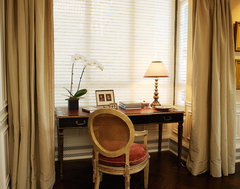 San Francisco Nob Hill Highrise · More Info
Or...leave the bench in the bay to have a spot to soak up the sun and put a narrow console on the wall opposite the fireplace.
Joe thanked pcmom1 - 11 years ago
We are very happy for you in your new place .. in 90 days or so, as you get settled in, bring us some pictures so we can cheer on your progress.
Joe thanked libradesigneye Joe
Original Author11 years agoWill do! But first, lol I just came up with two more questions!
What if I did a different shade of blue for the dining room, something a little lighter but still a Navy? Or should I just keep it the same color since it opens into the living room? Only reason I thought this was because its a smaller room but then again the wainscoting will brighten it up a bit.
Second question: thoughts on this rug for underneath the dining room table? Dark wood table and darker hardwood flooring.
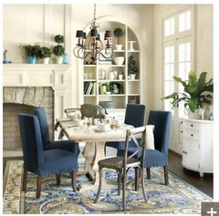
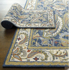
- 11 years agolast modified: 11 years ago
The dining room might be a great place to test your best blue, but as the rooms are adjacent I think they need to match. Don't be afraid to go for something a bit more iris or cobalt than navy .. maybe in a matte finish . .
Just in the dining room, if the wainscot is high, you might do a blue ceiling. .
on the walls . . a lighter shade of blue will move away from the transitional feel you want towards something more traditional .. not where you want to go with that leather upholstery and since the house is very traditional in styling, and you are adding wainscot / (tall I hope for the light it will bounce around) you need the dark blue to counterbalance.
I think you'll like the rug and that is what matters. Rugs are almost like art - very personal. Colors are good.
Joe
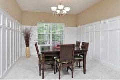
Original Author11 years agoIt's crunch time and I need to make some decisions and I'm being indecisive! Thanks for your continued help Libra. Regarding the wainscoting, I'm torn between the style and the height. I am afraid of going to tall because that room isn't that big and has standard ceilings - how about something like 48" which would be over the window sill.
The style, I'm liking the board and batten and the square paneled type both pictured below.
Back to the color of the trim, would I paint the wainscoting the same color as the rest of the trim in house. Like the fireplace mantle and baseboards, window trim etc? I've always used a brilliant white but I'm trying to change my direction like you suggested. Your suggesting I should use an off white/warmer white - something kinda creamy colored like my sofa, correct? I happened to have a bunch of white samples from Behr and I found one that similar to my furniture but lighter, see picture below.
Board n Batten style trying to decide between:
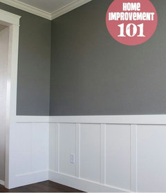
Or
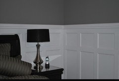
Or this panel style: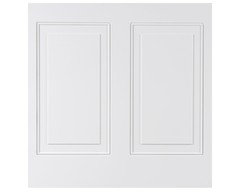
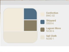
Lastly, the white trim color I was talking about, Confection BWC-02:
Joe
Original Author11 years agoBTW, this is partly what I was referring to when I mentioned being nervous about going to high with the wainscoting. I just don't like the way this room feels.
- 11 years ago
The higher wainscot is because you are using it with navy - and so you have the ability to make some horizontal interest - agree that the room you picture isn't ideal . . To my eye, the other styles are waaay too traditional for your style - the panel is out and the top choices is better but almost a throw-away because it has not too much interest. What if you line up the top with the middle sash on your window? that looks to be high enough to make it interesting without being too old english . . which is what the single horizontal on the picture you posted looks like to me .. not quite right for this house . . .
let me find a photo of the square version that i think you will like . . and be back.
- 11 years ago
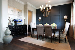
So, I was thinking two squares high - here is the full wall version as an accent - since you want to run yours around the room, I thought something more contemporary in line like this - with the top trim board lined up with the middle sash on the windows. That in a nice dark white will keep the transition between your living and kitchen going . .
the white you chose is yellow / cream based .. don't think that compliments your furniture or the navy - you want a dark white that is sort of greige undertone - warm but not yellow - warmed with greige (like a man's chino pant) undertone
 Dining Room · More Info
go test bm seashell - warm but sandy warm not yellow warm .. sw can make you a perfect match of this . . .http://www.benjaminmoore.com/en-us/paint-color/seashellboth home depot/behr and sherwin williams will make ben moore colors
Joe
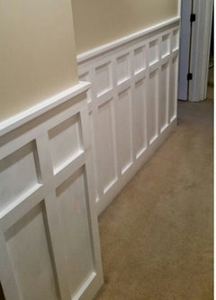
Original Author11 years agoHow about this look:
I like that seashell color! However, the more I think about it I'm leaning towards just going with just a pure white so I don't have to repaint all the trim and doors everywhere else. Not sure I'm up for all that painting with all my other tasks lol.- 11 years ago
I understand - maybe use the seashell only on trim in the living room and dining room . . that is where it is adjacent to your leather and it will make the biggest impact . . if you like the last photo, and can line it up with something that makes sense, fine. If going to the sash on the window (the horizontal line where the upper pane ends) works for you, you might put your horizontal element just under the window so it runs through as trim and has a connection to the architecture of the room.
Joe thanked libradesigneye  11 years ago
I think the wainscotting needs to be 28-31 inches from the floor or lower; maybe even below the window low edge. That is how the pic below was done all around the room below the windows. You can also do squares below the rail with wallpaper pattern done in the squares with solid blue on the upper walls. Nice architectural detail.
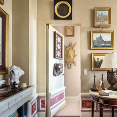 J. Pocker Ledger - Client Rooms · More Info
Joe
Original Author11 years agoAhh, I understand now what your talking about with the flow of the architect. If I do the last picture I posted the 2 top squares/horizontal element won't really line up well with the windows.
With that in mind, I think your original idea may be easier and look nicer against the window:
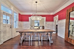
- 11 years ago
I still think that is a winner if you want wainscot. Low wainscot always calls to mind colonial homes, which is not the vibe you are going for .. . this photo blends modern chandelier, modern chairs, traditional table and traditional room with pow color. I grabbed it because it seemed to have some of the elements that make a transitional look work the best - going more modern for your lighting will make a big positive difference.
Joe
Original Author11 years agoI agree! Besides the height, what other features of this type of batten board contributes to the transitional look I'm going for? Would it be the closer/tighter spacing the type of top shelf cap they used? I'm having the work done within the next day and want to have it done right the first time. I think this particular batten board is spaced out about 10" but I could be totally wrong.
Joe
Original Author11 years agoNow that I have the painter in our new home, I have decided to paint the kitchen too. Originally, you suggested to go with a white paint for the kitchen but now that I'm inside, I feel like I'd prefer some sort of color. But, it does need to transition well from there, to the dining room and the living room which will all be the navy & white. The kitchen is like a vestibule and several rooms enter into it and can be seen from in the kitchen. For example, aside from DR & LR, the laundry room (which is a neutral beige type color, I believe called Bittersweet Stem) and family room (which will be a greige color called Fawn Brindle).
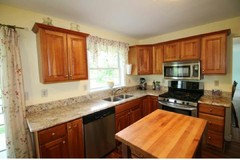
I was thinking something with a little gold, or djon like you mentioned to go with the gold tones in the granite. I want to have a color that complement my cabinets as well. Thoughts?
Here is my kitchen now: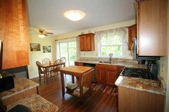
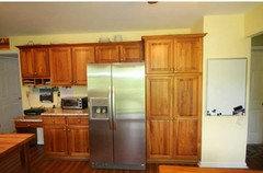
 PRO11 years ago
Navy blues and greys are in right now. There are so many different variations to choose from. I like the blue that you chose!
- 11 years ago
Fawn brindle is a terrific greige. Painting over the bittersweet stem isn't a priority now but you want to do it eventually - it isn't in the new house palette - painting it the same as the kitchen would be best.
I'm normally a yellow fan - have it in my kitchen and family room - but here I think that yellow would be a mistake. You have it on the walls now and it isn't doing much for you - though good yellows are difficult to select. You have a lot of gold tones going on already - bittersweet stem is going to clash next to yellow or dijon walls even though it is a minor element adjacent I don't think yellow is the right thing here. I think you want a neutral here - not sure contrast back to the white trim is good here.
Bringing a light shade in the direction of the fawn brindle in here might be your best strategy. Yellow is going to be verry traditional with these cabinets and you've set up the rest of the house as a transitional mix. I thought this would be a place to use your bright white but I can see that going white might feel too boring or blah.
SW has a great color called canvas tan that I think you might try - it will flow from all of the rooms, give you contrast back and keep this room light and bright. Then, you can still use a dijon ceramic duck or two . . but shift to blue and white kitchen linens. If you want to use a lot of yellow accents in the kitchen then you would need a pale gray - they have some that will work with fawn brindle but the beauty of fawn brindle is that it is a warm gray . . so canvas tan flows from it beautifully, is great against white and wood (trim and cabinets) and could set up a kind of nautical vibe with the wood . . consider a nautical light fixture here where the fan is - there is a sort of steampunk kichler fan in that would be terrific if a fan is right for your climate.
Since your trim around doors and windows is painted - wow, you can really see that with this stone the warmer white trim would be so much better than the trim white they have going now in here. With canvas tan on the walls, it won't clash but feel crisp like you like.
Add blue - if this is yours, your art has lots of green - maybe frame those in a wide denim blue washed frame . . change the curtains from sheers to something like a cheerful suzani print with white and blues and a bit of mustard .. so you get some color and print here - if you inherited sheers - sheers are hard to balance with heavy cabinets and appliances - visually they belong more in a nursery or guest space.
Joe
Original Author11 years agoI actually purchased the Bittersweet Stem for the laundry room but haven't painted it yet, it's currently a pastel green color. I'd rather not have to repaint it and what your saying is making sense. Maybe I'll use the bittersweet in the small bathroom off of the laundry room. It's a small bathroom, with a white wood work around the window and a white pedestal type of sink. I was thinking of using a maroon type of color as an accent around the small window wall. It's a shame I don't have pictures of this bathroom or the color name.
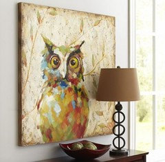
What about the canvas tan, or a lighter variation of the Fawn Brindle for the kitchen and laundry room and an accent wall in the kitchen, such as the wall under the fan? Or would that be too much? I have this painting that I could possibly use if I did a goldish tone accent wall. See photo below.
All of the paintings in the photos of the new house aren't ours and all of the window treatments are already down and we have new ones going up.
BTW, love the fan idea! Actually, like all your ideas - you've been a huge help for us!
- 11 years agolast modified: 11 years ago
I think that art would be great on a canvas tan wall as is. I'm not a big fan of accent walls in general except when you have a feature you want to draw peoples attention to in a very contemporary space . . powder rooms are different though ..
If the end wall of the kitchen flows to the family room and you want to paint it fawn brindle instead of canvas tan that is a personal decision but I don't think it is a great idea for the mix you are trying to get. This art against canvas tan is going to do much better than this art against fawn brindle.
A powder room is a little different - doing something unexpected can be fun ..and I like the idea of a end focus where the window is "framed" with a color
however, i'm not sure where burgundy came in as that is such a specific tone and not one I envision well in a room with white bath fixtures or anywhere near a green laundry room. If the laundry room is apple green, and you want to keep it / not paint it, then the accent wall in the powder should be in the blue or green family. Apple greens are a natural pairing with navy and warm white and warm grays, and they appear here in your art. They are great with white and wood, but getting just the right shade is critical .. . and green reflections are not great on skin so usually bathrooms avoid them - if you are using it only on the window wall, that should not be an issue but that won't flow great from the laundry area.
The bittersweet stem has a red undertone - not great with the other elements / doesn't flow - and bad with burgundy (a blue red - this is an orange red undertone). I think you want to use it only if you recolor it or use it upstairs in a guest bedroom. Your art has some rust tones - you could get the stem recolored to a deep muddy red orange easily
Is that a color you want to use as an accent or like enough to introduce permanently? Recoloring in the same family is ideal - something to use only as the single accent end wall in the powder room - you could take the paint back and they will add the colorant for sw spicy hue to make something you could use for an accent (they will just put the color for spicy hue over / in the bittersweet stem). It wouldn't be my choice but it will work - but then you need to paint out the green laundry room and paint the rest of the bath with canvas tan - so you can use the spicy hue tone - green next to bittersweet stem will be bad. You could get color added to go to a darker taupe neutral - deeper than fawn but more in that color family for that back wall. Those shades will take over the stem well - but it is a nice shade if you want to use it in a spare bedroom upstairs. you might let it go for now . .
Let me think about this and come back with a better idea for you - my first instinct is to say - put more canvas tan in the laundry and bath and use apple green or spicy hue as your end wall. You don't want the colors to call attention to themselves except at the accent place ..
Joe
Original Author11 years agoI'm actually at the paint store now and am looking at the paint chips. We decided we liked the canvas tan for the laundry room and kitchen however, it is very light now that I see it in person. How about the Urban putty, just a little darker than the canvas tan.
I think I need to come up with another color other than green or red.
- 11 years ago
Not as great with your wood tones but sample if you like it , you like it - darker is okay but you have to stay warm to work with the wood and then you are clashing with fawn brindle .. you need a room that is full of light after the navy rooms and the kitchen is the right one for that . . use your navy on the back wall of the powder room to tie it all together - or come up a shade and do something like a teal blue
Joe
Original Author11 years agoGreat suggestions, thanks again! I definitely owe you for all your help!!
 PRO9 years ago
white white
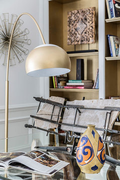
white...all of the walls. you can make them textural like grass cloth then lacquering them...white. Use navy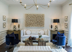
accents. But do sheer linen texture of windows in white. accent with gold and navy.







libradesigneye