Software
Houzz Logo Print
anniebird

Is this kitchen boring?

11 years ago
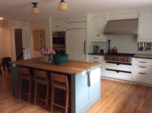
I ask because everybody seems underwhelmed when they see it. I'm wondering if I'm missing something and there's a problem no one wants to mention. Honest feedback?

Comments (112)

  • 11 years ago

    Loved every thing about it, (including the lights over the island) even before I saw the dining nook. It's wonderful!


  • 11 years ago

    It is gorgeous but even with lights it seems dark. This will be a thoughtful inexpensive fix. I would start by removing the covers from the over island lights and just see if when the bulb is exposed they bring in enough light. If so, all you would need are new covers. I would use either nightlights or a string of xmas lights to experiment with an under cabinet lighting effect. You have a great kitchen and a great eye good luck.

  • 11 years ago

    I think it is a beautiful kitchen, and it looks comfortable to cook in and to hang out in. It's hard to tell from the photos if you need more light or different fixtures, but if you do decide you need more light that's an easy fix.

    I wonder if the "underwhelmed" response you've been getting is because you designed it in classic, timeless style. It looks like a real kitchen, not a showcase. I think that's a huge compliment!

  • 11 years ago
    last modified: 11 years ago

    I want your kitchen. Send it to me!

    Seriously, though, it is spacious and classy. It looks like a nice place to work, too. I like that it's not trying too hard. Personally, I really like the white cabinets complemented by the pop of color on your island. I like the butcher block on the island, too.

    The person who suggested colored subway tile to match your island (or pick up some other detail?) has a point: a little more color or texture would add additional interest.


    EDIT to add: I just saw the follow up pictures. They reveal a lot of wonderful detail not evident in the first photo. The cosy dining spot, shelves, and windows add a lot of interest. The dining spot in particular is warm and inviting.

  • 11 years ago
    last modified: 11 years ago

    I like it even more. The wood of the banquette is stunning and so warm looking. It balances the coolness of the cabinets. That's a good thing as in "you did good" not as in "you saved it from being a mess". I think I'm digging myself a hole.

    There is a touch of old-world about the kitchen which is very cool.

    The dogs area rug is perfect.

    The island lights (I haven't commented yet) - It looks like they have some orange in them and having seen the rest of the space I really like the combination of the orange and blue. I like the idea of staying with the orange for the lighting but I do think dropped pendants would be better. It would make the island and the lighting a cohesive unit rather than having your eyes bounce up and down. And then take that colour combo, which is in your eating area a bit, and add some touches to the perimeter.

    If you do nothing though, the space is amazing.


  • 11 years ago
    last modified: 11 years ago

    The cabinets are beautiful, countertops, floor...that island! Everything is lovely and I think what's holding you back is a bit more color.

    The blue island....love it! But then the color seems to stop. The island lights look a little vintage, so why not play off that?

    Maybe a light blue or green on the walls? That would make the display items over the banquette pop, too.

    I would also add a little more 'personality' by hanging up a fun clock and maybe a few pictures. You have lots of interest at the banquette and a great rug, but I think some color and pattern on other areas would bring that personality to the rest of the space :)

  • 11 years ago

    Seeing the rest of the kitchen, I LOVE the banquette and the light above it! I imagine curling up there with a book and a cup of coffee and just feeling peacefully happy.

  • 11 years ago

    Are these comments coming from people online? Or people seeing it in person? What were you coming from?

    We always get comments from people who see it in person BUT we took out two walls so it completely transformed the house. If we had kept the same layout but changed the cabinets and counters I doubt anyone would notice. :P

    But here? It'd be yet another white kitchen with soapstone.

  • 11 years ago

    I personally LOVE it. Very home-y and comfortable!! I don't like flashy for my kitchen, it's fine in someone else's. I Would say yours is refined and pleasant. ;)

  • 11 years ago

    well you sure are getting tons of feedback. since you asked, i'll throw in my two cents :) i think the perimeter is gorgeous. for some reason i'm not loving the island color (though i love the wood topper). the blue just doesn't "go" with the perimeter (this is my own opinion so disregard if you like). love your white cab color, the appliances, backsplash and the hardware. i'd have done an island to match the perimeter or more of a gray if you had to do a color. that blue just doesn't jive with the white you chose. maybe if it were a more creamy white? i'd also switch out the lighting to pendants. i might switch out the stools but i like that they go with your flooring and island topper.


  • 11 years ago

    The island color is one of my favorite things about this kitchen. On my monitor, it looks gorgeous and goes great with the perimeter. But I'm a color person and not into gray or greige at all.

  • 11 years ago

    I love the island color too. Thanks for the link to the light. It is exactly what I was looking for when redoing my kitchen but never found anything. I must have been looking in the wrOng places. I feel a little sad inside. My husband hates the pendants I had installed so maybe I should change them....

  • 11 years ago
    Let's banish that sad feeling with happy pendants! Those lights come in all sorts of shapes, sizes and colors - I hope they work for you. The pendant over our kitchen table was bought several years ago and hung in our dining room. They don't make it in that color way anymore, but there are other lovely colors available now. It is one of my favorite things and inspired the color scheme for the kitchen; the island is actually a grayish green - it's BM Duxbury Gray, and it pulls from the gray in the shade. I love the island color - it's earthy.
  • 11 years ago
    last modified: 11 years ago

    I think the underwhelming part is the wall of white and stainless steel. I think people are used to colorful backsplashes and they don't know what to do when they see an expanse of white. One wall is white/black and the island is light wood/blue. They don't seem to tie in together. I agree that black stools and a blue backsplash would make the space more cohesive.The small lights above the island seem out of place too. They are just so high up (but they are really cute!)

  • 11 years ago

    Wow - my apologies for thinking the island was blue. When I looked up the colour Duxbury Gray it looks like a slate gray but when I look up kitchens with cabinets painted in that colour it comes across as a blue-gray. Interesting.


  • 11 years ago

    And on my monitor it is a soft Robin egg blue! No gray tone at all. And I really liked that blue.

  • 11 years ago

    Yes sorry it looked blue to me too. Again your kitchen is very pretty and it certainly looks like you paid close attention to detail. My comments are just personal preference.

  • 11 years ago

    I also saw blue. It was a nice bit of interest.

  • 11 years ago
    No apologies necessary! I asked for your opinions and am glad to have them. Color is one of those things that you have to see in person anyway. The take away seems to be that most people find the semi-flush lights are distracting/not cohesive. Thank you for the other great suggestions - black barstools, different backsplash, styling with green apples in a white bowl (great excuse to find a nice antique!!). I'm relieved and reassured that there doesn't seem to be a huge design flaw. Thanks for your input!
  • 11 years ago

    Personally, I'm not into all the white, but I'd say the design and layout is NOT boring. Looks useful!

  • 11 years ago

    I think it is simple and pretty. I really like the blue on the island, and I'd be tempted to try to bring it elsewhere, maybe on the walls or ceiling? I would think that some pretty pendant lighting over the island could dress it up a lot, though. I would think that two nice sizable pendants could really add a lot of interest to the area.

  • 11 years ago

    This is not boring, it's lovely! The only change would be the pendant lights, and even they aren't bad. (Oh, you could position the pooch more central to the shots??? Grin...)

  • 11 years ago

    Beautiful timeless kitchen! I love it!

  • 11 years ago

    I read comments down to the new pics. Have to dash, but had to reply. I am the target audience for your kitchen. It is exactly my style and taste so, obviously, I don't find it boring at all!

    I love looking through design & regional interest mags. I often see kitchens that are beautifully lit, staged and professionally photographed that make a ho-hum space sing. Yours is well above many of those and would get many Wows if it were featured. It looks like a well-designed charming classic, IMO.

    Re the pup "bench" - I'm curious about the breed. He/she resembles one of mine ;)


  • 11 years ago
    Hi amck2! The furry "bench" is our dog Ruffo. He's a Bergamasco - an Italian Sheepdog. Very unique personality: more person than dog. I know everyone thinks this about their pooch. but I swear it's more true for this breed than others:). I love him dearly, he can be exasperatingly stubborn, and he is a big presence in our family. He's great with kids, occasionally forgets himself and tries to herd everyone, and is nicknamed "The Great Woolly Beast". Not a dog for impatient people or those who aren't confident about dog training - he would run the show if allowed - but paradoxically, would do anything to please me and literally smiles when I tell him how good he is. Ah, I could go on and on. Suffice to say, he is my Italian lover:)
  • 11 years ago

    It is a GW rule that your dog match your kitchen, btw! (The town of Bergamo is really nice and worth a stay, if you have not visited your "italian lover's" hometown --- I read that the Alps above the town are the home of the breed)

    It's interesting that many of us read the island as blue, when it is a greyed green. I wonder if the camera interacted with the light at the time of day it was taken.

  • 11 years ago
    That will have to go on my bucket list, Gooster. Like their fizzy water too - San Pellegrino. Cheap cases at CostCo made me an addict.
  • 11 years ago

    Bergamasco! Yes, I've seen & admired them in the big dog shows. Not my dog's breed but they sure photograph similarly.

    Back to your kitchen.. After viewing the additional shots I am going to weigh in with a contrary opinion to many regarding the pendant lights. I really like what you have. I love your pendants over the sink and your colorful drum shade and it works for me to have the island lights not hanging down, as well.

    I have schoolhouse shades that are painted in gradient blue stripes and it's really hard in photographs to do justice to the punch of color they add. I am familiar with your shades and IMO they do add that pop without fighting with your drum shade. Also, I've been in a number of new/remodeled kitchens w/ oversized island pendants that are a wow factor when viewing the room but hard on the eyes if you sit at the island. If I were moving into your home I'd keep them. My 2 cents ;)

  • PRO
    11 years ago

    Sorry that I could not see the dog in the first photo - it appeared like a dark spot on this computer, but when I looked at it on a different screen, it looked like a dog. At first I thought it was a step stool, for reaching upper cabinets/shelves, but it looked a bit short for that.

    It's nice that you have so many windows. I had a kitchen/breakfast nook in Houston like that, and the breakfast nook had windows on three sides of it, overlooking the back yard. My kitchen today only has views of the side of the neighbor's garage (really more a view of the separating wall covered with vines, but at least it does not look into any of her windows.

    I also like your high shelf with white pottery, but that would be very scary here in earthquake territory!

  • 11 years ago
    Lars, that was a delightful mistake! I've never thought of him as a fuzzy bench - he has a new nickname:)
  • 11 years ago

    Well. I think that the elements are tastefully done. The picture above doesn't give me a lived-in feeling or warmth. However, if you like it, then that is all that matters.

  • 11 years ago
    last modified: 11 years ago

    I really like it. Lucky you. I like lots of natural light, wood, cookbook and counter space. Love you pupdawg too. I like white and bright clean neutrals with splashes of interesting color that I can easily change out as I wish. I'll be happy to swap. Oh, for the photos, when taking interior shots, I find it works well to pre focus on an intermediate light level, then move the lens view to frame, and final click.

    You might not hear exclamations when the airy peaceful ambiance of your kitchen relaxes a visitor. It's a natural space. We don't often exclaim about air, water, and woodland paths.

  • 11 years ago

    This would be an interesting question for the Home Decorating forum.

  • 11 years ago

    Anniebird, among other things I love about your kitchen I adore your vent hood. Would you mind sharing details and if you are happy with it? Thanks!

  • 11 years ago

    I initially found the island lights a disconcerting element, and also agreed that the chairs would look better painted black UNTIL you posted the other views, and again see why getting a partial perspective is dangerous. Your chairs clearly tie in with the dining area (adorable) so changing the island chairs to black would NOT be a good plan, and I personally would not want two more hanging pendants with sink pendants so near. Too much visual clutter. Maybe some other island lights, but not hanging ones IMO. Soothing kitchen!

  • 11 years ago

    Lovely kitchen, great bones. All I think you need is a fun back splash (but I always think that:))

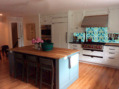
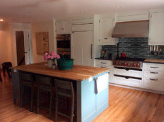
    Lights gone, chairs dark (not sure you need to do this - but just showing how it would look). I took the liberty of tossing in a Fireclay glass tile backsplash:


    I'm not saying to use this tile, but see the pop you can get with a bold tile and a calm pallette. Another Fireclay (Wave):


  • 11 years ago

    oldbat2be that's amazing! That totally changes the look of the room and makes the island pop!

  • 11 years ago

    oldbat2be, that first photo with the bright, fun tile fills my color-lovin' heart with glee. :)

  • 11 years ago
    last modified: 11 years ago

    I like the white subway as is--wouldn't touch it--but if you decide to replace it, go to your nearest big box store, and buy a can of epoxy paint, mixed in whatever color you like, and try that first. I've painted 4x4 tile a couple of times, with excellent results.

  • 11 years ago

    You have a lovely, classic kitchen. I'd only think of accessories/decorating if you wanted to jazz it up. If it were my kitchen, I wouldn't change much. I'd try a kitchen rug/mat. Something like a chilewich might look nice as the island seems to swim a bit in the middle (see below link). A plant or two in a contrasting pot (maybe black if you get black stools).

    https://www.chilewich.com/store/floor/shag_indooroutdoor_floormats/#


  • 11 years ago

    Like everyone else has already said, this is a beautiful, classic kitchen. You have done a great job coordinating all the elements and colors! I would not add a crazy backsplash because its expensive, a time consuming mess, and that is what you will be bored with in a short amount of time. Keep it classic but....this kitchen just needs a little bling to take it over the top. I agree with everyone about the pendant lighting. Get something fun and eye catching. Easy enough to change out in 3 to 5 years. The other thing I don't believe anyone else has mentioned are the bare windows. They create a stark look to an otherwise warm kitchen. I would do tailored Roman shades. This will be in line with your understated design and make the kitchen look more "complete".

  • 11 years ago

    PS....If you do get window treatments make sure they pick up the pretty blue color on your island so that the island color relates to something else in the space. That and new pendants would really pull it all together, IMO :)

  • 11 years ago

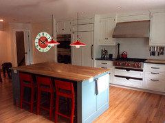
    I second Noelle's advice 100%. I love its classic look and you can keep it beautifully classic with a few pops of color/pattern that can easily and inexpensively be swapped out and updated in a year if it doesn't feel "you". I'm thinking one easy pop is swap out the artwork which appears very "beige" and neutral and replace it with it bit more of a statement piece with red in it to pull the room together, drawing from the red in your knobs and teakettle. Also, look at what a difference even just red stools would make. This kitchen has a very similar palette to yours. Pull more red and I think you've got some serious 'wow' factor because everything else is so clean and classic. Red stools like this will make a HUGE impact.

  • 11 years ago

    Here are a few options for artwork to add a pop of color/personality if red stools are too much for you, either statement-wise or cost-wise. This is a little whimsy with the right colors. And this is a nod to classic, retro style. Also, in the right color palette.

  • 11 years ago

    rebeccamom - you have a good eye for color; I think playing up the red is a good way to go.

    Here are some pendants and a wall clock. Maybe red canister for utensils? I keep trying to figure out how to add some red under the hood area.


    Noelle - I did a 'crazy' backsplash and am not bored of it. In hindsight, I didn't have the right whites, had way too much white (between cabinets, countertop and ceiling) and the overall effect was 'meh'. Adding a bold backsplash tied everything together.

  • 11 years ago

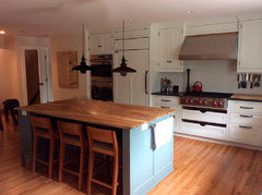
    Or, play up the black...

    Actually, I may like this best so far:)

  • 11 years ago

    I love the red with it! Great idea on the pendants. The contrast against the white cabs is perfect. But, I love the blue/red palette together so I'm probably partial to that. I'd add the clock or artwork, pendants or stools and then I'd lose the salt grinder and line up a set of 3 red canisters to the left of the range. (and put your cooking utensils in one) to replace what you already using. Or, add a big red Le Creuset on that stovetop - and call it a day. I wouldn't change the backsplash, but again, I'm partial to keeping the more "permanent" elements clean and simple - so that you can change things up as styles change, and not be locked in to anything. I love the clean simplicity of the backsplash just as it is. And, I like the drawers as a focal point - which you'd lose with a bold backsplash. Those drawers are awesome!

    Oldbat2be, how do you do that to photos? What software do you use? I would have so much fun with that!

  • 11 years ago

    I would add a colorful runner and artwork with lots of bold color. Dunno about the lights--I don't personally care for the ceiling flush mounts but more pendants? You already have a lot of pendants hanging from the ceiling and I'm afraid more might be too busy. If you like pendants for the island, then I would consider using recessed lighting over the sink area where you now have pendants.

    Also--not loving the shelving over the windows in the dining area. The shelving feels like it's smashing the windows. The windows would be a WOW feature without the shelving and trimmed out on top like the rest of the windows in the room. With the shelving, the windows feel like they're getting sat on. And the eye gets confused--it wants to look at/ out the windows but the shelving is distracting.


  • 11 years ago

    Anniebird, can you post a photo of the sink wall? I think we should see that too. There might be a spot for a kitchen rug or dishtowels to also add accent color.

  • 11 years ago

    Opps - sorry - just saw it.