Software
Houzz Logo Print
nrobrien

Dinning room paint color suggestions please.

11 years ago
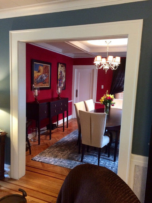
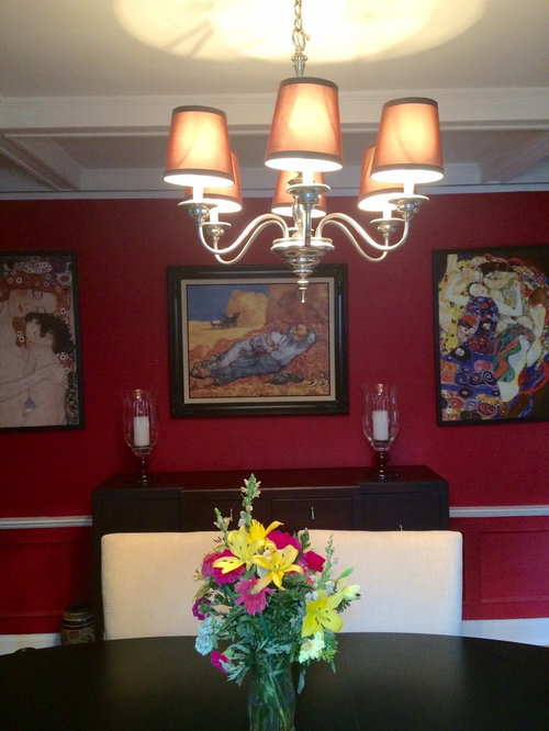
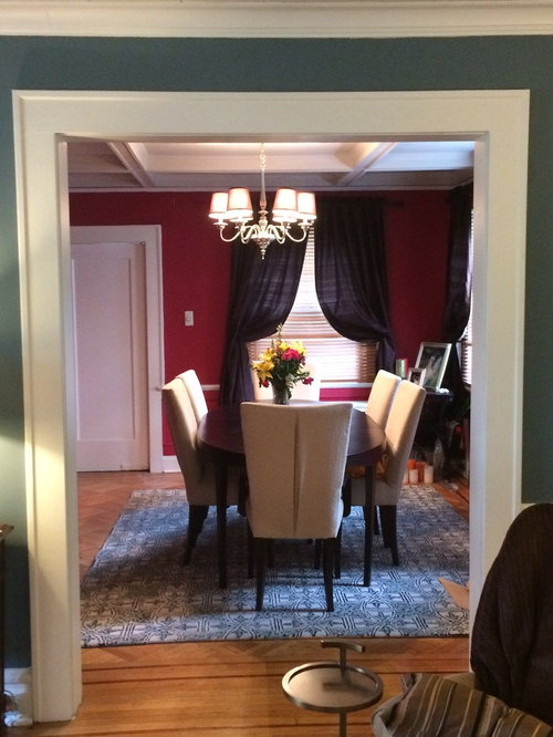
My room has been this color for the last 13years. The paint has held up well, but I want a change. The adjoining living room is Smokestack gray from Benjamin Moore and I wanted a complimentary color but still have some drama. I'm keeping the furniture and rug, and I really like the art but I'm open to change. The silk drapes I made and love, but can change. Would love any suggestions.

Comments (47)

  • PRO
    11 years ago
    last modified: 11 years ago
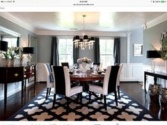
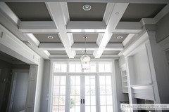
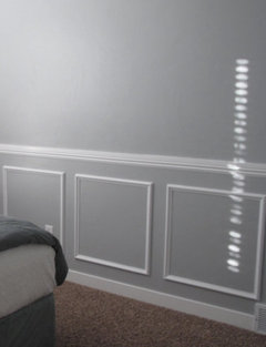
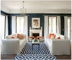
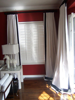
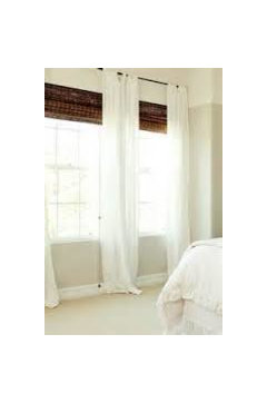
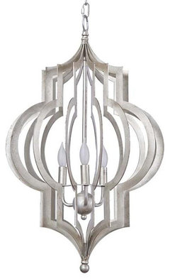
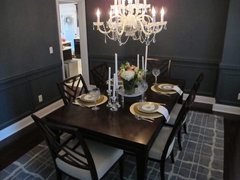
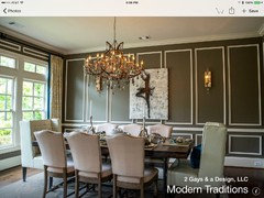
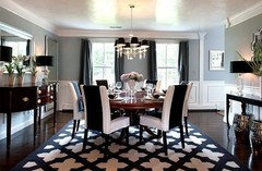
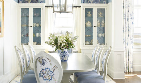
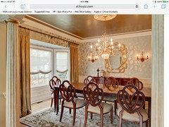
    I love that you are not afraid of color:) What about finding a gray that works well with the blue that you have in the joining room about 3 steps down in darkness. Then on the inside of the coffers only do that same gray but again but bumped up to pull your eye into the room and up to the ceiling. Keeping al the furnishings but maybe changing out the chandelier for something for eye-catching and dramatic as well. In terms of the drapery I would go with a bright white banded in the blue from the area rug. Remove the blinds and add reed shades inside the windows for added texture and warmth. The warm brown tones will play off the floor and furniture and pop off of the white and blue draperies. If you love your art collection keep it the neutral tones will also enhance the dramatic subject matter and let the colors pop:) I also see you have a chair rail in the room with frames below. I would keep the frames white as well as the rail and then introduce the two shades of gray into the detail work.

    Color in a coffered ceiling

    Below the chair rail do the darker gray with the white as shown and the lighter gray inside the frame.

    Banded draperies opened up out of the window to make the windows look larger

    Reed shades side the window for color and texture

  • 11 years ago
    Intermix interiors Thanks so much for taking the time to add pics! I love your idea of painting the coffers, and have often thought about doing so, but the thought of taping was ugh... Lol..
    I have those type of blinds in my kitchen and really like them, never thought of adding them to the dinning room as I figured they need something "dressier" but I see your vision. The room also has a wainscot with a small ledge, should the entire room be painted with the grey or the top 2/3?
  • 11 years ago

    Miacomtelady thank you! Neutral was an idea we tossed around, although I'm color loving gal, myself. I will definitely keep it in mind as it will be a change.
  • 11 years ago
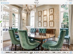
    What a gorgeous room! I love the read, but understand the desire for change. My first thought, on seeing your artwork, was some shade of orange. I am not good at finding and attaching photos, so I hope this one comes through. Good luck and let us know what you decide.
    http://houzz.com/photos/46502
  • 11 years ago
    I'd go color on top, white on bottom! Especially with a bold color!
  • 11 years ago
    last modified: 11 years ago

    Love the red, very vibrant. I think a sky blue to navy blue would be a good choice but could go with orange too. I do think I would paint out the chair rail.

  • 11 years ago
    Junef22 thanks so much for your suggestion. Orange was not only radar at all and I see how it can work with the art, but not sure it will give my home a cohesive look. My living room has red chairs which we are not changing so the color really needs to complement the living room decor as well. I'll post a pic.
  • 11 years ago
    Junef22 Hi! for some reason I can't attach the pic in my comments. When you have a moment you can check out my other design deliver on my profile for a peak at my living room.
  • 11 years ago
    last modified: 11 years ago

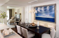
    I would paint your room the same color as the living room, but one shade darker or lighter (including the chair rail). For a more modern look, I would remove the tie backs on the drapes and you may need a longer rod so drapery can fall on either side of the windows. If possible, would also remove the blinds. I would move the middle art piece to another wall and bring the two others closer and centered over buffet and just a modern bowl to compliment your art. Move your hurricane lamps to the dining table + a centrepiece and would also remove the corner table. Hope you don't mind these suggestions, but you mentioned you would like a change.

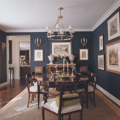
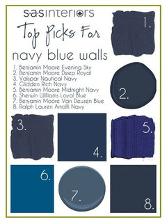
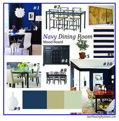
    Dark Blue Dining Room · More Info
    Lazy Susan Gold Vortex Bowl · More Info
    Living Large · More Info

  • 11 years ago
    Dar Eckert. Hi! Thanks, I've loved it to for many years, and at dinner parties with the right lighting everyone is beautiful! Liking the navy blue idea a lot, great suggestion. It would definitely be dramatic and a change. I would absolutely have to keep the light colored drapes that InterMix Interiors suggested. My home is surrounded by mature trees and doesn't get much light in this part of the house.
  • 11 years ago
    last modified: 11 years ago

    A view photoshop of -- paint color the same as chairs, but what about the rug's blue on ceiling, subtly? That would be a soft look of blues and creams - adjoining is it blue-grey?

  • 11 years ago

    If it's gloomy, maybe a soft warm tone.

  • PRO
    11 years ago

    light grey/blue should lighten it up and compliments the dark blue in the other room. Lighter curtains would look great too.

  • 11 years ago

    Blue was mentioned before, and i think it would work beautifully. How about a dark purple from the Klimt reproduction on the right?

  • 11 years ago
    Maybe a light gray would look good but change the flowers to blue and change the artwork.
  • 11 years ago
    what are thoughts about BM'S fan coral or rust for the wall color?

    or do you want to move completely away from the red family?
  • 11 years ago

    Minor point I think, but red has the drama that rust doesn't have. Maybe Kelley's idea of earth toned? Maybe not too dark as to compete with greys... sounds like the desert all of the sudden....

  • PRO
    11 years ago
    last modified: 11 years ago

    The purple will make the room seem smaller with the dark furniture, so if going that direction I would do light curtains and potentially a light or even white rug for drama and to lighten it up a bit. Also, the current rug may compete with the art due to the pattern so the simpler the accessories, the better. You could also add a mirror if there is room to add some lightness.

  • 11 years ago
    Perhaps a rich yellow gold color (see photo below) would be beautiful. It would it would be a saturated color (colorful) and add brightness, plus complement the other colors and especially the paintings.

    http://houzz.com/photos/2346937
  • 11 years ago
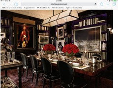
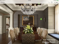
    Ok, we must be related. I have the exact same colors in my living room and dining room and I'm wanting to make the same change. Down to the white on the dining room chairs. Here is what I am thinking about. I want to take it up a notch - more sophistication, a kind of sultry interior. I really like the black dining room (without the purple) but I'm afraid it will be too dark. I am also seriously looking at wallpapering the dining room with a Phillip Jeffiries paper in leather or animal skin (crocodile). Keep me/us posted on what you decide as I have to repair my house from a flood so it won't happen until the repairs are done. I'll see if I can find any dining rooms with the Jeffries wallpaper in it and post later.
  • 11 years ago
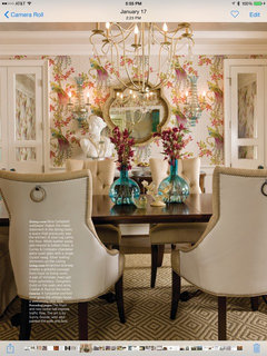
    What about this wallpaper?
  • 11 years ago
    here are more phptos
  • 11 years ago
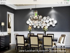
    Wow such great suggestions! I'm feeling the two tone grey of your first room Maureen and yours too bellburgmaggie. Wouldn't it be interesting to use Dar Eckert's navy or blue suggestion in a two tone effect? Thinking more along the lines of a metallic effect for the bottom ( I've used RL metallic paint and love the effect) and a similar shade in flat for the top??
    Thanks Kelley, but everdebz is right, I don't think the rust will give me the drama that I'm looking for.
  • 11 years ago
    Thanks for taking the time to post sootsprite, that's a beautiful room, but I think I want to go for more color in the space.
  • 11 years ago
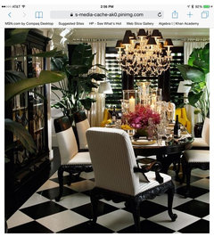
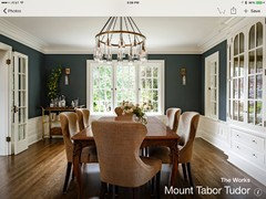
    I found this one which would go with your dining room.
  • 11 years ago
    That's gorgeous! Love the design of the drapes. Hmm....one to show to hubby. @bellburgmaggie
  • 11 years ago
    found a couple more photos
  • 11 years ago
    Yes I like that one also, didn't care for the chandelier in the photo.
  • 11 years ago
    I think I accidentally started a new thread & meant to post here. Tell me if this is too wild for you. You said you want drama, but I'm getting the idea that you are interested in modernizing the look.
  • 11 years ago
    Yes like the navy and white very much
  • 11 years ago

    You want drama? How about a copper metallic for the walls? Very dramatic and beautiful. Change out your lighting for a crystal chandelier. Change drapes for a white silk. You can keep everything else and your room will be transformed.

  • 11 years ago
    @zazfuzzroc hope you've been well. Want to chime in on my DR paint selection? I really enjoyed your tips with my LR
  • 11 years ago
    more photos. this exercise is helping me for my change over
  • 11 years ago

    Hello. New day and 'new' look - so I noticed your art. I think it's getting 'lost' with such wall color. Even other colors might detract from it. Are you keeping them in this room?

  • 11 years ago

    Each has such detail and color both, that a color, even a dark neutral might be too much. What paint color did you say adjoining room is - their site might give appropriate complementing paints - I picture a very light and bit muted warm tone. Add opposite to blue tones in hall, which would have a bit of drama, but understated. ART!

  • 11 years ago
    Found another pic
  • 11 years ago
    Hi everdebz (and every one else) the adjoining room is smokestack gray from Ben Moore. They do have complimentary colors, and we actually have one for our little sun room. We like two colors so far that we are going to get swatches of (all from Ben Moore) Gentleman's gray and Almost black to see how it works in the room. We also envision their pearlescent white on the ceiling beams and keeping the white trim. Thoughts?
  • 11 years ago
    What are the Benjamin Moore numbers. I fave a BM paint fan.
  • 11 years ago
    I found them online. May I suggest cavair.
  • 11 years ago
    As a secondary choice if you are getting samples to paint on a sheetrock board. Remember, the red will alter the color of the room's paint samples. I like your color choice, my room which looks almost the same is Benjamin Moore Vermont Slate. My ceiling is a green gray but looks grey because of the blue in the wall color.. I can't remember what color it is but to make the trim pop, you will want to paint your fifth wall a color and I would consider a light grey blue haze 1667
  • 11 years ago
    We actually saw deep caviar as a suggested color while we were looking at another swatch and both felt it too gray for us. Thanks for the note and warning on color confusion when we do our swatches. My living room color was the first time trying Ben Moore paint, I've used to used random paints from Home Depot and gave that up and went to Ralph Lauren which I love. Ben Moore is slowing becoming my fave, the colors are beautiful. Side note my living room color is from Dutch Boy (that's a blast from the past right? I need to goggle them and see if they are still in business) I think it was part of the Martha Stewart line she did for them.
  • 11 years ago
    You may have to do a coat of primer over the red first. I did the BM paint with primer in it and it worked like a charm to cover PURPLE! One other hint, if you ever paint red again on a wall, be sure to paint the wall blue first. BM sells sample units of paint for $5 or so, to check out paint colors on walls, etc. I thought Vermont slate would look awful and my friend who suggested it was correct. So I learned to think about color differently. Be careful with the grays, because on four walls in a dining room it may appear to be a tomb. Hence why I suggested a bit of brown with the grey. And don't listen to anyone that tells you dark colors make a room smaller, it depends on the room. I had a room with a dark green on the walls and a light airy room and everyone went into the dark green cozy room. Also, put the paint on all four walls and live with it for a few days (without cutting it on the trim, just most of the walls). Then adjust to the new color to see if you like it at night (when you will be using it.) Post photos when you have it repainted. If you want to tie the two rooms together use a cut or a color similar to your living room, only lighter on the ceiling of the dining room
  • 11 years ago
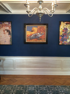
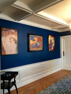
    Hi! Coming on to show the color we ended up with. It's BM champion cobalt. The bottom half is RL mother of pearl with BM pearlescent glaze over top. The room is not done yet still need drapes etc.
  • 11 years ago

    Beautiful.

  • 11 years ago
    Thank you! @jean benelli My first choice was gentlemans gray but hubby was afraid of it. This was a good compromise for us both.
  • 11 years ago

    Lovely hair/ rocks show well against the blue.