Software
Houzz Logo Print
hollister

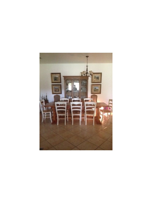
My dining room light is terribly wrong.

13 years ago
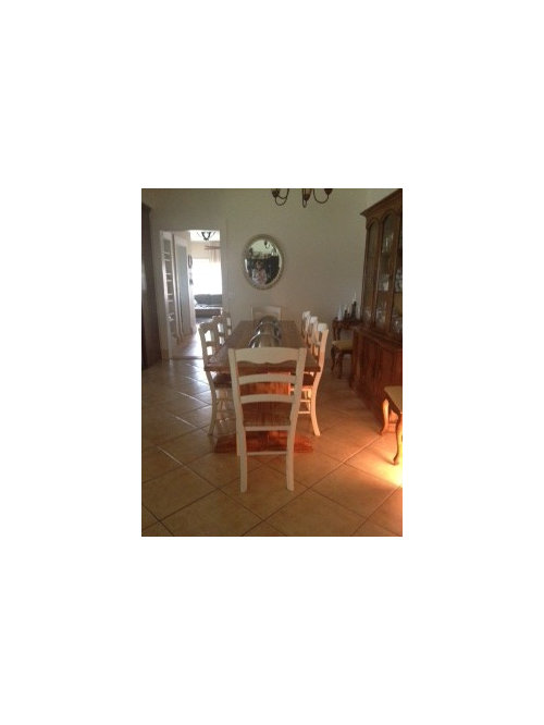
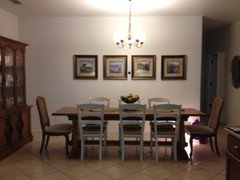
I though fixing my light fixture would help this room but this picture taken today really has made me wonder if everything else is ok. We moved in to our home recently and our farm style table fits nicely but the light is way off. Do you think the room is too busy? Should I remove the artwork or the chair on the sides of the hutch? Will a simple light fixture fix everything? My room is very dark and I need to choose lighting that will illuminate the room well. The paint is white because that is the way it was. I am afraid to add color for fear of darkening the space. The cabinets are cherry glazed chocolate which I don't want to change. I just want to light the room and now I think I really need some ideas more than just getting the right light fixture.

Comments (66)

  • 13 years ago
    last modified: 13 years ago
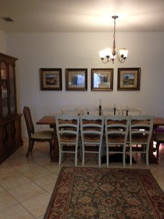
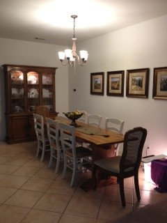
    I've been working on all of your suggestions, thank you all so much, I thought I would show you the "new" version of my room. Here's what I have done:

    1. move hutch to other wall - check
    2. move table centered under light as much as possible - check
    3. arrange artwork in a line (they are centered on room, should be centered on table?) - check
    4. add runner and candlesticks -- check
    5. add rug - tried but nothing I currently have will fit- 8x11 is too wide - so i just put one on the tile in front of the table for now
    6. move mismatched chairs to end of table (is 10 chairs too many?) - check

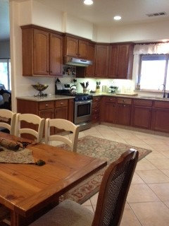
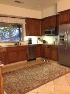
    Ok, so what do you think? Did I forget anything? I included the same two views of the table in its new surroundings and added two views of the kitchen so you can see the whole room, I thought it might spark some more discussion. I think I need an island and a backsplash and some color.

    Can't wait to hear more, thank you for taking another look.
  • 13 years ago
    PS..In your space, I don't think you need an area rug under the table. So, I'd center the rug with your kitchen area instead. Lookin good!
  • 13 years ago
    Wow, what a transformation! Well done! The wonderful result of collaborative effort...so nice to see. Thanks for posting the photos.
  • 13 years ago
    last modified: 13 years ago
    This seems much better. I agree that the pictures need to be positioned on the wall to match the table. I like the two darker chairs on the ends but feel like you have too many chairs on each side. Try using only three on each side. Maybe you have some place to put the extra two chairs unless you actually need them. Maybe you can get a longer chain for the light fixture and swag it to the center of your table - dropping it a little lower. I'm interested in what you end up with so please continue to post your progress. Everything is so neat and tidy. This can be a lovely room.
  • 13 years ago
    Thanks guys, I think it is better now too. What do you think of the kitchen area in relation to the dining, is there anymore that can be improved?

    OK, I will move the art-the holes were already there because that is how the art was before the hutch came. One step at a time is always best.

    Darzy, I have a question about the centering in my kitchen area. The table now is not centered in the kitchen area, it is now out of center. It was centered in the before pics. So, now if I want an island or a rug centered in the kitchen, do I ignore the relation to the table and center in the kitchen space. Basically, it seems something has to be off but maybe that is ok. Would you put a rug under an island?

    Mveasey - did you notice the light in the hutch "after" picture? I forgot it was there, so I plugged it in before putting up against the wall and Voila! Thank you.

    LBinteriors - I think the mismatch dining set is working, do you think the chairs are too crowded, or is it ok? i also might paint the chairs, maybe greenish something for a little contrast.

    Also, still need to figure out light fixture, almost think now, if canopy was rectangular, i won't need to move box if I find a linear style chandelier.
  • 13 years ago
    As far as "centering" goes, I would treat each space individually. It's okay if the dining table is off center with your future island. I'd only keep an area rug under an island if it was on wheels to move around to vacuum. Even if you get a linear chandelier, it looks like you'll need to move the electrical over on the ceiling. Is it possible to move the table right 6" to have the chandy centered? Hope so. Also, I don't think you should paint the dining chairs. They look good with the table. I agree to pull out two chairs from the sides (keep the head chairs...they complement the hutch). Great job! You have a lovely home.
  • 13 years ago
    ps...will the kitchen rug take up too much space if you rotate it and "keep it in the kitchen"?
  • 13 years ago
    last modified: 13 years ago
    Darzy, thank you, I put table where it is because it lines up with the tiles on the floor, do they matter?

    Thanks for suggesting that the two areas can be treated separately.

    I repositioned table and rug. I need to fix artwork, do you think three is better than four. I am looking at three pictures- minus the left one but they are not centered on the table now so either way I need to rehang and I can't decide.

    What do you think about paint? I don't love the big soffits above the cabinets but can't change them, do you think color will make them look their best?

    I think everyone agrees too many chairs, I just pulled two away.

    If all lighting and faucets are oil rubbed bronze, should I keep the new lighting the same? I keep finding light fixtures with steel or nickel and don't know if I need to keep avoiding them.
  • 13 years ago
    I like the look of the four prints on the wall in your space. I also like your wall color as is. It works nicely with the cabinets and your dining chairs. Don't worry about the soffit. Like L said, just don't put any decor up there. BTW..unless you need the extra workspace, I wouldn't get an island. I like the openness and with your dining space there, it's open, yet cozy with the rug there.
  • 13 years ago
    Just wanted to share an article that addresses your fear that painting a color would make the room look smaller. I had a room that got very little sunlight and had it painted white. It is now painted deep burgundy and a purple taupe with white trim. Feels so much better than the white that always looked dirty and gray. You don't have to paint, but don't be afraid to try a saturated color in a dark room.

    http://www.devinecolorblog.com/2010/04/color-advice-101-choosing-color-for-a-dark-room.html
  • PRO
    13 years ago
    last modified: 13 years ago
    An "island" center in the kithcen? Looks like you have room for one. The placement can come forward to the end side of the kitchen cabinets before it becomes the dining room.

    China hutch cabinet needs to be centered on the wall, not centered with the table.
  • PRO
    13 years ago
    I would lower artwork, the four pieces are too high. Center line of artwork works better if it is about 62"- 65" from the floor.
  • PRO
    13 years ago
    I think an island is more practical than a carpet in the kitchen without anything on it except spilled food.
  • PRO
    13 years ago
    last modified: 13 years ago
    Another thought, if you choose to have an island, place 2-3 barstools on the side facing the dining room. Great for kids' homework while mom's cooking and breakfast in a rush. The island may come with an extended ledge for this purpose or can install one on the back side. Can be slightly lower than original island top and can be made from a different material.
    Vrabel · More Info
  • 13 years ago
    I just moved the hutch to center on the wall, this picture shows it still centered on the table. LB Interiors, thanks for all your suggestions, i do think an "island" will be nice, even if it is small. The picture below shows how large the space is in comparison to the rug which is now set the other way - the rug is 5x8. So the space is probably about 9x9 from cabinet to cabinet.

    Jennifer thanks for link to the color blog, I do think that I need a color on the wall that will not darken the room but not look blah - The current color is Behr Swiss Coffee, pretty much builder white, I think. I like white walls when there is enough light but this room is very dark unless the lights are on so maybe a more saturated color would be better. But one that is reflective? Does anyone know if there is such a term for paint? It would be nice to choose a paint that you knew was made to brighten a space up.

    The artwork is currently hung 62 inches on center, do you think it looks high because the pictures are small? Or that the light is higher than it should be? I still need to figure out a light fixture and I guess it will hang right in front of the pictures, is that ok?
  • 13 years ago
    The light is higher than it should be. Otherwise, things are looking great so far! You've made some great moves/changes.

    What kind of light bulbs are in the chandelier? Are they compact fluorescents?
  • 13 years ago
    This looks so much better!

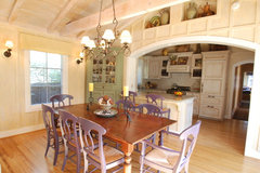
    Check out Rejuvenation Lighting for a number of pool hall style linear chandeliers, like this one:
    http://www.rejuvenation.com/catalog/products/scholls-ferry
    They will make the fixture the height you need, with lots of options for metal finishes and shades. And they're lovely folks to deal with!
  • 13 years ago
    yes, CFL's are very harsh light, maybe I should try changing bulbs out. Husband says we can change light fixture so that is the plan, but i still don't know the style that will click. Something longer on the table, and bigger, and more farm style.

    Thank you for the compliments. My family likes it better and I really do too.

    it is amazing what can be done with furniture positioning!

    So many great suggestions today, I would have never been able to do this! You all are very talented and I very much appreciate all of this help!

    I am still not 100% satisfied. I think I am craving some color in here. I want it to look more like a HOUZZ room...
  • PRO
    13 years ago
    last modified: 13 years ago
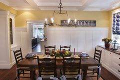
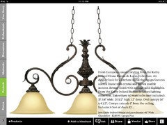
    This would look good over your table and centered in both directions.
    http://www.houzz.com/ideabooks/query/hanging-chandelier
    You could also put mirrors in the hutch doors instead of glass. That would also help to reflect the light or you could put lights inside the hutch that shone down from the top. Place them toward the front so they don't glare in the eyes--so you can't actually see the fixture behind the wood. You could also put artwork lights above the pictures.
  • 13 years ago
    Wow what a great transformation. Great advice from everyone and hats off to you for all that ambition in one day!
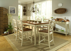
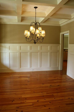
    I would also consider a backsplash in the kitchen, and definitely add some color to your DR walls so they have some contrast with the ceiling. You could also add beadboard or wainscot on bottom of wall, then put your color up above...creating a prettier backdrop for your artwork and chandelier.

    [houzz=
    fun on location · More Info
    ]
    [houzz=
    Restyled Home · More Info
    ]
    [houzz=
    Nantucket in So Cal · More Info
    ]
    [houzz=
    Hardwood Floors & More, Inc. · More Info
    ]
  • 13 years ago
    Love the transformation. Great job. It is inspiring and fun to see the before and after pictures.
    Hope you find your perfect light fixture and post more photos! The room is really lovely.
  • 13 years ago
    OMG..it looks great! Thanks for trying the rug the other way. Hmmm...it doesn't look right tho, does it? Is the table positioned there going to work? It looks like you don't have to move the electrical on the ceiling. ccwaters nantucket chandy looks nice. If you want to have a "magazine" kitchen, I think an updated window treatment...roman shade..above your sink would be nice.
  • 13 years ago
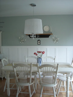
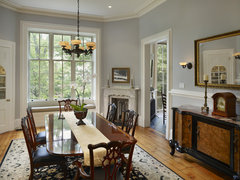
    Hey fellow Houzzers...Ms Hollister would like a color on the walls...what do you think about BM Harbor Gray to consider?
    Wyndmoor Residence Dining Room · More Info
  • PRO
    13 years ago
    Hollister, yes I really think you need an island. The kitchen space looks too barren without it. You do have the space for one and I assume you don't have a breakfast area to use that way. A small island will work fine. It's such an added feature. I think you'd enjoy the convenience of eating somewhere other than the dining room. What a great job and you're fast in re-arranging. Hooray.

    Metallic paint is a great option for wall paint in a dark room. It will catch light from other areas. Your walls need to be smooth or evenly textured or the paint will show all the imperfections of bumps and lumps.

    What colors are in the adjoining spaces near the dining and kitchen? Do you like specific colors.

    The artwork at the dining still looks a little off - I think you need larger pieces since there is nothing below them to help in the correct balance of the wall.
  • 13 years ago
    I think I might have to disagree with stools with an island here. The table is so close and I think it may look too busy with so many seats available. The space is not that big. An island for workspace, yes.
  • 13 years ago
    The light fixture still looks way too high.....and I think one with French look - lowered - would finish your space. But it's going to have to be centered over the table. The hutch looks good on the end wall. Don't think you need a rug under the table, just make sure the chairs move easily and quietly.....
  • 13 years ago
    What a difference!! It's looking great!
  • PRO
    13 years ago
    last modified: 13 years ago
    Another idea about art. Purchase a rectangle or larger oval MIRROR other than the one you had. Position it vertically in center of the space. Flank on both sides of the mirror each set of two artworks, one over the other, vertically. You will get more light reflected, metallic paint on the walls, and be able to still use your art pieces.
  • PRO
    13 years ago
    Hollister, can you take another photo? Viewpoint of the kitchen on the left and dining on the right facing that open doorway. I think you have room for a small island. The carpet is in the wrong place and is making it confusing. You seem to have it in a pathway? It's too small for the dining set. Maybe use it at a sofa area.
  • 13 years ago
    last modified: 13 years ago
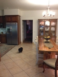
    Thanks everyone, here is another photo, this shows the space between the "kitchen" and "dining"- in the second set of photos above, the rug was turned 90 degrees from where it is now. That is why is was so confusing to look at the pics and figure out the space. I can move out the rug. i don't have one that would fit under the table properly - mine are 8x11 which are just too wide to look right. Our mini doxie in photo too!
  • PRO
    13 years ago
    Thanks for the new photo. Actually the 8" x 11' might work under the dining table. What is the length and width of the table? What are the dimensions of the dining space up to the right side of doorway. I think you have space for the island & barstools. Chairs of dining and barstools will not look wrong. They are in two different spaces and used for two different functions.
  • 13 years ago
    I LOVE the beadboard idea,that would look so great in that space. I would definitely add a backsplash and get a small island and add a little bit of color. It will give your room depth. I personally think that a backsplash makes a kitchen into a kitchen instead of "a room with cabinets". I like what you've done so far and your adorable doxie!
  • 13 years ago
    Yes, I noticed the light! The reason why this setup works, is because your hutch now looks as though it is an extension of your kitchen cabinets. I agree with Darzy on the work height island, no extra seating and the roman shade in the kitchen. I like the rug in the kitchen, it separates the space into two zones. About your light fixture, would you get a different one? How about a rectangular one? Glad your family likes the change too, not sure if your pooch approves yet! :-) and yes, amazing how quickly you got things changed around, hope you have a restful weekend!
  • 13 years ago
    The dimensions from the wall to the door is only 7 feet. The 8 foot wide rug would encroach on the door and look wrong - the length is ok. It would also not have the table centered side to side-here we go talking about centering again, this can get very tiring.

    Is it ok to do beadboard on just one wall? Or do we have to do both dining walls? Can it stop before turning the corner down the hallway? I have thought about beadboard for the backslash, what do you think about that idea?
  • PRO
    13 years ago
    last modified: 13 years ago
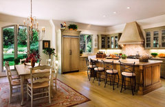
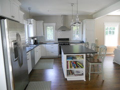
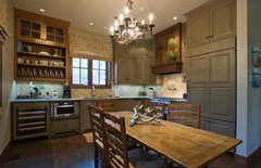
    Here are examples of island with barstools near a separate dining room. But choose a different barstool design than the dining chairs. Maybe this can help for a yay or nay.
    Carmel Cottage Kitchen · More Info

    Showpiece Kitchen · More Info

    montecito · More Info
  • 13 years ago
    You would want to wrap every wall that is part of the DR in the beadboard / wainscot to define that space....plus it will be beautiful.
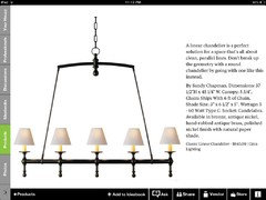
    I wanted to do a beadboard backsplash in the kitchen at our cottage and researched it quite a bit. There are actual porcelain tiles made to look like beadboard that are both beautiful and functional, behind the stove would be an area where you want real tile for easy cleanup. Your stove, however, appears to have its own backsplash, so no need for real tile. If you do go with beadboard for a backsplash, it will definitely give a certain country feel to it. To keep it a more 'current' country/farmhouse feel, I would look for a chandelier for dining, and pendant(s) for kitchen island that have some straight lines to them to balance the look. The example that mveasy gave you in the top left corner (by Sandy Chapman) would be gorgeous in the dining room with beadboard or wainscot.
    Another option could be for you to do a wainscot in the dining room (the "Restyled Home" photo I attached above has always been a favorite of mine), and a simple subway or other 'simple' tile for your kitchen....again with the same style straight line chandelier.
    As far as an island goes, I think it would look great and be super functional....as long as you have about 40" of walking space around it between island and perimeter cabs (they say minimum of 36", but I personally prefer a little more)
  • 13 years ago
    Just a tip,the bottom of the hanging fixture should be 36" above the table top and pictures hung at eye level and on both counts people tend to hang them too high. The transformation is amazing ...just goes to show how much furniture arrangement can impact style. I personally don't like rugs in a kitchen and would prefer an island without chairs. Darzy's always has terrific advice, I've been following her comments and I think she has a great spatial sense. Very much my aesthetic.
  • 13 years ago
    @ aniluap2..Thank you! We do think a lot alike.
  • PRO
    13 years ago
    Thanks for your kindness. You'll do fine if you go with your heart and make decisions based on what you prefer and who you are!
  • 13 years ago
    You all are great and have given me so much help.

    My "free" changes are now done, next step is to work on finding the light - love some of the suggestions you guys have already shown, I think adding the paneling to the lower wall and color on the upper wall might be just the answer too. Sparkly paint sounds interesting too, I think one of you guys mentioned it. I might have to wait to do the paneling I though because I think it will need to wrap it into the hallway which is carpet that I want to change to wood and should probably wait until that project etc.

    I also plan on trying to rework an old library table with some fun paint, casters and a new top to see if it will work as a small island, the size seems to be good but I need to add three inches or so to the height - we'll see if I can do it.

    Before buying "the" light, I might post it for all of your approval if that is ok. I will also post the island if it seems worthwhile once i get started on that project.

    I do also like the suggestion of a roman shade and might have to start searching for something there. And of course, the backsplash too, subway tile is preferable to me but beadboard might have to do - less $.

    Thanks everyone, and of course, if anyone thinks of anything else, I would love to hear from you.
  • 13 years ago
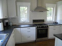
    Just one more thought regarding subway tile since you are concerned about price: You can get basic white subway for a mere 23 cents per tile at Home Depot or Lowes. It's very basic tile, no bevels, crackle, etc. I used it in my cottage with gray grout, see below. It's clearly a different style kitchen, but it will give you a good idea of what 23 cents tile looks like up on a backsplash.
    Just wanted to let you know...

    Good luck on the rest of your changes! It looks great so far!
  • 13 years ago
    last modified: 13 years ago
    yes that is so pretty. I love your kitchen, what is your paint color? Do you know how to add a photo to this conversation from my idea book. I just found a great kitchen photo that i would like to share
  • 13 years ago
    Hi hollister...there could be a better way to add a picture, I do this: After you find your picture you want, right click the mouse and click on the picture and click "open in a new window". Then, right click on the URL address and copy. Then, in your comment section, click a "spot" in the section then right click, paste, enter. The picture should come up.
  • 13 years ago
    last modified: 13 years ago
    [houzz=
    Farmhouse Living Room · More Info
    ] Living Room design by Other Metro Architect Timothy F. White

    http://st.houzz.com/simgs/f7e229780d3be000_7-9600/home-design.jpghttp://st.houzz.com/simgs/f7e229780d3be000_7-9600/home-design.jpg


    Traditional Living Room design by Other Metro Architect Timothy F. White
    I loved the colors in this kitchen and the light fixture is great. Do you think this color on the walls would be too dark? I like it with the cherry cabinet color.
  • 13 years ago
    Not sure if you are wondering about that color for your kitchen or DR, but with the white wainscot or beadoard to break up and brighten the DR wall, many colors could work on the upper wall.
    Regardless of the wall, the only way to know for sure if a color will work is to buy a sample and put it on a couple posterboards to place up on different walls, looking at them at different times of the day.

    The color you see on my cottage kitchen walls is Ben Moore's Revere Pewter. It is my favorite "go to" neutral.
    If you want to try some color, Darzy's suggestion of Harbor Gray might be something to consider in the DR (with beadboard/wainscot). BM Alaskan Husky is also a beautiful soft gray with a hint of blue behind it.

    Just be sure to use sample paint and posterboards for any color you are considering, and you won't have to repaint (learned that the hard way years ago ;)
  • PRO
    13 years ago
    This thread is the perfect example of why I love Houzz!

    Lyvonne
    www.essentialsinside.com
  • PRO
    13 years ago
    last modified: 13 years ago
    Hollister, I love that you could move around items that you already owned. That is one of my specialties. I love re-making anything. Good idea re: the library table. Glad to see another hands-on gal.

    Re: the beadboard, you absolutely do not have to wrap it into the hallway. the hallway is considered a different space because of the change in direction. The beadboard edges can end there.

    Use a small finish molding vertically on the left side of beadboard. Just be sure you include some beadboard on the "sliver" of wall on the left side of hall doorway up to the refrigerator cabinet. If you miss that area, it doesn't finish the flow. That is actually the dining wall also. Same trim on both doorway edges. Panel all the dining walls and doorway walls that are on the same plane as the larger dining walls.
  • PRO
    13 years ago
    In reviewing your pics again, I don't think you should have a rug under the dining table. Maybe someone already said that. Not enough room to sit all the way under the chairs.
  • PRO
    13 years ago
    We make Contemporary Stained Glass Lighting and Art. We customize size and color; visit our website at http://www.lightinart.com/ to see some options.