Software
Houzz Logo Print
hzdeleted_1049040

Comparing 3 Yellows

11 years ago
last modified: 11 years ago
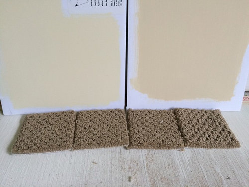
Hello...was wondering if anyone has any opinions on these 3 yellows that I am considering:

1. Standish White

2. Hepplewhite Ivory

3. Philadelphia Cream

This is for a home office in an upstairs bedroom in which the furniture will be white.

I have samples of Standish White and Windham Cream, but have ruled out Windham Cream (it is a delightfully pretty color but I think too pure yellow). The Standish White looks good with the carpet swatches, and coordinates well with other colors in my home, but thinking maybe I should sample Philadelphia Cream and Hepplewhite Ivory before I make a final decision.

The Standish White almost looks like it has a tinge of orange in it? My goal is to have a warm yellow that is not lemony. Kind of like a warm lit-from-within color. Standish White might be the winner. This room gets good light, that gets brighter as the day goes on (it is a corner room in the back of the house). So I don't necessarily need or want anything bright, but just want a warm yellowish tone that won't look washed out with white furniture. Also want to add that I'm primarily interested in BM Historical Colors.

Does anyone have experience with these three yellows in comparison to one another? The Philadelphia Cream card looks SO similar to Standish White. Do they lean towards different undertones?

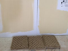
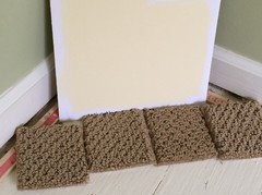
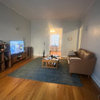
Here is a photo with carpet swatches. Windham Cream on left, Standish White on right ...

Comments (22)

  • 11 years ago

    I have very similar colors in my house - and similar carpet in my master bedroom. I went for the lighter (L) tone in the master, but the darker (R) shade in my guest bedroom and bathroom seems more sophisticated.
    In your case, based on your photo, I really think the right hand, richer color looks better with your carpet and will look fantastic next to white trim.


    User thanked gardenspice
  • PRO
    11 years ago

    Maybe consider a soft yellow full bodied color instead


  • 11 years ago

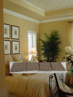
    That is a gorgeous photo Beverly, I wonder what yellow that is

  • 11 years ago

    Based on your picture I like the Wyndham.....it's brighter and more cheerful than the other which has more brown/orange in it.

  • 11 years ago

    I like the one on the left. But I have always had a problem with yellows being neon under artificial light.

    Pretty cream color.


    Neon ouch! (Closed the blinds and turned the lights on)


  • 11 years ago

    Wow Butternut! Is that the SAME color in both photos?? It looks like a COMPLETELY different color! What a difference the lighting makes.

  • 11 years ago
    last modified: 11 years ago

    I have SW Antique White in my downstairs hallway, in the stairwell, and in an upstairs sitting room that faces south. I chose it because it was one of the few samples that showed no peach undertones. However, I think that the lighter cream colors take on the color of the light, so you're in for some surprises as the light changes through the year. Antique White can look bright yellow on sunny days. Downstairs it can look green where it's near the green DR. Sometimes it looks colorless. So you might want a more saturated color like Beverly suggests. However, if it reads yellow on the paint chip, it will be very yellow on the wall. I picked a nice soft butter color for a powder room and ended up with what can only be described as egg yolk.

  • 11 years ago

    With such similar colors, the only way to tell which one you will like is to try them. Almost always choose something much paler than what you think you want.

    User thanked kitschykitch
  • 11 years ago

    may_flowers - I am familiar with Antique White (in fact I have Whole Wheat in hallway and all common areas which is further down on the Antique White strip). In my last house I had painted Antique White in the dining room and thought it looked colorless like primer on the wall. That entire strip has green undertones (although are in the yellow family).

    I don't want this room to have a "neutral" color in it - my hallway and big foyer all have neutral in it so I wanted an actual "color" in each bedroom. So I thought a yellow shade would be a good idea. That being said, I don't want lemony yellow, neon yellow, or anything to harsh...just a warm candlelight kind of yellow if that makes any sort of sense :) Obviously it has to look good with the carpet as well. I detect green undertones in the carpet.

    The Windham (swatch on the left) is VERY pretty, I have used it in the past, but I think just too pure of a yellow for the décor. The Standish White (swatch on the right) is better...but I just want to consider all my options before I make the final decision. The Philadelphia Cream looked so similar on the sample cards, Hepplewhite looked nice too. I guess I am just going to have to get mixed sample cans and compare them in the lighting.

  • 11 years ago

    Maybe the question to ask is whether you should be looking for undertones, and if so, which color? When I sampled creamy yellows, I could only see yellow, peach, and an ugly putty color for undertones, and I didn't want any of those. I looked at samples for over a year and still am not quite happy with AW. I don't know the answer. Maybe the peach in Standish White is the way to go, but I avoided colors with any red. I was afraid of getting the dreaded fleshy Band-aid color.

  • 11 years ago

    may_flowers - I think it all depends on your surrounding décor. Because whatever the color is next to, it will bring out the undertones. AW definitely has green undertones and can look great in the right lighting. For instance, when I hold the Standish White up against my Palladian Blue bedroom, it looks very yellow. But next to the Windham sample, it looks more peachish. Color changes depending on what it is next to. I agree, it is difficult and I have trouble finding the right answers...which is why I come on this lovely forum!!! :)

  • 11 years ago

    Another SW-AW person here. It's on 90 of my walls and ceilings and I love it. On this very gray July day with only natural light coming in, my living room walls appear creamy sedate yellow to me. It puts me in my happy space.

    I'm pretty sure I could go slightly more yellow, or is it really more gold? Unlike some people, I'm okay with green undertones. Anything but pink or peach.

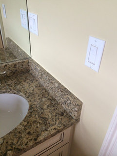
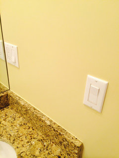
    I think I've read here on GW that yellow is for sure the most difficult color to get right. Philadelphia Cream looked so calm and pleasant as a little splotch on the wall. But four walls turned it into something I hadn't intended. Plus the light.

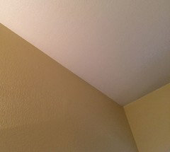
    Philadelphia Cream - natural light (Swiss Coffee on ceiling)


    Philadelphia Cream - halogen light from above vanity


  • 11 years ago

    With yellow you have to be careful about the light sources. Incandescents have a LOT of yellow to bounce back at you.

    We have Valspar's "Pina Colada" and it looks good day and night with white LEDs. With an incandescent bulb, it goes yellower.


  • 11 years ago
    last modified: 11 years ago

    Linelle that Philadelphia Cream looks so nice in the natural light. It's amazing how different it looks in the 2nd photo.

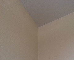
    All pictures I have taken are in natural light. I just picked up a sample of the Philadelphia Cream and it looks almost identical to the Standish White!

    Standish on left. Philly Cream on right in below photo...

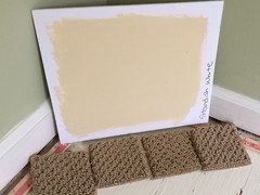
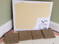
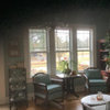
    Here are all 3 from a different cornering room:

    Standish White:

    Philadelphia Cream:

    Windham Cream:

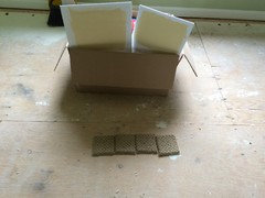
    And here I placed the carpet swatches on the middle of the room and propped paint swatches up...just to get a different angle of light because the carpet seemed to be reading dark in my other photos. Standish on LEFT and Philly Cream on RIGHT:


  • 11 years ago

    I like the Philly if you want darker and the Windham if you want pale. They seem to have more energy/brightness to them than the Standish.

  • 11 years ago

    I have Philadelphia Cream in my dining room and love it. All the other walls on our main floor are BM Carrington Beige and it coordinates nicely with those. I wanted a subtle yellow in the DR, which is the only room separate from the open plan. It has 2 large windows but faces west, so gets the least amount of bright natural light of any of our rooms.

    It reads soft and creamy but is distinctly more yellow than my cream stained dining set. My BM Simply White trim shows up nicely against it.

    It's an understatement to say that it's all about the light ;)

  • 11 years ago

    BM Oriental Silk is an old yellow paint color which is a soft yellow.

  • 11 years ago

    It really is all about the light and the way the color intensifies when you have it on four walls. Also, my bathroom is very small, like 5 x 7 max. with a ceiling that goes from 9 to about 12 feet, so that's a lot of wall in a small space. And it's an eggshell finish which throws back more yellow. I've learned to ignore it when it's very intense. One day I will repaint.

  • 11 years ago

    Standish white

  • 11 years ago
    last modified: 11 years ago

    Thanks everyone for the help. I am 99% sure I am going with the Standish White. I honestly think all 3 yellows look very pretty, but when taking into account the carpet color and the colors I have in neighboring bedrooms, the Standish White seems to be best. The Philadelphia Cream looks so pretty on the posterboard but I think it might intensify and brighten on all four walls. I don't really want a heavily saturated color (because the rest of my decor is more subtle). Standish seems like a more subtle yellow that is muted and that has that lit-from-within glow that I am after, without being too lemony (like the Windham) or too sunshiney (like Philly Cream). And it has a more sophisticated feel to it...at least that is what hubby said :)

    I don't think I could go wrong with any of these colors though.

  • 11 years ago

    Did you get around to painting? Do you have photos you would like to share? What colour did you decide on? Thanks