

Crisis: your vote counts! It will save a relationship :-)
11 years ago
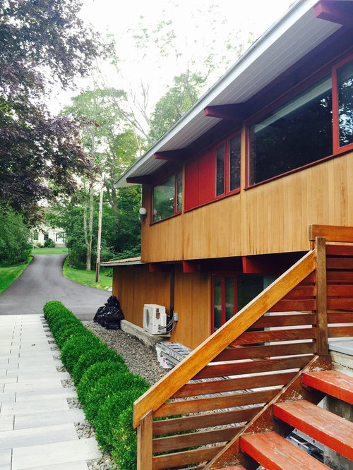
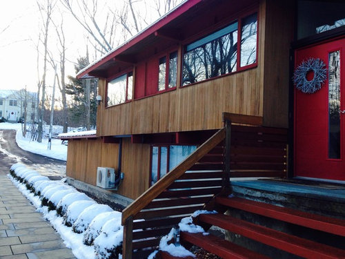
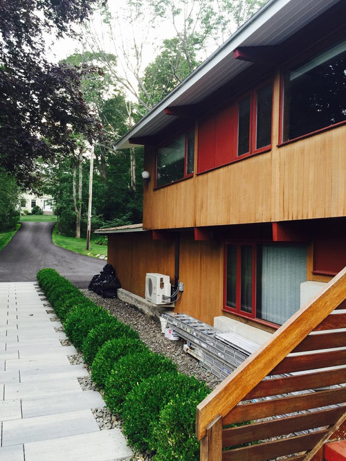
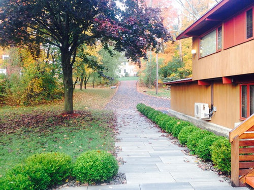
Featured Answer
Sort by:Oldest
Comments (25)
- 11 years agolast modified: 11 years ago
 11 years ago
 11 years ago
- 11 years ago
- 11 years ago
 11 years ago
- 11 years ago
- 11 years agolast modified: 11 years ago
- 9 years ago
- 9 years ago
- 9 years ago
- 9 years ago
 PRO9 years ago
 9 years ago
- 9 years ago
- 9 years ago
- 9 years ago
- 9 years ago
- 9 years ago
- 9 years ago
- 9 years ago
 9 years ago





Related Stories

REMODELING GUIDESHow to Remodel Your Relationship While Remodeling Your Home
A new Houzz survey shows how couples cope with stress and make tough choices during building and decorating projects
Full Story
WORKING WITH AN INTERIOR DESIGNER5 Qualities of a Happy Designer-Client Relationship
Cultivate trust, flexibility and more during a design project, and it could be the beginning of a beautiful alliance
Full Story
LIFE12 Ways to Nurture a Happy Neighborhood
Having good relationships with neighbors improves the quality of life for all
Full Story
DECORATING GUIDESNo Neutral Ground? Why the Color Camps Are So Opinionated
Can't we all just get along when it comes to color versus neutrals?
Full Story
TINY HOUSESHouzz Tour: A Custom-Made Tiny House for Skiing and Hiking
Ethan Waldman quit his job, left his large house and spent $42,000 to build a 200-square-foot home that costs him $100 a month to live in
Full Story
WORKING WITH PROS12 Questions Your Interior Designer Should Ask You
The best decorators aren’t dictators — and they’re not mind readers either. To understand your tastes, they need this essential info
Full Story
BATHROOM DESIGNShould You Install a Urinal at Home?
Wall-mounted pit stops are handy in more than just man caves — and they can look better than you might think
Full Story
LIFE10 Reasons to Be Happy You’re a Renter
Homeownership has many benefits, but there are upsides to not owning a home too
Full Story
LIFEReluctant DIYer’s Diary of a Dresser Makeover
Weekend project: Glossy new black-and-white dresser, hold the sandpaper
Full Story
REMODELING GUIDESShould You Stay or Should You Go for a Remodel? 10 Points to Ponder
Consider these renovation realities to help you decide whether to budget for temporary housing
Full Story




Carolyn Albert-Kincl, ASID