Software
Houzz Logo Print
ponyboat

MCM kitchen final design advice help!

11 years ago
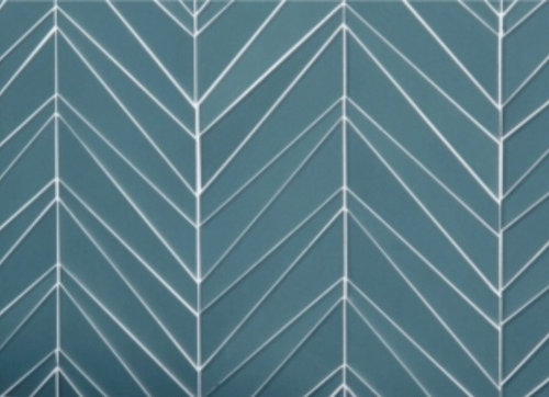
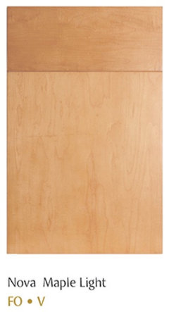
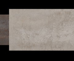
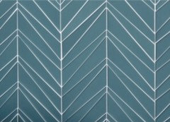
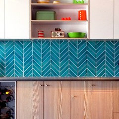
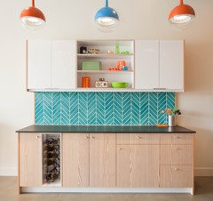
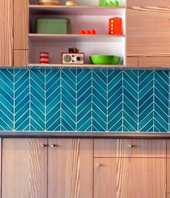
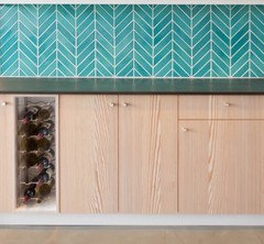
Hi, I posted a few days ago with a dilemma about a backsplash tile that I loved for my upcoming kitchen remodel. After much deliberation I am leaning towards something in the same color family but a little less "in your face". I found this turquoise glass tile in a cool chevron pattern that feels very midcentury to me, and I believe it will be easier on the eyes. I am pretty much there with the final plan, but would love some opinions about my choices using this backsplash, especially on the counters. I will be using a slab front cabinet in natural maple, very blonde. On the floor, a porcelain tile that mimics concrete (there are two different dark hardwood floors adjoining the sides and pine walls so liked the idea of concrete being a neutral harmonizer!). The counters will be quartz. Not sure if I should go with a white stone or a dark grey. I had originally wanted to go with a London Grey that looks like marble, but I got some very good advice here from people who say that marble is not very midcentury and therefore I would be mixing my metaphors, especially with a turquoise backsplash. Found cool chrome hardware that screams MCM called Creased Bow by Amerock. The only other relevant variables are the walls, which are whitewashed knotty pine in the adjoining space, and the fact that there isn't a ton of natural light. I will add more photos showing these factors, but I would love to hear opinions about whether to go with the white or grey quartz, and in general whether these choices work together! I want to stay true to the midcentury feel of the home, but I also want the kitchen to be modern and beautiful!

Comments (42)

  • 11 years ago
    Trying to post photos of the countertop slabs are proving to be difficult. The choices are Caesarstone organic white or concrete!
  • 11 years ago
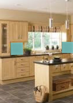
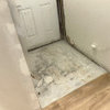
    These are essentially the choices, sans countertop. The actual cabinet choice could either be this color or the next shade up, which is called natural. Not sure which is better, given the palette as a whole and also the contrast of the whitewashed walls which show a little pinkish pine through. Also, there is a darker concrete tile underneath the light one in center photo which I would probably use if I use the white countertop.
  • PRO
    11 years ago

    I would do the organic white with that backsplash.Just so you know just because you have a MCM house doesn’t mean all the spaces have to be in that style I have a MCM house that I love but my kitchen is really 21 st century as the 50’s kitchens sucked in many ways.I would have done cararra marble counters in mine but I have a huge fireplace that is in my LR and kitchen that is all the stone I think I need

  • PRO
    11 years ago

    I am havng trouble posting pics too.

  • 11 years ago
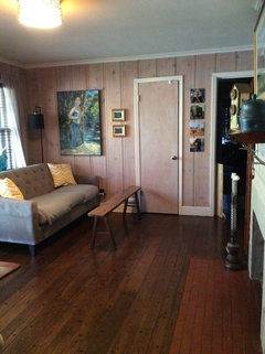
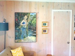
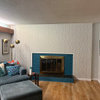
    Also posting this with caution, adjoining hearth room, to show knotty pine and adjacent floor. I will be putting another coat of whitewash on the pine, so it will be less pink.
  • 11 years ago
    These are the countertop choices. Open to others as well!
  • 11 years ago
    last modified: 11 years ago

    The tiles are amazing :) and I love the colour of your maple light cabinets with these choices I like the look of the caesarstone concrete (if I have the right colour below)

    It will be a stunner of a kitchen!

  • 11 years ago
    Tracey P where did you get that photo? I haven't been able to see it all together except as a 3D drawn rendering! Of course my cab wood isn't that pretty and it would be maple on top too but this is so close!
  • 11 years ago
    Well I guess I can assume you found it on houzz, but I have searched and searched for something similar.
  • 11 years ago

    Hi Ponyboat, no I found it on a general search in the Internet for teal chevron tile backsplash :)

  • 11 years ago
    last modified: 11 years ago

    Have a quick peep here

    https://www.modwalls.com/chevron-tile-teal-agate-ceramic-blue-kiln.html

    it's very cool, I have to say I love the white upper cabinetry in this look seems to pull everything together- but I am sure your upper cabinets in maple will be fantastic as well :)

  • 11 years ago
    Thanks! I like how the white counters pull in the grout, but I also like how the gray ones make it look less beachy/bathrooms. Hmm...
  • 11 years ago

    Hi Ponyboat, how is your counter selection going :)

  • 11 years ago

    I usually do not do grey as it is so overused the past few years, however yours is light & gives the look of concrete which I love. I adore the choices you have made for cabinets, backsplash, floors & counters (great either in white or light grey.) Kudos to you. I love MCM.

  • 11 years ago

    I really like white with this combination of elements, especially with that tile and with already having grey floors. In particular, the one you linked above would look verh MCM from a distance while having the feel of modern luxury stone up close.


    just my two cents tho'

  • 11 years ago
    Still deciding. Lots of great comments. Actually leaning towards the darker grey caesarstone as it pops more against the blonde maple. With a lighter toned grey concrete floor. I love the white too, but shows dirt so much more and we aren't super tidy around here... I like the lighter grey counter but when you look at it from a distance it seems to fade into the maple and I think I like more contrast!
  • 11 years ago

    My vote is for the darker grey looking forward to seeing how it all progresses :)

  • 11 years ago

    Gray- the horizontal surfaces in the same color.

  • 11 years ago

    Regarding your whitewashed walls for your den, if you use a gray rather than white, you will avoid pink walls. See this link for designer Sarah Richardson's cottage. http://www.sarahrichardsondesign.com/getinspired/tips/2013/05/28/paint-it-whitewash

  • 11 years ago

    Bette P, that's a great article. The link didn't work for me, but googling sarah richardson paint it whitewash did. Thanks!

  • 11 years ago
    I like the darker concrete flooring that was under your first choice you showed. It seems to have a touch of the cabinet color in it that would also tie in with the whitewashed pine wall. Just to add my vote. The backsplash is fabulous!
  • 11 years ago

    Thanks, we did use a grey based stain for the whitewash, and it still turned out pinkish. But I am going to do another coat and get it a little less transparent. Hard to tell but here is a photo of the walls now, before we apply another coat.

  • 11 years ago

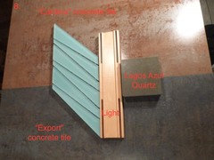
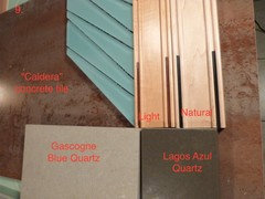
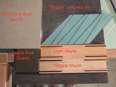
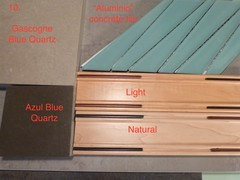
    I have gotten some new tile samples for the floor, and have my final contenders all in different shades of a concrete look. I am set on the backsplash tile (that is half of the chevron of the Island Stone Palm glass in Spring), and pretty sure I am set on the light maple cabinet in a slab (I am showing the natural maple in these photos too and open to opinions on that). But here are the combinations of three floor tiles by Porcelanosa - the shades are Caldera, Export, and Aluminio. The counters are down to two (i took the white out of contention), which are Lagos Azul or Gascogne Blue Quartz. I feel like the Gascogne may fade too much into the maple cabinetry, same for the lighter alumnio flooring. But I would love opinions on this final palette as I feel I have finally narrowed it down! FYI I absolutely LOVE the Caldera rusty concrete look tile, but don't want it to clash with my MCM style and the whitewashed pine.

  • 11 years ago

    http://www.islandstone.com/product-detail.php?id=60&keywords=Palms Here are some photos of that tile in a backsplash. I think you said earlier you were looking for photos of installations. If you stay with the original drawings from your other post, you have a lot of wall to cover. It's a beautiful tile, and very dramatic, especially in a big space.

  • 11 years ago
    Thanks drememon, actually I found out the tile in that backsplash is the darker color lagoon, not this one which is spring. At first I considered changing to the darker one but now I think I like this paler aqua better!
  • 11 years ago
    last modified: 11 years ago

    Both lagoon and spring are beautiful tiles- just me but I get a more MCM vibe from lagoon- I think it's a teal thing :)

    spring will be fab with your wood I love your choice of the light maple rather than the natural.

  • 11 years ago

    If your adjoining floors are dark, and you don't have a lot of light, I would consider the lighter Aluminio concrete tile for the floor and Gascogne Blue Quartz for the counter. If you put those three samples together on their own, do they complement your surrounding space? I just love your backsplash choice.

  • 11 years ago
    They do, my only hesitation about the Gascogne blue counter with the light maple is that they seem to blend into each other without much contrast. I don't mind that with "like" colors such as white with white, gray with gray etc, but something seems off to me with the light wood and light gray. But then I see photos of simolar color combo and I like it so...

    I wish I could see a real photo rendering of these together, the drawing just doesn't give me a good enough idea.
  • 11 years ago

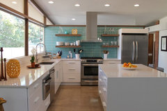
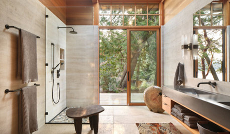
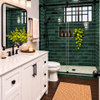
    I know it's a bathroom...but the aqua makes it sing! I can imagine your backsplash in the 2nd photo too. Do you know if you are doing white grout in the backsplash? That's another 'color' to consider.

    Master Bath · More Info

    Soda Spring Residence · More Info

    Canterbury · More Info

  • 11 years ago

    I'd probably do a white quartz to brighten things up and since the grout will likely be white. I don't think that is one of your options now but the other choices feel sort of heavy and industrial to me, less MCM.

  • 11 years ago
    Thanks for those photos! I do like that combo better now that I see it in a decent photo. Lee I had considered the white for the reasons you stated but I really don't love the idea especially given the fact that everything shows on them and we are a busy, messy family. It's true the gray is less MCM but I am not going for total period accuracy, just a vibe.
  • 11 years ago
    last modified: 11 years ago

    perhaps it's the difference of the back splash tile colours....but for me the Aqua tile seems to want the rusted floor tile, and the lighter grey counter top to work with the maple

    Sun-drenched Kitchen · More Info

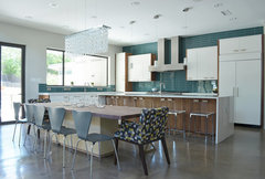
    While the teal tile works with the concrete look floor, and a darker countertop

    Dallas, TX: Scott & Melissa Powell / New Leaf · More Info

  • 11 years ago

    Hi just popped in to see how you are getting on?

  • 11 years ago
    Thanks for checking in! I ordered the cabinets - natural maple - and have decided on Aqua chevron palms tile, the darker porcelanosa ferroker floor and the darker concrete quart counters for a 9/21 start date. I have had to push the start date to 10/5 because my sister is having surgery in NY and I have to go there. I was all happy with my choices but now starting to second guess the dark counters and wondering if I should do white. I still have time to change as they wont cut until after the cabs are in to get the measurement just right. Bottom line is I don't really like white countertops, but I also don't want to end up with something that looks wrong! I feel like it took a long time to get to my choices and I'm hesitant to change, but the only thing at this point that is not changeable is the cabinet.
  • 11 years ago
    Also wondering if I should use the darker turquoise-ish palms tile that is shown in the cover photo of this post, rather than the lighter aqua.
  • 11 years ago
    Wow...love those tiles
  • 11 years ago
    last modified: 11 years ago

    Hi Ponyboat

    you don't have to go with a white countertop- especially as you don't really like white. Can you post pics of your current choices?

  • 11 years ago

    What did you end up choosing?

  • 11 years ago
    On the floor I chose the darker grey porcelain tile with the stained concrete look, called Porcelanosa Ferroker. Looks great, large 17 x 26 tiles. Unfortunately, that is all I have right now in an empty room with drywall and wires hanging out of it. The contractor apparently forgot to order the cabinets until after he ripped out my old kitchen out so I have been at a standstill a couple of weeks with no kitchen. I am livid. I placed my cabinet order back in July! Eventually, I will have the natural slab maple cabinets which is the lightest blonde maple they had, the island stone Palm springs backsplash, which is what you see in my profile photo except in a lighter aqua color. The countertops will be the darker gray concrete. It will probably be another month until this is done. At least.
  • 11 years ago

    Oh, how terrible! Living without a kitchen is a challenge even when everything goes smoothly. I can't imagine how you must feel.

    Hang in there -- the pain will be counted in weeks, but you'll love this fun kitchen for years!!

  • 11 years ago

    So glad the flooring at least is in!

    No consolation at the moment, but your kitchen will be fab once done :)

    please post some pics..... I would love so see how your beautiful kitchen turns out........

Sponsored
Bella Casa LLC
Average rating: 5 out of 5 stars17 Reviews
The Leading Interior Design Studio in Franklin County