Software
Houzz Logo Print
boymom2009

backsplash causing arguments....

11 years ago
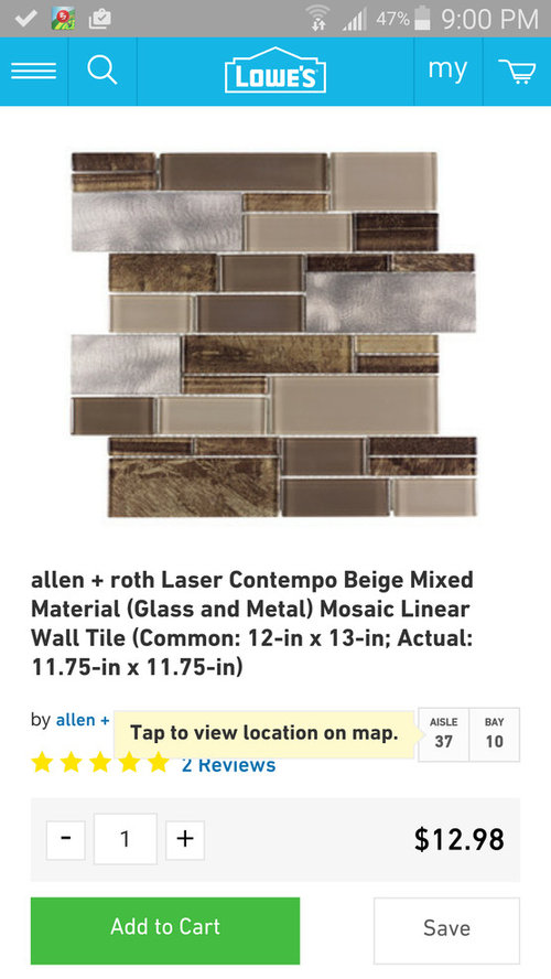
I've stumbled upon this website many of times and seen a lot of beautiful kitchens, and gotten alot of info just reading others posts, but today I need help....

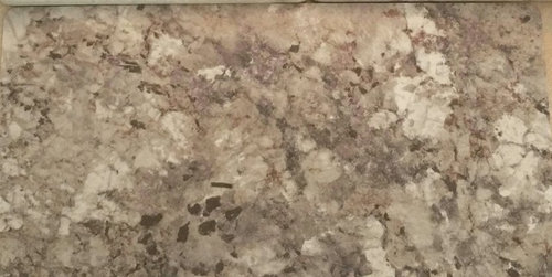
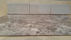
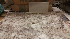
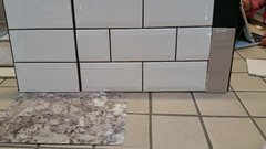
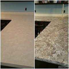
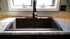
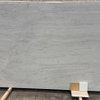
We are redoing our kitchen and this included painting our cabinets espresso, getting new counters (wilsonart hd, autumn carnival), new Blanco single bowl sink, and trying to find a backsplash to match our kinda busy counters. My original plan was to do subway tile. After hubby and I couldn't agree on the same style, we stumbled upon a marble ivory 3x6 tile with glass mosaic border. I brought the samples home a few days ago and everything we loved about it I now hate. I feel like I wanna do something different than the normal tile with glass mosaic border alot of people do, the tile color seems to washed out, and the mosaic changed big time once home and wetted. While I'm happy to know this ahead of time before buying and installing, hubby and I can't agree now on ANY other style. I wanna be a little more daring and he hates everything. Here's a pic of my counter and tile I found today that I love. Maybe I am going to busy and just don't realize it. Please tell me what you would do with this counter. And I'd love to see pics of similar busy counters and your backsplash

Tia

Comments (65)

  • 11 years ago

    Here....I think this is excellent advice for your husband.

  • 11 years ago

    Now that;s funny...


  • 11 years ago

    Omg...I love that!!!! I swear this kitchen might be the death of him!

    How do you guys think this might look, did I pick out the right color? It's so hard to find the right shade. Just bought a small box to lay out and see

  • 11 years ago

    I like that look.

    Um who spends most of the time in the kitchen? You or DH? That's who's desire should be tops when it comes to the backsplash.

  • 11 years ago

    Lol, gwlake!

  • 11 years ago

    Hmmm, well hubby cooks but doesn't spend as much time in kitchen as I do and isn't home as much as me. Does that count lol

  • 11 years ago

    I know what happens in our house....my husband doesn't ever pick anything out. It works very nice over here. :). So when he does say something. I will roll with it. I wanted smooth stucco. He didn't. I let him pick.

    Were you able to find the textured glass that I posted?

  • 11 years ago

    Is that the Allen and Roth chocolate that Beth posted? Or is it Pearl? I like it.

  • 11 years ago

    I like that.

  • 11 years ago

    Gwlake...not in the color you posted I saw something similar in white but wasnt as nice as yours.

    I like Beths color too, think it's darker. Wish I knew where it was from

  • 11 years ago

    Hi Kelly, the link for that tile is the green word "link" in my post up there. If you click on it, you can see it's from Lowe's. :)

    Are the two tiles you posted the same color? The top one looks grayer. They don't look bad, but the bottom "seems" closer in color to the one I posted.

  • 11 years ago
    last modified: 11 years ago

    The link Beth posted takes you to the Lowes website where it shows the Allen and Roth Chocolate tile. So the sample box you got, they must be the A&R Pearl then? You didn't see the chocolate right next to the Pearl?

    ETA Beth ya beat me to it. :-)

  • 11 years ago

    :)

  • 11 years ago
    last modified: 11 years ago

    I agree with others...you need something lighter!

    I'd go with the lightest cream color in your granite. You can bring drama in with hardware, accessories, etc. Those are easier to change :)

  • 11 years ago

    No not in my store maybe I can order it online. They only had pearl and another color but not chocolate :(

  • 11 years ago

    I've had it set up in my kitchen all day and every time I look at it I fall more in love :)

    I'm just wondering why all these tile stores here told us it was outdated or not popular anymore :/

  • 11 years ago

    Kelly I have debated those tiles for my own bs. I thought they were very nice. They have the hand glazed look where the color saturation is darker at the edges. It is not outdated in my opinion at all. I think that Pearl color goes pretty much perfect with your granite.

    I may have to revisit these samples for my kitchen, just in case. Pretty, and the price is right. Win, win! :-)

  • 11 years ago

    What type of tiles does your tile store think is on trend? I think the glass mosaics are dated, and even if they aren't, they won't stand the test of time (which is about 5 years in design!).

    I'd use a light cream tile with your espresso cabs, brown sink, and orb faucet. I think you've got enough dark colors. I can see the gray in that top tile that beth sees, so I'm not sure if that plays well with the browns. If you have the cabs and counter done and installed, a photo would be helpful. We can't make good suggestions when we only see a tiny piece of the puzzle. ;)


  • 11 years ago

    I totally get that bc I feel the same way dealing with a small sample trying to match things up. That's why I've been bringing more home and just leaving them there. The time even though they say pearl do look more grayish with my counter and my counter foes have some grey in it.

    When we walked in our first tile store they asked me what I wanted and I said subway tile. They showed me the glassy look them took me over to travertine or natural stone and said noone really used the shiny stuff anymore. I agree that the mosaic glass is not so much outdated but over played we went to that idea first I think bc that's all we knew dumb what everyone does. But finally I said to my hubby let's do something different and who cares if they say it's outdated I like it. But on the other hand I don't want guests walking in thinking wow that's old fashion (without us knowing that) or that should really be used in a bathroom as my wonderful hubby thinks. But I think I'm putting my foot down on this one and getting this time. I will post pics Thursday when counters are in. All cupboard doors may not be fully hung but maybe better idea. I also want my under cabinet lighting in before anything is officially installed to make sure that doesn't turn anything yellow or wash it out.

    You guys have been super helpful

  • 11 years ago

    I am probably in the minority but I am getting a bit tired of seeing back splashes installed just because "it's expected". If someone has invested in nice cabinets and a beautiful counter top I think it's a mistake to embellish with a fancy back splash. It seems to me it's like wearing an expensive designer gown and loading up with too much jewelry. That back splash has become that one extra piece that should be removed IMO.

    When I see an elaborate back splash with stone,grout etc. I don't see beauty, I see unnecessary labor and upkeep. The only time I like a pretty elaborate back splash is when the counter itself is very plain and simple. But counter with movement and back splash with movement hurts my eyes. Too busy.

    I agree with Joseph Corlett. If you must have a back splash for function then use a solid colored solid surface. If it's not for function then use a good paint.

  • 11 years ago

    We debated whether to even install BS, but my wife tends to be messy when she cooks and so I did not want the area behind to be unprotected and I think the 4" granite is less 'decorative'. We even are debating, well.. what about a 4" mosaic BS instead of the entire thing a BS.

    I think if the stove wall is protected and the sink area, folks should be fine. Not saying don't do a BS, but a BS is easy something you can come back for later and just find what grabs ya.. Easier to do a BS when the rest of the kitchen is done and over with and let's you put a little more budget elsewhere.

    Just an idea.


    And sorry if my typing is off, glasses are in the other room and only correcting where I see red lines .. heh

    Russ


  • 11 years ago

    We have wanted a backsplash for awhile our counters haven't been updated since original people so 80's, they are like cream/Yellow laminate. Another reason we will need a backsplash is the old laminate has the the standard laminate backsplash lip, this new piece will not so the wall will be damage from removal. At first I didn't think our choices were too busy until I'm now getting a better idea of what you guys mean and I'm back to really liking a simple color subway tile. I've seen some gorgeous remodel kitchens on here, or new builders and we do not have that by any means just trying to update it with rest of house. I appreciate all the feed back is been very helpful. Once the new counters are in I will post pics.

  • 11 years ago
    last modified: 11 years ago

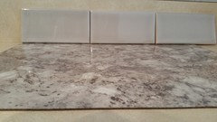
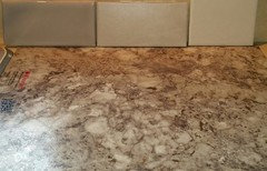
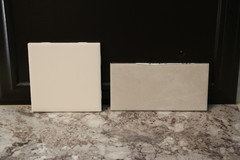
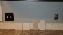
    I returned our old tile selection and came back with two more suggestions from the tile people. Far left is the one I posted yesterday...middle and right one are the newest. Hubbies favorite is middle bc its not shiny, lol. But he did say I have pick...he's learning lol

    I also need suggestions on how to end subway tile??

  • 11 years ago

    Your counter is pretty dark, you are doing espresso cabs. You need a VERY light backsplash. Like off-white light, not grey, not tan, not taupe. Pick one that matches the lightest color in your counter sample.

    Invest in under cabinet lighting and extra cans as well.

  • 11 years ago

    Your pics didn't post. You can get subway tiles in a matte glaze. I am drawn to matte glazes. Sonoma TileMakers is one company who has lots of neutral colors in matte. They're around $20 SF however.

  • 11 years ago

    Here's the pic, yes we are doing under cabinet lighting too

  • 11 years ago

    I like the one on the right.

  • 11 years ago

    I just ordered Autumn Carnival today. Will be watching this thread.

  • 11 years ago

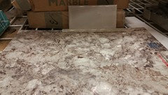
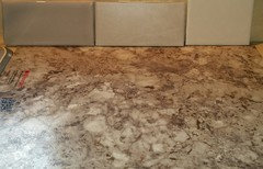
    Oh wow! I know that colors in different lighting can change. Where I liked the Pearl better in the earlier photos, I do not it in this last one (tile on right). It almost seems that all three tiles are having an odd olive green grey cast to them. The countertops in the last picture look way different too.

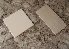
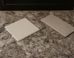
    Which of these three pictures would you say is the 'most' accurate in real life? Here they are side by side for a better comparison.

  • 11 years ago
    last modified: 11 years ago

    Why do my posts never post the 1st time? ughh!

    I would say the counter in pic 1 and 2 is more accurate, but the tile in last picture is more true to how it looked tonight when I took picture. Yesterday in the 1st pic that tile did look like that and for pearl it does change to a grey next to my counter. Alot of tiles do that or change yellow its crazy.

    Yesterday it was my favorite but I think I've changed my mind.

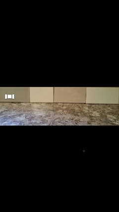
    Here is another pic I took tonight to poll my fb family and friends

    #3 2nd from far right was the winner by a landslide, which I'm surprised by. My favorite right now is#2 matte bisquit. The last one on the right side is bone, very close to white

  • 11 years ago

    Between those four my votes go to

    4

    2

    3

    1

    in that order, left to right. The lightest one is very nice. The next one (the one you like) is nice too, but I don't think gives as much LRV and that is super important in a dark space.

  • 11 years ago

    What is lrv

  • 11 years ago

    This is how light#4 is, hubby again hates it lol but said he'd trust me. This is bone. Obviously piece on end was just for show

  • 11 years ago

    I wondered what LRV was too.

    Since hubby hates 4, and it is very close in color to 2 (matte) which was your first choice, I would rule out 4.

    I would also rule out 1 (Pearl).

    Can you do one more picture only comparing only 2 and 3? :-)


  • 11 years ago

    Bone is stark bathroomy white. #3 could end up reading pink or even purple if it's a taupe. Anything with gray undertones would be somber--better to use gray with lots of white. #2 is a warmer white, good with your browns, and adds a lighter value to the kitchen. I think that material-wise, a matte tile pairs well with Wilsonart.

  • 11 years ago
    last modified: 11 years ago

    I agree that in that pic above #3 is pulling pinkish color, in person it does not. I am trying so hard to capture the true color for you guys to see. I attempted with these pics taking them by my counter with the color of my cabinets behind them. I am leaning towards left tile in 3x6 bc its lighter. So the area will look bright and fresh. My opinion is that right tile blends too much.(?)

  • 11 years ago

    LRV = light reflective value. You will often find it on paint chips. It gives you an idea of how much light is reflected vs. absorbed by any color.

    It is really important to understand whether the color you are choosing will suck the light out of the space (desirable in theater/media rooms, for people that want dark bedrooms) or push light back out into the space (desirable in kitchens, small baths, smaller living spaces).

    If a room is VERY large, a low LRV will help to "cozy" it up some.

    If a room is SMALL, a high LRV will help it not feel so cramped.


    The other materials you've chosen have low LRV, so if you put a low LRV tile into the space, it will feel smaller.

    Most people have an intuitive sense that a room will feel dark with X or Y material versus another. LRV is helpful in comparing non-similar materials and non-similar colors. Comparing a brown versus a blue for example.

  • 11 years ago

    The square tile on the left, in your most recent photo, looks like a winner.

  • 11 years ago

    We got our counters in today. ..yahoo what a difference!! And I LOVE my super single Blanco sink. So I'm still leaning towards a light tile but unfortunately the one to the far left is pulling pink against my counter and I don't wanna do stark white so this might be very hard to find the right shade. I took a far away pic so you could see how dark my cabinets are too.


  • 10 years ago

    Kelly, I am dying to know how the kitchen came out? Mostly because I am in same dilemma here. Obviously we have similar (awesome) tastes. I googled Autumn Carnival countertop because I'm trying to find back splash for my new kitchen. I also chose a granite composite single sink-ordered dark brown but we received black instead, and it works. My husband is one picky guy as well, except he keeps picking funkard mosaics that are too busy. I have a mixture of chocolate (espresso-ish) and whiskey black glazed maple shaker cabinets, so keeping it simple matters more here. Mama Rachel's comment about LRV was very helpful. My kitchen is large, so I can get away with lower LRV, but I like the direction you are going with the subway shape and deeper ivory. If you get a chance please update us all- I would so much appreciate it- my butt is cramping from sitting and looking at tile online for weeks :)

  • 10 years ago

    Susan

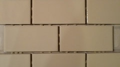
    It took us forever to pick the tile out. We went with a mini subway tile in bisquit color from Menards...don't know if u have one of those by you. We haven't put it up yet so I wish I had pics to share w you, it should be going up this week or next.

  • 10 years ago

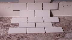
    Yes, but it doesn't look that yellow in person. Here's a picture of it out of box

  • 10 years ago

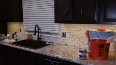
    The bottom picture against my counter is more accurate. We bought I think it's called j channel to end it in matching color ordered from Lowe's bc we did not want to use bullnose

  • 10 years ago

    Susan, we got it started. Have you found anything you like yet in your searches?


  • 10 years ago

    Looks great!

    See how nice blue or red would go as accent colors?

  • 10 years ago

    Thank you

    And using accents as in on counters?

    Examples of what u mean?

  • 10 years ago

    Kelly that tile is perfect. Red accents as in a red or blue bowl on the counter. Actually with your kitchen any color would work as an accent. What is your favorite color?

  • 10 years ago

    I meant kitchen accessories, like pot holders, dish towels, utensils, bowl, toaster, rug, etc. whatever you have in your kitchen.

    Just mentioned red and blue because of the bucket and blue/white rag.