

Help - gray kitchen looks "masculine"
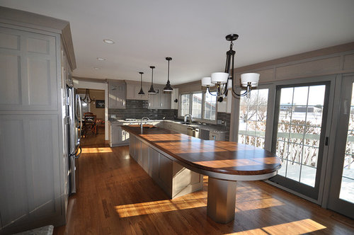
I am mostly a lurker on this forum and appreciate all of the advice I read! A friend recently remodeled a kitchen and complains that it looks "masculine" but doesn't know how to fix it. She has since added drapery, some decor to the island/counter-tops and stools, but still feels like the kitchen has a masculine or formal feel. A current consideration is re-finishing the upper cabinets to be white or a lighter gray, but there is a concern that would be too many finishes since there are already two different counter top materials.
Any suggestions to give the space a different feel? Please let me know if this question is better suited for the decorating forum.
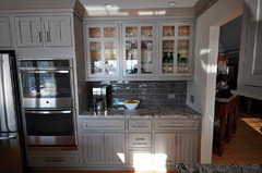
I'll post a photo of the fridge/oven wall separately.
Comments (89)
alley2007
Original Author11 years agoThis is all great feedback - thanks for taking the time to comment!
The kitchen was designed by the homeowners, with the help of their general contractor and I think in compromising on design decisions the husband's style ended up reflected a bit more in the end result.
After reading all the responses I am itching to go pick out stools, drapes, accessories and start thinking about paint on the ceiling or the walls! We'll see what the homeowner thinks :).
 11 years ago
You're a good friend, alley! It's so stressful when you invest in something and it doesn't feel quite right.
Related Professionals
El Dorado Kitchen & Bathroom Designers · Chambersburg Kitchen & Bathroom Designers · Albany Kitchen & Bathroom Designers · Mansfield Kitchen & Bathroom Designers · Pittsburgh Kitchen & Bathroom Designers · San Jose Kitchen & Bathroom Designers · Frederick Kitchen Remodelers · Memphis Kitchen Remodelers · Charleston Kitchen Remodelers · Albert Lea Kitchen Remodelers · Hudson Kitchen Remodelers · Bakersfield Kitchen Remodelers · Little Rock Custom Countertops · Albany Custom Countertops · Dayton Custom Countertopsalley2007
Original Author11 years agopalimpsest - I think your thoughts are on point with the conversations she has had with a couple of designers who have come through to offer suggestions. In not as blunt of terms they have essentially said - "you have a well designed space and should accept it for the design it is and go with it rather than trying to change it."
 11 years ago
localeater...I wasn't offended at all and meant no offense to you in my response...maybe my early morning ramblings didn't come out quite right either.
I have noticed that what others perceive as a "well designed space" often looks cold and non-personal to me. Others feel differently and I have no problem with that but for my home I want people to walk in and say "Deon and Cindy live here". I think that may be what alley2007's friend is feeling about her space...anyone could live here...it's just not personal enough as shown in the pics.
- 11 years agolast modified: 11 years ago
Just wanted to add (although I know the homeowner will be totally involved in this decision), although I love the idea of print fabrics, if I were to even suggest anything floral, my DH would move out LOL!.
 11 years ago
gah "I have a Mom with no filter". Could derail with that statement and passive aggressive 'that is so you' all day long.
It's a beautiful kitchen.
 11 years ago
Good point, palimpsest. But how does one know what choices won't diminish the design but will still allow the wife to add a bit of herself to the design? Sounds like it's a fine line between just right and too much.
- 11 years agolast modified: 11 years ago
My reaction was the same as herbflavor's. To me the photo just looks like folks have not yet moved in. All the snow outside the windows is not helping the look.
I could add greenery (maidenhair fern?), some rugs, seating (rush seats?), and be done. Think the kitchen looks great.
 11 years ago
If it were me, I'd paint the walls, the trim and the upper cabinets white. It would REALLY lighten up the space. I know a lot of people like gray, but I do not. So that's what I would do. Then add the softer fabrics and other details.
Just to be clear....I'm not saying the owner needs to do this, it's just what I would do. After looking at the pictures more, there really isn't that much wall space. So wallpaper won't make that much difference.The other 'issue' I have (again this is me) with gray is that it seems cold. My mom is a real sweetie and I'm very lucky.....but her 'gray period' came after the divorce. I was SO happy to see her go back to green, yellow and peach a few years later :)
- 11 years ago
Not a gray lover myself, except in clothing! It *is* a color which is more on the masculine side, and the 'lady of the house' should not have compromised so quickly, unless it's the husband who actually spends the majority of time in the kitchen, ie; cooking, baking, cleaning up, etc. Or is the kitchen more 'for show' than function? More than masculine, IMO, it appears to be very cold. Does it blend with the rest of the home?
- 11 years agolast modified: 11 years ago
I don't think the kitchen looks quite so "impersonal" and empty when it's actually in use.
On the one hand, I want to ask, "How can it be "impersonal" when the finishes were selected by the people it belongs to, and no one else?" But, on the other hand, I think "impersonal" rooms are quite popular these days with people saying they want their Living Room to look like a "high end hotel lobby", their dining room to look like a "fancy restaurant" and their bedroom to look like a "spa retreat". All of these terms tell me that the individual wants something that is both impressive, and appeals to a wide variety of people--and is not individual.
On the other other hand, the cold and impersonal or otherwise unsatisfactory results that people often seem to get when they design their own rooms by themselves, gives lie to the Gardenweb conventional wisdom that almost anybody is better at designing their own rooms for themselves, than some interior designer who has "their own agenda". That just isn't really true for many people.
I am not going to venture my personal opinion about, or what I might change in this kitchen other than that I think it is well-appointed and the palette works. It is a fine line, lisa_a, because in a kitchen almost all the elements are "fixed"--this is a fait accompli, so to speak. Everything that is already there tends to dictate a rather narrow scope of what else can happen. This isn't a living room that is essentially an empty shell that can have the "wrong" furniture or rug taken out or recovered.
 11 years agolast modified: 11 years ago
localeater, no need to apologize. I was not offended, but was taken aback. I thought saying bling is a horror was kinda harsh. lol There's probably a lot of jewelry on this board that might indeed be a little offended however. ;)
- 11 years agolast modified: 11 years ago
I will stick my neck out and say that misplaced "bling" is, Quite Often, "a horror".
I look at real estate every day, and I am regularly starting to see houses, that are essentially conventional in decoration, or houses that, in themselves, are essentially a time capsule structurally, where most of the light fixtures have been replaced with some "flirty" "feminine" shiny, glittery, crystallized, pastel, and completely inappropriate chandelier or pendant of some sort, or the otherwise dull kitchen has been tricked out with glittery faux jewelry cabinet hardware because TV told them that you can "update" or "add interest" to any room, on a budget by adding some "bling". I hate the word and I hate the concept. Jewelry should be something fabulous hanging off your hand, not over your toilet.
- 11 years ago
Thanks for the explanation, palimpsest. What you wrote makes good sense to me.
btw, I love this, "Jewelry should be something fabulous hanging off your hand, not over your toilet."
 11 years ago
As another person who recoiled in horror regarding bling in the kitchen, I also appreciate Palimpsest's explanation. And believe we might all define bling differently. I associate bling with tacky and too-too much. Kardashian instead of Audrey Hepburn.
- 11 years ago
i think the kitchen is fabulous. it doesn't look formal to me, but it does err towards the dark/ masculine. i think the granite emphasizes the "dark" but obviously that's not going to be changed. i would switch out the pulls for something "slimmer". i think they're way too chunky, and since the cabs already have a very square/block face, the pulls really just emphasize that. i actually like the pendant lighting but instead of black i might go with chrome or glass pendants to brighten it up. i would get rid of that last fixture with the white shades. i think changing that backsplash to a lighter subway would also brighten it up but i hate to suggest that since it's such a beautiful backsplash. i just think the three items being dark- cabs, subway & counter don't have enough contrast. do you know who makes that subway tile? love it.
and i totally agree with palimpsest as i am also not a fan of bling-y or
glitzy fixtures. and i wouldn't add anything floral as it just doesn't
"go" with the space, IMO of course.  11 years agolast modified: 11 years ago
I think the kitchen is beautiful how it is. It doesn't feel overly masculine or too dark to me. I think the OP has added a bit of decor and color after this photo was taken. But really, I think all it needs to be Houzz ready is:
1) a bowl of fruit, 2) a vase of flowers, and 3) a teapot on the stove. (Oh and maybe a row of Pellegrino bottles on the counter for no apparent reason. :-D)
Honestly, the only thing I'd consider changing if it were my kitchen is the island table base. That might not even be a possibility now that it is installed. It is not that it looks bad, it is just something about it is catching my eye and making me say, hmmmm, what if....
It could be the lack of chairs drawing my attention, or maybe it's the camera angle, who knows! I'm weird!
Here just a quick mock up with the first example I found, so the style of the pedestal might not be right, and of course the color. I just wanted to see what of a different shape, size, and placement under the rounded part would look like. It really is a gorgeous kitchen!
- 11 years ago
I see many masculine spaces and it seems to be 'popular for resale' at least around here. When it doubt, go with tan, grey or beige. Then add stone, wood, metal. Very masculine.
It seems like too many people don't know their style (or think it's out of favor) and go along with the trend. Then they aren't happy with the result.
Rather than disregarding the designer, I see too many people go along with the suggestions and end up with a home that really doesn't suit them. It's sad, but all too common. At least in our area. - 11 years ago
Last time I checked, beauty still was in the eye of the beholder. For those aghast at anything "blingy" in a kitchen? I find the vast majority of kitchens terribly utilitarian, stark and boring. But if the owner likes it? then so be it. That IS all that matters.
alley2007
Original Author11 years agoagk2003 - subway tile details are: FIANDRE USA architectural surfaces, Cafe wall glossy, 11 1/2" x 3 1/2"
I passed along a summary of the comments and told her there were over 50 comments so far. She said, "oh no is it that bad?" I reassured her that was GREAT to have comments and that these boards are full of people trying to help and respond to the question that was asked (not suggest anything is wrong with the kitchen) LOL :).
Thanks again for all of the ideas!
- 11 years ago
alley2007...I would give my eye teeth for that kitchen...it's absolutely gorgeous! It's more than I need and I would definitely want to lighten it up and personalize it but even in it's current state it is fantastically beautiful!!! Please do reassure her that our comments are only meant to help her achieve a kitchen that SHE thinks is absolutely perfect!!
alley2007
Original Author11 years agoThanks, dcward89. I promise I didn't make the last post to fish for compliments on the kitchen. I totally get that if you ask for advice, you should expect to get, well, advice. I just thought it would be a little laugh to everybody who understands how these forums work :).
- 11 years ago
thank you for the info on the subway tiles alley2007. and yes reassure her that it is a fab kitchen.
btw, rebunky i am cracking up at the pellegrino bottles as one of my fave houzz kitchens has those lol. i think it's something with the green against the stark white that pops.
 11 years ago
How long has your friend lived/worked in this kitchen? Is she the type who might take a bit to react to change - which can be more than understandable having reached the end of a long remodeling process. We want to feel its perfect and love it immediately ;) - we are tired, sometimes second guessing ourselves, and sometimes need a transition period.
I do completely love that kitchen. It looks sleek, elegant (my ideal image of myself even if not the case ;) beautiful. I shun things more contemporary but not within kitchens, bathrooms. It occurs to me it would be easy to clean too, without a lot of fabric, accessories to dust, clean, wipe down, maintain. I would put that room in my house, as is. I know that doesn't address her question and can't be considered a helpful response ;)
- 11 years agolast modified: 11 years ago
Hmm, I don't think this thread is really about "beauty" or "ugliness" or "good taste" or "bad taste". I think that the kitchen is essentially representative of current "good taste" within a particular context of a certain socio-economic niche, to get really technical. But that doesn't mean that everyone or anyone has to like it. Beauty may be in the eye of the beholder, but there tends to be an almost statistically modal common "eye" that many people behold with at any given time.
And generally I think what is beautiful and what is ugly are not opposites, I think there is actually a fine line between the two, and that the complete opposite of both is probably banality. ( And that stolid "good" taste is probably closer to boring and banal than it is to either beauty or ugliness).
 11 years ago
Oh my, what a lovely space! The comment about the pulls being too heavy struck me - here's a quick attempt to show how the clean lines emerge when the pulls disappear. Figuring out how to hide the holes will seem daunting but I'm sure can be done - that's another thread :). Perhaps crystal knobs on the upper cabinets?
Also, I think the lighting could be much more fun. That might be the easiest change - plus some fun stools.
 11 years ago
I think it is beautiful just needs some wishing touches and I dont have comments ts because you said some have been done
If she wants to make it girlie....kitchenAid mixers come in pink- 11 years ago
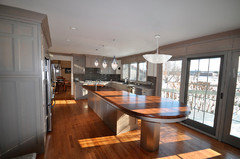
While I note that the lighting in adjacent DR is black, here's a first stab at some lighter lighting. Tech Lighting Trace Suspension (which also comes in antique bronze) and their Piper pendants. I don't think the pendants go here (and scale is off) but the end result is definitely more airy.
- 11 years agolast modified: 11 years ago
Awesome kitchen! And I agree it may be unfamiliarity with it rather than "too "masculine" ... grey and wood could also be "tailored businesswoman".
Yellow goes well with grey and "cheers it up".
I'm seeing a yellowish wall color through the doorway in the dining room.
Grey and yellow gauzy curtains? Pity to hide that view.
Bring it into the kitchen in rounded wooden stools with upholstered seats using grey and shades of yellow in a floral or rounded geometric print.
Paint the insides of the glass doored cabinets in yellow and paint the panels over the windows the same color to bring the color out into the kitchen
BUT!
Then I found this ... it's base color is grey, but it brings in blues and yellow you could pick up in accessories ... I'd use colors from it on the back of the glass cabinets, use this for the seats of the stools, with a coordinating fabric for tucked-up roman shades or a valance or something.
You can get lovely sea-glass bowls and light shades and things.
http://www.artisticfabrics.com/leopold-aquamarine-6600728-floral-home-decorating-fabric.aspx
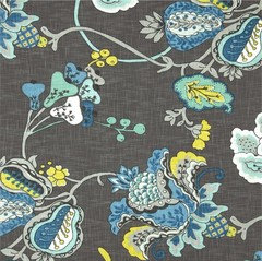
- 11 years ago
alley - "is it really that bad" - oh my gosh. Is she having post build let down (not that I would know anything about that)? It is a really awesome kitchen, so many great details and it has a good feel. I think most could pick at least a dozen things that are awesome. I actually like it as is but I like soothing tones like that. I could move right in.
Maybe she needs to step back a little, get settled in there and take it all in from afar? She has likely been absorbed in details for so long that maybe she can't see the space for what it is in all its glory?
I like old bat's lights she photoshopped in there. And I really like that fabric that lazygardens posted.
Is there something specific that is bothering your friend? I think she did a great job.
alley2007
Original Author11 years agoI think the "is it really that bad?" came from not understanding how these forums work. When I said "over 50 comments," I think she heard "over 50 things wrong/to change," and was relieved when I explained that means "over 50 people excited to help with the finishing touches."
The pictures have snow on the ground, so she has been in the kitchen for some time. I think she liked all of the finishes individually but didn't realize what the finished product with all of the selections put together would really look like. And, I personally think that she thought she wanted a gray kitchen, but didn't really want a gray kitchen, but that isn't all that helpful to point out now that she has a gray kitchen now is it?!?
- 11 years ago
alley-I didn't see the snow (blocking it out I suppose). It is so hard to visualize how things will be when they are put together. I hope she can find some minor changes that give it a better feel for her.
 11 years ago
So much great advice here! I would def change out the lighting, but I would go glam, for ultra feminine and use crystal chandeliers. I wouls also do some thing in the glass cabinets, but I would prob go for wallpaper back there... like s flocked damask print, maybe in a pretty lavender and silver or lavender and creamy white. something like this maybe

http://www.brewsterwallcovering.com/2542-20713-mauve-glitter-damask.aspx
or this, in the purple http://www.brewsterwallcovering.com/dl30609-purple-crepe-moroccan-medallion.aspx
really, there are so many great way to change the look of the space without even touching the cabinet finish.- 11 years agolast modified: 11 years ago
Alley, I hope she also knows how many of us think her kitchen is beautiful. It really is lovely!
I love that fabric you found, lazy_gardens! It's a floral but it's not a fussy floral and the colors sure add a fun pop. It just might compliment the homeowner's pretty green glassware in the display cabs.
 11 years ago
I would kill for that kitchen! So easy to change it up with colors, or bling it out with sparkles and brass.
- 11 years ago
That's an awesome kitchen. The island looks like a work of art. My kitchen is a billion times smaller and not nearly so gorgeous, but I felt like I had a bit of the same issue. I have taupe cabinets in a galley configuration, and it felt more monochromatic and more modern than I intended. (In retrospect, I probably would have chosen something different than a plain eased edge on my Silestone, for example, to add a little softer touch. Maybe different pulls too - I love mine but they seemed to accentuate the straight lines.)
The good thing is that this is such a beautiful space! I think there are three relatively easy ways to make a difference in the overall feel of the room: first, the chandelier. The one that's there seems a little too ordinary. I would spend a bunch of time on every great lighting site and do some photoshop to find something that brings in whatever element the homeowner feels is missing. (Depending on the choice, that might mean different pendants too.) Then, some stools with fabric seats as some of the previous posters have suggested. Finally, I'd look for a couple of great runners that bring in the style she wants to convey. (If it were me, I'd suggest some old Persian carpets, but that's pretty individual.)
A few little tweaks that incorporate the homeowner's sense of style, and it won't be a question of masculine or feminine - it will just feel like her home.
- 11 years agolast modified: 11 years ago
I'm not into a lot of bling and like simple designs but.... This kitchen is very masculine. All that gray, the black & white granite and the dark wood island top read 'Men's Club' to me.
I would replace the light fixtures with clear glass ones (with just a hint of bling--I'd mostly want them to disappear) and replace all the counter tops with a light colored marble-ish quartz or solid surface like Corian Rain Cloud. And replace the backsplash with something lighter in color. Introduce a touch of color by painting the inside of the glass-doored cabinets. Probably change out the hardware to something not quite so boxy and stern looking.
Love all the windows and what I would strive to do is soften the design without having to resort to window treatments. There is already a lot going on what with the strong design lines in the cabinetry and the curlique island with the odd pedestal (I'd have to change that)--I fear that adding design-softening window treatments would make a nightmarish mish-mash of things.
- 11 years agolast modified: 11 years ago
It will be interesting trying to convince the husband who selected that dark, masculine design to now add yellow fabric and crystal chandeliers.
The backsplash is what pushes it over the edge for me. White or a very light gray would have been a better choice. There's not a lot of BS, so maybe it could be done for not too much money.
- 11 years agolast modified: 11 years ago
Interesting mayflowers, I particularly liked the backsplash. And there's more than a little - it's on three sides of the kitchen.
For the convenience of anyone else who'd like to suggest alternate lighting, here's a blank canvas :)
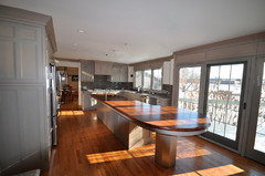
 11 years ago
It's the wood island top that is making it feel masculine. Should have the same granite as the perimeter and molding should be painted white.. Fabric counter stools, a bowl of fruit, that's all you need.
- 11 years ago
The kitchen is perfect but the "interior" decoration part hasn't happened...that's what needs to happen. The pictures that you show have not one warm touch. Art work? Where is the fruit bowl? Where is a flower vase? The errant cookbook? The cake plate? How about a long oriental style runner? Time to have fun.
- 11 years ago
I like the tile, just not with the gun metal gray. I think that should have been the darkest value in the room.
- 11 years agolast modified: 11 years ago
Suzy- I respectfully disagree. If this kitchen was painted white, we'd all be loving it! The gray is what's making it masculine, IMHO.
If the perimeter cabinets AND trim were painted white, it would look so much different! This one has the wood floors and island counter...and the gray island. But the white perimeter is much brighter.
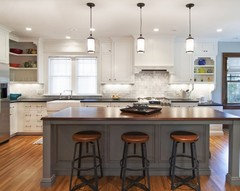
This kitchen has darker wood floors and the wood island....but look how much lighter it seems.

If there's any way to paint that trim (and perimeter cabinets) the backsplash, island, floor, island counter would all still be very nice. But not so dark....nor so masculine.
ETA: You all like the nor? I was watching Conjunction Junction with the niece and nephews :)
 11 years ago
I agree with Lavender. To me, all that gray is making it feel very heavy and somber, even with all those fabulous windows and winter light streaming in. I realize that gray interiors are on trend, but I just don't get it. I'm sure the angle of the first photograph is throwing proportions off, but I don't think I've ever seen an island of quite that length!
I like the backsplash, the floor, the wood atop the island. The windows and vista are incredible. I'm indifferent about the lights, certainly easy enough to change out. I do think this is an example of when all gray cabinets don't work.
- 11 years agolast modified: 11 years ago
I'm not sure what the thinking was with the trim. Over the cabs, it's painted a grayish tan to make it look like crown molding. Then that color is extended over the windows. Maybe the trim over the cabs should have been painted the same gray as the cabs, then they could have painted the entire window wall white to match the wall that leads to the DR. Do the the decorative panels over the windows and doors add to the heaviness? If they took them down, they could paint that wall area white. I wouldn't paint the panels white because they're made to repeat the cabinetry. They probably painted the window wall gray to balance the kitchen so it wasn't dark on one side and light on the other, but I don't think it needs balance. The windows and view do that job without help from paint and panels.




Jillius