Software
Houzz Logo Print
akl_vdb

While looking for bathroom tile...

11 years ago
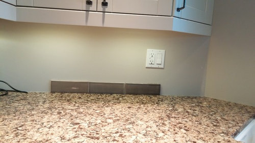
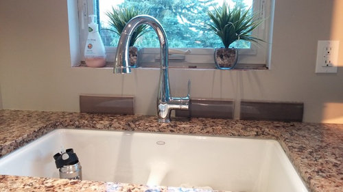
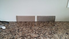
Saw some kitchen backsplash tile that caught my eye.

It's currently on hold as our carpenter had to make a sill for the window before tile went up. Now he's doing a whole casing around, so wasn't concerned with the backsplash with everything else that has been going on (ie, planning on gutting the ensuite and getting a workable design for that).

But these caught my eye. I like the shape. I like the colours. Can I go wrong with any of them?

What does GW say?

UCL on

No UCL on

UCL on


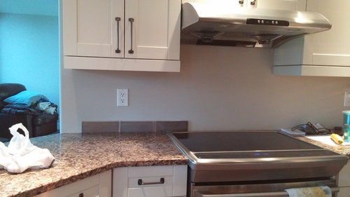
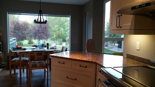
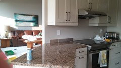
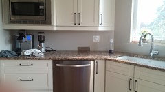
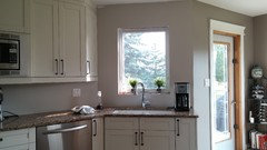
Rest of kitchen, kinda.

Thanks!

Comments (26)

  • 11 years ago

    I think they will look too dark when installed as an entire backsplash. I would try to match up the lighter color in your counter.

    akl_vdb thanked eld61
  • 11 years ago

    I don't think they are too dark (well, maybe the darkest of the three). You have white cabinets and good light--dark tile shouldn't be a problem. I don't think my monitor is rendering the colors for me to vote on a favorite (they all look pretty similar to each other and all look good with the counter).

    akl_vdb thanked cawaps
  • 11 years ago

    On my monitor, it looks too dark for the counter. Agree with picking something in the lighter color of the counter.

    akl_vdb thanked lizbeth-gardener
  • 11 years ago

    I think the lightest one is not too dark at all. I'll take a couple pics tomorrow. I took these at like 7 pm. I think the lightest one might do it. The other lightest are beige and white, which I am not interested in at all. Thanks elledi61 and cawaps ! They are all pretty similar in colour.


    LINK TO TILE

  • 11 years ago
    last modified: 11 years ago

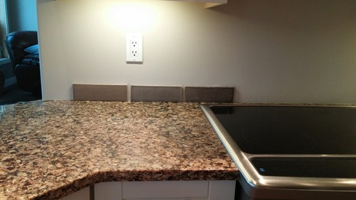
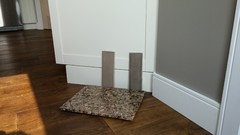
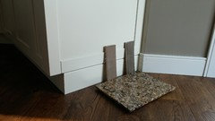
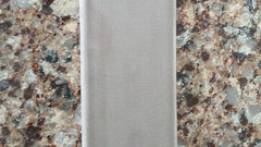
    Daytime

    lightest colour

  • 11 years ago

    That won't read purplish, will it? Taupey tile has been known to go there. Otherwise, it seems to match colors in the counter and I don't think it's too dark for the little bit of wall space you have.

    akl_vdb thanked User
  • 11 years ago
    last modified: 11 years ago

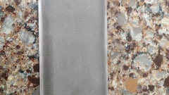
    Can't see any pink/purple in either. These 2 are the darkest and the lightest. I vetoed the middle one as it was too grey.

    They have the tiniest bit of crackle in them. This is daytime against our cabs with natural light. Any pink/purple?

    Wall colour it will be up against is ashley grey and also revere pewter. Unless I go up the whole window wall which I don't think we'll do as this one does have a finishing pencil tile.


    Thanks!

  • 11 years ago

    Pretty tiles! I like the one on the right. No pink/purple on my monitor at least :)

    akl_vdb thanked Butternut
  • 11 years ago
    last modified: 11 years ago

    I do see some pink/purple but I've learned that colors change in every photo so you need to go by what you see. It looks like a good choice to pick out the brighter colors of the quartz while still leaning neutral, unlike what you'd get if you went full-out caramel. But the darker one does match your paint pretty well in that photo, but it's not great with the counter.

    akl_vdb thanked User
  • 11 years ago

    Mayflowers, which one do you see pink in?

  • 11 years ago

    The one on the left. Kind of a dusky lavender.

    Do you like the darker one with the counter? Which quartz is that?

    akl_vdb thanked User
  • 11 years ago
    last modified: 11 years ago

    That's what I was thinking mayflowers, it doesn't look like that irl. They both look ok with the counter but would lean more towards the lighter one. (clay vs flax for colour). It's just really easy in the eyes when looking at it. Nothing to fancy, just like it's kind of supposed to be there, kwim?

    The counter is Cambria Canterbury.

    Thanks!

  • 11 years ago

    Understand that you are choosing an entire backsplash by looking at one tile.

    My concern, since we are not seeing the tile as you see it, is how it transitions from the your cabinets. I see the cabinets with a yellow undertone.


  • 11 years ago

    I would get more to see how they look together. Case in point, when I picked a simple white tile to go with my white cabinets and giallo granite, (which looks brown) the tile did not show gray, but DID when the backsplash was installed! I had it removed the next day.


    akl_vdb thanked eld61
  • 11 years ago

    I will get a few more tiles as samples before we do the whole thing. We have also ripped out a backsplash. I don't want to do that again!

  • 11 years ago
    last modified: 11 years ago

    I agree with Elledi61, they are too dark and think it would be better to pull a lighter shade from the granite. I've posted the link to Tinker's backsplash gallery from her blogspot; a true Gardenweb favorite with many many member backsplashes on it including some with similar tiles. It may help to give you a better visual.

    Finished Backsplashes

    akl_vdb thanked User
  • 11 years ago

    Thanks for the link lukkiirish! When I return the other samples I'll pick up a few more of the clay and biscuit, which is lighter.

  • 11 years ago
    last modified: 11 years ago

    Weren't you the one who picked out that bad boy backsplash last year? How will you ever be happy with biscuit tile? I have the same dilemma--I have beige quartz countertops with subtle white squiggles, and while cream or white tile would be the safest choice, there's so much gorgeous tile out there.

    I totally disagree that it's too dark. Look at all the windows and doors in your kitchen area! You have that little bit of area on the stove wall and then the microwave and one and a half cabinets on the other wall. I would continue the tile at that level on the window wall.

    You said that tile has a little crackle glazing. Is there variation between tiles that gives a lighter and darker effect?

  • 11 years ago
    last modified: 11 years ago

    Here's a Ickaisgir's backsplash in similar tones/color value. I know she did a reveal that you could search for, but I'm not sure I've got the spelling right. She still posts though. I like the stick mosaics in the same color as the field tile.

    akl_vdb thanked User
  • 11 years ago
    last modified: 11 years ago

    Thanks mayflowers! Yes, I did pick out that bad boy tile last year! I don't think biscuit will do it for us, but do like the advice I receive here so Ican get some samples and see. Dh isn't on board with a white/ beige tile. And I'm scared the colour will be just off-which is what happened with the first new backsplash before the flood.

    I'll search for that reveal. Gorg tile. I have also had every taupey grey , brown, beige ,golden Fireclay tile up. The colours just weren't right. Plus now our Canadian dollar is horrible!

    There is some variation. A little darker around the border- the tile looks all squatty- click on the pic to see the full effect. Thanks!!

  • 11 years ago

    And the darker one

  • 11 years ago

    Some of the tiles show variation from tile to tile, giving the wall a bit of a mottled effect. I can find some pics if you're not sure what I mean.

    So now the tile looks gray. This is why we can't pick colors for you. I like the lighter one on the counter, better than I did in all the other photos. If you can pull the gray out from the counter without it looking like it clashes when it's installed, I'd go for it. But you're combining gray with a counter that reads warm caramel. You'll need to get more tile like elledi said.

    akl_vdb thanked User
  • 11 years ago
    last modified: 11 years ago

    I do know what you mean may flowers, variation from tile to tile. Both colours look the same on the monitor when on the counter. So weird. It totally reads browny taupe on the wall. More tiles when I get out there! Thank you for helping me sort this out! eta: now it looks clashy and pink. Sigh. Thanks for helping me out and putting up with this!

  • 11 years ago
    last modified: 11 years ago

    I love tile! Romy, kitchendetective, oldbat, and a few others went on a four thread quest for someone last year and I looked at tons of tile. I didn't know much about it beforehand, so it was really informative. I was hoping to do my BS this fall, but we also need a MB remodel and I'd like to have the tilers in for both projects at once.

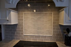
    I found a photo that shows variation in a similar color and size. I think that you get pooling of the glaze with a more crackled tile. The tile doesn't look like a solid wall of color, but I think less crackling is good for your less traditional home. There's still going to be variation.

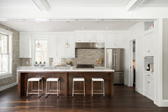
    This is Encore tile, $$$$, which a few people in Kitchens have used.

    Contemporary Kitchen · More Info

    akl_vdb thanked User
  • 11 years ago
    last modified: 11 years ago

    Well that's gorgeous. Also redoing our ensuite. I'm sure by the time the carpenter finishes his projects the br will be designed! All in good time! That will be my next thread, tile and vanity for the ensuite!