Software
Houzz Logo Print
brdrl

Kitchen wall color - opinions needed!

10 years ago

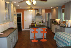
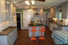
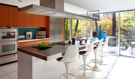
We recently completed a kitchen renovation with grey cabinets, white tile and soapstone. We love everything except the wall color. I got talked into a grey that is too close to the cabinets and really blah. I love color and found these orange stools that we also love. However, I have been stuck on the idea for a fabric with orange for the still unfinished banquette and entry bench, but too much ends up looking Halloween’ish. I love the combination of teal/turquoise and orange and am wondering if we can pull off a color combination like this fantastic BHG cover.

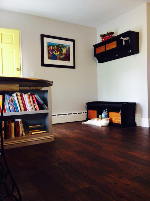
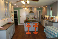
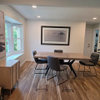
In the first picture is our home’s primary entry. Come through the yellow door and straight ahead is the bench. Do you think we could paint that wall and the wall with café print some shade of teal as a way to separate it from the rest of the kitchen and make it pop?

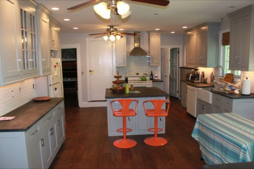
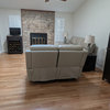
This view is from the entry looking into the kitchen. There is very little wall space and painting strips here and there will make it look striped, I think. So we may only paint the entry walls a different color. Thoughts?

Lastly, the entry bench and the L-shaped banquette need to have coordinating fabric but not necessarily the same fabric. The banquette is behind the picnic table cloth, we now have a real table. If I did an orange print on the banquette should I try to find the same print in black/white for the bench? Or do orange there with a teal backdrop?

I went into decision overload by the time we got done with the kitchen and have about 20 samples of fabric that I don’t love. I have a black/white sheet wrapped around them now and know that I want a more colorful fabric. When I look at google images of orange and grey kitchens they are very modern and harsh, not at all our style. It is hard to see but our table is a repurposed sewing machine base with a round wood table-top. We have colorful art and accessories around now too.

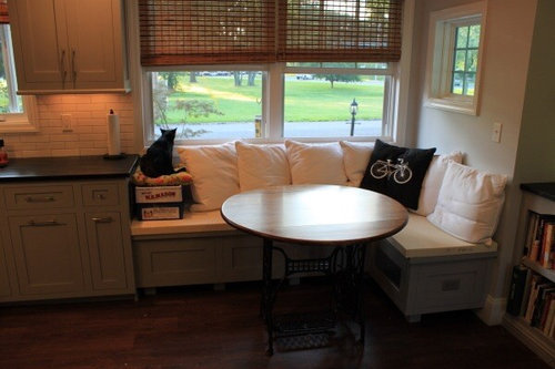
This is the banquette. We will continue to use the white pillows.

If you got through this long post, thank you!


Comments (21)

  • 10 years ago

    You definitely need some more orange, as right now the only orange is your stools. Instead of teal why not paint your entry walls a muted orange. I think it would look lovely against your dark floors and co ordinate with the orange in your kitchen. I think grey can be a harsh color if it is a cool or cement colored grey, but a brown grey is warm and inviting and would go great with orange.

  • 10 years ago

    I'd do the walls in a cool, very deep chocolate brown. My favorite is BM Midsummer Night, but BM Whitall is a very nice cool brown. the cool will be good with the gray cabs, and the brown good with the orange.


  • 10 years ago

    I suggest finding a fabric that you love as the first step--it should include the orange of the stools. Let the fabric determine the other colors--if it contains teal/turquoise then you can decide where to put it. Paint colors to match the fabric will be easier to find than fabric to match a paint color. If you don't want to paint the walls, then perhaps a horizontal but colorful picture/decorative item over the doors on either side of the stove will perk it up. You could use those items as inspiration pieces rather than fabric if you find them first.

    Good luck, your kitchen is beautiful.

  • 10 years ago

    Ok find the thread that is before and afters - great site

    That has a link to the blog and the most recent post on that blog is about picking fabrics and colors etc. Read that first then go pick your main fabric. Actually the fabric on that pillow on the blog would be perfect for you.

  • 10 years ago

    Since you don't have a lot of wall space, I would do the walls in a deeper gray so the cabinets stand out. Maybe go down the same color strip as the cabinet color to one of the darker shades.

    I would find coordinating fabrics that have orange and turquoise in them and use them on the banquette, entry bench and window treatments. I think you could definitely paint the entry and bench walls turquoise then paint the entry door the same color as the trim.

  • 10 years ago

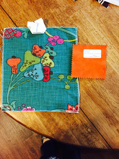
    Thank you all for your comments. I just revisited my samples. What do you think of this teal print for black bench and the solid orange for banquette? It is soft micro suede so easy to clean and as cat friendly as possible. With the white pillow back (and others to bring in more teal and/or orange prints) not much will show on the seat. It is a traditional print for me. I am usually drawn to ikat but just can't find perfect cat and spill friendly option. I like the idea of darker grey feature walls. Possibly orange if I can find the right shade. The interior of the door is white. The yellow faces out.

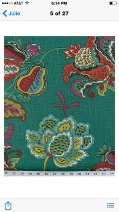
    Better pic of print

  • 10 years ago

    Dark Gray

    Orange

  • 10 years ago

    I painted my kitchen walls a very very muted orange about six years ago, which I still love. Somewhere I have the name of the color but I'd have to hunt it down. This would work with your plan.

    (I'd brightened up my kitchen, which faces a deep steep hillside and barely ever gets any sun -- I call it my Tequila Sunrise kitchen. I wouldn't recommend much of the rest of what I did there, but it served its purpose for enough years. Cheered me up, for sure -- even though the cabinets are going to be re-painted, the walls will remain as they are.

  • 10 years ago


  • 10 years ago

    Brdrl--are you sure those two pictures are of the same piece of fabric? I like the first one, but it doesn't have any white in it. I don't see the orange in the 2nd one. I think white would tie it into your tile and your pillows on the banquette. Maybe add an orange and white stripe to the banquette.

  • 10 years ago
    last modified: 10 years ago

    Okay, here is a crazy idea. Instead of doing the walls a darker colour, do them the same white as the trim or similar. Then your cabs will pop and you can bring in all those lovely colours elsewhere like with fabric, etc. I think painting the walls a dark colour with your white trim makes everything too busy. Then when you start adding in busy fabrics it is really going to be too much.

    That teal print is divine and I think it would be great with the orange - and white walls of course :)

  • 10 years ago

    I would also paint your walls the same color as the trim in flat paint or matching your backsplash. The world is your oyster in fabric in orange and teal. http://www.babybedding.com/gray-and-orange-see-saw-fabric

    Check out Dorssett fabric.

  • 10 years ago

    I was thinking the same, go with the color of the trim or backsplash.

  • 10 years ago

    The see-saw fabric is perfect! I agree with the recent posts about less busyness and contrast, but if you're going for that you might as well leave the walls the color you have now. You can order a swatch from the company Voila posted and see how it looks with your stools and the orange solid.

    How about covering some or all of your white pillows in the pattern? That would bring more interest to the banquette. You will still need touches of color on the counters or over the doors.

  • 10 years ago

    I agree to go with a color as suggested by Daisy.

  • PRO
    10 years ago

    I like the first fabric you posted next to the small orange square. Perhaps a "booster seat" for kitty made out of the same fabric?

  • 10 years ago

    I like the 3 blues tibbrix did above ...

  • 10 years ago

    I love the first printed fabric with the orange. I think I would do a darker grey. I could see a turquoise entry although I know some say "feature" walls are out....I love a spark of color. I have turquoise as my pop of color in my home that is an old farmhouse with lots of gold and rust.

  • 10 years ago

    We are doing a booster seat! The park and bird feeder make it a favorite cat spot - 4 cats rule the house.