Software
Houzz Logo Print
kangadr

Narrowed down to three! (Finally!)

11 years ago
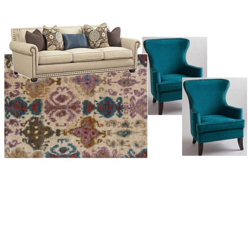
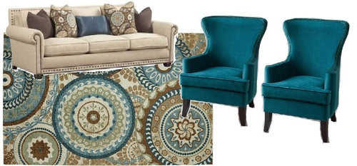
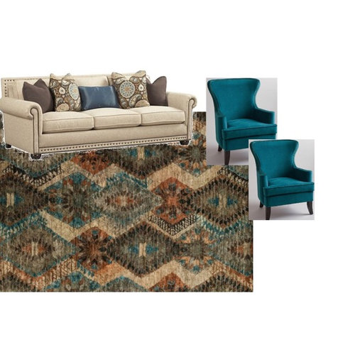
Which one do you like?

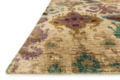
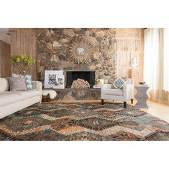
A.

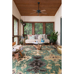
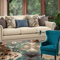
B:


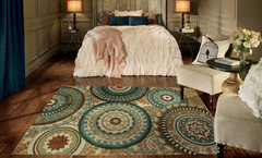
C:

THANK YOU!!!

Comments (43)

  • 11 years ago

    I really like the last one. It has the colors you want plus some depth with the Dark brown. It looks so cozy!

  • 11 years ago

    Me too (although I think all 3 work, I'm more drawn to the last one). In fact, could you post a link to where you found it?

  • 11 years ago

    3 or 1 (Ikat fan here).

  • 11 years ago

    Probably #3 as long as it isn't too dark for the room. Agree it looks cozy. I like 2 but think I would tire of the circles. Quickly. And the first one works, but it isn't someting I would buy. You also don't need the added purple.

  • PRO
    11 years ago

    3 hits all the buttons for me. Lovely!

  • 11 years ago

    I need more information before I give an answer. I like #2 but I think the rug has the potential to dominate the room or be the focal point. I think rug #3 reads more solid than the other two and would allow for something else to be the focal point.

    They all are pretty. Is the scale similar on all of them? Does that help with the decision?

  • 11 years ago

    Either one or three, would have to see it in the room. No. 2, there is just too many circles.

  • 11 years ago

    I think they all work well. I personally like the first one, but that is because I don't care for the the orangish tones in the third. And the second seems a tad too light. But it's splitting hairs.

    Aren't you drawn to one? None would be a mistake.

    Kanga thanked MtnRdRedux
  • 11 years ago

    I'm with Red. I like 1 and 3, but am a bit concerned with the orange tones in 3. What color are the walls and ceilings? Do you have wood work nearby that would look too orange with 3 in place?

  • 11 years ago

    I prefer #1.

    Kanga thanked Fun2BHere
  • 11 years ago

    FWIW, I think ikat (#1) and suzani-esque (#2) have peaked (though I have those styles and like them and would buy them myself). The last one is vaguely tribal i suppose and less trend-specific so may not look "out" as quickly?

    Kanga thanked MtnRdRedux
  • 11 years ago

    #3. It's so rich and gorgeous.

    Kanga thanked User
  • 11 years ago
    last modified: 11 years ago

    I'm drawn to # 2 because it has a more contemporary vibe, but I agree it would dominate the room more than the other two. I guess it just depends on the look you're going for. The purple in the first rug could be another accent color used around the room. The third rug seems a little too dark and gloomy to me in comparison to the other two.

    Kanga thanked joaniepoanie
  • 11 years ago

    To answer your questions:

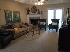
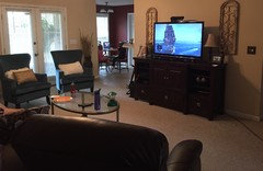
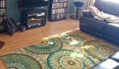
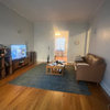
    Here is my space...NOTE: I would NOT keep the painting if I chose rug #3. I have an espresso-colored recliner and entertainment center. No end tables yet, as i am limited on space. My coffee table is a muted gold frame (which I LOVE) and I have a white garden stool for inbetween the accent chairs, but that can be painted a different color. I do fear that #3 is too dark or too southwestern for my space. (Ignore kitchen color...will be changing).

  • 11 years ago

    They are all pretty, but I love #1.

  • 11 years ago

    I like #3! I have a similiar color scheme in my living/dining room so I'm interested to see what you are doing. I like what you have done so far.

    Kanga thanked countryatheart
  • 11 years ago

    Here are all three used in real life."

    A.


    Same pattern as above, but different colors (which I love more, but feel will clash with my chairs):

    B:

    C:

  • 11 years ago

    Hmmmm. # 3 was my only choice, but now seeing the rug as it would appear IRL, I'm not so sure.

    Kanga thanked gramarows
  • 11 years ago
    last modified: 11 years ago

    I think rugs are really hard to choose on line because colors often aren't the quite same and color tones are so important to me!

    I like #1 in the blue color better!! I would be concerned with the primarily light #1 being light and the beige/creams of the rug and carpet not complementing each other... your beige carpet looks like it might have either a grayish tone or even a pinkish/taupey tone and I would be concerned that such a light rug might not look the best... but, maybe it will... that is my favorite out of the 3.

    I would choose #3 over #2... tho not sure I love the color combo... I would order rug samples if you can to be sure you like the colors in 'real life'...

    Kanga thanked busybee3
  • 11 years ago

    I like them all for different reasons but the second one has the best pop to me. I like one because it's different and unexpected. I like three because it seems cozier and more to my style.

    Kanga thanked User
  • 11 years ago

    1.

    Kanga thanked User
  • 11 years ago

    1. If you have dogs 1. In the teal.


  • 11 years ago

    Number 1. The example you posted seems to be a very large rug and I think the scale in the smaller size you will likely have, will look better. I like #3, too. #2 is too much like your pillows and think would look theme-y. It also is such a strong pattern that it's all your eye would focus on. Love your coffee table!

    Kanga thanked Olychick
  • 11 years ago

    in seeing the first samples I would have picked #3.


    In seeing them on the floor,

    #1 is a BIG print and I would skip

    #2 is iffy, kind of a vertigo moment but that might not bother you

    #3 from that angle would also be an issue, but might look better from a different angle as well


    Since you move around a lot, I would pick between the second two the first one will have just too much mauve I think

    Kanga thanked Kippy
  • 11 years ago

    Hmmm...#2 matches your pillows too much and the scale on the other two look like they will overwhelm your furniture/room.

    Kanga thanked User
  • 11 years ago

    Here is area rug #1 in the other color offered:

  • 11 years ago

    I first preferred 2 but after thinking and reading the comments, I am drawn to 1. i like that it does have another color besides the teal cream and brown. If you chose to embrace the red?purple?brown? for accents that is a nice option. I do think they all are great and would work, but I think I am liking the very first one best.

    Kanga thanked User
  • 11 years ago

    #3.

    Kanga thanked User
  • 11 years ago

    I first liked 3 best, but after looking at more photos I prefer 1. I don't care for 2, but I think it's more of a my preference/style thing that I think it won't look right.

    Kanga thanked User
  • 11 years ago

    I like 3 best. I'm not crazy about 2 in part because I keep seeing a face in it! In the last pic you posted, there are the beige eyes and nose and the dark mouth. Sorry! It's probably a kind of Rorschach, and I just flunked. Love your furniture.

    Kanga thanked indygo
  • 11 years ago

    Indygo: you had me cracking up over flunking Rorschach!

  • 11 years ago

    I have changed my mind #! for sure.

    Kanga thanked amykath
  • 11 years ago

    I like no. 1! I cant tell the difference between the two colors for no. 1. Maybe it's my monitor?

    Kanga thanked rockybird
  • 11 years ago

    I really flunked! It's #1 that has the face! I really do love #3.

    Kanga thanked indygo
  • 11 years ago

    Whew! I thought I had a problem but you see it, too!

    Kanga thanked User
  • 11 years ago

    They're all nice, but frankly I would go for something with less visual impact. I love the artwork and I would want to make that the focal point. But I do like #3. I have a couch with a similar pattern on it, I get a lot of compliments on it.

    Kanga thanked l pinkmountain
  • 11 years ago

    Don't like 1 at all, number 2 is my preference but number 3 is also acceptable but it is dark. Number 2 would help lighten up the room.

    Kanga thanked ravencajun Zone 8b TX
  • 11 years ago

    Easy! Number 1

    Kanga thanked natebear zone 10B
  • 11 years ago

    I like number one in the picture that has more blue in it. It looks nice with your other furniture.

    Kanga thanked Karenseb
  • 11 years ago

    #1

    Kanga thanked User
  • 11 years ago

    I prefer one for a few reasons. The unexpected purple seems cheerful to me. The purple looks good with the wall color. The other two just seem so bold for your room. I like number one in the second color also but you are right about the blues not matching. That would not be good.

    Kanga thanked emmarene9
Sponsored
Kuhns Contracting, Inc.
Average rating: 5 out of 5 stars26 Reviews
Central Ohio's Trusted Home Remodeler Specializing in Kitchens & Baths