Software
Houzz Logo Print
newenglandsara2

backsplash replacement: seeking input!

11 years ago

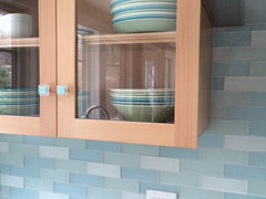
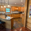
Hi All, I have posted on Gardenweb before about my kitchen backsplash. The tile went up last winter, and we ran into a technical issue. We have not been able to remedy the issue, so we have finally decided to replace the backsplash. Having lived with this backsplash for a year, I am actually hoping to pick something more neutral this time around: something less busy that will allow us to bring a variety of colors into the kitchen. With this existing backsplash (which matches our dishes), it is hard to bring in any colors that don't perfectly match the backsplash and dishes. However, I would still like the backsplash to add some interest and personality since we don't otherwise have a ton of color in the space. I would love to gather suggestions for types of tile to consider. I had thought of a textured white or a solid color glass, but I am very open to ideas. The island and glass knobs are both a soft turquoise color. Please see below for some photos of the space: apologies for some countertop clutter here and there! :-) The countertop is a medium-dark silver color quartz: hard to see in the photos.

Thanks!

Sara

Comments (33)

  • 11 years ago

    That green backsplash actually is a neutral color and you can add just about any color to work with it. It doesn't have to match and it shouldn't! Why can't you bring in purples, or reds, or peaches, or blues to work with the backsplash color?

    However if you're truly looking to switch, I think picking a white backsplash will make the kitchen...bland. Why not pick up the turquoise in your knobs for the backsplash?

  • 11 years ago

    Such a shame! Your current BS is so lovely, I'm having a hard time envisioning something else in there.

  • 11 years ago

    I like it! What were the technical problems? I agree you can punch it up with other colors as cpartist describes.

  • 11 years ago

    Thanks for the input so far! Maybe the pictures are not clear enough. The backsplash is not seafoam green; it is an even mix of white, turquoise and seafoam green textured glass. Maybe the overall look blends to appear seafoam green?

    Anyway, the technical issue involves thinset that is stuck inside the grooves of the tile. When the tile was put up, the contractor initially put it up in a zig zag pattern. When we came home and saw it, we realized that our signals had crossed. The contractor suggested pulling down the tiles and soaking them in pails of water overnight. We did this, and he put up the backsplash in its current pattern the next day. He thought that the thinset would come out of the tile, but it ended up drying up and getting stuck in the grooves of the tile. We have tried every product to remove the dried thinset: water with a sponge (scrapes the finish off the tile since the thinset is grainy), vinegar, glass cleaner, hot and soapy water, etc. Some people have suggested an acid, but we are not comfortable using one in the house (especially due to some asthma issues for someone in our family.) The tile looks dirty and smeared with thinset, and I have saved up to replace it with something clean.


    It is helpful to hear that others like the existing tile! If we did not have this issue with the thinset residue, I would keep it and enjoy it. Since we do, I don't want to replace with the same thing since I don't love it. I appreciate the point about white. Any other ideas are welcome!


    I will also see if I can post a close-up of the tile to give a better view of the colors.


    Thanks again!


    Sara

  • 11 years ago

    Which (of the green and the turquoise) looks better with your counters? I can't tell online, but it looks like the gray has a slight pink cast? Maybe it is a pure neutral gray (although that's rare), but maybe it is leaning in one direction or another and something is "off" that is hard to describe? Or is it the contrast of having all 3 colors that's bothering you?

  • 11 years ago

    Oh I remember your other post where you worried about the colors being a little too bold. I too really like it, but can understand it being difficult to accept the thin set issue. So other then maybe the colors, you like the tile itself? What brand is it?

  • 11 years ago

    Can you just chisel out the tan tiles, they are discordant to my eye, the rest is fine...

  • 11 years ago

    What about either glass or ceramic subways in either a blue or green tone - one color versus mixing 3 colors. If you're looking for more interest, you could do a ceramic crackle that has some variation in color pooling but still reads as a solid. In the 1st three pics, the backsplash reads green. The green tone looks great with your cabinets. Or a blue that blends with your knob color.

  • 11 years ago

    Thanks for so much great input! Lori, I think the colors all go with the countertop, and the issue is more the "busy" nature of the three colors together. The white tiles seem to create a lot of the busy feeling. Since my island and knobs are turquoise, I wonder if using the green alone would look a bit odd? I could use the turquoise alone, but then I would have a ton of turquoise in my kitchen! (I do love turquoise, but...) :-) rebunky and dcward89, the tile is from the Ann Sacks "under $20" collection. It's a lovely tile, but I am wary of choosing a textured glass again due to the thinset issue. If we have any blips during install, I don't want to get stuck with the same problem. practigal, the issue with chiseling out some tiles is that I will still be left with the problem of the dried thinset on the existing tiles. Otherwise, that is a great idea! romy718, those are terrific ideas! As I had mentioned above, I am worried that the green tone won't make sense when mixed with the turquoise knobs and island, but I could definitely do a pale turquoise crackle tile. Do you think that crackle style would look okay with the style of this kitchen (which is a bit more modern when it comes to the lighting and knobs?) I really appreciate all of these thoughts! It's easy to lose faith in your own judgement during a reno.

  • 11 years ago

    instead of doing a subway crackle tile in a staggered look, run them so they are stacked on top of one another for a more contemporary look. The crackle in a turquoise will look fabulous

  • 11 years ago

    cpartist, that is a great idea! When you see the photos of our kitchen, do you think more modern vs. traditional? With any tile we pick, would you recommend the stacked vs. subway approach? Maybe the subway format is part of what is making the tile feel busy.

  • 11 years ago

    My kitchen is definitely contemporary, and we used small crackle subways in a stacked pattern. Nearly two years in and we still love the look. (FWIW, we have replaced the white receptacles with stainless receptacles and they look modern and fit in perfectly with the other elements)

  • 11 years ago

    sjhockeyfan, LOVE that backsplash! Great model for what to consider in ours! Thanks!

  • 11 years ago

    Thank you!

  • 11 years ago
    last modified: 11 years ago

    Would you be interested at all in eschewing tile, thin set, and grout, and instead choosing a sheet glass bs? It's uniformity of color might give you the subtle background you want...

    It also occurs to me that you have a LOT of tile, on adjacent walls that don't necessarily need it. You could freshen/brighten things a bit by painting those walls instead of installing a bs there.

  • 11 years ago

    eam44, I thought of that! I wasn't sure if it would make our kitchen look too plain since we don't have a lot of room to accessorize. (eg. We don't have any empty wall space.) It's definitely worth considering! I assume the cost is lower than tile? We would just need to smooth the walls, paint them and order the glass? Which type of contractor would I call for this? Thanks!

  • 11 years ago
    last modified: 11 years ago

    Your cabinets could go either way. Transitional vs contemporary. What is the rest of your house like? And personally, I prefer a stacked tile vs a plain glass backsplash for your space. I think you still need a bit of "interest." Beautiful kitchen btw.

  • 11 years ago
    last modified: 11 years ago

    Oh good! First of all, if you are planning to demo yourselves... BE CAREFUL. I had to have surgery to remove a piece of glass from my finger after just such a demo!!!

    To repair the walls, call a paint contractor, but first look for a glass installer in your area. This link is to one such installer. Find out from them what type of finish level you need on your walls i.e., how much joint compound and how smooth the skim coat must be, and if they should be primed or painted. Without this info it'll be hard to get a good quote. Also, make sure you include in your contract w painters that they will clean up! Drywall dust can be awful.

    I don't think the solid glass would be too plain, especially if it's translucent colored glass. I like the frosted glass but gloss can be nice as well. You have a million options with solid glass. The cost will depend on your area.

  • 11 years ago

    cpartist, thank you! We live in a 1941 Cape in New England that was renovated last year. The rest of the house has a cottage-style with some artsy light fixtures (mixed with School House style ones), painted or medium wood furniture, somewhat colorful walls, etc. Our ceilings our low. Not sure if that helps, but I do now really like the idea of stacked tile. eam44, that is great info! A friend of mine has this look at her beach house, and it is very calming and pretty.

  • 11 years ago

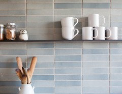
    I love this vertically stacked crackle tile. I like gray with pops of bright colors as accessories, but not as permanent elements next to each other, so I would not use anything in the turquoise/seaglass/green family. I would do a light silver crackle like romy's Encore tiles with your turquoise accessories. You could use larger tiles to minimize grout lines.

    Wilshire Kitchen, Portland (Photo: Matt Niebuhr) · More Info

  • 11 years ago

    mayflowers, thank you so much for the idea! The gray idea is an interesting way to keep the kitchen neutral for accessorizing. I do tend towards turquoise vs. neutrals, but I think I need to push myself to be okay with neutrals since they allow good flexibility. :-) If I choose a light enough crackle with turquoise, I think that might be okay since I already have turquoise in the knobs and island. Thoughts? Interesting idea to use larger tiles to minimize grout lines!

  • 11 years ago

    I do like the larger format tiles, but I don't think crackle belongs in every kitchen. If you decide to go that way make sure your installer knows the manufacturer requirements for sealing the tile.

  • 11 years ago
    last modified: 11 years ago

    Since it's a 1941 Cape, I'd stay a little more traditional with a smaller format tile. It looks like it's a 3 x 6" in my photo, but maybe a 3 x 8" or 4 x 8" would work.

    You don't have to do crackle--there are other glazed tiles with subtle variation that won't give you the striped or checkerboard effect. I personally don't think any of those blue green tiles work with the solid gray countertop, but a soft gray backsplash would be pretty with your cabinet color and make your turquoise accessories pop.

  • 11 years ago

    I like a color like this: Aqua Subway Tile

    Here's the link: Subway tile It's the third one down, (Urban Hues).

    Frankly, I think Fireclay tile would be my first source for tile: Fireclay Tile

    Take a look at their Aqua or their Mayan Blue. If you want to be daring, I'd take a look at their Hawaiian Blue or even their Jade.

  • 11 years ago

    Beaconsfield · More Info

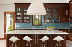
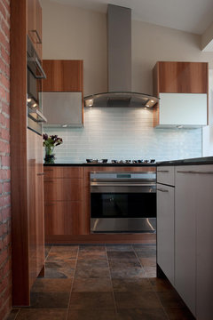
    Found a couple of pics on Houzz.
    Village Apartment NYC · More Info

    Contemporary Kitchen · More Info

    Light and Modern in Downtown Austin · More Info

    Contemporary Kitchen · More Info


    San Francisco Remodel · More Info

    Poggenpohl · More Info

  • 11 years ago

    These are all wonderful suggestions with links to gorgeous tile! Wow! I can understand why a light gray would look nice, but it's hard to resist those pale aqua options! I will need to go shopping soon. If any additional ideas come to mind, don't hesitate to send them my way. This thread has been amazingly helpful!

  • 11 years ago

    Of romy's photos, I like that last tile color the best. I can almost picture it as a pale gray with a little bit of a green/blue undertone. ;)

    The second photo is the most interesting to me. There they've used a stacked mosaic glass tile. I love the little white shelf that matches the grout color. You'd really want the aqua stove too, don't you think? I also like the updated square tiles in photo 6. That would be appropriate to your house. I grew up in a 1954 Cape in upstate NY and we had square blue tiles in the bathroom, and a blue sink, toilet, and bathtub!

    Has it ever bothered you how the open storage wall was tiled? Typically we recommend stopping at the upper cabinet, not the counter. My eye keeps going to that inch or so of tile that juts beyond the upper cab.

  • 11 years ago

    mayflowers, don't even get me started on the idea of an aqua stove! :-) I love those 1950s baths! The tile jobs were just incredible! As for the way the open storage wall was tiled, I now see what you mean. Great eye! I will ask for that to be corrected when we redo the tiling. I think the tile guy pondered the options and decided to end at the counter. It's a tricky spot.

  • 11 years ago

    Thought I'd post a picture of our aqua glass backsplash - we just finished our kitchen remodel in July.

  • 11 years ago

    andyscott, that looks beautiful! Where did you buy the tiles? Love that color!

  • 11 years ago

    The tiles aren't brand name. I bought the tiles from a Chinese granite/tile store that had them on inventory clearance. Similar tiles can be found at subwaytileoutlet.com and modwalls.com You may also want to check out Chinese granite stores if there any in your area. BTW, we only bought the glass tiles at the Chinese store (our cabinet frames are Ikea).

  • PRO
    11 years ago

    Choosing a backsplash can be overwhelming! Here is
    a great article: A
    Backsplash Guide