

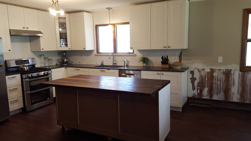
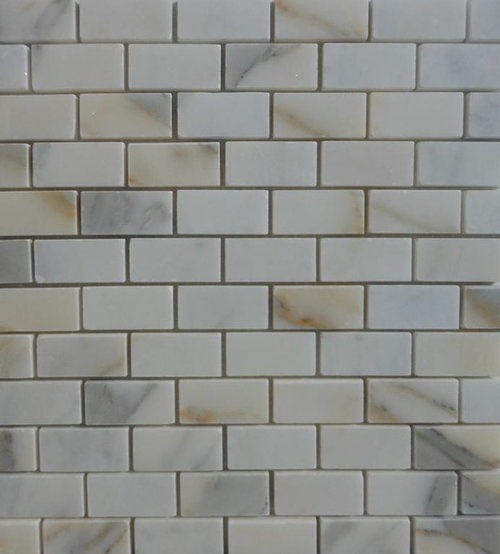
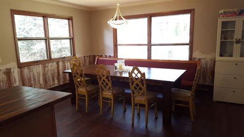
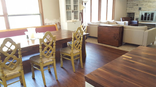
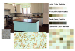
Rehabbed kitchen - now need help choosing paint colors!
10 years ago
Featured Answer
Sort by:Oldest
Comments (15)
 10 years ago
 10 years ago
Related Professionals
Lake City Interior Designers & Decorators · Columbia Interior Designers & Decorators · Marietta Interior Designers & Decorators · Flagstaff Interior Designers & Decorators · Mesquite Interior Designers & Decorators · Bismarck Interior Designers & Decorators · Portland Interior Designers & Decorators · Riverton Interior Designers & Decorators · Cookeville Kitchen & Bathroom Designers · Hartford Kitchen & Bathroom Designers · Buffalo Kitchen & Bathroom Designers · Brunswick Furniture & Accessories · Shreveport Furniture & Accessories · Fall River Furniture & Accessories · Wausau Furniture & Accessories 10 years ago
- 10 years ago
 10 years ago
- 10 years ago
 10 years agolast modified: 10 years ago
- 10 years ago
- 10 years ago
- 10 years ago
 10 years ago
- 10 years ago
- 10 years agolast modified: 10 years ago
- 10 years ago

Related Stories
COLORHow to Choose a Paint Color
Designers offer tips for examining your closet, memories and daily life to find the right paint colors for your home
Full Story
COLORChoosing Hues: Roll With the Color Wheel
See how an age-old tool can help you find the right paint
Full Story
DECLUTTERINGDownsizing Help: Choosing What Furniture to Leave Behind
What to take, what to buy, how to make your favorite furniture fit ... get some answers from a homeowner who scaled way down
Full Story
GRAYChoosing Paint: How To Pick the Right Gray
Which Version of Today's 'It' Neutral Is For You?
Full Story
EXTERIORSHelp! What Color Should I Paint My House Exterior?
Real homeowners get real help in choosing paint palettes. Bonus: 3 tips for everyone on picking exterior colors
Full Story
COLORPaint-Picking Help and Secrets From a Color Expert
Advice for wall and trim colors, what to always do before committing and the one paint feature you should completely ignore
Full Story
NEUTRAL COLORSDare to Choose a More Colorful Neutral
Understanding Shades of Hue Helps You Go Beyond Gray, White and Beige
Full Story
COLORPick-a-Paint Help: How to Create a Whole-House Color Palette
Don't be daunted. With these strategies, building a cohesive palette for your entire home is less difficult than it seems
Full Story
ENTRYWAYSHelp! What Color Should I Paint My Front Door?
We come to the rescue of three Houzzers, offering color palette options for the front door, trim and siding
Full Story
COLORPick-a-Paint Help: How to Quit Procrastinating on Color Choice
If you're up to your ears in paint chips but no further to pinning down a hue, our new 3-part series is for you
Full Story




User