Software
Houzz Logo Print
akl_vdb

Think I picked it. Backsplash (again!)

11 years ago
last modified: 11 years ago
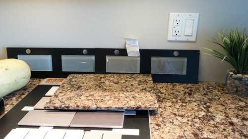
Ok, last post except for reveal (hahaha!) I hope!

Remember it was between the glass milkshake and the ceramic latte? I found the latte one would not go well with the paint and kinda too beigey. The milkshake one a bit too brown. But cozy.

So I think I found a good in between. I'm kinda ticked I sent back the brown one as it would have been a great comparison. Oh well, I should know better! After all you have taught me GW!

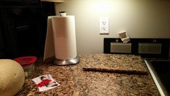
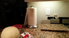
So it's the one with the paint chip on it, the 3rd from the left. Taupe. That's the colour. Not very exciting. Reads taupe. Grey/beigey depending on the light.

?? What say GW?

Comments (51)

  • 11 years ago
    last modified: 11 years ago

    I think I love it! Can you show the pairing in different lighting as well?

    akl_vdb thanked just_terrilynn
  • 11 years ago

    It looks too cool to me as well. But colors are tough on monitors.

    akl_vdb thanked Nothing Left to Say
  • 11 years ago

    Completely agree with the decenters. The granite reads warm and the tile reads cool.

    akl_vdb thanked k9arlene
  • 11 years ago
    last modified: 11 years ago

    From your old posts ( but the new color) and in different lighting. No matter what you pick it's going to look different in different lighting. When the lighting is such that it's making the countertop look very warm I don't think you have to make everything including the backslash very warm . But that's just me. I like what you picked. BUT, I would use a warm grout!!!

    akl_vdb thanked just_terrilynn
  • 11 years ago

    Thank you all. I am having a really hard time picking just the right level of warmth without being too warm. I don't want brown, grey is too cool, and some of the tile i have seen online and one that mayflowers directed me to in the last thread are just not accessible to me here in Canada. I have 12 million fireclay samples, I've tried copper (just too much) the allumino was too dark.

    I do not want to rip out another backsplash though!! So I do value all opinions, even dissenting ones!

    I have 1 more tile place I could go to. Well, 2 now that I think about it.

    I will take a couple more pics. Pitch black here now, and the tile looks really good :) lighting is everything though!

    Ucl

    Cans and ucl

    Same lighting, plus the other tile to the right I was contemplating, but too beige and just a bit off.

  • 11 years ago

    justerrilynn's mock up looks great. I think this is more a lighting/monitor issue than anything else and it's just hard to know online.

    akl_vdb thanked Nothing Left to Say
  • 11 years ago

    This is Cambria Canterbury, right?

  • 11 years ago

    Yes mayflowers, Canterbury. Which I do love. But what a pita to pick a backsplash for!

  • 11 years ago

    Yes it's picking up the dark bits without looking to dark. What is your grout pick (another fun part)? Are you picking a warm grout? That would look good.

    akl_vdb thanked just_terrilynn
  • 11 years ago

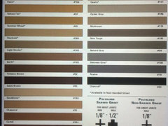
    Grout- you're killing me justerrilynn! What our tile guy does is do the tile then leave the grout samples for the next day.

  • 11 years ago

    You need to decide if you want to try to match the tile for a homogenous look or a different color which will create a busier look.

    akl_vdb thanked k9arlene
  • 11 years ago
    last modified: 11 years ago

    Picking grout is not fun!

    akl_vdb thanked just_terrilynn
  • 11 years ago

    Ugh you guys, grout! I did the homogeneous look for our floor tile in the bathrooms and laundry room.

    Not that I want busy, but I do want the tile to stand our and not just be a sheet of glass tile, kwim? Thank you for the advice!

  • 11 years ago
    last modified: 11 years ago

    We looked at Canturbury about four years ago when we remodeled our kitchen. It's an older color and I think Cambria designed it with a travertine backsplash in mind.

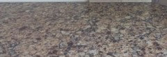
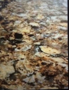
    I think this is a good representation of the counter, but with Cambria, there can be so much variation from lot to lot. The beige has quite a bit of yellow, there's brown, black, and gray, and there are red crystal-like spots. Is that accurate for your counter, akl?

    Gainesville Cambria Kitchen · More Info

  • 11 years ago

    Definitely mayflowers. Looks like ours! Now have you seen it with travertine? Horrid. Just my own humble opinion. I would like it better with bricks! The red crystal like spots are copper.

    So I tried going metallic and looked at some copper tiles last week, and it was just too much. I want serene. I'm not into accent pieces either. It is a gorgeous counter, we've had it 2 years and we picked it because it looked good with our aged maple cabs. Well, kitchen flood happened mere months later and we decided to change the cabs and keep our 5 k countertops. It goes really well with our floors. Which are brown. Which is why I didn't want too much brown in here. We've done that.

    Anyways, thanks for your help!

  • 11 years ago
    last modified: 11 years ago
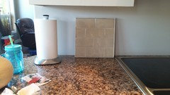
    Yes, it's horrid with travertine! But I see so many warmer granites and quartzes with travertine.

    akl_vdb thanked User
  • 11 years ago

    Off topic...I love your floor tile. What brand and color?

    akl_vdb thanked sweetealy
  • 11 years ago

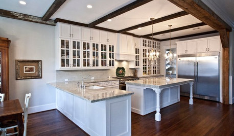
    That is a GORGEOUS slab of granite!!!! I'd be willing to tear out my entire kitchen and start over for that! WOWZA!! I don't think that tile you picked out (gray/beige) does it justice at all tho. What about a warm cream colored tile with a dark or bronze accent? I know that's not your kitchen in the picture right above this post, but I love the wood island too!

    akl_vdb thanked monicakm_gw
  • 11 years ago

    I know it's a boring choice but you need to find a beige that will mimic the travertine color.

    As I mentioned before, this happened to me with my White Dove cabinets and my Giallo granite. Interestingly, they are now showing brown with white. But, six years ago, no. The Grazi Rixi in cream was the perfect transition only because it did pick up the exact cream in the granite. And only one person out of many, many,many was able to help me.

    Very frustrating, but we need to forge ahead!


    akl_vdb thanked eld6161
  • 11 years ago

    Here's a close-up of A2Gemini's Grazi Rixi Crema. I think it'd actually go better with your quartz because it has more cream.

    BTW, that was ellendi who found that beautiful cocoa backsplash. I haven't found anything. I'm just here to naysay. :P

    akl_vdb thanked User
  • 11 years ago

    Oops, sorry mayflowers (and ellendi!) see though, that cream does nothing really for me. I could see it looking ok with the quartz but not the cabs +/or the sink (kohler white cast iron).

    No beige! Ellendi-I refuse :) i just can't do it after living the past 10 years with beige and have done all we can to move past! Cream I could do but wouldn't want it to make the cabs look dirty. And then the sink makes it look dirty. Ugh. Thank you though!

    Sweetealy- the tile is Ames Babylon in sand. We love it. We just decided to put it in our DS's bathroom too.

  • 11 years ago

    Can you get a shot of the backsplash tile lying on the granite? Since they have it mounted to that black board I guess it'll be difficult?!

    I really like the tile color in the ucl pic and wonder if you can order/buy at least 4 tiles before deciding.

    I can definitely see large flecks of that color in your granite.

    akl_vdb thanked annztoo
  • 11 years ago

    You are looking at glass tiles that are on a black background. You're not getting the true color if you're doing that. The tile needs to be on a white background because you'll be using a white thinset to put it up on the wall. What color is the tile when it's not glued to a black background?

    I almost made that mistake 5 years ago. I wanted a beige/yellow stone floor. I looked at an onyx that was on a black background and I hated it. It had a dirty green tinge. Well after I brought the sample home. a few of the tiles, um, fell off the black backing and lo and behold they were much brighter and not as green as on the black. (When you mix yellow with black, you wind up with a dirty green color.)

    akl_vdb thanked cpartist
  • 11 years ago

    I tried to take the tile off the backboard, it kinda broke a little where I tried that (Ooops!) Good idea annztoo about just buying a few.

    Thanks cpartist!

  • 11 years ago

    Akl,.

    To remove the tile from the glued board use fishing line and rub it taught under it until it prys free. I'm not loving the glass tile choices with your countertop. The taupe of the choices offered.

  • 11 years ago
    last modified: 11 years ago

    I would look at Sonoma Tilemakers crackle tile in the Stellar line. They sell them at two tile shops in Alberta, in Edmonton and Calgary. I think the crackle will give you something to get excited about and there are plenty of colors. To my knowledge they run about $25 a square foot.

    https://www.sonomatilemakers.com/Palette.aspx?prod-line-id=6&IsColorPalette=True

    akl_vdb thanked User
  • 11 years ago
    last modified: 11 years ago

    Or, unwaxed dental floss to remove the tile.

    akl_vdb thanked just_terrilynn
  • 11 years ago
    last modified: 11 years ago
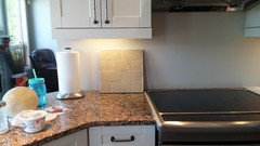
    Well mayflowers, this is gorgeous, the otter from Sonoma.

    I live in Manitoba though! I had taken a look previously at them. Not sure what they can ship for samples. Will have to contact them. Thanks.

  • 11 years ago
    last modified: 11 years ago

    Those are nice SunFlowers! Oops, I mean SunFlowers lol. I see what's happening my words are going into auto- correct. It did it again.

  • 11 years ago

    Sunflowers? I'll take it! LOL!

    Otter is the exact one that jumped out at me! It reminds me of the Encore tile Smoke which we helped someone select last year after going through gazillions of tiles.

    There were several Canadian dealers but I thought you were in Alberta.

    akl_vdb thanked User
  • 11 years ago
    last modified: 11 years ago
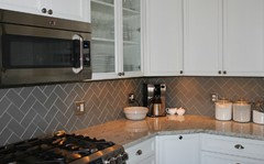
    Akl , as K9arlene stated above you need to decide if you want a homogenous look or other. On top of that you need to decide what your overall decorating style is. Are you traditional, contemporary, modern or eclectic? My taste is eclectic and mixing unrelated items through color association. So, that is not everyone's decor picks. It will be easier for you to decide once you nail down what your style is and how your kitchen will jive with the rest of your home. What is your decorating style?

    akl_vdb thanked just_terrilynn
  • 11 years ago

    She is all of the above!

    With counter and backsplash, I NEED it to feel like the two were designed to go together, like a matching outfit. I can only see it as a whole even though they're on different planes. I think color has to come first and she hasn't hit it yet, mainly because the rich chocolate brown isn't the direction she wants. I don't think that's a bad choice, but a crackle could soften the brown and give some contrast to the floors. Crackle is traditional but a brown can move it more contemporary.

    She has to tread carefully with pattern and tone too. She's already removed one busy backsplash of cool colors.

    akl_vdb thanked User
  • 11 years ago

    Ok all, 2 tile places down, 1 more to go. I looked at some Ann sacks $75 us/sq ft tile. Too rich for me! I have 2 more samples thus far.

    I'm going for the coolest warm i can go. I think glass will be too modern and shiny. I think simple ceramic with a bit of interest will do. Crackle would be nice, but I've yet to find really any.

  • 11 years ago

    Ha mayflowers, I think you know me well! I would say we are trying to be rustic contemporary with some traditional thrown in.

  • 11 years ago

    I think the otter crackle is a winner. I love the Sonoma crackle tile. Great eye Mayflowers.

  • 11 years ago

    They'll look different in person. I really like the matte tiles. They have a satin glaze and some of the creamy colors have speckles of brown. I'm more of a nature girl than a blingy girl.

  • 11 years ago

    I think it's very difficult to judge color over screens, but it seems you are drawn to cool taupes for your tile, which will be tough to do with your (very pretty) very warm-toned granite.

    I think your options are: Brown, which you feel like you already have in the floors, and would be high contrast with the cabinets. Off-white, which wouldn't be the best with the cabinets. Metallic copper/bronze/stainless, which you feel is too busy or bold. So I think that leaves either a light brown (not taupe), or a cream with a lot of yellow. Or, maybe beadboard or a wood-look tile?

  • 11 years ago

    Ok, don't shoot me. How about a bricky colour. Like rust brick.

  • 11 years ago
    last modified: 11 years ago
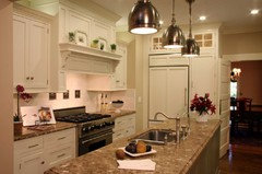
    Akl, since online it's impossible to see a true color, could you tell us if the taupe you picked is a warm taupe or a cool taupe? Stick it next to a true brown and see how it reads.

  • 11 years ago

    It's probably a cooler taupe. I get what you are all saying. I will not get glass, and I will make sure it's warm.

    These were my hauls for today.

    Is it too early for wine??

  • 11 years ago
    last modified: 11 years ago
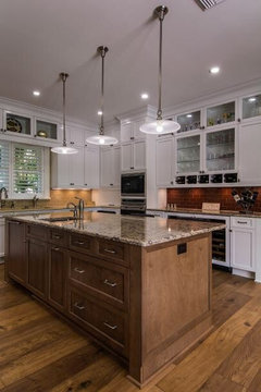
    Ucl on

    This is some kind of bullnose tile and stone


  • 11 years ago
    last modified: 11 years ago
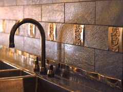
    http://www.bullnosetile.com/pages/Linealuis.html

    This is the tile company and line. This colour is avena.


    So..after burning my hot dogs on the bbq because I was looking at the tile...it's growing on me.

  • 11 years ago

    Did you mean Root Beer? The Avena is green. Sorry, I don't see green on that backsplash.

  • 11 years ago

    Would you say that the one of the colors could be caramel? On your website, the Adex Design has a caramel subway. It actually looks different on my IPad than on my computer.

    I remembered that Horus Art Ceramiche also makes a caramel color. Look at the Tiffany crackle. It seems to appear gold on my computer, but it should be more caramel IRL.

    If you do a caramel, then you would do a white grout. This would tie it all together.

    This is really hard, as I see different tones in each of your pictures.

  • 11 years ago

    No, it's avena! Root beer was like reddish. Pretty, but red.

    Gosh this computer/colour thing is batty!

  • 11 years ago
    last modified: 11 years ago
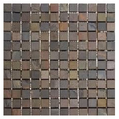
    Here are some ( sort of ) examples of what has been mentioned so far.


    akl_vdb thanked just_terrilynn
  • 11 years ago
    last modified: 11 years ago

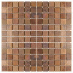
    A crackle to match your cabinets and some copper added just behind the range like picture #2? Or, WARM taupe with non-too- bright copper somewhere? Or , maybe just muti colored copper?

  • 11 years ago
    last modified: 11 years ago

    I emailed sonoma tilemakers to see how I could get samples. I'll go back to the place with the bullnose tile and bring my sample and see if there is another colour maybe not as yellowy that will go. That one looks good though, but dh isn't crazy about it.

    And that walker zanger that autumn.4 has looks gorgeous. I can see 2-3 colours that I'd love to try. But I seem to be getting screwed in Manitoba here! No dealers!

  • 11 years ago
    last modified: 11 years ago

    I'm sorry, I don't think that it goes very well. I would look for something else. I like mayflowers picture. I think that looks good, and when I look at that, I'm thinking that it looks great, not why doesn't this go together. I think you need something that is more in the cream family.

    akl_vdb thanked K Sissy