Software
Houzz Logo Print
akl_vdb

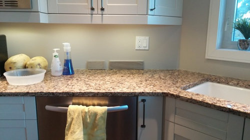
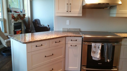
Is this a contender for a backsplash?

11 years ago
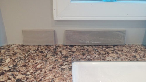
So all the wonderful tile that people find and suggest, I do not have have access to. So I asked around for the crackle, and/or waterfall (??) effect. No go. If there's crackle the colour is wrong, either too brown or grey. (had a thread a few back).

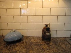
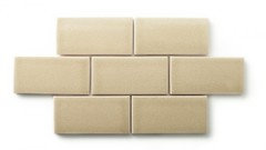
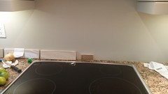
So this looks interesting? I think? Urban Zebra. Not sure of colour. It's the 3×12. The one to the left was the one I was just thinking of going with.

My carpenter put casings and jambs around the windows (had drywall return) and boy it improves the look!

So is the long tile a warm enough taupe that it flows?

Ugh, wondering if it's looking too grey.

Thanks for putting up with me!

Comments (52)

  • 11 years ago

    I'm losing it ellendi6161. Love that walker zanger? That was in another thread. Not in Manitoba. Sonoma tile, not in Manitoba. That other one you brought up, couldn't find it.

    I look and I want it just to be seamless, kwim? Like it's always been there.

    Thanks for the opinions. The dropping off tile samples is driving me batty!

  • 11 years ago

    I think the tone is better but the color is still too grey. No one said backsplashing was easy though, you'll get there. :)

    akl_vdb thanked ghostlyvision
  • 11 years ago

    Almost

    akl_vdb thanked Houseofsticks
  • 11 years ago
    last modified: 11 years ago
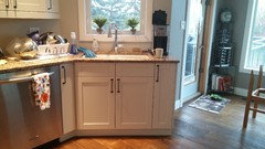
    You will find something! I am just not seeing the taupe on my screen. When I look at the Cambria I see browns and a golden tan, not really taupe.

    akl_vdb thanked eld61
  • 11 years ago

    Thanks again all. I really appreciate the support! I think I'll just start opening a whole 'nother can of worms and call Alberta and see if they can send me some tile! I emailed Sonoma tile, told them I was in Mb and they just gave me the list of places that sold it in Canada. We're not one of them! That's why I was asking for help!

  • 11 years ago
    last modified: 11 years ago
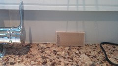
    Just did a some research. Benjamin Moore has teamed with Cambria to take the guess work out of choosing your paint. I thought these suggestions could help with a color for your tile.

    They picked four colors:

    Intense White OC51

    Brookline Beige HC47

    Storm AF700

    Desert Camel 2162-20

    Personally, I'm not seeing the gray or white. I like the direction the other two could take you.

  • 11 years ago
    last modified: 11 years ago
    Thanks ellendi! I did have that mustardy one which while not exact to the desert camel is along the same lines. Just not loving it! I love this dove grey tile style... just more beige or something.

    http://ths.gardenweb.com/discussions/3453790/backsplash-help-needed?n=13

    And this...in hamptons beige or something close.

    http://www.walkerzanger.com/collections/products.php?view=mat&mat=Ceramic%20and%20Terracotta&view_val=&coll=Gramercy%20Park%E2%84%A2&piece=Colors

  • 11 years ago

    What about trying to match up the Brookline Beige?

    akl_vdb thanked eld6161
  • 11 years ago

    I like storm lol.

  • 11 years ago

    You 2 are opposite justerrilyn and ellendi! I will find it, the perfect combo of storm and brooklyn beige!

  • 11 years ago
    last modified: 11 years ago
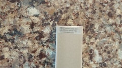
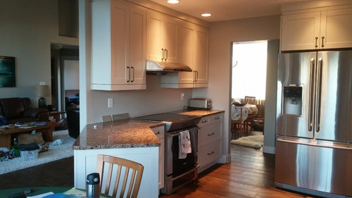
    In the last photo, from a distance, the best color with the counter is the back of your chair! I really think you need something warmer to go with that countertop. Where the lights are hitting it, it's so warm and those taupe and gray colors just look off to me. I think the Desert Camel would look smashing with your counter and cabinets.

    akl_vdb thanked Olychick
  • 11 years ago

    Yes Oly, I agree. Close up there is taupe and gray mixed in. But, Akl, needs to go with the overall color that the counter reads when you walk into the room.

    Do you have a sample of your countertop that you take along? Here is another idea. Going to the Cambria website, they match up two solid colors of Cambria. Dover (beige) Cherrybrook (brown).

    If you think these do look good, order samples of them and you can try to color match. I think the brown would be too dark, but I do like the beige.

    When you don't have all the elements in place at the start, it is very difficult finding the missing piece that will look like it was planned all along. Something is out there, but you will need to compromise. And when you find it, everyone (not us here of course) will think it was not a big deal!

    akl_vdb thanked eld6161
  • 11 years ago

    I see that olychick! Ha!

  • 11 years ago

    Ellendi- thanks for the extra help on colours.

    I take my counter along. These are what people are giving me to try. They have obviously never been on GW!

    So when people walk in and say how beautiful the backsplash is I can just say, "Oh, this ol' thing? I just threw it on." ;)

  • 11 years ago

    I know there have been other threads about this, but I can't find them. Have you considered just getting a subway the color of the cabinets? Maybe a darkish grout? Perhaps this was considered and rejected already.


    Traditional Kitchen · More Info

  • 11 years ago

    The dover counter is quite similar to this tile I had.

    http://www.bullnosetile.com/pages/Linealuis.html in avena

  • 11 years ago

    Thanks oly, so with the creamy tile while I think it could look good, with the white sink and the off white cabs, I'm so scared of the tile or the cabs looking dirty or 'off'.

  • 11 years ago

    Have you tried to color match tile to your cabinets? I don't think the white sink would be a problem, if the largest masses were well matched. Sorry if this has all been considered in your previous thread.

    akl_vdb thanked Olychick
  • 11 years ago
    last modified: 11 years ago

    Backsplashes do not have to read the same color as the countertop except maybe on HGTV. I can find millions of examples from top designers. However, since you can't find the warm taupe that is in your countertop perhaps an off white is for you. At least it will be easier to find many samples. I don't think you would tire of it because it's so easy to get along with and decorate around.

    akl_vdb thanked just_terrilynn
  • 11 years ago

    Sigh. Dh and I have the am off together. Maybe we'll head off to a tile store to look at some off whites.

    Thank you again!

  • 11 years ago

    Been following along. I think the one on the left looks okay in the first pic. It also is a good choice with your paint which the tile will butt up against in several places. Can you get a few samples of that tile?

    akl_vdb thanked User
  • 11 years ago
    last modified: 11 years ago
    mayflowers I did have 2 samples and hee'd and haw'd about them. It doesn't go great with the paint in the eating area which it will butt up to by the sink. (BM Ashley grey). So I'm going to call the Alberta dealers of Sonoma tile and see what I can get.

    Otter, frappe, daydream, burlywood, truffle and barnwood catch my eye.

    And see if I can get Walker Zanger while I'm at it....

    I think my bathroom tile may be on backorder, so I have an extra week possibly before my tile guy is here. I'd like to do both at the same time. I've been looking for backsplashes though for months! He's coming Nov. 13, or the 20th. Oh well, if I don't find it, I'd rather wait and pay the bit extra for his second trip than have to rip the backsplash out (again!)

  • 11 years ago

    I think I'd be looking for a tile that "goes" with your counters and cabinets,not the paint color of your adjoining eating area. I'd rather reapint the area if need be.

    akl_vdb thanked k9arlene
  • 11 years ago

    Yeah, who wouldn't? I thought she just painted everything Revere Pewter though.

    I think the reality is that when you've been to every tile shop multiple times and there just aren't the resources available, you have to choose the best of what's available.

    I've been thinking about going to a contractor's design center here to look at tile for my backsplash. They have the 12" Cambria samples and some of the Sonoma tiles. I'll let you know if I see anything.

    akl_vdb thanked User
  • 11 years ago
    last modified: 11 years ago

    Yes. Thanks k9arlene. Not painting though. We have open concept. Once we start, it continues. And I love the colours. Thanks mayflowers.

    I think I'll check out a couple more from this manufacturer that is available to me, see if any others go.

    http://urbanzebra.ca/catalogue/urbanzebra/

    it's the catalogue....pg 82-85 or so, Hamptons, I have the New Yorker sample. Maybe the caramel colour.

    Thanks all. One day I'll just show up with a reveal....

  • 11 years ago

    I called Cambria Headquarters. The rep thinks that the Clyde is a better match for a tile for your Canterbury as it is more brown. I am wondering if it will look different in person.

    They can make tiles to match. Probably very expensive though. But, if that color works maybe you can try to match it.

    akl_vdb thanked eld6161
  • 11 years ago

    I would try and match your wall color if that's staying and you like it. then it will all work together. Take a look at Jeffrey Court Tile. Online both Sage, Mountain Mist or Riverwash might work with your wall color and conversely your counters. I believe they will send you samples. I have their antique lace in my kitchen and it's a beautiful crackle tile. Jeffrey Court Tile

    akl_vdb thanked cpartist
  • 11 years ago

    Going to try this again, in clay and in biscuit. See how that works.


    TILE

    Thanks all for your help.

    Ellendi- thanks for calling cambria. I had a sample like that colour. It went nicely.

  • 11 years ago

    They look good. I hope one of them works.

    How about the Jeffrey Court nutmeg? The ivory looked nice too. (not too light at all)

  • 11 years ago

    Have you looked at Horus Art crackle in caramel? I have half a box left from our reno and would be happy to send you a tile.

    akl_vdb thanked shellibeinke
  • 11 years ago

    If you really love a tile that's available in Alberta, I'm sure you can get *someone* to pick them up and take them to Greyhound for you.

    akl_vdb thanked amberm145
  • 11 years ago

    Shellibeinke- how sweet are you! I appreciate it greatly, I love how this community is so helpful to virtual strangers. I'm going to try out the biscuit and clay by ames which is local and crackle and has that darker around the edges effect. Thank you for the offer!

    Amberm145- I can't draw you into my crazy :) if I knew what colour...but I don't. I never did call the Alberta companies as I'm feeling defeated. I think my tile guy is going to come in December now, (bathroom tile backordered) so that gives me some time to call as well and get a couple samples. Thank you so much!

    My friend is like, "you know you're losing it when you want to drive to Edmonton to get tile." she's just starting a reno. I'm like, "just wait...."

  • 11 years ago

    If I only had to drive to Edmonton... I had tile ordered from California, shipped to Montana, and drove to get it. I'd welcome the distraction from my own crazy.

    akl_vdb thanked amberm145
  • 11 years ago

    Ha ha! amberm- I had Fireclay shipped but we were already in California at the time. 6 months ago! This darn backsplash issues! Then when I look at other people's stuff I'm so decisive. Why is it so hard for me?? I'm no special snowflake!

  • 11 years ago

    There's no loss to you if you're wrong when deciding for someone else. I could easily tell you to go with the grey one and go on with my day. But you're the one who has to live with it.

    I would (and have) totally have samples shipped to wherever I am in the US. But a couple boxes of tile? Only if I'm driving home, and there aren't a lot of places to vacation in the US within driving distance of Calgary.

  • 11 years ago

    I'm going to call you SS from now on. :) It took me the longest time to remember your initials.

    Remind me which Fireclay you had shipped. Feather Grass is pretty. Is it too gold?

  • 11 years ago

    This may be my screen, but what I'm seeing is that the wall paint color, pretty as it is, may have different undertone than the countertop. The counter, flooring and cabinet colors seems warmer than the paint color (though it could be the lighting?) But I know how it is with open concept... . There are online color Consultants who are relatively inexpensive. It may be worth $100 to get a fresh eye, though I've seen the collective talent of GW input! Good luck!

    akl_vdb thanked AbbyJoy
  • 11 years ago
    last modified: 11 years ago

    AbbeyJoy- the paint is a touch cooler than the counter/cabs. But it's still ok. Then I have Ashley grey which is a nice warm grey/brown in the eating area. It's such a small painted area in the kitchen that won't be covered in tile, maybe;) if I ever find one!

    And I loove revere pewter. It still reads slightly warm, but was just such a nice update from the beige we had. Goes great in our open concept and just is gorgeous in our space.

    Mayflowers- SS, does that stand for anything?? I know, my name is long, I can barely remember passwords and what not. I had 12 fireclays shipped

    Feather grass does go. I am listening to you guys and going away from taupe, grey, and trying out some creams/browns (without being too brown!) i have one that I'm not crazy about, but was worth a shot!

    So I'm looking with new eyes.

    Feathergrass

    Feathergrass in the middle of the oven, the little sample.

    Ucl on here. It's cloudy!

    Another creamy one I tried. Not working for me.

    Sorry for the disaster that is my kitchen. Cooking spree this am.

    This feathergrass looks nice. My mil actually picked this one out when I had them all lined up.

  • 11 years ago

    I hope that this last picture is truly indicative of the the actual color because I think you have a winner. It will be a good transition going from the cream of your cabinets to the brown in your cambria. But, it seems to look different to me in each of your photos.

    Can you get more and create a sample board? It is difficult to make a decision with one lone tile.

    akl_vdb thanked eld6161
  • 11 years ago

    I like the Feather Grass! Looks to be just the right tone and color.

    akl_vdb thanked ghostlyvision
  • 11 years ago

    I think the Feather grass is gorgeous. If the color I'm seeing on my iPad is accurate it is perfect with your counter!

    akl_vdb thanked Holly- Kay
  • 11 years ago

    I like it a lot, too!

    akl_vdb thanked Olychick
  • 11 years ago

    Thanks all!

    mayflowers- I can see a touch of green. But it seems everything else I own has a green undertone as well. Revere pewter, etc. SS-Special snowflake- yup! Love it.

    It does go pretty well. Now the problem (of course!) is that it is $30/sq ft. US $. The state of our poor CDN is abysmal. Which equals to $40 CDN/sq ft. Which is a bit much. I still owe my folks some us $ from our last trip to Grand Forks, ND (the trip which counts as a big deal around here- ooh, went to Grand Forks for the w/e!) and I'm waiting for the dollar to bounce back a little!

    It seems to change with all directions and different lights. It looks dark on one wall, lighter on the next. So I will take my little sample and try the tile stores and see what comes up. Maybe there is something similar out there.

    The other day I was wondering why my purse was so heavy, not much in there, wallet, coupons, phone. Well, on the outside pocket I had 2- 3 x 6 ceramic and glass tiles in there! Gosh, I could have taken an eye out!

  • 11 years ago

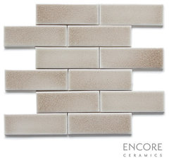
    Did I mention Encore Ceramics in the Smoke color? I thought I did on your last thread. Feather Grass reminds me of Smoke. Anyway, romy and a few others used Encore and we all went ga-ga over it when trying to find a backsplash for Michele, who chose Smoke. Romy said the Bravo line is a quick ship and runs about $22 sq.ft, and Smoke is in the Bravo line. It's a crackle tile.

    So here's the weird thing. I started wanting it for my kitchen but I saw they don't have a dealer in Oregon so my hopes were dashed. I just now looked at their Houzz page and it says they are made in Oregon. I did not know that! It also says they ship to Canada! You have to download their catalog and drool over it. There are several Houzz photos with Encore installations.


    http://www.houzz.com/pro/encore-ceramics/encore-ceramics

    akl_vdb thanked User
  • 11 years ago

    It looks fantastic to me - fingers crossed you will find it not too far away at a great price. I can't wait to see the after photo!

    akl_vdb thanked AbbyJoy
  • 11 years ago

    Here's a photo of Smoke. I saw several samples that Michele brought home and it had a richer look than shown here.


    2 x 6 Field Tile in Smoke crackle · More Info

    akl_vdb thanked User
  • 11 years ago

    mayflowers- that is freaking gorgeous. So Oregon, ship to Canada, and less $? Ok, let me look into this. Because the weird thing is, somehow it seems getting shipping from 2 provinces over is more work! (and I don't want to take advantage of a wonderful GW'er that has offered to pick them up when I don't even know what I want! -too many choices!)

  • 11 years ago

    Wow that is nice (last one).

  • 11 years ago
    last modified: 11 years ago

    Ok, I emailed them. It says they don't sell directly to the public and have dealers. Hmmm. We'll see what can be done!

    They do have representation in Palm Desert, which is where my folks are going in a week or so. Hmmmm. "Mind hauling back 40 sq. ft of tile back Dad?" Ha hahaha!