Software
Houzz Logo Print
scarmstrong

Did I fly too close to the sun?

10 years ago
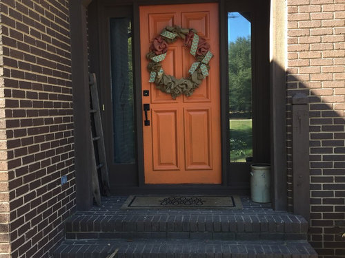
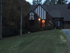
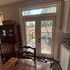
So, I painted & sanded three times. I was afraid the original color I picked would be too dark in the recess. Did I go too far?

Comments (29)

  • 10 years ago

    It is lovely. I like the color with your brick. How do you like it from afar?

    Houseofsticks thanked voila
  • 10 years ago

    I also think it looks great.

    Houseofsticks thanked JustDoIt
  • 10 years ago
    last modified: 10 years ago

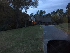
    My husband and daughter were appalled at first. It matched our pumpkins perfectly. I think it looks better since the wreath and new hardware were added, but the reviews are very mixed. My original choice was more cinnamon colored. I'll post an afar pic, you may change your mind, lol.

  • 10 years ago

    I remembered that you pondered painting the side lights and I think you should paint them same as the door

    Houseofsticks thanked emmarene9
  • 10 years ago

    I like it - and I'm generally quite conservative when it comes to color.

    Houseofsticks thanked User
  • 10 years ago
    last modified: 10 years ago

    Maybe look for a door mat that has that orange and other colors in it. I'll see if I can dig up something. Also a bright copper flower pot instead of the whitish one you have there now and put something like bittersweet in it. And I'm not a big fan of wreaths on doors, especially on a door as pretty as yours. Lastly, I'd leave the side lights as they are and just have the door stand out.

    Door mat possibility


    Or this

    Houseofsticks thanked ceezeecz
  • 10 years ago

    I was thinking of copper/bronzing the milk jug.

    Bluebell- I was the only one excited about the change. I even had a friend say, "so your doing this for the holiday?"

    Chez, thanks for the mat links. I love the coir since we have kids and dogs it seems to help with the dirt/Carolina clay. The "white planter" is actually an old grey number 4 crock-I can move it in but liked the antique quality with the old ladder piece. It may read as junky to some though.

    This is the morning pic at the top of the driveway.

  • 10 years ago

    I wasn't too sure up close but from afar, it looks really great.

    Houseofsticks thanked MagdalenaLee
  • 10 years ago

    Whew, for a minute there I thought you were going to copper the crock! Don't do that. (I have two, am looking for a third, but I'm trying to get my house numbers. Turns out I don't think they MADE a size 7, so I may have to give up the idea, or fake it)

    Your door looks nice in the glow of the overhead light, but I agree with bluebell: doesn't sound like YOU love it. The pictures are hard to tell how it reads IRL. Do live with it for a couple of weeks and see.

  • 10 years ago

    Love it in the far pics with the light on. Up close, it's just a tad too orange, needs more rust, IMO.

  • 10 years ago

    I rather like it, up close and further away. It sounds like you like it but your family & friends don't. If their opinion bothers you then I would do as Tib suggested and paint it in a bit deeper or more rusty orange. If you aren't bothered by their opinion just love your gorgeous front door as is!

  • 10 years ago

    I don't think I would want my front door that light with the siding and brick you have, but I don't think it looks bad...

    Houseofsticks thanked busybee3
  • 10 years ago

    I like it more from a distance-- I think I'd want to darken it up a little, a bit more brownish. My other thought is, are you going to like it at other times of the year, for example, at Christmas time, or in the spring? It is a very autumnal color.

  • 10 years ago

    You flew too close. ;-) (Love the way you phrased that, by the way!) I don't care for the color. Particularly from a distance, it looks to me like The Great Pumpkin is standing there, waiting to be let in.

  • 10 years ago

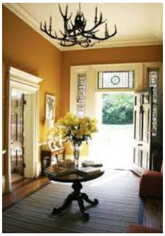
    I found a wonderful pumpkin color I'm thinking about using in my kitchen. BM Greenfield Pumpkin. I think it has the brown in it that you need.

    Here it is in a room

    Houseofsticks thanked User
  • 10 years ago
    last modified: 10 years ago

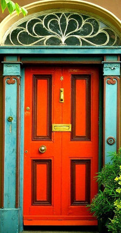
    I wonder how SW Clay Pot would look on your door? To me it has a more subtle, earthy look. (Just re-read above and see that your first choice was more cinnamon colored. Was it more like this?)

    Houseofsticks thanked User
  • 10 years ago

    My first choice was BM Fiery Opal, but only because my husband was set on another red. Now, after THIS, he says it's only missing a purple Tiger paw (Clemson reference). I still like it but I'm a sucker for an orange and I'm in the midst of what qualifies for fall in the Carolinas. I guess time will tell.

    Bpathhome, Funny, I saw the same idea in Pinterest and I was all like I have a zero in my address, I knew they didn't make one:). It's the metal milk jug I will browout/copper.

    JLC, I use this wreath (and I need to either add more burlap or starch it up soon as it's floundering) all year except I make my own from the magnolia, conifers, southern pines and Nandina berry shrubs so it's usually all greenery and sometimes a few red berries.

    We had pumpkins but my new rescue ate all 6 in 2 days:(. The kids inadvertently let her sample the guts of the carved ones. She apparently thought they were too tasty to not perceive a snack.

    Tribb, That color is beautiful in that room. I think I like it for your brownie counter top choice.

    AuntJen, Clay Pot my husband would probably go for if he tells me I have to repaint it. He probably won't as he's uber practical and loves me enough to live in the house he doesn't love with dogs he didn't want, lol. I've enjoyed your postings.

    Thank you all for your opinions. People keep stopping to look at the house on walks (everyone here walks) and hubs is like, "they have to stop, you've blinded them." Also, with a wreath it doesn't read as bright. After considering an umber wash to brown it out a bit I worried it would read as filthy up close. I appreciate all your time and thoughts.

  • 10 years ago

    I think it needs more red, to lean burnt orange or cinnamon (Jen's color is great). I would also paint the trim around the side lights.

  • 10 years ago

    If you decide to play, you could use some of the trim color on the door.


    Houseofsticks thanked User
  • 10 years ago

    I love it. Especially from afar.

    Houseofsticks thanked amberm145
  • 10 years ago

    I was afraid to paint the side lights out in the pumpkin because I thought the brown parallel lines might be too much distraction. This reads Partridge Family era to me Chijim on a Tudor but I can totally see this in an urban eclectic community.

  • 10 years ago

    I like it, and I would even paint the sidelights too. If you think, after a month or so, that it is too bright, paint it a more burnt orange tone. I think the lighter color looks great. (But I also want to paint my front door yellow - on a blue and shite house!)

    Houseofsticks thanked loonlakelaborcamp
  • 10 years ago

    a blue and shite house -- ???

    The immature Anglophile in me is giggling like an idiot! ;-D

  • 10 years ago

    auntjen, I will always be 12 years old in some ways. I laughed too.

    Since you asked, I don't care for the color. I like a lot of oranges if they have some rust/depth to them. This seems to have white in it and it's lightly cartoon-ish. I'm sorry.

    Houseofsticks thanked Bunny
  • 10 years ago

    While I like the color, I dont like the shade of it. It needs to be a muddier/brown orange, it is too bright for my taste.

    Houseofsticks thanked User
  • 10 years ago

    On a scale of 1-10, I would give it a 3. Jen's suggestion would rate a 10! ;)

    Now if you're a Longhorn fan, leave it as is! Actually it's quite a popular color in Tx. Have seen rooms 'wearing' it. ;)

    Houseofsticks thanked patty_cakes42
  • 10 years ago

    I probably would go with a darker orange.


    Houseofsticks thanked nosoccermom
  • 10 years ago

    I agree with the suggestions pushing towards a light rust color. Sorry, that isn't a flattering orange to my eye.

    Houseofsticks thanked User
Sponsored
Bella Casa LLC
Average rating: 5 out of 5 stars17 Reviews
The Leading Interior Design Studio in Franklin County