Software
Houzz Logo Print
shelleyjr

Buttery yellow paint?

10 years ago
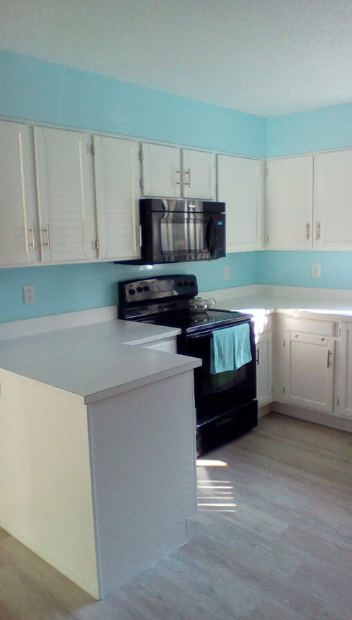
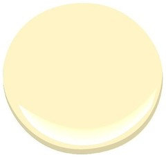
Our kitchen was painted Crystal Falls by Behr. It is way too bright for this south facing kitchen. One window faces east. I feel sunglasses are needed just to walk in there every morning!

Our bathrooms got painted Lemon Sorbet by Benjamin Moore and it looks great. However, with all of the light coming into the kitchen, I feel this color will be overwhelming.

What I am searching for is a buttery yellow that doesn't have any green but more true yellow or towards the Orange range. Also, I don't like browned yellows with the chantilly lace painted white cabinets and black appliances.

Any suggestions would be greatly appreciated.

Comments (162)

  • 10 years ago

    I love Collingwood too, and it's quite comparable to the warm gray hues I suggested earlier. These cooler hues do look nice with floor, it's the cabinetry where the color misses the mark. :))

  • 10 years ago

    Since you like color in paint, why not leave the current color and only paint / or stencil design with that color and the white in backsplash area?

  • 10 years ago

    Natalie,

    I got some SW paintchips. Silver plate is almost identical to Harbor gray, but slightly darker.

    Gray clouds might work, but it seems so dark. I got the big full paint card and I don't think I'll like it. Pussywillow looks good but again too dark for my taste.

    Our house is small only 1148 sq. ft.

    This is so frustrating. Maybe I should have an all white kitchen.


  • 10 years ago

    Shelleyjr can you put the Silverplate swatch up against the HG sample and snap a pic?

    shelleyjr thanked Natalie
  • 10 years ago

    Pussywillow is much too dark and not good with your floor.

    shelleyjr thanked Natalie
  • 10 years ago

    Hi Natalie, yes I can do that after my migraine stops! You have been so terrific to help me. I can't thank you enough!

  • 10 years ago

    Oh you too! LoL! Had to take a couple of Tylenol about an hour ago. Whenever you get a chance. Feel better. :))

    shelleyjr thanked Natalie
  • 10 years ago

    Ok, here is the photo.

  • 10 years ago

    Thanks Shelleyjr... it is darker than the HG, noticed that right away. I think you should try a sample of the Silverplate, as it's not as bright as the HG and that is probably why the HG works with the floor, but not the cabs. It needs to be deeper. If you think Gray Clouds is too dark, you're probably right, so scratch that one off the list. How about Light French Gray, did you like it?

  • 10 years ago
    last modified: 10 years ago

    Hi Natalie,

    Yes, silverplate is slightly darker than harbor gray. But we think the bright blue walls are throwing everything off, like you mentioned earlier. You know how the colors look good against the floor but the minute I put them near the upper cabinets, bam it looks flat or just off.

    So here is plan. Our living/dining room is painted the same color as the cabinets, chantilly lace. The only difference is the finish, high gloss on cabinets and eggshell on the walls.

    I just painted a second coat of the harbor gray and I painted the Wickham Gray again on another foam board.

    In the morning I'll take a picture of both of these in the living/dining room which faces south, the same as the kitchen. This way the blue walls won't be interfering with the foam boards.

    I think this will reveal a lot! Pictures in the morning!!!

    Shelley

  • 10 years ago

    Sounds like a Great Idea to me. I'll be watching for photos... :))

    shelleyjr thanked Natalie
  • 10 years ago
    last modified: 10 years ago

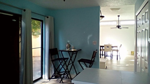
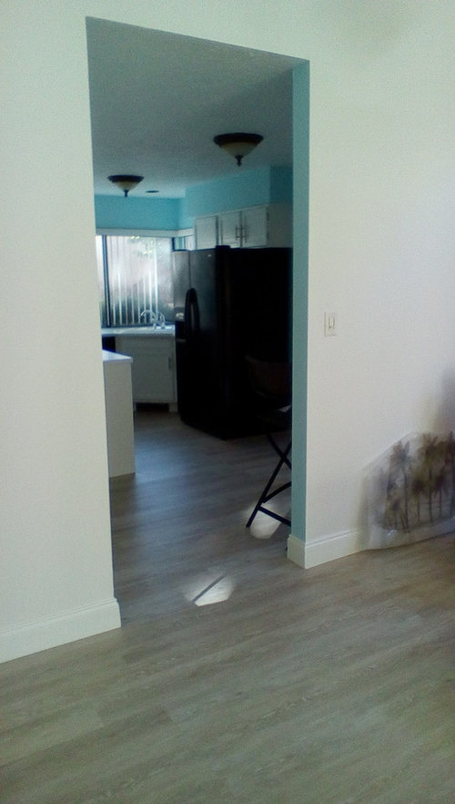
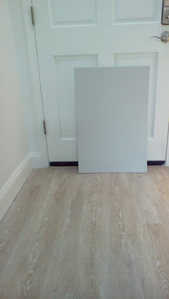
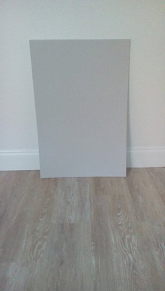
    Sneak peak of Harbor gray at night in living room.

  • 10 years ago

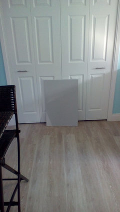
    Harbor gray AC-25 BM

    Front door is painted chantilly lace in high gloss same as cabinets

    Living room painted chantilly lace in eggshell

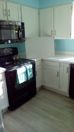
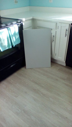
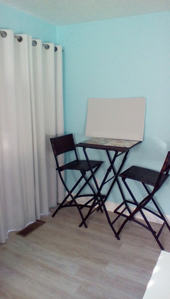
    The screaming bright sunny kitchen

    kitchen floor

    Bistro set in kitchen

    laundry doors in kitchen painted high gloss chantilly lace

    Do you think this color works or should I try silverplate?


  • 10 years ago

    I think the Harbor Gray looks fantastic. No matter what you paint in the kitchen it will wash out (the sun is a fiery ball after all, lol) so if you love it else where I say go for it. You can always put in a backsplash later to tone the kitchen down even more if you are still blind in there. I have an east facing kitchen and it is beyond bright on summer mornings. So I am watching your kitchen to see what ends up working for you!

    shelleyjr thanked Rawketgrl
  • 10 years ago

    Rawketgrl,

    Thanks for the vote on Harbor gray. My only concern is that it looks purple at times and this occurred last night when we were looking at in the living room! So, I am not a 100% sold on this color. It did the same thing in the kitchen with the curtains closed. Yikes!

    Silver plate by SW might be better since it has only black, yellow and red. No blue or green.


  • 10 years ago
    You may want to go for a warmer grey to avoid the blue and purple.
  • 10 years ago

    One thing I have noticed about this kitchen and colors is that warm undertones don't seem to work as well as cool undertones. I am so glad I didn't go with yellow. With that being said I question whether silverplate will work?

    I am really getting discouraged and frustrated with gray. It is so hard.

    Also, it doesn't seem that going darker is the solution but rather getting the correct undertone. So, I have been considering going more blue gray. I think this needs to be tested. I fear it might turn purple. But if I go more blue than gray it just might work.

    I have also considered Sea salt by SW. Not sure if that would work with all of the aqua towels?

  • 10 years ago

    SandyC,

    When I tried the warmer grays it doesn't work with the cabinets. Natalie thought the same thing. It works with the floor though.

  • 10 years ago

    Hi Shelleyjr

    It seems you've already decided to try a sample of Silverplate--so basically, you took the words out my mouth. Looking forward to seeing photos. Good Luck!

    shelleyjr thanked Natalie
  • 10 years ago

    Oh my! Purple.... an amazing color when you love it. Not so much when you don't want it. Then I look forward to seeing the silver plate by SW next. What about something true gray but on cool side?

    BM METRO GRAY

    shelleyjr thanked Rawketgrl
  • 10 years ago
    True grey is very cold and flat IMHO. Did you try Natlie's very first suggestions of warmer greys? Horizon?If they are too light, just go down one shade on the paint deck. Also if you are painting your walls, how about your ceiling don't forget that. I would not keep it stark white, but either the same color as your walls or a softer shade of the wall color.
    shelleyjr thanked User
  • 10 years ago
    I am off to painting class. I paint En Plein Air in oils. Colors are very, very hard. So don't beat yourself up about it. It's only paint and you can always change it :)
    shelleyjr thanked User
  • 10 years ago

    Hi Shelleyjr---

    Is no news, good news? I hope so.

    Looking forward to photos. Have a Great Night! :))

    shelleyjr thanked Natalie
  • 10 years ago
    last modified: 10 years ago

    MAJOR REVELATION!

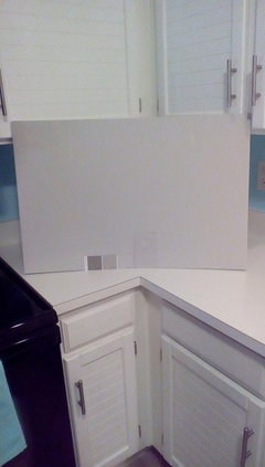
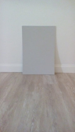
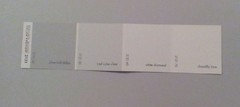
    I was reviewing all of the paint chips that I had collected over the past few days plus what I picked up today at SW. One of the BM colors that I liked was called Silver Half Dollar 2121-40. Well on the opposite end was...Chantilly Lace 2121-70. Say what? My original paint chip has Chantilly Lace as an Off- white Color OC-65.

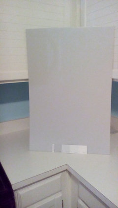
    This is a game changer. We looked at Silver Half Dollar and decided it was a tad too dark for our taste. So we had it mixed at 75% strength. (The paint strip above was photographed on the mixed version of silver half dollar.)

    Both of the pictures were taken at night and the paint was still drying. So the real test will be how it looks in the morning.

    Another thing we feel the cabinets need another coat of paint even though they have 2 coats. The cabinets were very dry and soaked up the paint. I think this is why all the gray foam boards were not working with them.

  • 10 years ago

    Oh that's FABULOUS news! It looks very nice---daylight will be the deciding factor. If it's too light, have it mixed @full strength. The color looks perfect with the cabs. Make sure to post pics---full shots---floor and cabs. Happy for You! :))

    shelleyjr thanked Natalie
  • 10 years ago
    Don't take your monitor's word for it. Check out Ben Moore's Moon Light Yellow.
  • 10 years ago

    Natalie,

    This is really exciting. The curtains blend so well with these colors, they are right between Iced Cube Silver 2121-50 and White Diamond 2121-60.

    Silver half dollar looks great against the trim and with another coat of paint on the cabinets should pull it all together.

  • 10 years ago
    Red and green so NOT make yellow.. Yelp ow is a primary color.. Mixing red and green with make browns.
  • 10 years ago
    last modified: 10 years ago

    Well, silver half dollar is way too blue in the daytime.

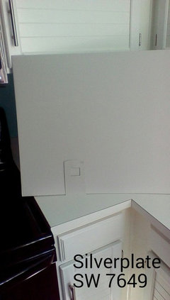
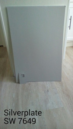
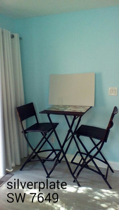
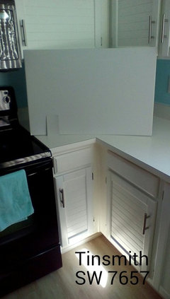
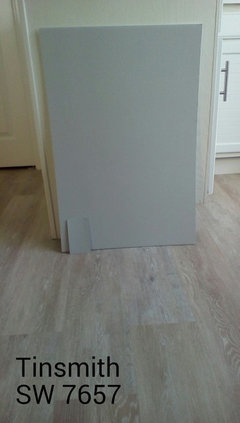
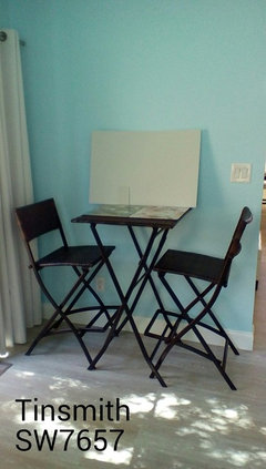
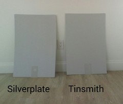
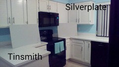
    Here are 2 from SW, Silverplate and Tinsmith. Only one coat applied so far.

    Silverplate


  • 10 years ago

    Tinsmith


  • 10 years ago
    last modified: 10 years ago

    Hi Shelleyjr---

    I Love the Silverplate! Tinsmith is pretty, but I'm concerned if it is too blue. What are your thoughts? Could you post pics of these colors in the Living room?

  • 10 years ago
    last modified: 10 years ago

    Side by side. This is weird, they look different in here like I got them reversed but I checked and they are labeled correctly.

  • 10 years ago

    LoL! Even the paint chips look different. Could you put them more upright?

    shelleyjr thanked Natalie
  • 10 years ago
    last modified: 10 years ago

    No sorry, they are warped from all of the paint. lol!

    They need a second coat.

    The paint chips might be a different finish than the actual paint.

  • 10 years ago
    last modified: 10 years ago

    Another revelation!

    Tinsmith is one shade lighter than Silverplate on the SW's website! But I do know that silverplate has brown in it.

    I just put another coat on both foam boards. They look good during the day, but I need to see what happens at night.

    Tinsmith seems cooler because it doesn't have the brown but both are looking quite nice during the day.

  • 10 years ago

    Colors at night.

  • 10 years ago

    Hi Shelleyjr

    Both look nice. If you prefer blue, the Tinsmith is the better of the two. More neutral of a backdrop-the Silverplate is best. Personally, I like the look of your turquoise accent color with the Silverplate. That's me. You're in the space, do you have a preference?

    shelleyjr thanked Natalie
  • 10 years ago

    Hi Natalie,

    So far we like both colors. I agree, the Tinsmith is cooler and can read just slightly blue. Again this depends on the light. But compared to other grays, Tinsmith is the least blue of the cooler grays that I have tried.

    We like Silverplate but it does read more brown but again just slightly.

    Neither one of these colors has morphed into the purple people eater category,

    We feel either one would work, but we want it to look awesome.

    Please clarify which color is more neutral?

    Again, you have been so helpful!

  • 10 years ago

    Wow pretty subtle differences there. I think Silverplate looks a shade more neutral in your space. It looks great with the floor, and adds a nice contrast to the counter.

    shelleyjr thanked Rawketgrl
  • 10 years ago

    Hi Shelleyjr---

    Both colors look nice. The Silverplate is more of a neutral shade of gray and from what I can see---appears to pair better with your turquoise accent color. Therefore, I'm more in favor of Silverplate. :)) Hope this is helpful.

    shelleyjr thanked Natalie
  • 10 years ago

    We looked at both colors this morning and are going to try Silverplate. It appears less cold and will tie in with the living/dining room better.

    Now to figure out what VOC paint to get. I think Lowe's carries this. Plus, they stock Sherwin Williams paint. The samples we got yesterday were huge.

  • 10 years ago

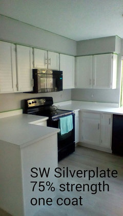
    Natalie,

    Here is one coat of SW Silverplate at 75% strength. I like it. Yesterday, the primer was applied. There was no way that I was going to paint over the bright blue without priming first.

    What do you think of the color?

  • 10 years ago
    last modified: 10 years ago

    Hi Shelleyjr---

    BEAUTIFUL! ♡ IT!

    Good call having it tinted @75% looks perfect. Just enough color---grays are tricky and can make a room gloomy looking. The color is bright, contrasts well with the cabinetry, and monochrome to the floor. The light turquoise is a great accent color for your room. How's it looking on your end? Happy to get rid of the bright blue wall color? :))

    shelleyjr thanked Natalie
  • 10 years ago

    Hi Natalie,

    Thanks for the kind words. Yes, I am delighted to get rid of the blue walls. This color is perfect. We are so glad that it was only at 75% strength!.

    I am so sore from painting the last 2 days. I hurt all over. My husband said he can help me tomorrow but by the time he gets home from work I'll have most of it done. My arms and hands are killing me. Not to mention my bad back. Yikes!

    So hopefully tomorrow it will be done. I always like to do 2 coats. It just looks better.

    Next painting project my bathroom....

  • 10 years ago

    LoL!

    Well, your hard work will definitely pay off, cause it's coming along Fabulous! I'm so glad you're happy with the color.

    Bathroom next? Great! Make sure you post the link to that dilemma when you start it.

    Looking forward to more photos of the kitchen once the painting is completed. Have Fun and Good Luck! :))

    shelleyjr thanked Natalie
  • 10 years ago
    last modified: 10 years ago

    Thanks Natalie for all of your help. Grays are not my color. They are so hard to get right. You have been a gem helping me get the right color of gray. I wouldn't have been able to do it without your help. I am truly grateful.

    I will definitely post my dilemma with the bathroom when I'm ready to do it. But here's the heads up, we have a beautiful periwinkle bedroom. I love the color however it goes into a bathroom that is a yellow color. I don't like the transition. Because there's no door between the bathroom with the double sinks and the bedroom. I'm even considering painting it the same color as the kitchen. Or just going to chantilly lace. Again the cabinets are chantilly lace that we had painted. More on that later.

  • 10 years ago

    Oh Shelley---you're welcome and thank you for your kind words. :)

    I Love periwinkle so I'm definitely looking forward to seeing those two areas of your home.

    About 20 years ago, I did an all white bathroom and painted the very dated oak vanity periwinkle. It was Gorgeous! I wish I had a photo to share but have no idea what photo album it is tucked away in. :0 Anyhow, all things are possible---and the power of paint is limitless.

    Happy Painting! :))


    shelleyjr thanked Natalie
  • 10 years ago

    Oooh a periwinkle vanity with white walls. I bet that looked fantastic. Besides aqua, periwinkle is one of my favorite colors. I can't get enough of it, lol. We had both bedrooms painted periwinkle and even the painters loved the color. Our floor guy wanted to know the name of the paint, he loved it.

    Paint is amazing once you get the correct color.


  • 10 years ago
    Looks great!!
    shelleyjr thanked radish
  • 10 years ago

    Natalie and Radishpixie,

    I posted a design problem today [Light gray paint for bathroom.[(https://www.houzz.com/discussions/light-gray-paint-color-for-bathroom-dsvw-vd~3511331?n=3)

    I look forward to your input.